Featuresexpand_more
Spotlightexpand_more
Featured Forumsexpand_more
Brand Forumsexpand_more
Independent Brandsexpand_more
Lifestyleexpand_more
Resourcesexpand_more
Collectors Market: If you're still looking...
I have two 2016 - 2018 catalogues; one in Mandarin and one in English. Also have a Boutique & Espaces collection catalogue. And a Sonnerie Souveraine - Grande Sonnerie book (the special edition with the outer cover and CD).
4Y
0
A. Lange & Söhne: First generation
For quite a number of reasons, but an easy one would be that the newer movement just has so much more empty space; the kind of empty space that to me feels more sparse/anaemic than it does minimalist.
4Y
1
A. Lange & Söhne: If I'm recalling correctly, it's a historical artifact -- one of the requirements for the Geneva Seal
Something about column wheels having to be capped or nicely decorated in some manner, not simply left unadorned. Vacheron Constantin's chronograph column wheels aren't capped like Patek's are, yet have the Geneva Seal, though, so I'm sure there's something to do with the way the requirement for the
4Y
1
A. Lange & Söhne: The way Patek avoids having those sharp inward chamfers is really blatant too...
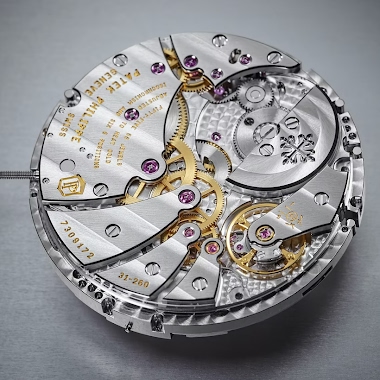
And it's not like it's a recent practice. But their most recent movements are especially egregious; see pics attached. The 31-260 is incredibly cheesy in its execution of avoiding as much as possible having internal anglage, to the point it feels like they're just taking the piss:
4Y
1
Jaeger-LeCoultre: Had the good fortune to see one in person some time ago...

JLC Boutique at ION Orchard in Singapore. Truly breathtaking. A tour de force.
6Y
1
Jaeger-LeCoultre: Let's see...
Blue aventurine in subdials, ruthenium-plated meteorite with applied JL logo for main dial; meteorite cutouts overlaid on the plates, AM/PM subdial featuring flinque enamelling. Chronograph minute track--maybe in grand feu enamel? Very curious if the back of the watch also features different decorat
6Y
1
Jaeger-LeCoultre: Pure coincidence!
The photo had just randomly appeared on my Instagram feed a few days ago (as a result of following "#gyrotourbillon") and I didn't think much of it. Funny how I instantly knew what I was looking at from those blurry photos! Glad to have been able to help.
6Y
1
Jaeger-LeCoultre: It's a Gyro 3

Limited edition of 8, made for the 76th Venice Film Festival. Here's a photo--credits go to @marengo_luca on Instagram:
6Y
3