Featuresexpand_more
Spotlightexpand_more
Featured Forumsexpand_more
Brand Forumsexpand_more
Independent Brandsexpand_more
Lifestyleexpand_more
Resourcesexpand_more
Ulysse Nardin Perpetual Calendar GMT Platinum. A close up of the dial.

Quite appealing... Best, Nicolas
7M
8
amanico
1505
That really is a stunning looking Ulysse Nardin Perpetual Calendar
The dial colour and the tone of the markers are really beautiful I am not usually a fan of skeleton hands but on this watch they not only make perfect sense to allow you to see the information being displayed but they look great too. Wear and enjoy it in
10M
30
Tim Jackson
4093

I was interested in this too
Its been on my radar too for some time. I dont mind the weigh on the hands. Gotten used to it. The day, date month year etc all have their separate pushers right? Not like kurt claus perpetual movements where one pusher advances all (ofcourse cannot come
1Y
14
amanico
4122
Ulysse Nardin Perpetual Calendar GMT, Platinum.

Which I had the pleasure to own, some 20 years ago, but which was aesthetically too close to the Sonata. Gone, but not forgotten. In platinum, it had the weight of a dead donkey. Not very comfortable, but a lot of character. Without forgetting that this i
1Y
14
amanico
4122
Yeah…

I wear 38-39mm all the time. But I also have some biggies… Here’s another photo. The problem is when I got it my wrist was 7.25” too but I lost. A lot of weight. The ceramic ones don’t weigh a lot and I love that it’s a perpetual. So cool… I know trends h
1Y
20
PhinneyWood
4820
I will play
Thoughts on some I owned or still own 1. Reverso Perpetuel Good: Amazing design The indications which are not being used often are on the flip side Bad: Manual wind with short power reserve Everything being adjusted via correctors, that feels fragile 2. A
1Y
19
WTWTStyle
7177
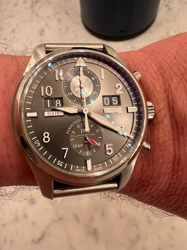
Do you have any watches you bought despite the marketing campaign?
Rather than because of it? I’m not always a contrarian, but in this case I just loved the dial, independent of any slogans on the back of IWC’s “Climate Action” watch. One yellow arrowhead to another. It’s a beefy watch, and heavy even on a strap. Ok, it
2Y
5
jakub04
1607
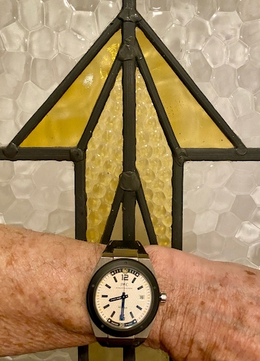
Couldnt agree more!
The Acqua perpetual has been on my list for years, cant decide on the dial color, blue is mesmerizing but the white date openings are a bit of a distraction, black is the most under the radar if a bit boring, white is not bad but looks like a golf ball (I
2Y
10
Tim Jackson
2463