
patrick_y
[PuristSPro Moderator]
33646

Beautiful report...
While I love your sentiments about the Aquanaut, I have to say, personally, I still prefer the Advanced Research Aquanaut more than this one. The orange is nice, but not for me. I have a friend who's an avid lover of the color orange. This might be ideal for someone who adores orange. The square pushers on this watch seem a little hard-edged. Contrasted to the rather soft look of the Aquanaut case with its muted and rounded edges, it seems almost out of place. Royal Oak is more hard edged than Nautilus. The pushers aren't quite as hard edged as the Royal Oak, but too hard edged for the Nautilus. First impressions... Maybe my mind will change upon seeing it in person.
The perpetual Nautilus' pusher at 9 o'clock on the side of the case really ruins the lines of the beautiful case for me. I cannot imagine forgiving it when I would be perfectly happy with a 5711 or 5712.
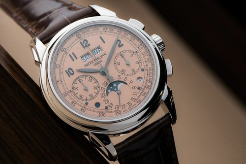
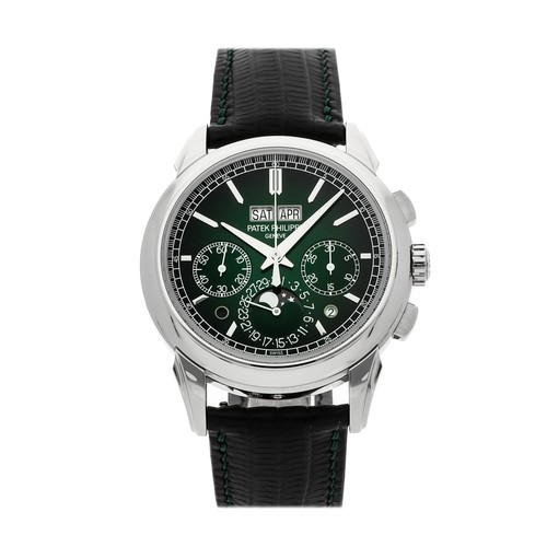
Which leaves me to the 5270P, which looks stunning. I like the idea of your 5970P more than the 5270P, and the color of the 5970P's modern black dial and the elegant concave bezel make it an extremely handsome watch that's both good for sporty wear (black dial) or extremely formal wear (black tie with black dial). The 5270P is very nice, I like the two dot apertures at 4:30 and 7:30 positions; but I'll have to try on the salmon dial before I can determine if I'd like the salmon dial over a more conventional colored dial.
Again, fantastic report. Thank you for sharing your sentiments!
Available on the marketplace


Patek Philippe at Basel - my favourite three from the novelties

Beautiful report baron sir

Thanks Mr. Red, for the opinion and photos.
doesn't help that its height is on the upper side.....

The WT Repeater was on.my shopping list but not keen on R
Yes.....but Miranda will do a full review of all the novelties after he has viewed them.....

It can only be my personal opinion.....


Was eagerly waiting for your on site report
Hey Keks....
Yes no doubt...

I agree with you keks. I'm so fond of my 5980s that other chronos inevitably fall short. The extra girth to the case of the 5968, without a degree of counterbalance in bracelet, and the absence of 12 hour counter render it unlikely for me.


subdials disrupt waffle pattern
it is a curious design for sure
Yes I think too that AP's tapisserie pattern made it easy for them to design & play.

Glad to see that you prefer the 5740G
most common watch in my collection is the Calatrava.....

Very concise. An informative report Joe , many thanks.


Excellent report, Baron!

Great post from first hand experience.....

Thank you Baron for your in-depth feeling report. I give a lot of importance to feelings and emotions when I want to buy a watch independently of its brand or price so I really appreciate your personal insights
i had the same feeling.......
Beautiful report...

Thanks Joe. Again you are bang on the money.
good for my wallet too..... ;)


Good report on describing your selection and decision process. Hope to see wrist shots of your Patek(s) soon.
PC in steel?
Good luck with your decision ! Look forward to seeing your wrist shots hopefully. IMO if PC is not a steel complication, then combining PC with an...
Great write up Joe. I found the reaction to the Aquanaut most interesting as one couldn't reach that conclusion without handling the piece in person.
Thanks 5980.....

What is the function of the pushers on the Aquanaut.......

Thanks for the great insight, Joe. How comes that the 11.8 mm of the Aqua chrono feel so big compared to the 5270p with 12.4 mm. Is it all about the diameter of 42.2 mm?
Two possible answers

Can I ask you how the 5370 wears compared to these?
Different case shape again
Thank you - much appreciated!!
Thank you for the trip and report

Superb write-up, your thoughts are much appreciated.

Thanks for these photos
Out of curiosity....
I don’t do vintage


Agree
Heaven sent report

Great report Joe, many thanks
I obviously agree
I took a bashing on my Instagram account for my pictures