kys1944
209

It makes all the NON FAT letterings look odd to me now
I like it... a few naked shots on my favourites: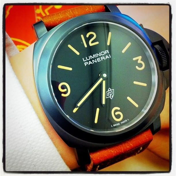
A human torpedo under the moon: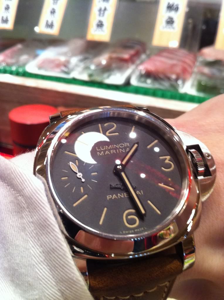
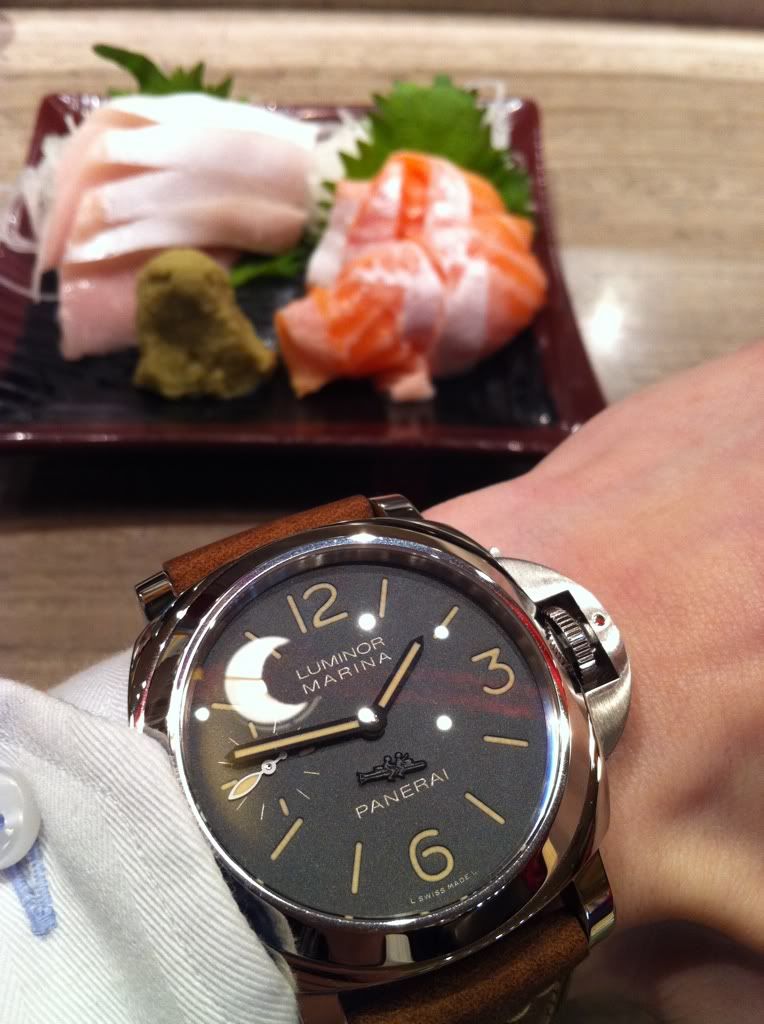
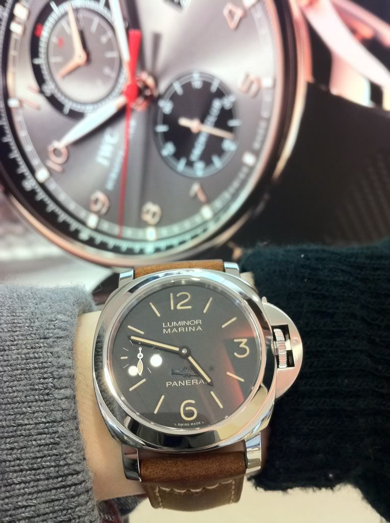
Torpedo vs IWC (Yacht Master and Perpetual calendar: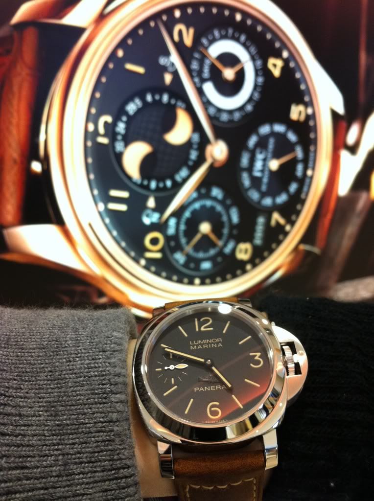
To me the best FAT is on this with thicker lettering but it is very different from 203a: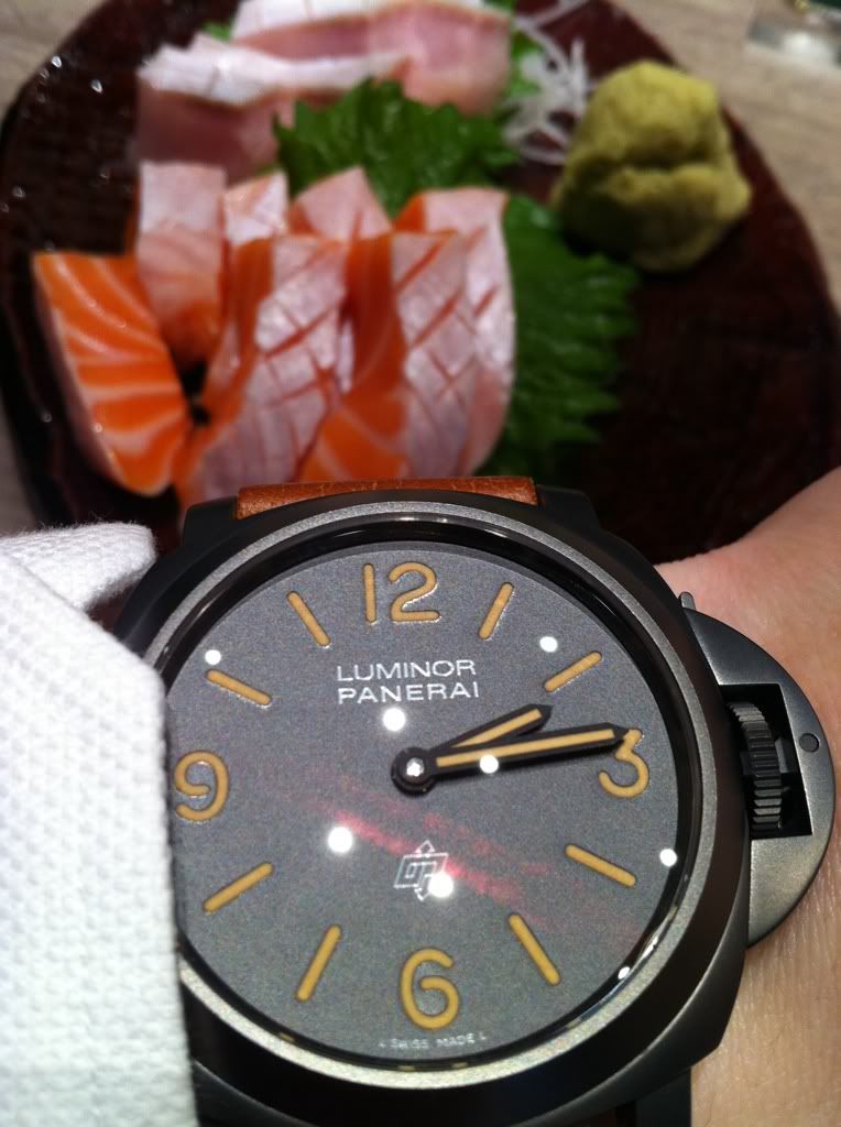
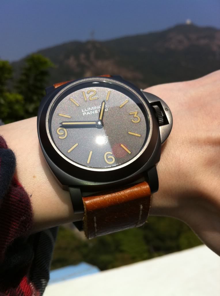
Under bright sunlight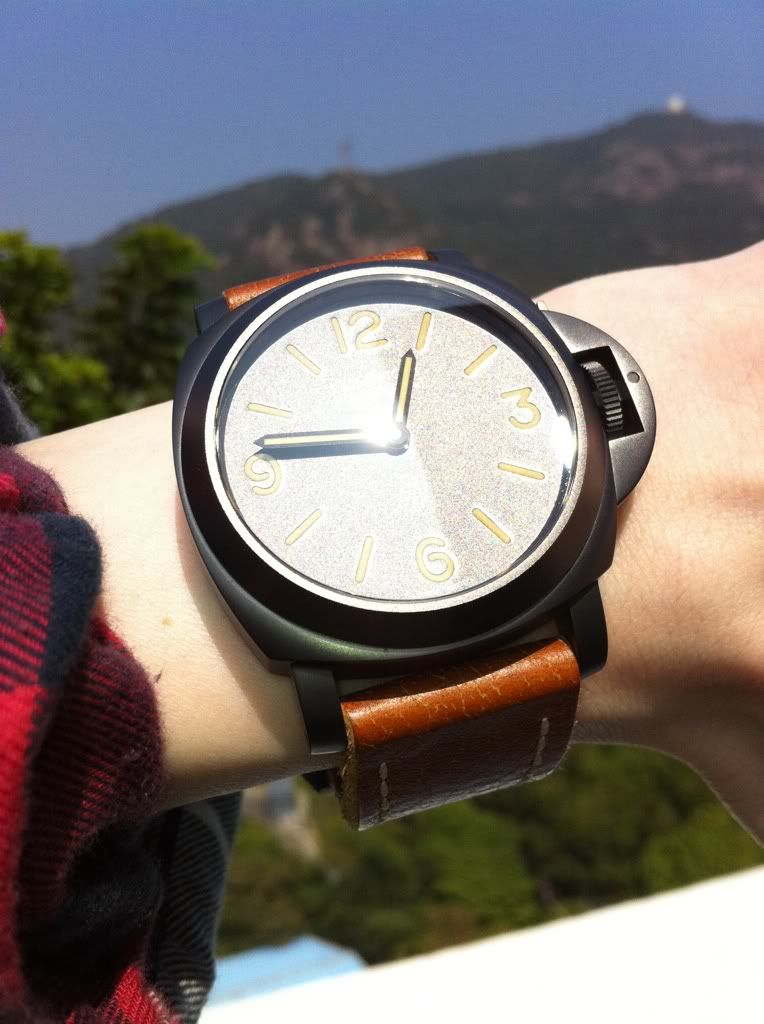
This is also nice: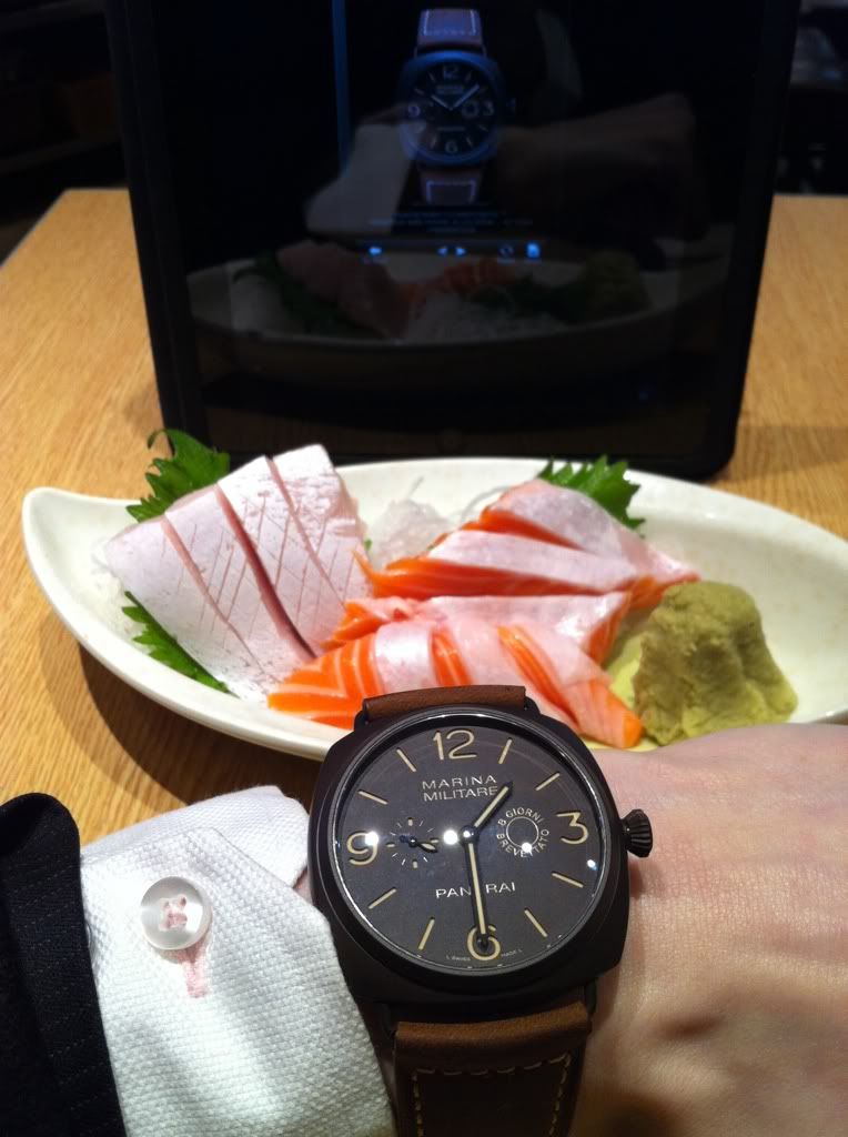
I must say that I have grown to fall in love with the FAT and these are my quartets again 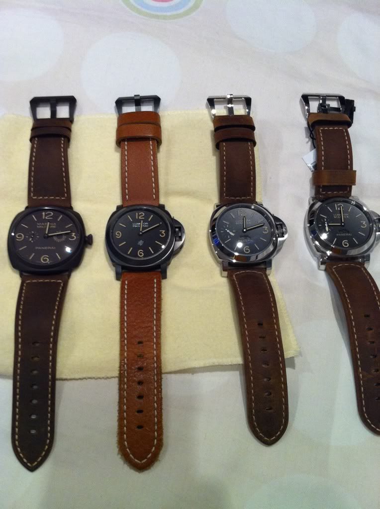
But I can see that some aren't so happy as they take a little of that specialty out of tritium aged dial but for the trained eyes, they are far from
being similar. The natural tritium aged on my 202 is very different from any of these colorings. However, I do admit that some of them are done up nicer than others on FAT. I think this is the direction as evident from 2011's 372, 375 and the new Daylight Chrono. I think we will see them being more popular. Inputs?

How do you guys feel about all the vintage looking patina'ed luminova in the new models?
I personally love it on the black and brown finished cases

I have a bit of a problem with the...faux patina....definition. As

After I saw it in person...
Hi Sam, I'm assuming you mean it has a green hue under sunlight
Kind of...
I need to add up more...

I don't mind the patinated look

I had somewhere a document showing the Luminova nuances.
Why are you disturbed by....
It would be great if it was the privilege of the 339...

I agree

I think we should all bear in mind that

Dear Nicolas

Hey Nicolas.....
Hola Sergio.
Thanks Nicolas.....
No, Imo, I had a pic which compared luminosity to each color of Luminova.
I really love it.

pam is pretty well hedged
i think it looks very nice , looking at the boutique edition
It makes all the NON FAT letterings look odd to me now
well
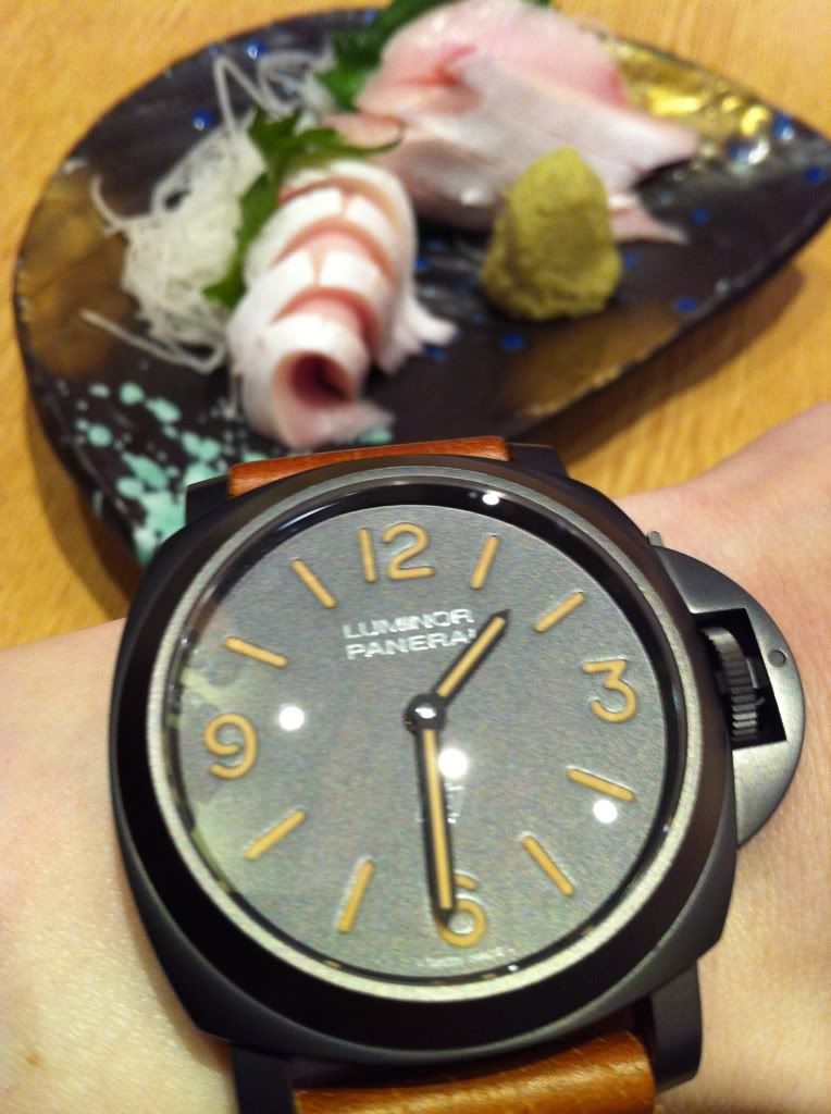
Anthony, the sashimis are there for comparisons

Not a fan.
Patina on PVD and Brown
