
Bill
31957

A Comprehensive Guide to Vintage Rolex Submariner MK1 through MK3 Bezel Inserts.
Rolex Fat Font inserts explored MK1 through MK3.
Historical Context
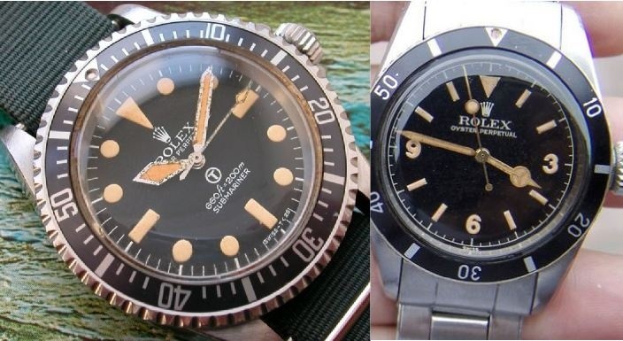
The evolution of Rolex bezel inserts tells the story of the brand's attention to detail and continuous refinement. Some of the very early inserts from the 1950s had no markers between 0-15—they just had individual marks at every 5-minute increment. We also have the famous red triangle that adorned the Rolex Big Crowns during the 1958-1959 period. Of course, there's the later military insert for the 5517 issue, which featured marks at every minute.
Scope of This Guide
The focus here will be on the inserts fitted to the 5512, 5513, 1665, and 1680 models. As always with Rolex, I must preface this guide with the fact that we are discussing Rolex, and nothing is definitive. Please enjoy this review as a guide formed by experience.
Understanding "Fat Font"
First and most important is to cover the main buzzword: "Fat Font." What is it with Rolex and "fat" this and "fat" that? First the lugs, now the fat inserts. Well, when dealing with the time period from the late 1950s to early 1970s, the standard was fat font. During the vintage period in question, MK1 through MK3 inserts are all fat font, with only service replacement inserts being thin/skinny. There are degrees of "fat," which will be illustrated throughout this guide.
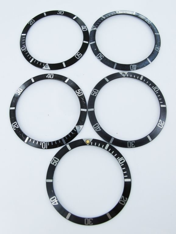
Insert Classification Overview
| Classification | Time Period | Key Characteristics | Models |
|---|---|---|---|
| MK0.5 | Late 1950s | Transitional insert, may have had red triangle | Early Big Crown models |
| MK1 | ~1958-1961 | "Kissing 40," very fat font, square "5," serifs | Early 5512, 5513 (gilt era) |
| MK2 | ~1961-1970 | Long "5," fat font without serifs, no touching numbers | 5512, 5513, 1680 "Red Sub" |
| MK3 | ~1965-1980s | Slight serifs, somewhat thinner font, square "5" | Most vintage Subs into early 1980s |
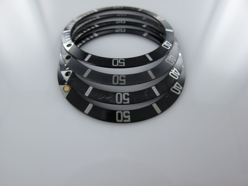
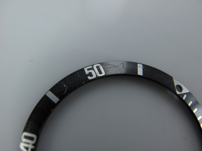
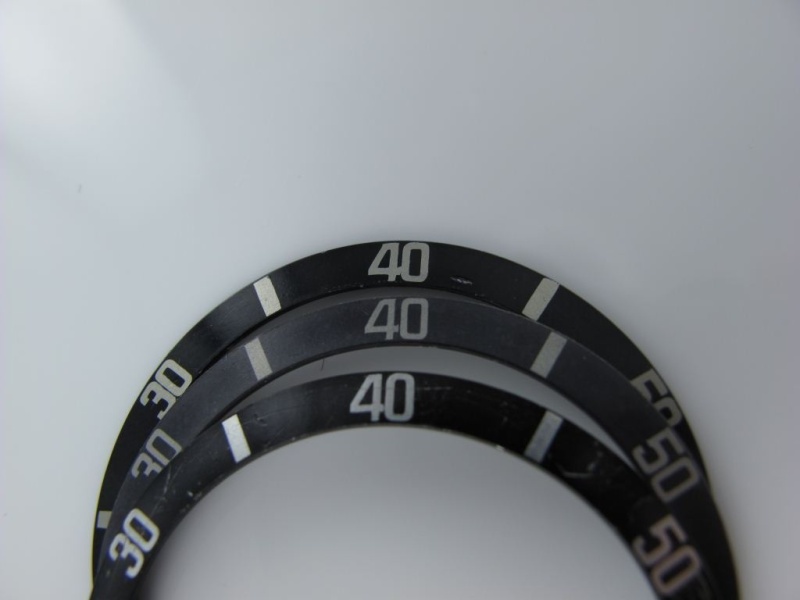
MK1: The "Kissing 40" Insert
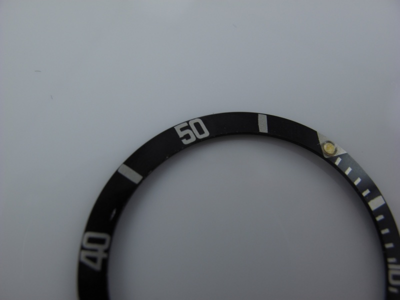
The fat font insert shown above features the early "kissing 40 font." Very rare to find, holding the position just after the early Subs with the red triangle. This model would have been present on early 1960s Submariners like the 5512 from the gilt era, and most likely the 5513 of the same period (i.e., a gilt "Swiss only" ending around 1963/64). It's not very common to find these intact on watches from this period.
MK1 Key Identifying Features:
- The "Kissing 40": The "4" and "0" in "40" actually touch each other
- Small Square "5": The number five has a distinctly small, square shape with thick font
- Serifs: Numbers feature small serif details—like little feet protruding at the ends
- Font Thickness: The fattest of all fonts, with numbers almost touching each other
- Thick Index Markers: Very substantial markers, appearing somewhat "sloppy" but correct
- Character: Overall appearance is bold and distinctive

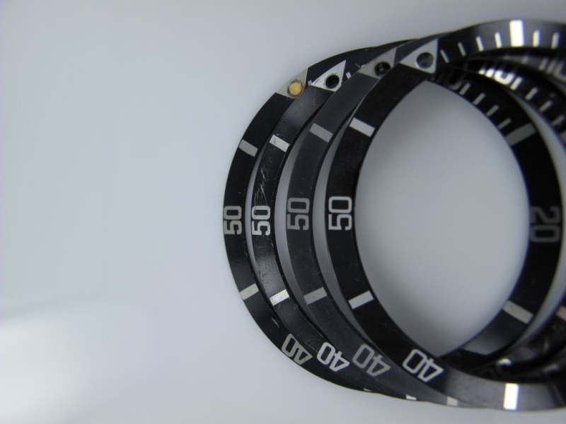
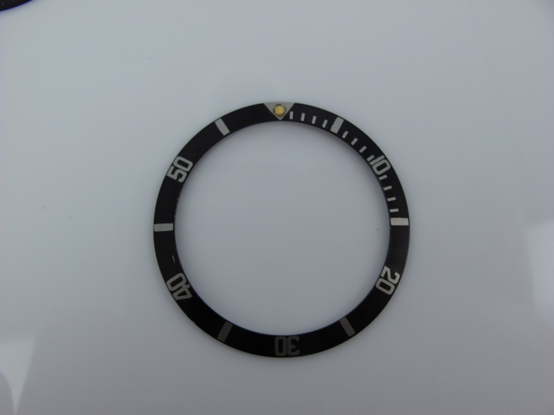
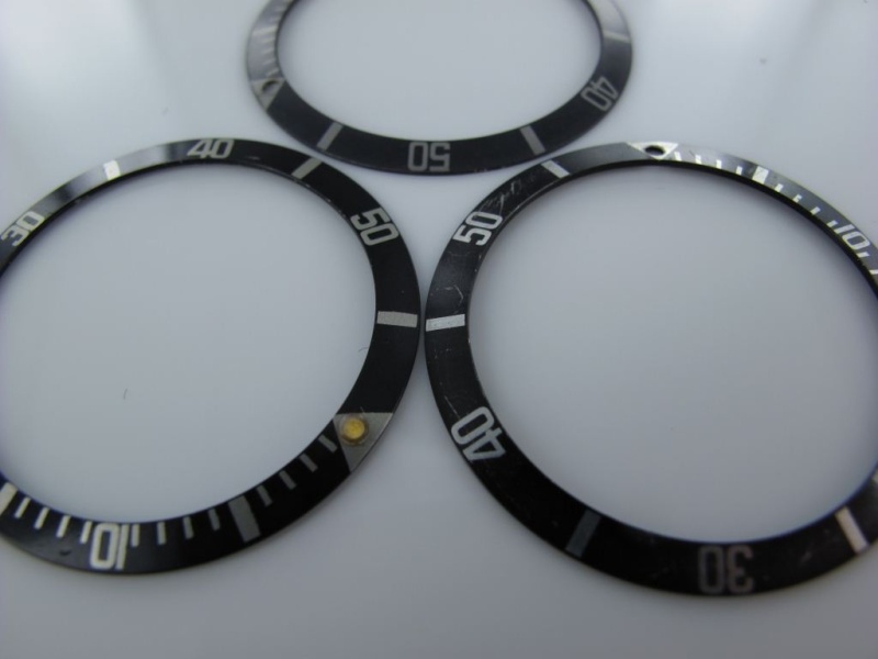
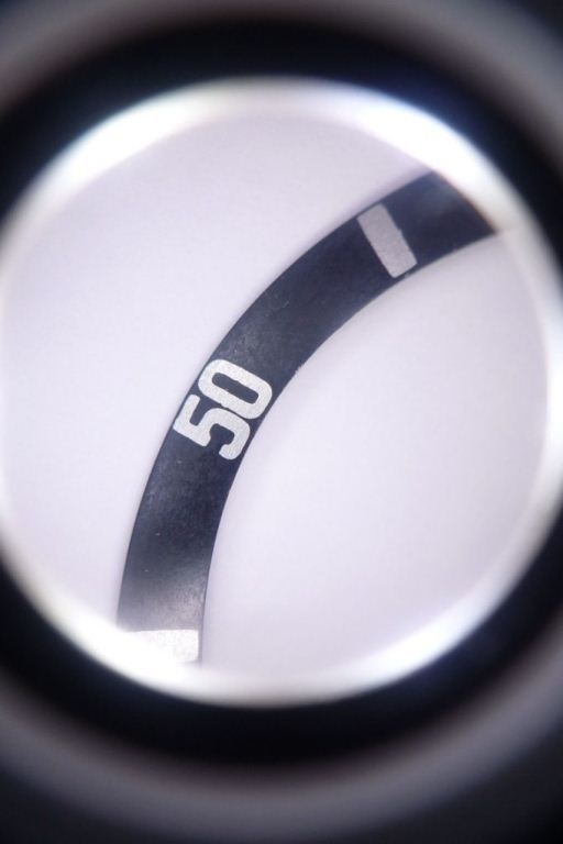
MK2: The "Long 5" Insert
The key identifier for this variant is the "long five" feature in the 50 marker. The interior of the five is elongated vertically, rather than square as in the MK1 (with the exception of the MK0.5 or MK1.5, which I'll discuss later). The fonts are without serifs and fat, but not touching in any way. There's slightly more breathing room between the fonts compared to MK1, but they're still very substantial.
MK2 Key Identifying Features:
- Long "5": The interior space of the "5" is vertically elongated
- No Serifs: Clean font without the decorative elements of MK1
- Fat but Separated: Bold font with clear spacing between numbers
- No Touching Numbers: Unlike MK1, numbers maintain distinct separation
- Cleaner Appearance: More refined look than MK1
This insert was probably fitted on the 5512 and 5513 models through the late 1960s to early 1970s. It was likely also the model found on the 1680 "Red Subs." It remains a highly desirable insert for all vintage Submariners.
MK2 on Rolex 5513
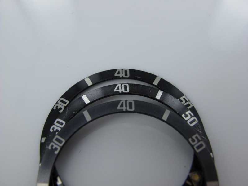
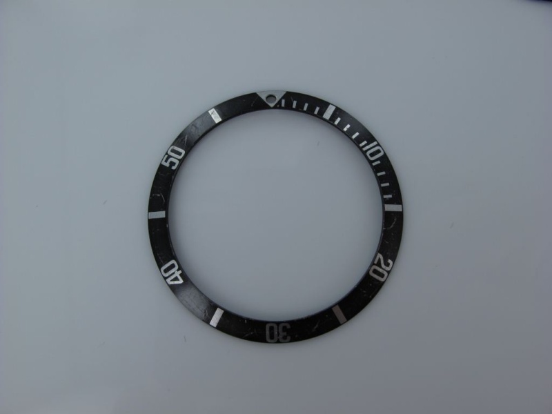
MK3: The Final Fat Font
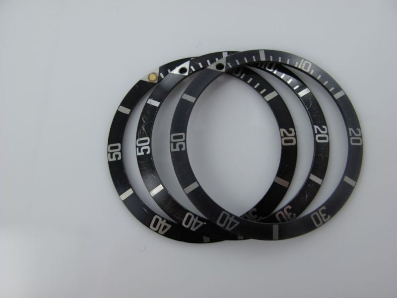
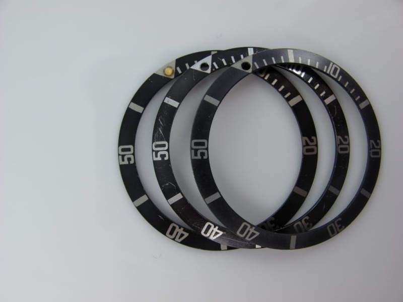
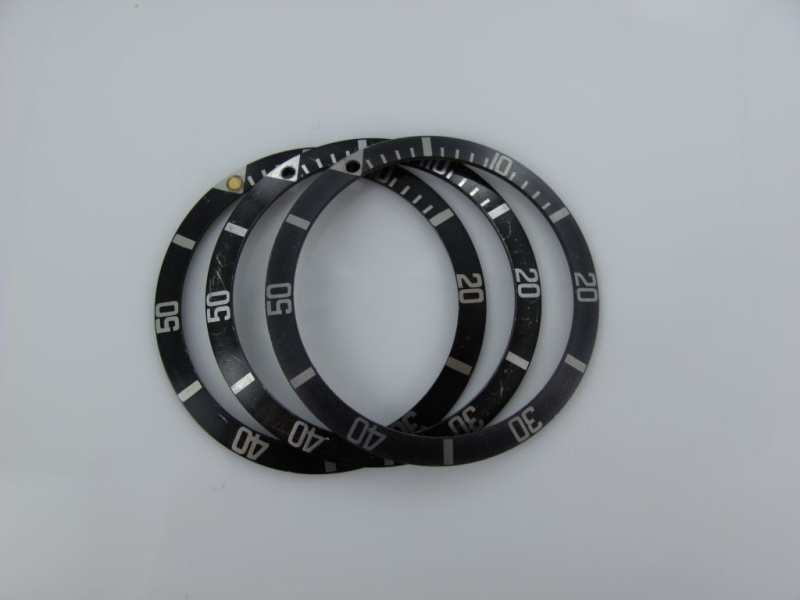
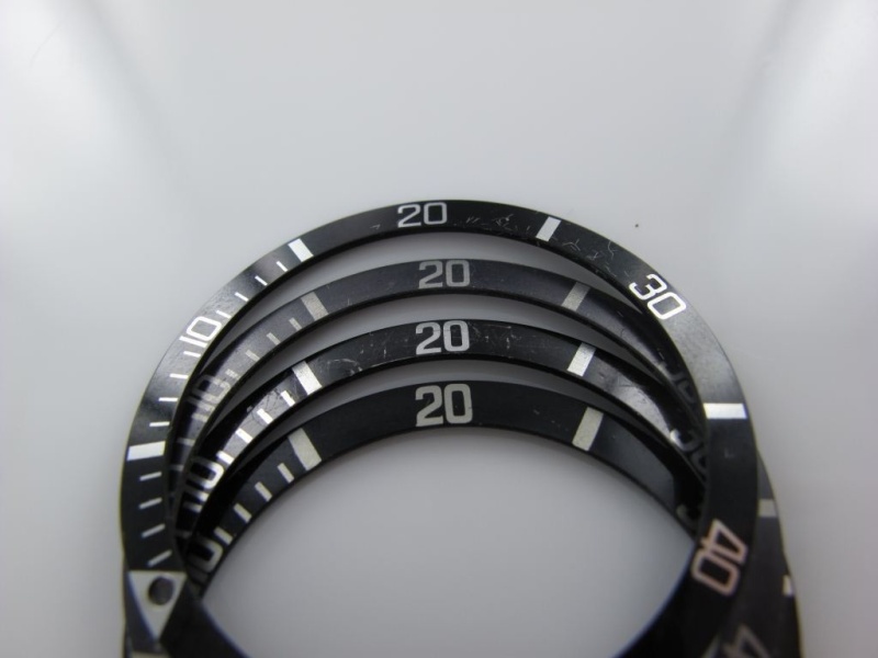
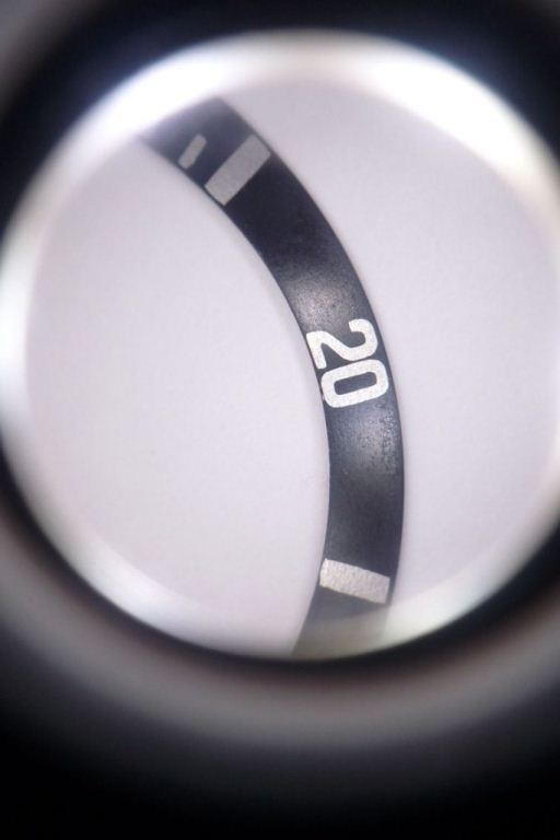
The MK3 fat font appears to be the last of the fat fonts and exhibits some sort of serif in the font style. It appears slightly thinner than the other two variants. You can see the little tails on the "40" as well as on the "20." The number "50" is again more square but not as small as the MK1.
MK3 Key Identifying Features:
- Subtle Serifs: Small decorative tails on numbers like "40" and "20"
- Slightly Thinner: Still bold but not as heavy as MK1 or MK2
- Square "5": More square than MK2 but larger than MK1
- Bold Feel: When sitting alone, still appears solid and substantial
- Most Common: Graced most vintage Subs up to the early 1980s, possibly later
When compared to a thin font insert, the difference is quite evident. However, when viewed alone, it appears to have a solid bold font feel. This is the insert that graced most vintage Submariners up to the early 1980s, maybe even later, and can be considered the last variation of the fat font era.
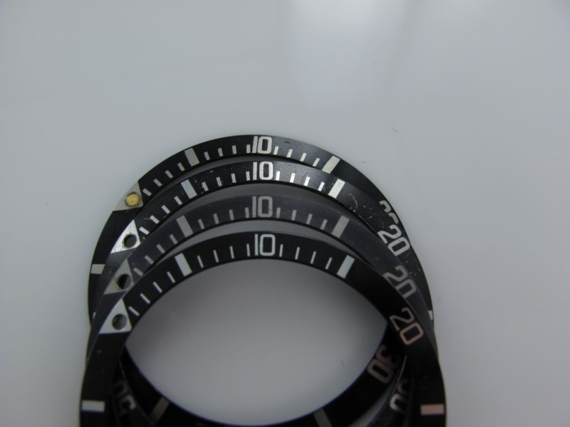
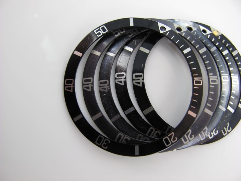
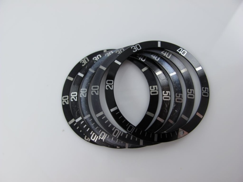
Visual Comparison: Fat vs. Thin Font
The following images allow you to really see the differences between MK1, MK2, and MK3 as compared to the thin font service inserts:
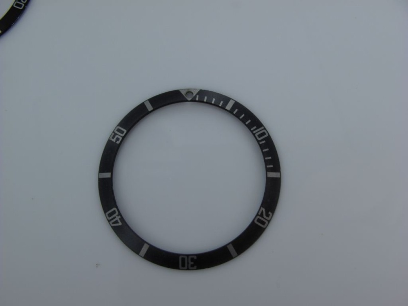
Special Classifications: The MK0.5
These last two examples presented a classification challenge. As promised, here's the MK0.5—I'm not sure what else to call it. These inserts look like they would have featured a red triangle. While I had some doubts initially, they are genuine examples, and as I always say: this is Rolex.
Quick Reference Guide
| Feature | MK1 | MK2 | MK3 |
|---|---|---|---|
| Font Weight | Fattest | Very Fat | Fat |
| "5" Shape | Small square | Long/elongated | Medium square |
| Serifs | Yes, pronounced | No | Yes, subtle |
| "40" Touching | Yes ("kissing") | No | No |
| Spacing | Minimal | Slightly more | Moderate |
| Rarity | Very rare | Rare | Most common |
Conclusion
The evolution of Rolex Submariner bezel inserts from the late 1950s through the early 1980s represents a fascinating journey in design refinement. From the ultra-bold MK1 with its distinctive "kissing 40" to the more refined MK3 that served collectors well into the 1980s, each variation tells part of the Submariner's story.
While these classifications (MK1, MK2, MK3) provide a useful framework for understanding and identifying vintage inserts, it's important to remember that with Rolex, variations and transitional pieces always exist. The dates and model associations provided here are educated estimates based on experience and observation of numerous examples.
For collectors and enthusiasts, understanding these distinctions adds another layer of appreciation for these iconic timepieces. Whether you're verifying the originality of a vintage Submariner or simply appreciating the evolution of design, these "fat font" inserts remain one of the most sought-after and distinctive features of vintage Rolex dive watches.
Best regards,
Bill
Addendum: Community Insights and Additional Discoveries
The "Skinny 4" or "Slim 4" Insert
One of the most significant discoveries from community feedback was the identification of a distinct insert variation known as the "Skinny 4" or "Slim 4." This insert doesn't fit neatly into the MK1-3 classification system and represents an important transitional piece in Rolex insert evolution.


Skinny 4 Characteristics:
- Distinctive "4": Notably slimmer "4" compared to all fat font variants
- Positioning: Numbers and hash marks appear pulled toward the outer edge of the insert
- Font Style: Roundish font with a tail on the "4"
- Square "5": The "5" has a square body similar to some fat font variants
- Time Period: Primarily associated with 1963 Submariners, particularly the 5513
- Rarity: Relatively uncommon and mostly observed on early 1963 examples
Chronological Placement Questions
The exact placement of the Skinny 4 in the chronological sequence remains debated within the collector community. The primary question is whether this insert predates or follows the MK3. Based on observed examples:


- Early 1963 Association: Most documented examples appear on 1963 5513 references, suggesting it may be contemporary with or slightly after the MK2
- Vintage Advertisement Evidence: Some period Rolex advertisements from later years (late 1960s) appear to show similar inserts, though there's debate about whether Rolex reused older photographs in advertisements
- Printing Variations: Some experts suggest certain "Skinny 4" examples may result from printing errors where the design was positioned too close to the outer edge, causing the appearance to differ from standard fat fonts
- Regional Variations: Different markets may have received slightly different insert variations during the same time period

Printing Error Theory
One theory suggests that some Skinny 4 examples may result from printing errors where the font positioning was too close to the outer edge of the insert. This caused the paint to be visible on the outer edges and created the distinctive appearance with numbers and markers pulled outward.


Period Advertisement Evidence
Vintage Rolex advertisements provide additional context, though their reliability for precise dating is debated. This 1967 advertisement shows insert characteristics that warrant careful examination:

The "40" as a Key Identifier
Community member M. Pisani contributed detailed analysis highlighting that the "40" marker is perhaps the most telling feature across all insert variations. Examining the "40" can quickly help identify which MK version you're observing:

- MK1: "Kissing 40" - the "4" and "0" touch each other
- MK2: Separated "40" with fat, clean fonts and no serifs
- MK3: Separated "40" with subtle tails/serifs on the "4"
- Milsub: Distinct military specification font with unique characteristics
Expanded Insert Classification System
Based on community observations and documentation, a more comprehensive classification system has emerged for plastic Submariner inserts with crown guards:
| Version | Time Period | Key Features |
|---|---|---|
| 1. Square Font Red Triangle | End of 1959-1960 | Transitional piece with red triangle at 12 o'clock |
| 2. Super Fat Font "Kissing 40" | 1960-1962 | MK1 - Fattest fonts, numbers nearly touching |
| 3. "Skinny 4" Insert | Early 1960s (1963) | Roundish font with notably slim "4", numbers pulled outward |
| 4. "Long 5" Insert | Mid 1960s | MK2 - Elongated "5", fat font without serifs |
| 5. MK3 Insert | Late 1960s-1970s | Fonts with small serifs similar to Milsub, slightly thinner |
| 6. Fat Font No Serifs | Late 1970s-1980s | Later fat font without decorative elements |
| 7. Mid Font Service Insert | Service replacement | Transitional service replacement font |
| 8. Skinny Font Service Insert | Modern/Current | Modern thin font service replacement |
The MK3.5 Possibility
Some collectors have proposed an additional classification - the "MK3.5" - to describe inserts that exhibit medium font weight similar to the MK3 but lack the characteristic serifs. This would represent another transitional piece between the classic fat fonts and the later thinner service replacements.
Important Considerations for Collectors
Authentication Notes:
- Period Advertisements: Vintage Rolex advertisements cannot always be relied upon for definitive dating, as Rolex may have reused older photographs in later promotional materials
- NOS (New Old Stock): Occasionally, new-old-stock bezels from earlier periods were fitted to later watches, creating seemingly anachronistic combinations that are nonetheless factory-correct
- Manufacturing Variations: Rolex used multiple contractors and printing methods, resulting in subtle variations even within the same classification
- Printing Errors: Some unusual insert appearances may result from manufacturing errors where designs were positioned incorrectly during printing
- Regional Variations: Different markets may have received slightly different insert variations during the same time period
Community Contributions
This guide has benefited enormously from the vintage Rolex collecting community. Special acknowledgment to:
- M. Pisani - For detailed photographic analysis of the "40" marker evolution across insert variants
- Multiple collectors - Who contributed examples of the "Skinny 4" insert and helped establish its approximate dating
- Forum members - Who shared their observations about NOS bezels, period advertisements, and manufacturing variations
- Vintage Rolex Forum community - For ongoing documentation and discussion of insert variations
Ongoing Research
The study of vintage Rolex bezel inserts remains an evolving field. As more examples are documented and analyzed, our understanding of the chronology and variations continues to develop. Collectors are encouraged to:
- Document their inserts with clear photographs, particularly of key markers like the "40" and "50"
- Record serial numbers and corresponding insert variations to help establish more precise dating
- Share observations of unusual or transitional pieces
- Maintain healthy skepticism about definitive classifications - with Rolex, there are always exceptions
Final Thoughts on Classification
As one community member astutely observed: "Great message...now I know why my inserts look like they were made by 20 different contractors or artists." This captures the reality of vintage Rolex insert collecting - the variations are numerous, the exceptions are common, and definitive classification remains elusive in many cases.
The MK1-3 system provides a useful framework for understanding the major insert variations, but collectors should remain aware that:
- Transitional pieces exist between all major classifications
- Manufacturing variations create legitimate outliers
- Time periods overlap significantly
- Multiple insert styles may have been in production simultaneously
Rather than seeking absolute certainty, collectors are better served by understanding the general evolution of insert styles while appreciating the unique characteristics of each individual piece.
Updated: This addendum incorporates community feedback and discoveries made following the original publication. As always with vintage Rolex, new information continues to emerge, and classifications may be refined as our collective knowledge expands.
Best regards,
Bill
With appreciation to the vintage Rolex collecting community
A Comprehensive Guide to Vintage Rolex Submariner MK1 through MK3 Bezel Inserts.

A Reference post I will save with your permission, Bill.
Every piece of art needs a frame

Great and informative thread my friend!! Cheers,

great research report Bill!
Pearls are a little more simple

Great Post Bill
Very informative
I have observed the insert in question
Here are some better images of the insert in question
I think it is safe to say based on the 5
Your insert is worth a deeper review.
That does shed some light on the time period for that format
Funny thing is...

Hi-res of the 1967 ad
Thanks for the Hi-res image.....
At first my guess was Bart Simpson 1965-66
So your saying it doesn't look like a 1964 Swiss-t<25 dial? [nt]
Yes it could very well be a 1964-65
Thanks...

Thank you Bill!
The art of Rolex
But if I was a betting man I would say non gilt MS 1967
Perhaps, but the L in Rolex....
Super hard to tell for sure.
Looking at the shape of your 4 it does appear to be Slim4

great review, Bill...


Maybe a slim 4 candidate
Another look at the "Slim 4" Rolex insert MK3/4


Hello Bill! Thank you so much for this most interesting...
Rolex 101 it never ends
Yep, it seems like...
Fat Font Slim4 = 1963 + is a good assumption
1963 + 1965 ads
GReat ads none appear to support the slim 4
There is no doubt taht the Slim 4 has claimed a position
Thanks Bill

Skinny 40 Rolex insert another firm reference from 1962 - 1963
5513 mark 2
Looks like a very nice 5513 - It looks like a maxi dial where the lume plots are almost touching the index markers.


Thanks for this.

Great post!
I'll do that, Thanks!

What a fantastic research and effort you have presented us, Bill!
That is a tough one.