Suboc
12

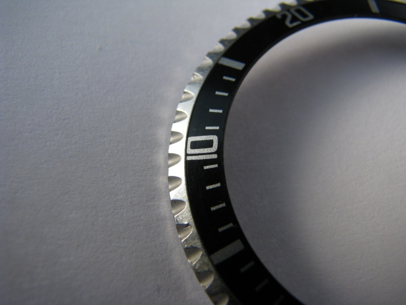
Here are some better images of the insert in question
Thanks Bill. There are certainly a number of other inserts, and figuring out how they fit into the chronology is a little confusing. I believe this insert is correct however not sure what period its from. I appologise for redirecting this thread from Mark 1,2,3. I was just comparing my insert to a similar one you posted under "There are a few other variations which I have not really classified as I am actually not completely sure".
Daniel

This message has been edited by Suboc on 2013-03-11 10:15:31

A Comprehensive Guide to Vintage Rolex Submariner MK1 through MK3 Bezel Inserts.
Rolex Fat Font inserts explored MK1 through MK3. The Rolex bezel insert is one of the most recognizable aspects of the Rolex Submariner—often imitated but never duplicated. The Rolex insert is a mark of distinction across the world, and the Submariner rem...

A Reference post I will save with your permission, Bill.
You wrote it very well. Inserts may look futile, but like a good piece of Art, the devil is n the details. And a Vintage Rolex needs its own insert. If you add the patina to the graphics, a nice and correct insert is not tha futile. We are two damned soul...
Every piece of art needs a frame
The Rolex insert is one of the most recognizable aspects of a Rolex Submariner. Often imitated but never duplicated. The Rolex insert is a mark of distinction across the world and the Rolex Submariner is the most recognizable when it comes to dive watches...

Great and informative thread my friend!! Cheers,
I think this should also be a sticky or saved--Well done Bill! Cheers, Ken

great research report Bill!
Rolexmania at its best! Will you do the same with the pearls! LOL, just kidding! Matt
Pearls are a little more simple
Just a question of tint but so many are refilled and you can't tell. Tricky stuff but not one I attach much importance to draw concern. Best Bill

Great Post Bill
Thank you for sharing your extensive knowledge about the submariner inserts... I certainly learned a lot from your post but definitely still need to learn more.. So much to learn about Vintage Rolex Thanks again for sharing... Best, Sam
Very informative
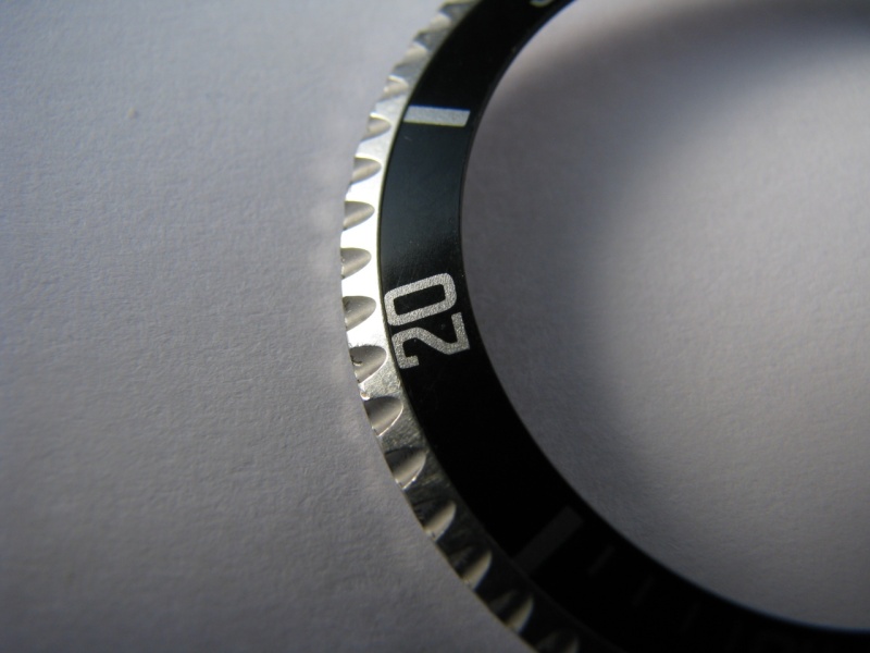
Excellent post. Here is a "Skinny 4" similar to one in the center of the third to last photo of inserts you show. Notice how the numbers and hash marks are pulled to the outter edge of the insert, as well as the skinny 4. I have been told these were produ...
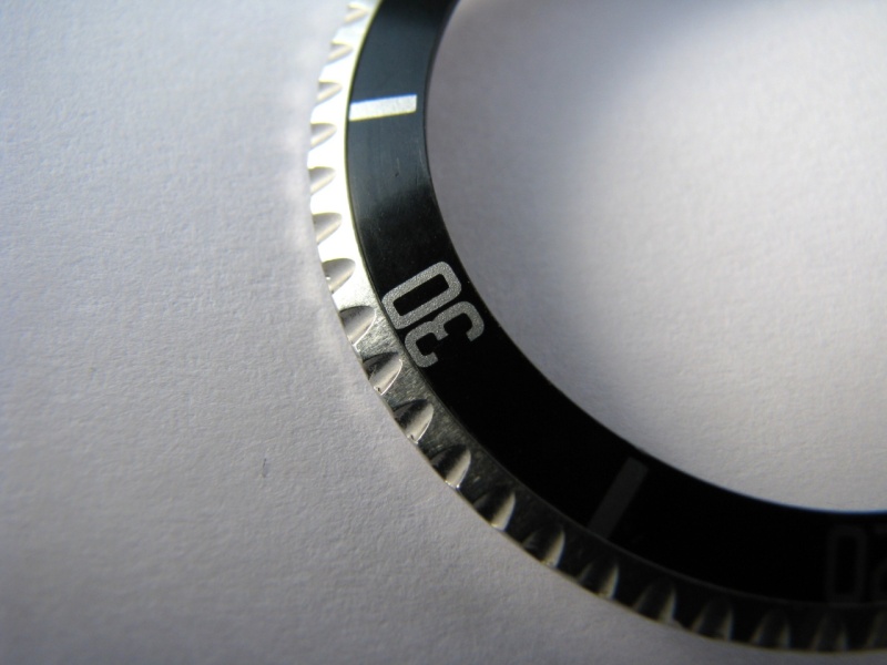
I have observed the insert in question
To me the one mounted on the watch is due to a error in the printing. The position was too close and the paint is actually visible on the outer edges of the insert. The format of the printing is consistent with the early fat font series. The fonts of the ...
Here are some better images of the insert in question
Thanks Bill. There are certainly a number of other inserts, and figuring out how they fit into the chronology is a little confusing. I believe this insert is correct however not sure what period its from. I appologise for redirecting this thread from Mark...
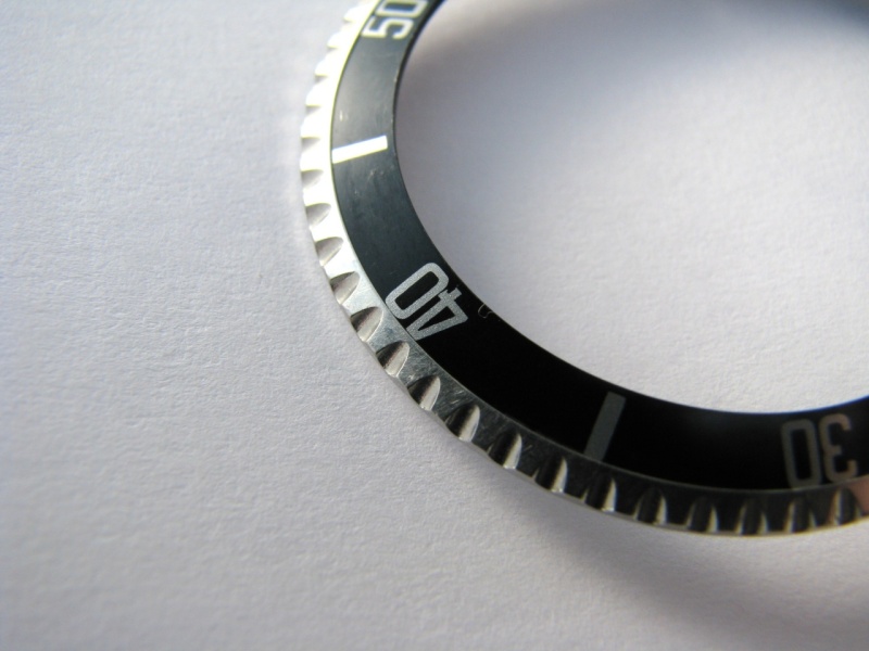
I think it is safe to say based on the 5
That it does not really fit in the MK1-3 "Fat fonts". Even the 40 with the tail appears to be a little more skinny both the #4 and the 0. I personally don't know how to classify beyond the Mk1-3 and even in the fat fonts there are many variations which ar...
Your insert is worth a deeper review.
I will see what I can come up with and as you pointed out to me you may be on to a new classification "Slim 4". I need to do some review at my end but all comments are welcome. Best Bill
That does shed some light on the time period for that format
But 1968 is a bit later than the examples put forward as "Slim4" which had been associated with 1963. Looks like we need to do some more work on the slim 4 qualifications. The two ads below have that format but these don't fit the time period with the dia...
Funny thing is...
I've yet to see this insert on anything other that 1963 5513 's I'm sure other years are possible. Perhaps Rolex was using older images in their adds. Do you have dates on those? Daniel

Hi-res of the 1967 ad
Hi Bill, Thank you for a great post - a newbie like me can only sit backk and enjoy the ride! :) Here is a hi-res of the second ad (1967) you posted, maybe there are some details that can help? Best Blomman ...
Thanks for the Hi-res image.....
Anyone recognize what 5513 dial variant(year) the add shows. Does it look like a 67 dial when the add was printed or a 64 dial? Reason I ask is that "Skinny 4" inserts have been seen on early 1964 watches and perhaps the image although in a 1967 add is th...
At first my guess was Bart Simpson 1965-66
It is impossible to tell but if we assume it is gilt and we look at the shape of the coronet it looks more like a Bart than 67-68 meters first because the coronet is not short and stout but skinny and tall. But if you observe the position of the FT on a b...
So your saying it doesn't look like a 1964 Swiss-t<25 dial? [nt]
My question was regarding 1964 Swiss-t<25 dials
Yes it could very well be a 1964-65
The ft is uneven and the coronet from what I can see is consistent with a gilt 1964-1965 5513. Sorry I was all over the place I was hung up on the slim 4 and the 1963 model. Best Bill
Thanks...
Well that may narrow down the "skinny 4" to for sure swiss only 1963 watches and perhaps early 1964 Swiss-t<25 watches. Daniel

Thank you Bill!
Bill: Awesome and informative post. Thank you for educating all of us here. You are right - every piece of art needs a frame. I just got a 10x loupe and have been looking at my 1665 and 16600. The bezels are really a piece of art, and the variations in th...
The art of Rolex
As you noted so much details so much history in the details. You never stop learning at Rolex school of hard knocks. Best Bill
But if I was a betting man I would say non gilt MS 1967
like this one. It has all the attributes of the ad and it is non guilt consistent with a 1967 + dial. But from the ad it is hard to tel just going by what Rolex would be advertising in 1967 more likely the mat dial. ...
Perhaps, but the L in Rolex....
On the matt dialed watch seems more centered under the crown than does the L in the add which looks set to the left. Could just be the photo.
Super hard to tell for sure.
This is a tough one. Unless we can confirm the date stamp on the ad we are still guessing. We also don't know if Rolex used old photos in new ads. Could be. And there is no way to really tell if the dial is gilt or matt. Actually in your first ad it does ...
Looking at the shape of your 4 it does appear to be Slim4
It looks like a NOS bezel which is pretty rare but always a possibility and you look to be the lucky owner. Bill

great review, Bill...
...i'd like to show you some details about the 40, the most interesting number on this insert series (imo) MK1 MK2 MK3 Milsub Thanks & credits to my friend M. Pisani. p.s.: more detailed pics on request ...


Maybe a slim 4 candidate
I always thought it was just an odd fat font but chose not to label it. It is an insert associated with a 1963 submariner. You can see it next to a mk3 fat font it has a tail on the 4 and the 5 has a square body. You can clearly see position 3 has a 4 tha...
Another look at the "Slim 4" Rolex insert MK3/4
I am not sure where to position the slim 4 before or after the MK3. The slim 4 is clearly illustrated below. ...


Hello Bill! Thank you so much for this most interesting...
... and informative post. Will keep as a fantastic reference source! Enjoyed very much reading and looking at these photographs! Receive my best cordial regards, Abel.
Rolex 101 it never ends
Just when we thought it was safe and we had a good handle on the MK1-3 the slim4 shows up. And back to Rolex 101 learning. Best Bill
Yep, it seems like...
Everyone agrees "Skinny 4" is an early version around 63 and then those later adds show what seems to be the same insert. My bet is that the adds back then weren't always accurate reflecting the exact dial/insert version being sold in a given year. Perhap...
Fat Font Slim4 = 1963 + is a good assumption
I think we have enough examples of watches around the 1963-1964 era to confirm that regardless of the ad. Best Bill
1963 + 1965 ads
Here is another example from my library... 1963: Note the PanAm reference. 1965: Best Blomman ...
GReat ads none appear to support the slim 4
based on the dates you are presenting. I love the second ad "Where did you get your Rolex". Looks to be very early 1959-1961 as it seems to feature a big logo on the bracelet you can see the inside and how the logo fills the blade. Do you know the year of...
There is no doubt taht the Slim 4 has claimed a position
in an among the Mk1-3 reduced view of the fat fonts 1959-1967 ish. I would not bet the house on it as we know Rolex can always throw a curve ball. However as noted based on the various examples as seen on the watch and my direct visual confirmation of a 1...
Thanks Bill
I guess I have excuse now to get a nice 1963/5513 in need of a period correct bezel and insert. Daniel

Skinny 40 Rolex insert another firm reference from 1962 - 1963
Seen here on a 5512 from 1962 ...
5513 mark 2
Do you think that my 5513 mark 2 from 1978 has the right insert? Thank you ...
Looks like a very nice 5513 - It looks like a maxi dial where the lume plots are almost touching the index markers.
On the insert it looks like it may be an original Rolex service insert but I could be wrong. Bill


Thanks for this.
A very useful tool as a buying guide. What many people don't realise is that the insert can really make or break a watch. For me, if I buy a 1680 or 5513 and it has a service insert, I can't stand the thing stumpy fonts and it doesn't do the overall desig...

Great post!
So much interesting information! So, forget about dial, hands and bracelet, could be my 5513's bezel a Rolex MK2 fat font - Long 5? ...
I'll do that, Thanks!
Now saving money for a decent meters-first dial (got the hands but need relume). I would try to sell the glossy dial and the 93150 bracelet (still have the 7206). Cheers

What a fantastic research and effort you have presented us, Bill!
Chapeau! I have a question pertaining the 1680/8 bezels... Is there any guidelines as to which years came with silver print and which ones came with gold print numerals? Wishing you all the best, Alex
That is a tough one.
If i was going to guess i would say the early 1680/8 meters first would be a candidate but that just means it could share the same black and silver bezel which standard to steel models. But as a rule i think they all have gold print if they are a gold wat...
Rolex 5513 insert
Afternoon Bill/Everyone Im so glad I found this thread! I have a 5513 Sub year 1968. Long story but sent the watch to a highly incompetent watch maker for a service and the watch was returned to me with the bezel and insert badly damaged/butchered. As you...