
Baron - Mr Red
14613

Dial Style
What is it about dials? They are the soul of the watch, right? If a watch has something about its dial, then so often it is hard to resist. I know that several things appeal to me in a watch. I love to know that the watch has some historical importance. I also like to know if the watch has some interesting history. It also matters to me that the watch has something quirky about it, and I define quirky in the loosest of manners. But, I think above all of these things, a watch has to have a dial that I love to look at. After all, it is the dial that one sees so often during the day. So, although this post will be under the Rolex header as it contains a lot of Rolexes, I will also add a few non-Rolex for fun.
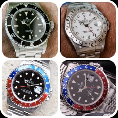
The bulk of my collection is Rolex, and as my wife constantly tells me, they all look the same. White metal. Black dial. Bezel. All identical. But actually, this is far from the truth. Within my Rolex collection there is actually a very wide range of dial variation. So variation is most definitely possible within Rolex.
However, it is outside my Rolexes that the range of dial variation is very pronounced. What occurred to me is that as a composite, the watches in my collection that are not Rolex have a very wide variation in dial style.
Is it because of the need for variation, or is it simply that the Submariner-style that dominates my collection affords me the luxury of seeking very different dials across other manufacturers? I am not sure. I suspect that diversity is an important factor for me and as a result I have a wide range of dial styles. I thought it would be fun to investigate them. What am I looking for in each watch? Well, maybe that is too much to bite in one posting, but maybe what am I looking for from each dial? Of course, everyone will be different but maybe it is fun to see into my own mind and push the answers for each dial here….
Lets start with the classic Rolex.
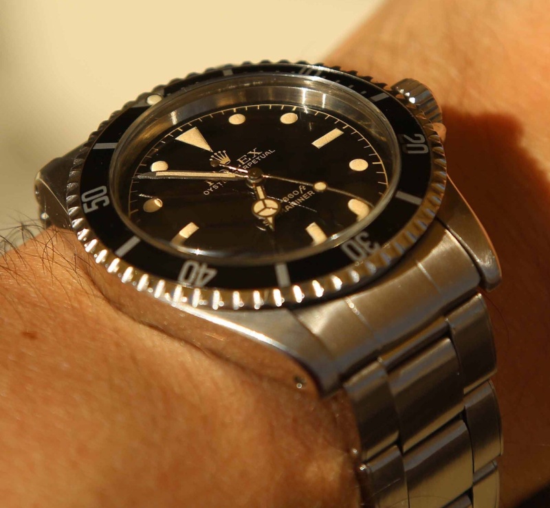
There is not much more classic than the 5512. To me, it represents the iconic Rolex. This one is relatively new to me…a 2013 purchase. But it is a core part of my Rolex collection for sure. I love so much about this watch. Sure, it is an iconic look, but it also carries so much more. The gilt and cream lime. The balance of the dial. Its size. So much appeals to me....
The next dial under the microscope is my Mk2 Patent Pending. Ok, the fact that were under 100 of these made, that it is a 1665 and that it has those wonderful 2-lines of red writing should explain some appeal. But actually, as the scan shows, this dial is starting to turn tropical and catches a fantastic shade of chocolate that compliments the red very well. Outside of sentimental watches, this is my favourite watch.
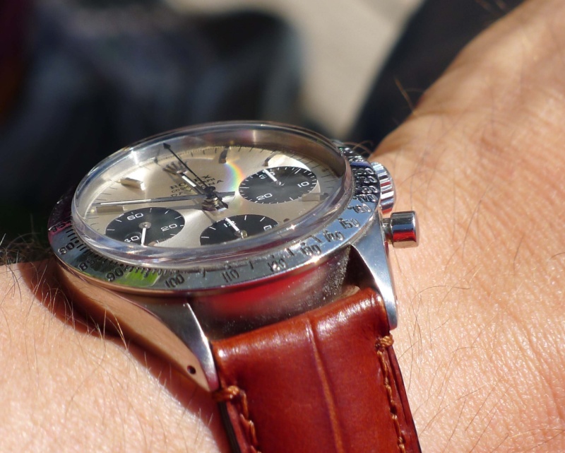
But just how different are these sea-beasts to the Chronographs. First is the 6239 with silver/pearl dial. It catches the light from the sun so beautifully and has such a wonderfully balanced dial. Three registers always feels well-balanced to my eye. But the pearl effect from the dial in the sun….Uhhm.
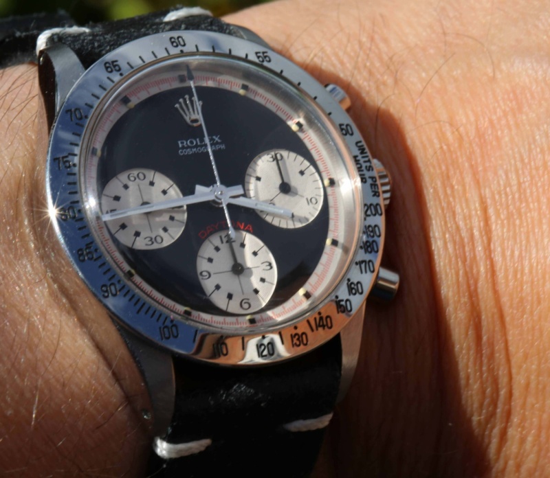
Another 6239, but this time a PN in black. A totally different personality to the 6239 in silver/pearl. It feels more sporty. It has that PN feature which does make it feel different on the wrist…even if that is only in my mind, that makes a difference.
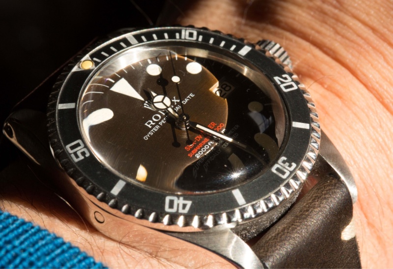
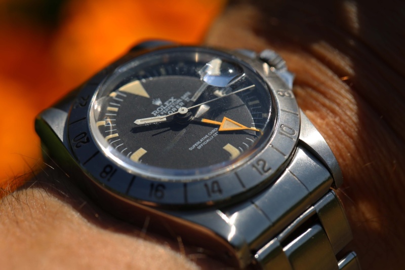
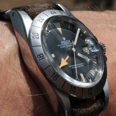
Then onto one of the most Un-Rolex Rolexes – the 1655 Straight-Hand. The dial has a deader feature to it which makes the orange hand stand out even more. On my dial, the lume is turning a beautiful cream colour that really mixes with the black dial well.
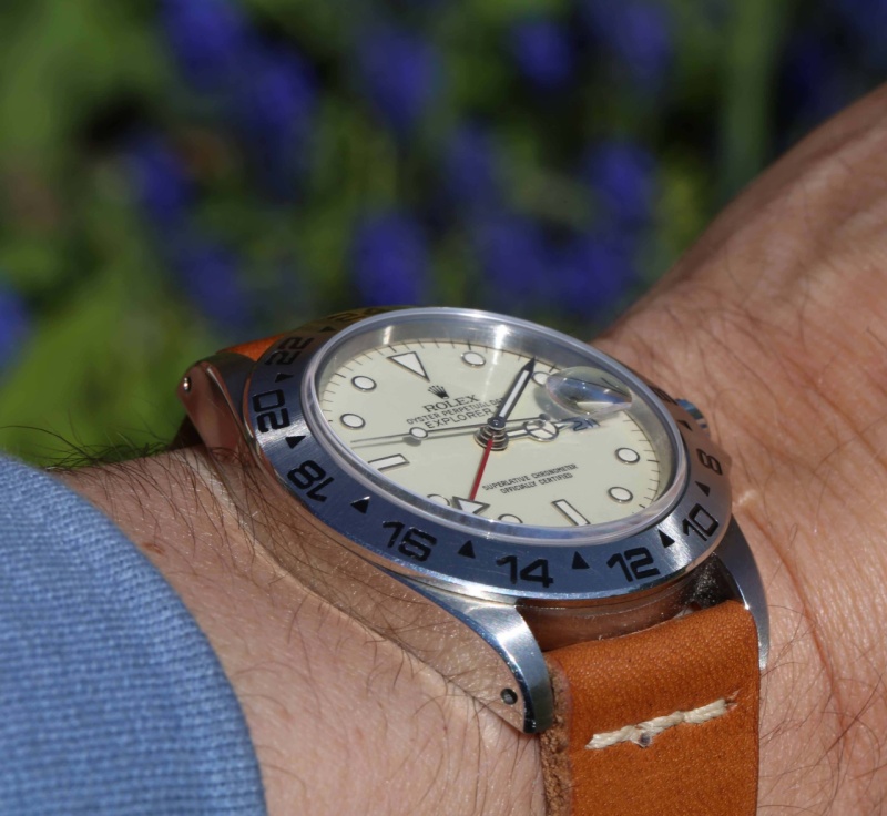
Onto another Explorer 2, but how different is this? The 16550 Panna, with its cream dial and altogether more summer-like personality. Again, a very different Rolex dial and personality to anything that came before.
Who says that Rolex all look the same, eh?
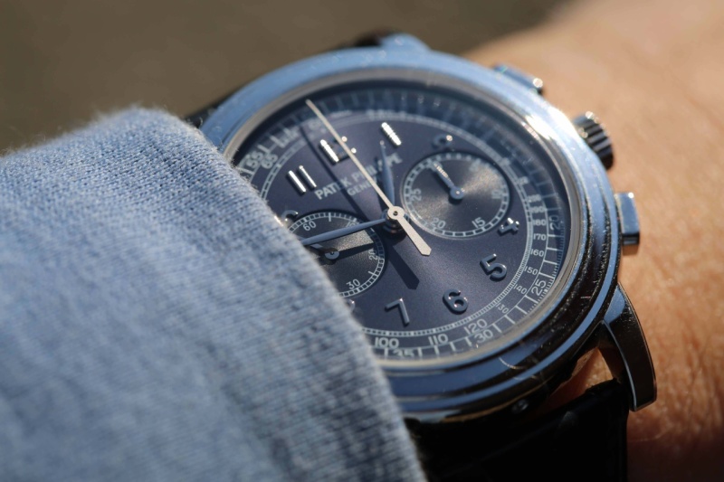
But now onto some of the other dials in my collection. The “Mona Lisa” dial is how I described the 5070P. It has an enigmatic effect. It has so many different variations on the blue. It is a dial that never ceases to give pleasure thanks to all its subtle variations in different lights. The Patek "Paul Newman"
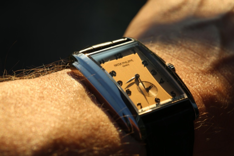
The 5124 dial also has its subtle colourings. Gondola, copper-like colouring against white metal. It is very alluring. Less sporty than the 5070P, but very pleasurable to wear either formally or casually. It offers something that is not present in my collection….
It does so in a different way to the JLC Rouge. The shape and colour of these two dials offer options that are not present in my Rolexes. One person described the Rouge as “dandy”. I think it is certainly true that these colours offer a light-heartedness and levity that makes it great fun to wear.
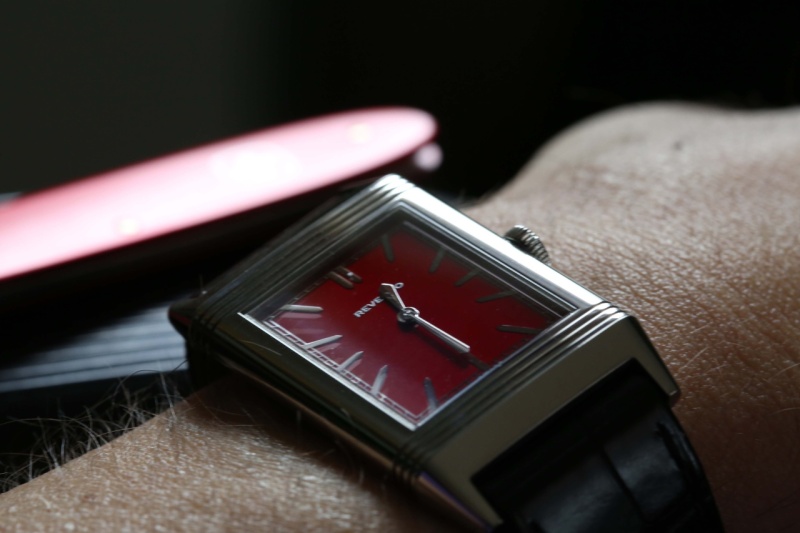
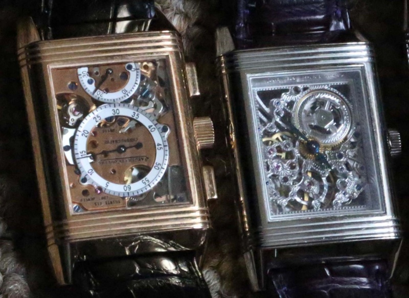
But then, JLC Reversos do offer something of a unique dial experience.....
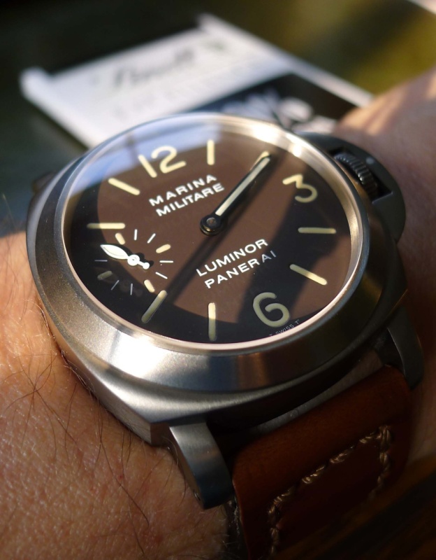
But, I guess that if I am giving some weight to the iconic look of the Reverso, there needs to be some room in the collection for a Panerai. but which Panerai.......Uhm.....has always been the 36 for me. The chocolate feel of the dial is just stunning to my eye...
I could go on and on about the various aspects of a dial that appeal to me. Variation clearly is a big feature for me in my collection. Some days I wake up and only one watch will suit me. Other days, I am in a totally different mood and need something else on my wrist.


Dial Style

Great post of some fantastic watches....
Nicolas...

I don't see you letting this 1665 MK II go. But if you change your mind, I would happily
That is not what I meant...

Great post Joe

i'm little bit interested in watches...
Fantastic watches and interesting dial comparisons...
I did say it was a mini-tour
The dial is certainly an important part of the watch.

Stunning display of watches, Baron! :)

Yes .Rolexes all look the same.
Well...


All of my favourite watches in one post!

Interesting - Broad and mass appeal - Submariner
what i think is definitely true is that...

Dear Joe!! This is a most insightful post, and I regret having seen...