Mark in Paris
[Purist]
10488

Hands-on review: New Patek Philippe 5327 Perpetual Calendar
Hi everyone,
One of the main events from last year's Baselworld fair was the launch of the new Perpetual Calendar reference: Patek Philippe 5327.
The previous generation reference 5140 has been in the catalogue for 10 years and is one of the very fine examples of what Patek classic means: a thin and smooth case, an elegant dial in spite of the large amount of information to display (inherent in such a complication) and housing the great micro-rotor 240 caliber.
- Please note that the 5140 is still available in a single platinum case and dark grey dial version that I imagine will be the last one. I’ll write a review about this ultimate version later -
As you may have noticed, the most significant evolutions from the 5327 stand in the case's shape, borrowed from the gorgeous 5227 Calatrava and in its new dial decoration. This outstanding design makes it amongst my top-3 favorite cases from the last two decades.

THE DIAL
The most obvious change is on the dial. Its balance has evolved significantly compared to the 5140 reference. Indeed, because of the new case size (from 37.2 to 39mm), the new space available at the edge of the dial has increased. Thus, people who know the 5140, may see a very different surface occupation: the sub-dials "look" more centered but they are in fact more respectful of the dial elements which are at the periphery.
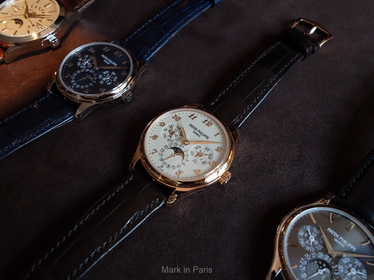
Here is the 5327G with its blue dial...

As a consequence, a newcomer to watches could observe the way that the 5140’s (or even 3940’s) sub-dials look too big for the dial and step on the numerals. Everything depends on what we’ve been used to seeing first and shows it is more a question of perspective than absolute value, as illustrated in the picture below...

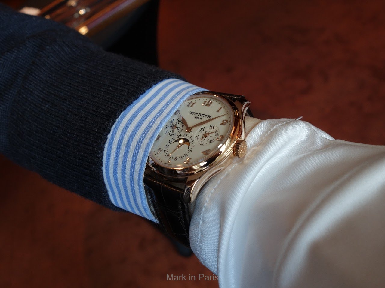
When we talk about Patek's Perpetual Calendar watches, we still have in mind its predecessors, the Patek Philippe 3940, which had a smaller case (36mm) and the 5140 in a 37.2mm case. Hence, the new 5327 with its 39mm is reaching today’s classical standards for a thin traditional watch, even more so as the watch is complicated (and dial is more complex than for a 3-hand watch).
I think these evolutions bring an answer to today's questions and to a will and need of new collectors and clients or older clients whose tastes have evolved. On a more practical level, the dial is very legible (considering how much data it has to display) and the font used is modern classic (no serif or rounded shapes that look more traditional).

The Ivory lacquered dials used in the R and J versions look warmer and a little more vintage than the silvery ones used in previous references. In the white gold version, Patek chose to provide a new offer with a perfectly tuned sunburst Royal blue dial. The latter brings the reference into today’s world in a wonderful way as the modern touch suits the watch perfectly.
The 5327R version...

By the way, I always notice how well Patek integrates these little minute nails in the layers of the lacquered dials. They look 3-D but sometimes they are curved “inward”. Have a look in-person, if you can. A lot of ways to play with dial decorations.

Of course, the main evolution in the dial layout is the new hour markers evolving from baton markers to Breguet numerals. I think that it transforms the watch significantly and brings a touch of charm that is very attractive. It is obviously choosing another path from the lighter looking dials from the two previous generations.

Finally, the Leaf hands bring the final charming touch to the dial and explore a different path from the hands we have seen lately: Stick hands for the 5170, Luminova hands used in the 5370P (Leaf) or 5204 and 5905 for instance, or the Dauphine hands (used in the two previous generations).
You've noticed that the G blue dial version has more "casual" white hands to show the leap year and 24-hour indications. In addition to allow a better reading of the sub-dials information, it adds this more casual spirit to this model. I'm not always a fan of white painted hands on classical watches but here I think it is working perfectly. That's how Patek has nicely brought the classic Perpetual Calendar model in a more contemporary way.
THE CASE
As mentioned above, the case is now a perfect contemporary standard 39mm, especially considering it is a perpetual calendar. However, what’s important here is the new case borrowed from the recent 5227 Calatrava.
As I said in the past, it is one of my favorite Patek case designs (and there are a lot of different nice styles in the collection). The way the side grooves are made, the lugs’ shape, their slightly inclined end part… very sensual and a lot of appeal, while not being heavy or over decorated.
All what Patek Philippe is about for many of us.

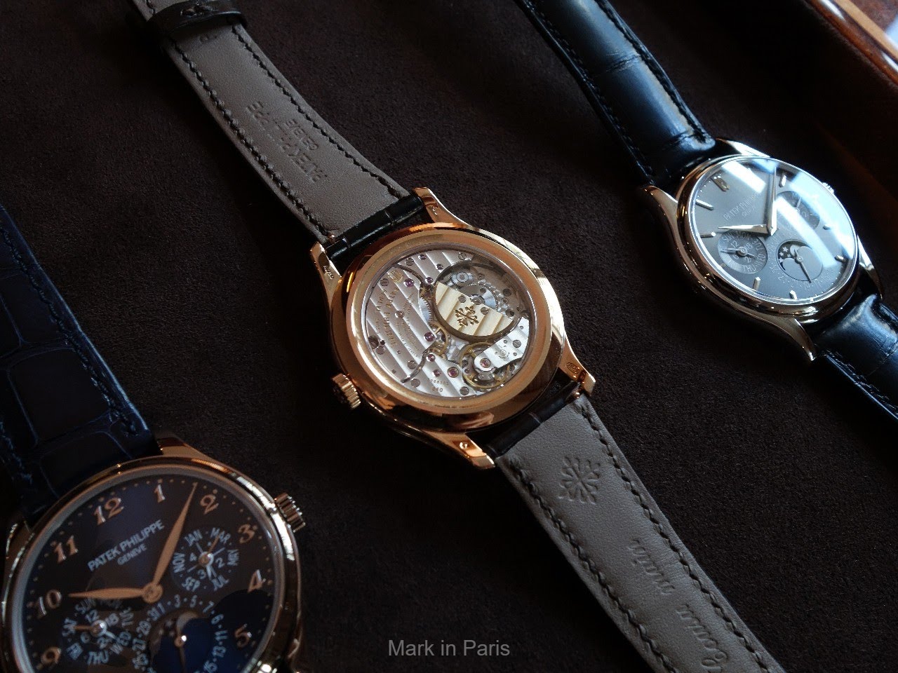
Whereas the 5227 has the officer’s cover with the recent stunning nearly invisible hinge, the 5327 receives a classical sapphire caseback. It would have been so nice to find such a feature in the 5327 but I see two problems that Patek had to cope with. First, the case would have been at least 2 mm thicker, which I think wouldn’t have been a good move when we know that modern Patek Perpetual Calendars are known and sought after for this thinness. Secondly, the price increase as seen in the 5227 would have also been quite significant.
I was dreaming of getting that 5227 case (and that was quite natural indeed) for the new perpetual calendar reference and I must say it serves it perfectly today.

The watch receives a fold-over clasp in gold with the crocodile leather strap.
THE MOVEMENT
The movement is the thin micro-rotor 240 caliber that was used in previous generations and that is still as enjoyable to look at through the sapphire caseback. A second solid back is also provided with the watch.
The power reserve stands at 38 hours (max. 48 hours) which might be a little low for today’s standards.

The movement receives the Spiromax balance spring made of Silinvar (Silicon based material).
CONCLUSION
Patek really has a kind of "signature" about these very thin Perpetual Calendar-only Calatravas; whether we’re talking about the 5327 presented here, the 5140, the more original 5940 which is the cushion-shaped version, the 5140, the "clous de Paris" decorated 5139 and last but not least, the very sought after 3940’s different series.
As far as I’m concerned, this is my favorite and best looking perpetual calendar only from the last “modern” generations and, even if I love the 3940 in a different way. It brings one of the brand’s emblematic complications to the present.
You can find more details about them here: www.patek.com
I hope you enjoyed reading and please feel free to share your feeling about this new Perpetual Calendar.
Best,
Mark


