
Mark in Paris
[Purist]
10488

A study on Daytona graphic styling
Hi everyone,
I was looking on the net for Daytona wallpapers and I fell on this: a graphic designer (Aman Sandhu) conducted some graphic studies based on our beloved Daytona.
I warn you, this is very different from the original but as I see a lot of discussions on future models, including the integration of ceramic bezels, I thought it could be shared as these are not bad at all, imho.
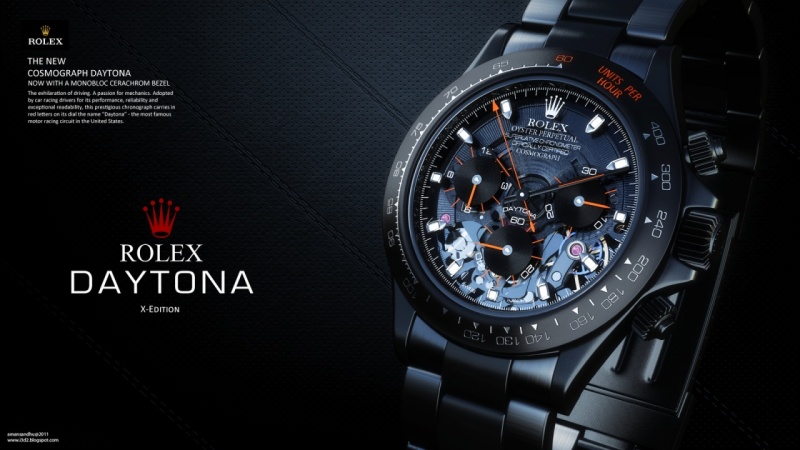
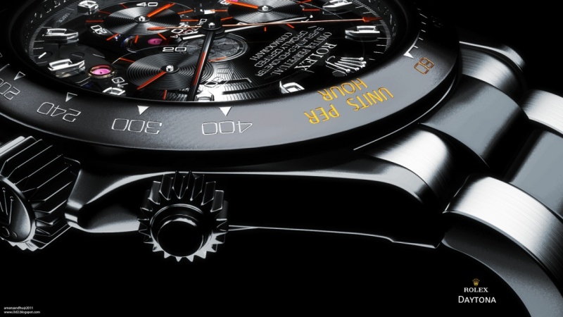
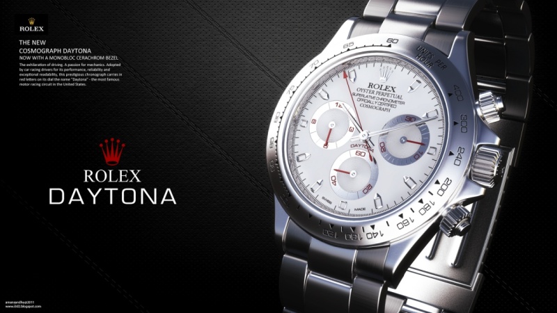
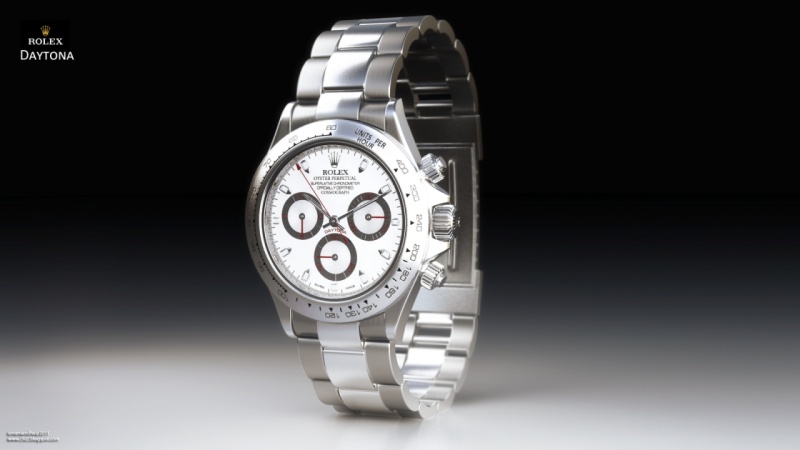
What could be a "sporty" interpretation of the 116520?
There could always be fully DLC / PVD treated versions. There are in fact (Colette etc...), but I personally do not find the outcome great because it is generally only a single surface coating without any new work concerning design / color.
In general, it gives a "heavy " result visually ( I will not address the problem of "resistance" of the coating in question).
____________________________________
(Pics credit: Aman Sandhu)
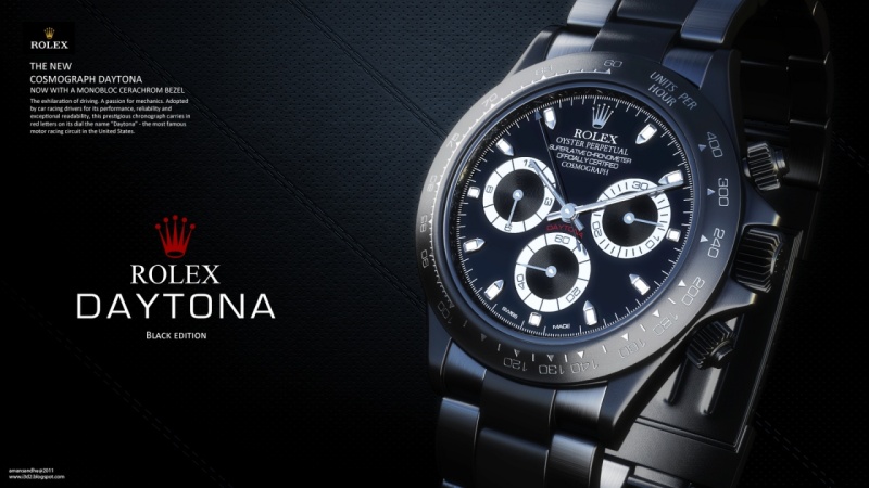
1/ On the 2 following (except the skeleton work that will not please everyone) , I find that the work was carried out as a whole project, until the end, and that the result is balanced and homogeneous. I like it really well.
This is particularly a beautiful integration of a ceramic bezel. Personally, I can't get use to the 116515 LN ( Everose ).
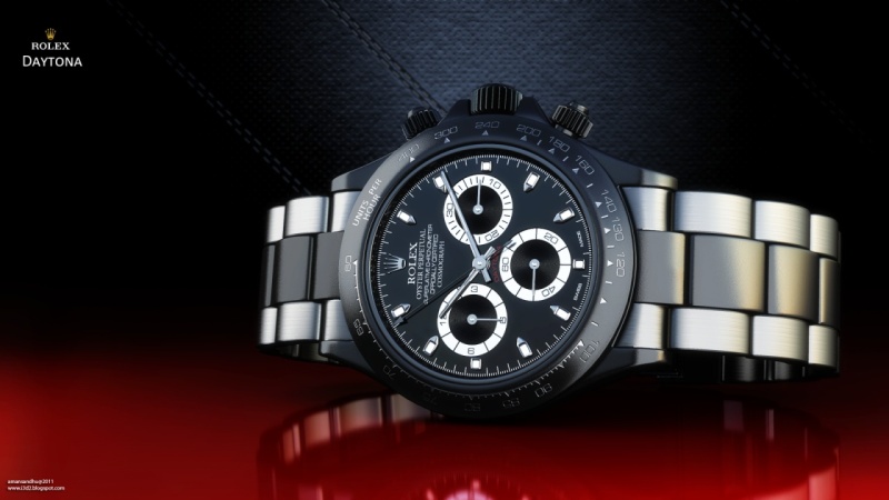
2/ This is a more basic transformation, but I like the 2 tone bracelet on the second picture (it is I think a lighting effect more than a difference of coating but let's do as if)
3/ This is a more simple adaptation of the dial. I'm not very knowledgeable on every detail about Rolexes, but it seems to me that the hands are also thinner. I find the result rather successful.
So, what do you think? Could these be Rolexes styling could get inspiration from? Share your opinion and feeling if you like.
Mark
PS: I hope I don't go against any of the forum's rules, there. I find the ideas interesting and my only purpose is to share new views on this watch.
Available on the marketplace


Reference Guide
Signo argues for the Rolex Daytona ref. 16519 as the ultimate grail. Explore its white gold case, Zenith El Primero movement, and unique strap design.
21 replies13097 views

Discussion
Rolex Daytona 116500LN black vs. white dial comparison. Discover collector preferences, subdial contrast, and why the white dial captures hearts.
76 replies23861 views

Reference Guide
Explore the Rolex Daytona ref. 16520 'Sapphire Era,' its Zenith El Primero movement, dial variations, and collector insights. Essential guide for Daytona enthusiasts.
30 replies18620 views

Vintage
Baron - Mr Red guides building a 5-watch vintage Rolex collection across $30k, $75k, $250k budgets. Features Explorer, Submariner, Sea-Dweller, GMT, Daytona.
48 replies17258 views
Reference Guide
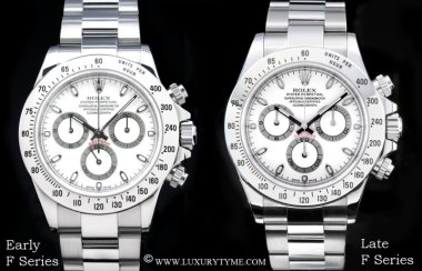
Explore the evolution of the Rolex Daytona 116520, from Mark I to Mark V. Sid Lefaye details changes in lume, hands, markers, and rehaut engraving for collectors.
10 replies17197 views

Vintage
Explore Bill's essential guide to vintage Rolex box references (1950s-2000s). Identify correct packaging for Submariner, GMT-Master, Daytona, and more.
35 replies17026 views
A study on Daytona graphic styling
Hi everyone, I was looking on the net for Daytona wallpapers and I fell on this: a graphic designer (Aman Sandhu) conducted some graphic studies based on our beloved Daytona. I warn you, this is very different from the original but as I see a lot of discu...

I LOVE the first one....
But it's like winning a lottery expecting Rolex to produce that.....
I agree,
they will never go that far, but I guess, like many concepts, some details could be picked up and become a good addition to the regular models. Thanks for your comment. Mark

Very interesting work...
#3 looks pretty much like an albino Daytona ! (photo: RPR) ...


I like the 1st Daytona
If Rolex were to ever make that, it would be smoking hot... - AT
Re:
The more I look at it and the more I agree, it would be soooo deliciously hot. Even if it would be very daring from Rolex... Cheers, Mark