
quattro
[Moderator]
18867

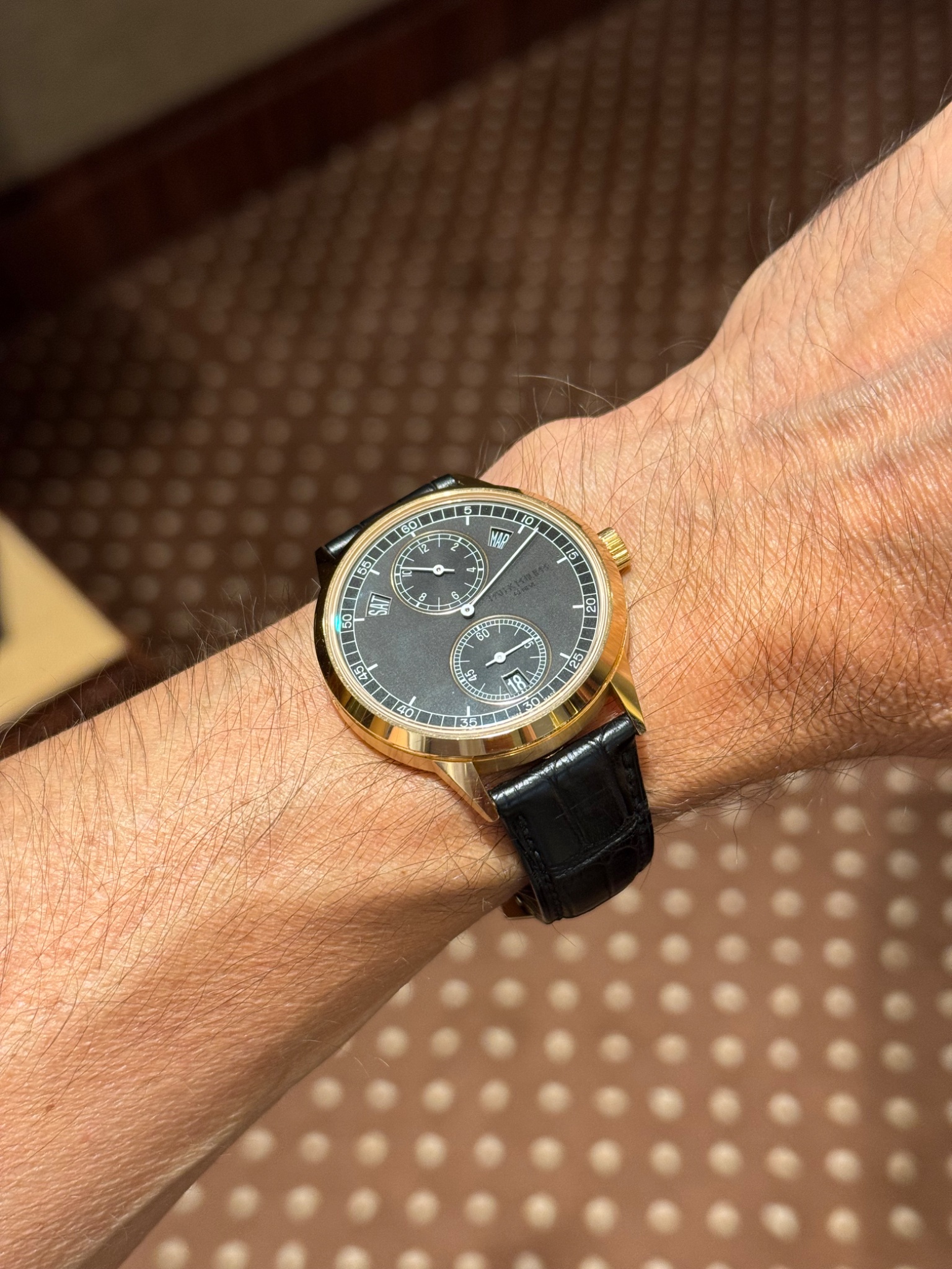
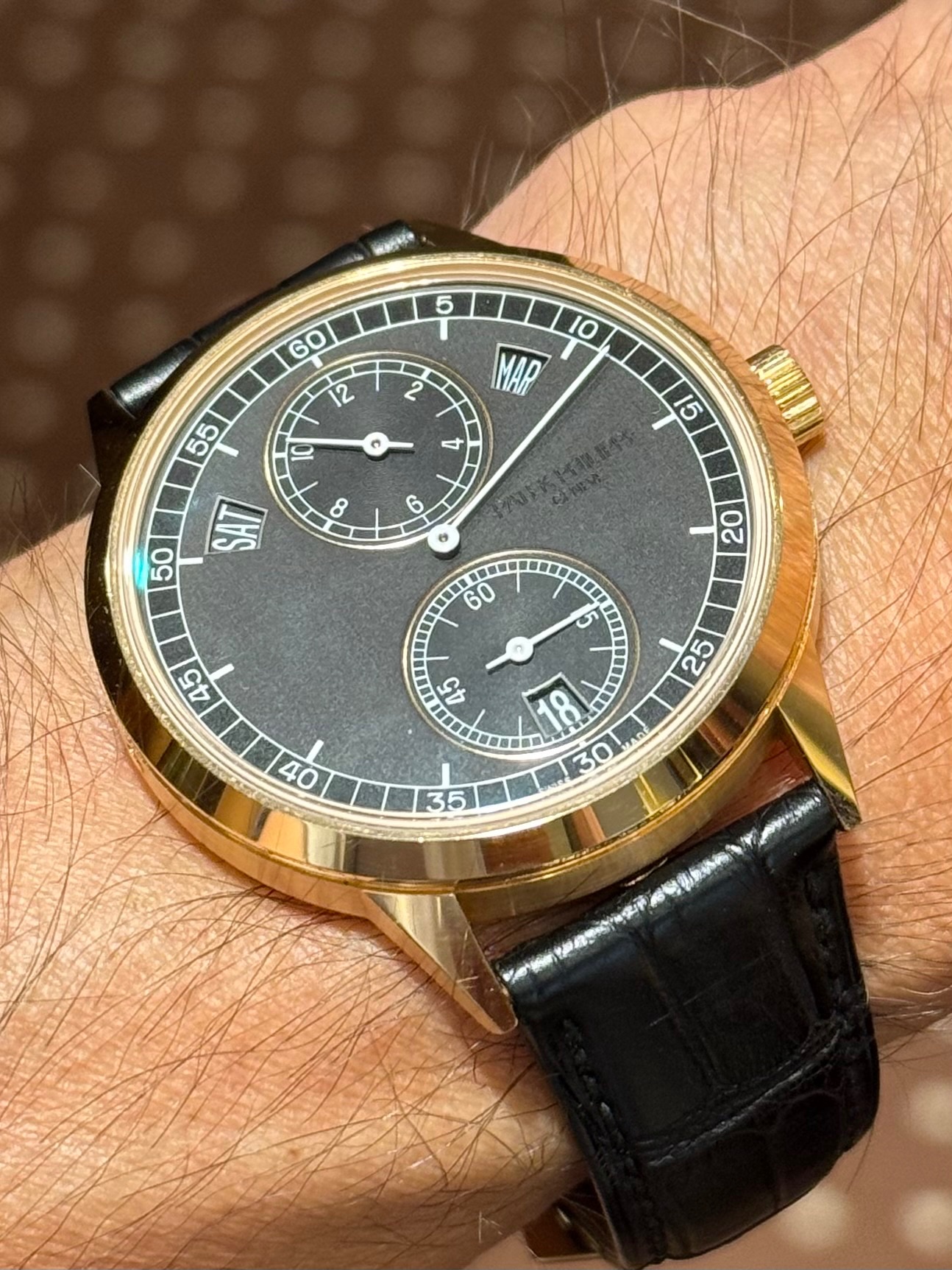
Some thoughts on the date window
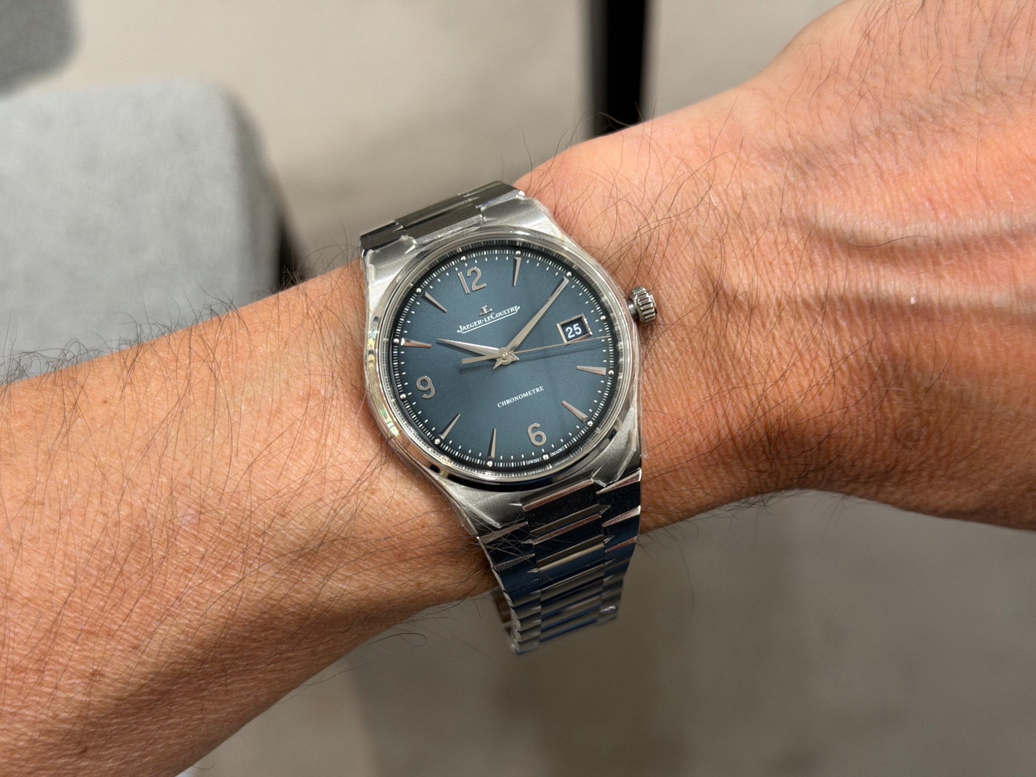
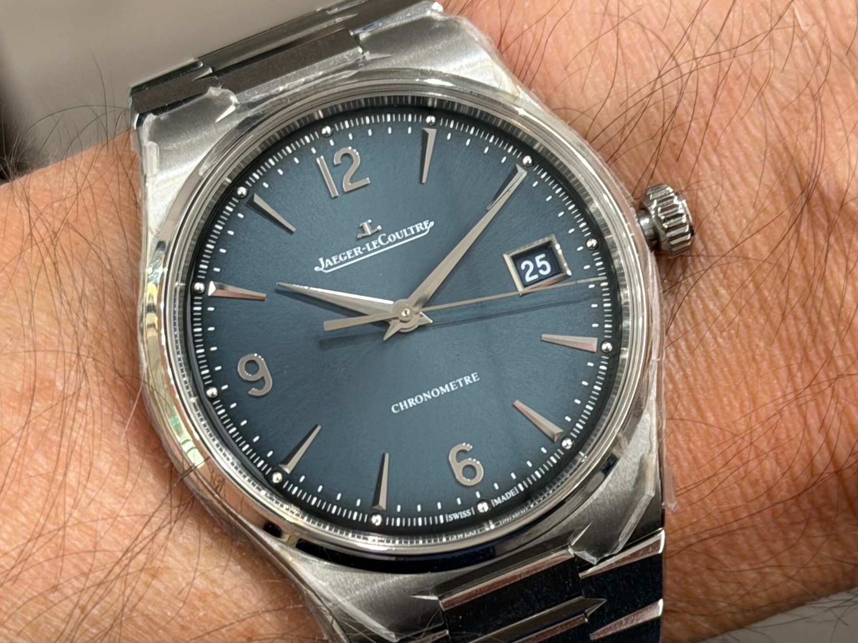
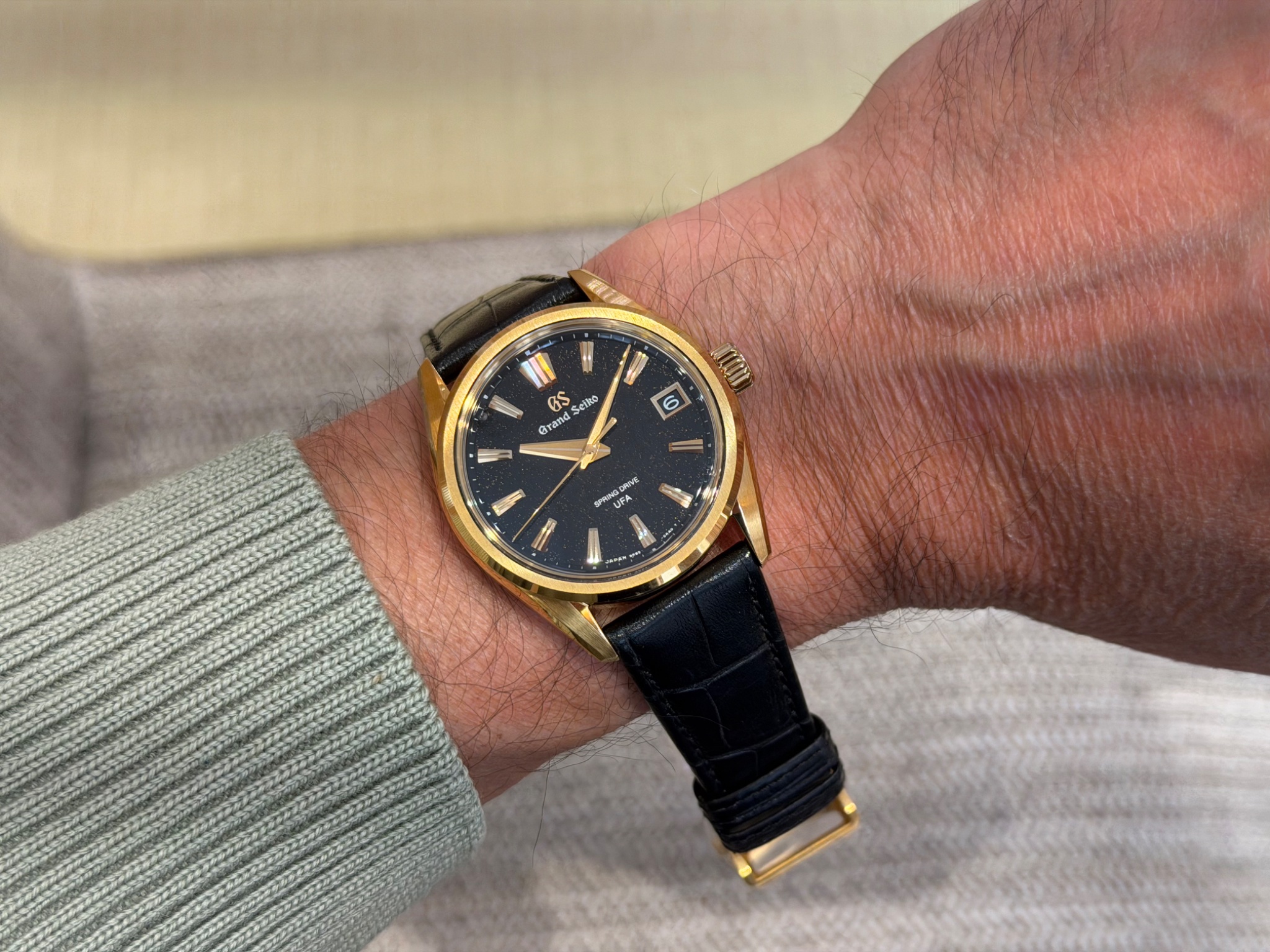
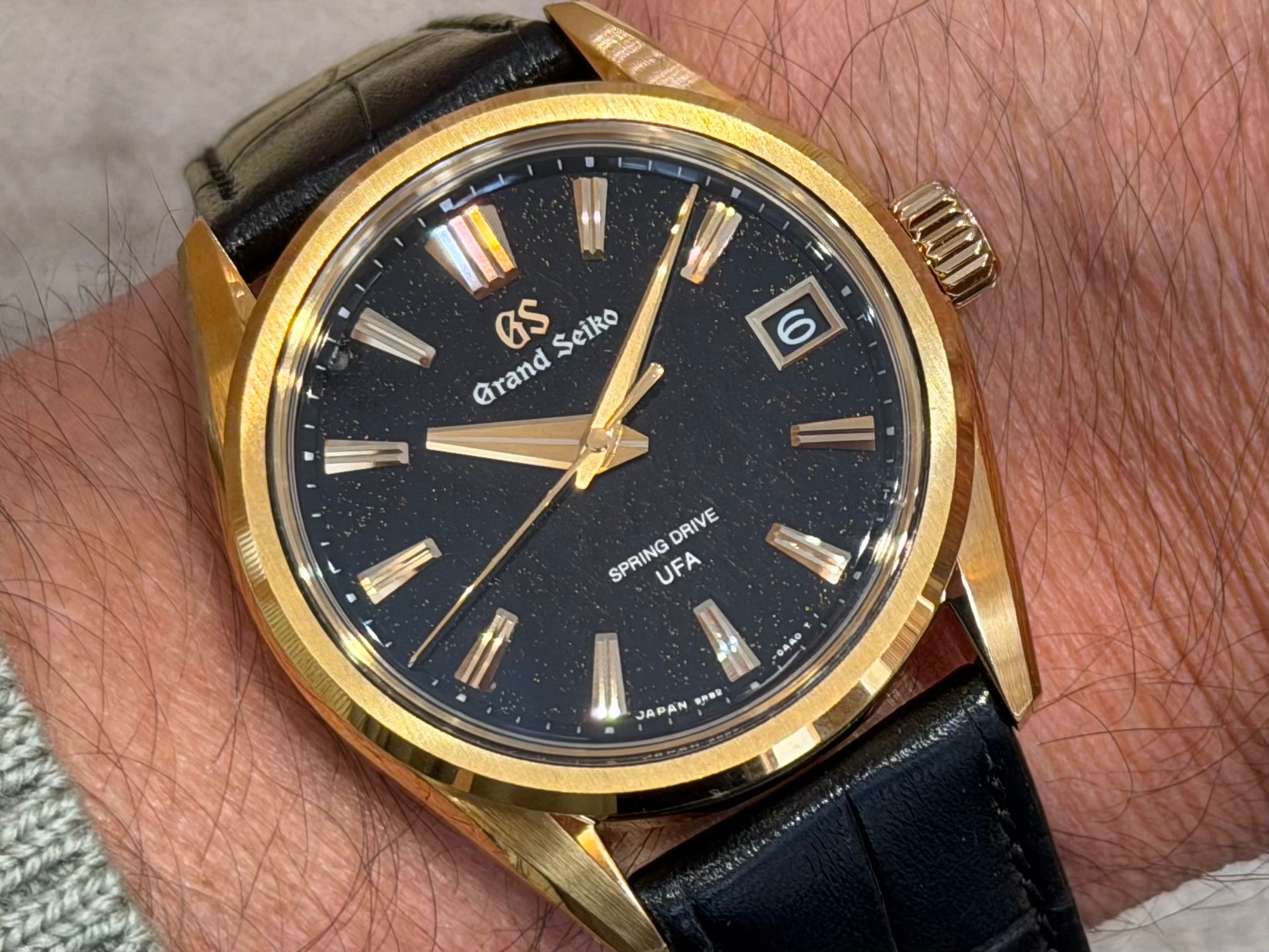
During my recent short stay in Paris, I tried on two watches with a date window about which I thought to myself: this is how it should be done.
What do they have in common?
- A framed aperture, well aligned with the hour markers.
- A date disc that matches the dial color.
- A font and color for the date numerals that harmonize well with the dial design.
- A placement at 3 o'clock.
The first one was the steel Jaeger-LeCoultre Master Control Chronometer Date ref. Q4158120
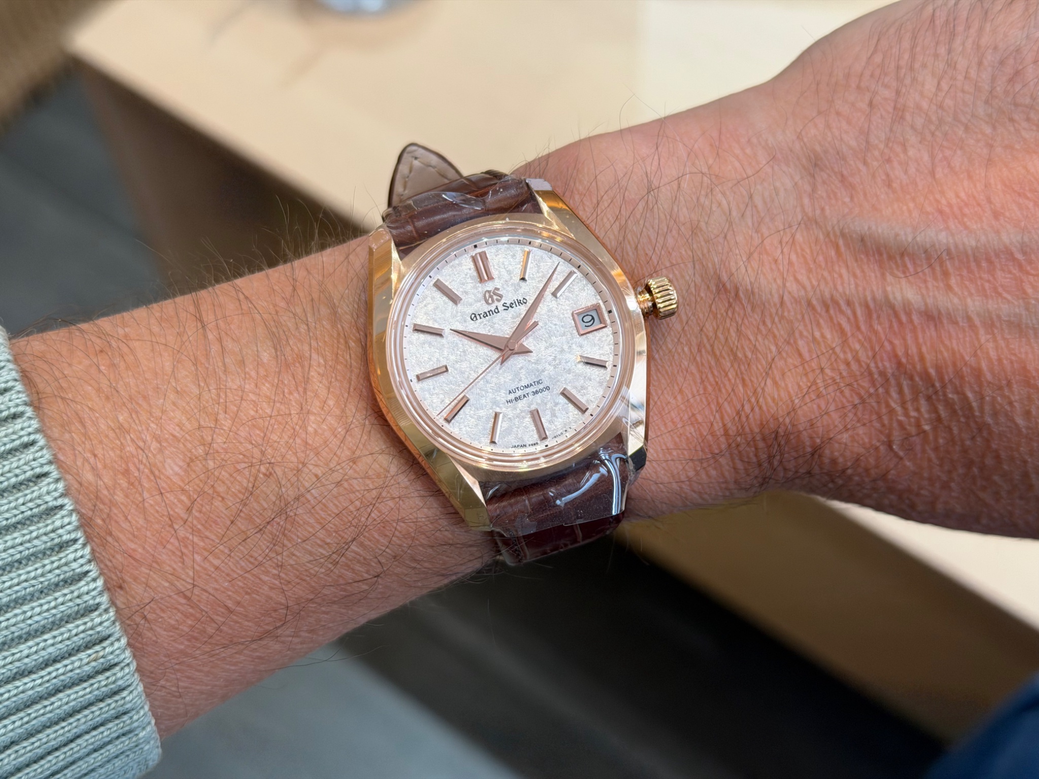
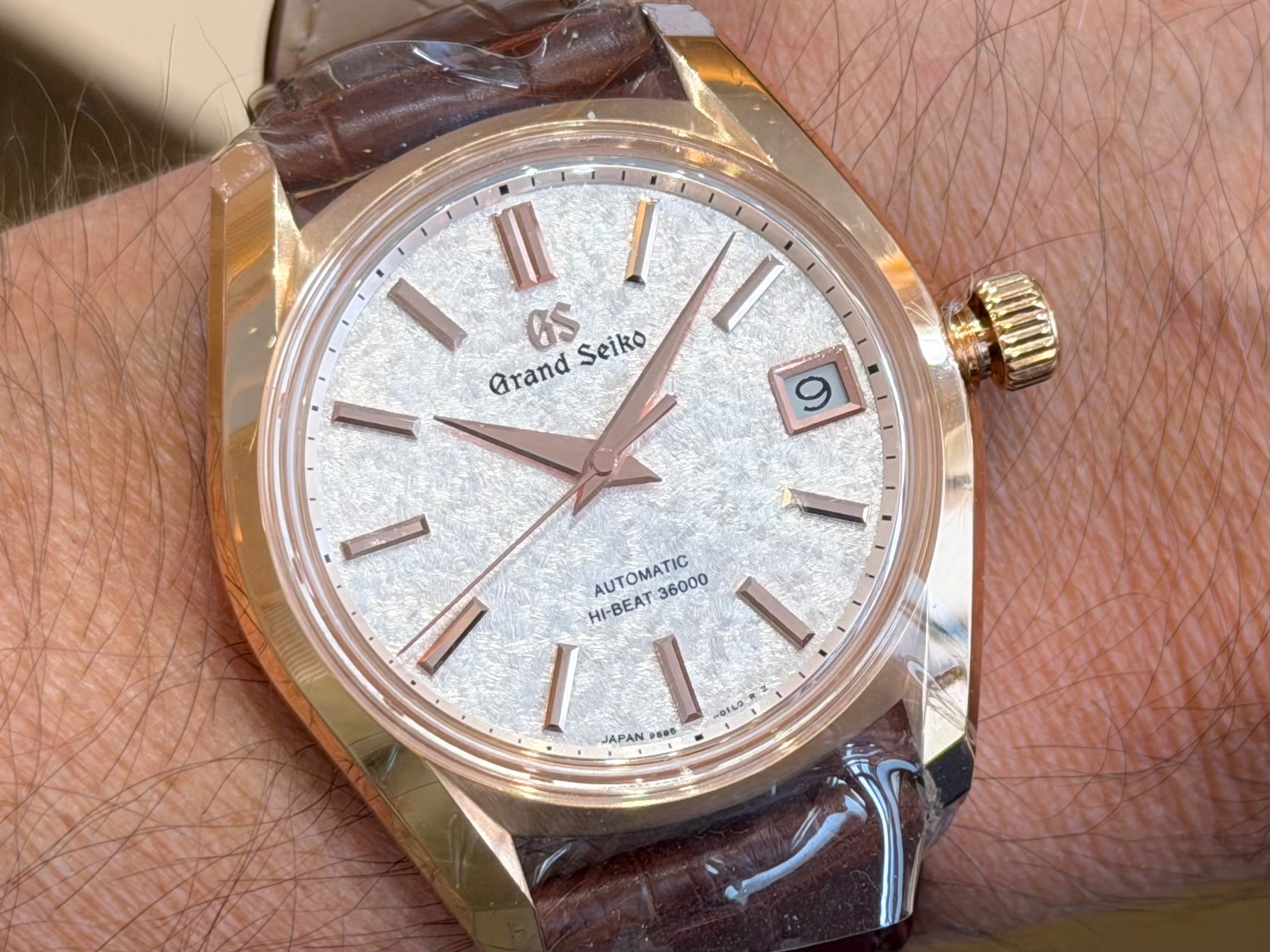
The second one was the Grand Seiko Evolution 9 Spring Drive U.F.A. ref. SLGB006
So I started going through my photo collection, looking at the date windows and wondering if I thought they were well executed or not, and why.
Here are twelve rather varied examples, accompanied by my personal impressions...
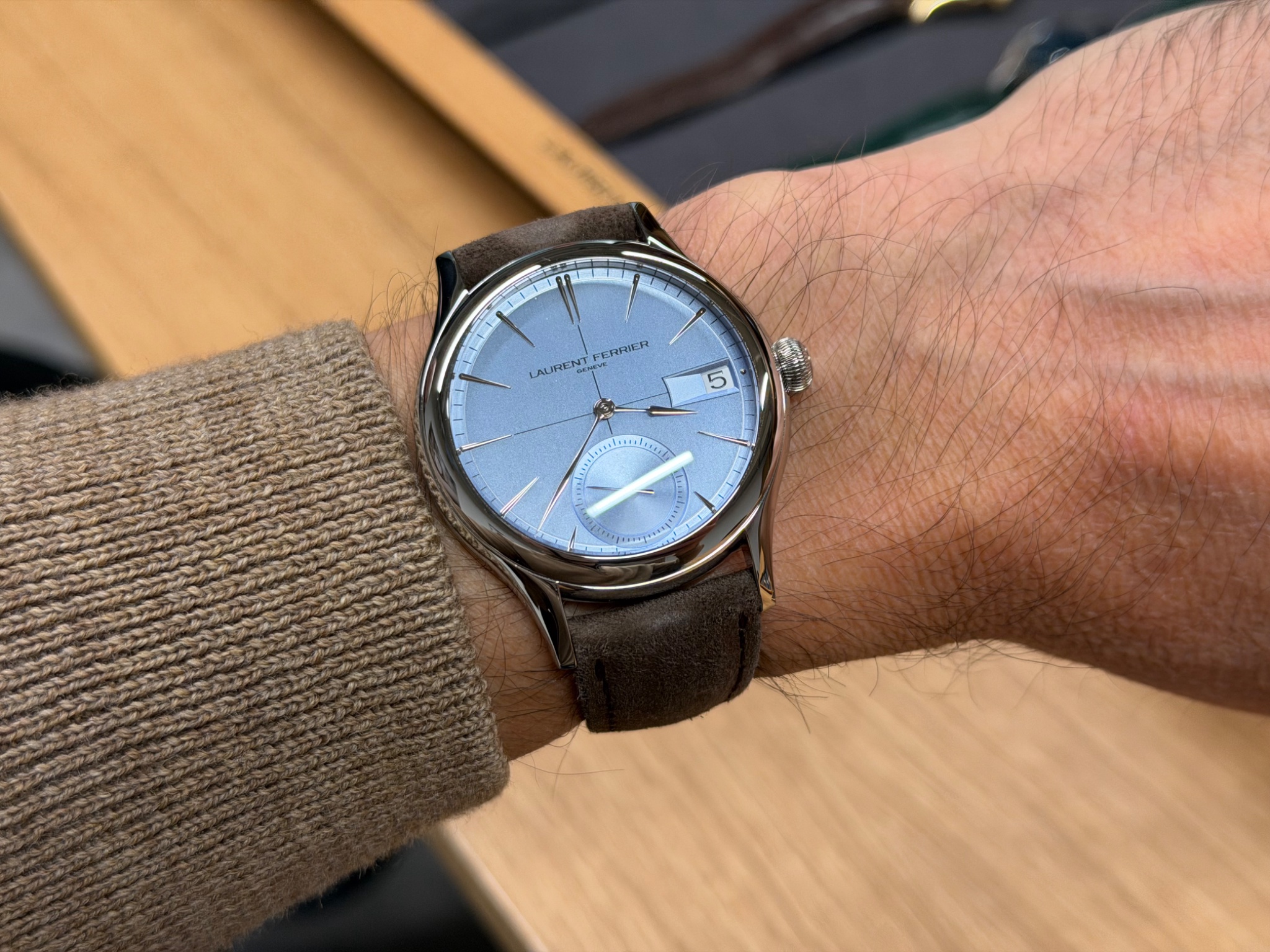
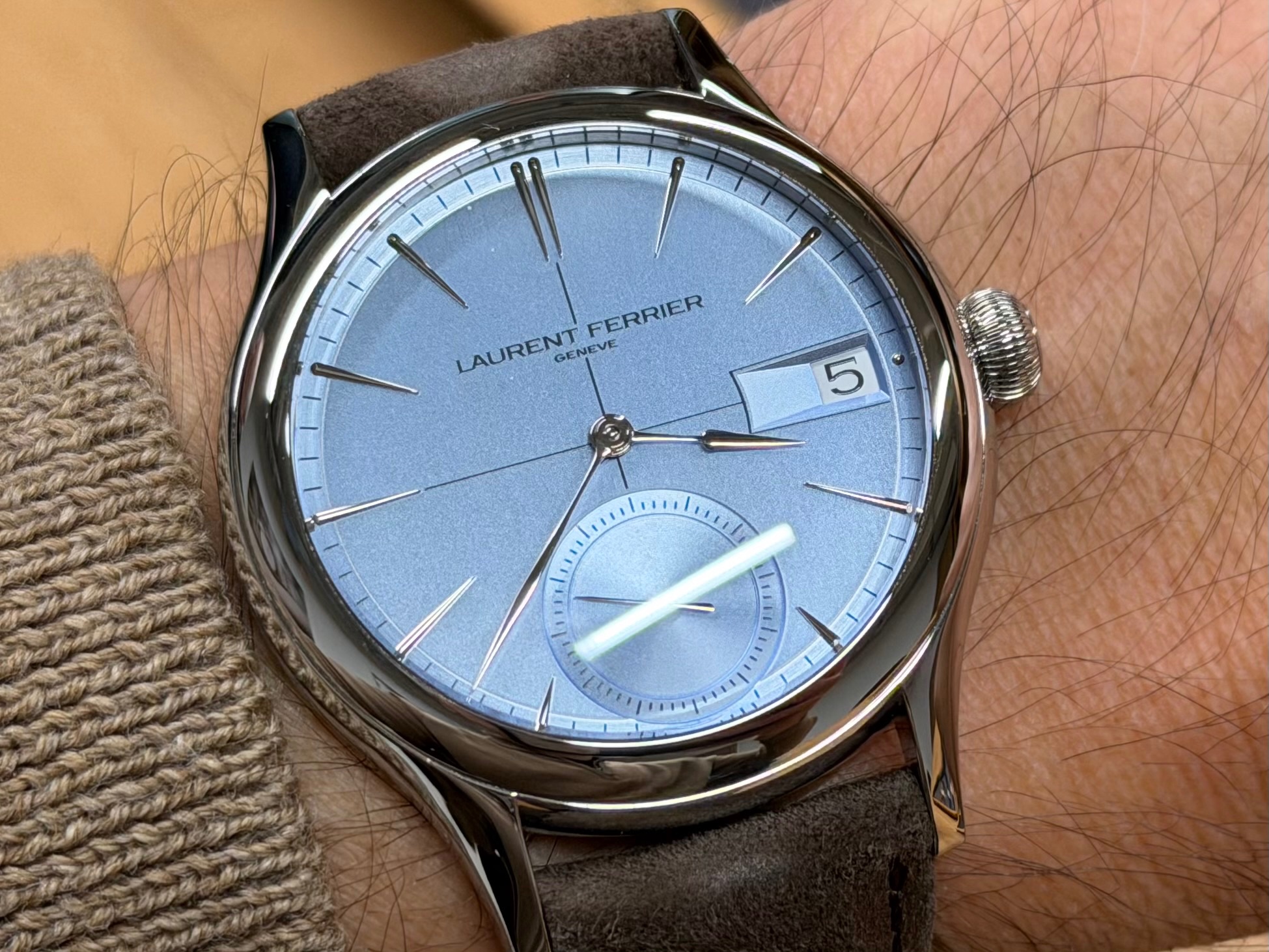
Laurent Ferrier Classic Auto Horizon ref. LCF046.AC.CG1: the aperture looks strange to me and the date disc doesn't match the dial color...
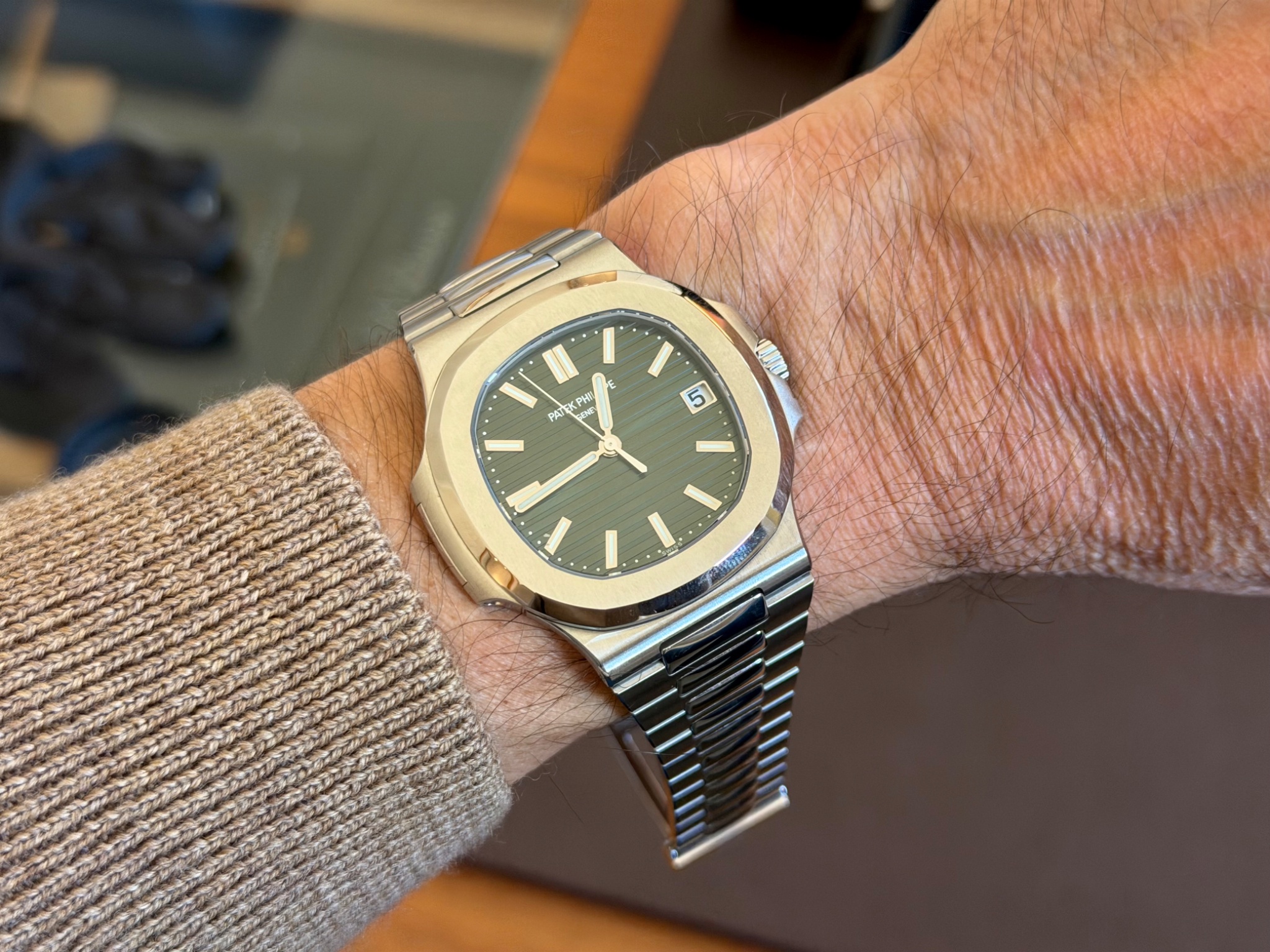
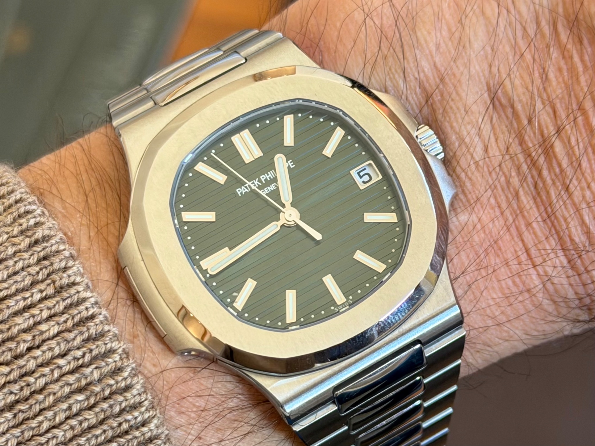
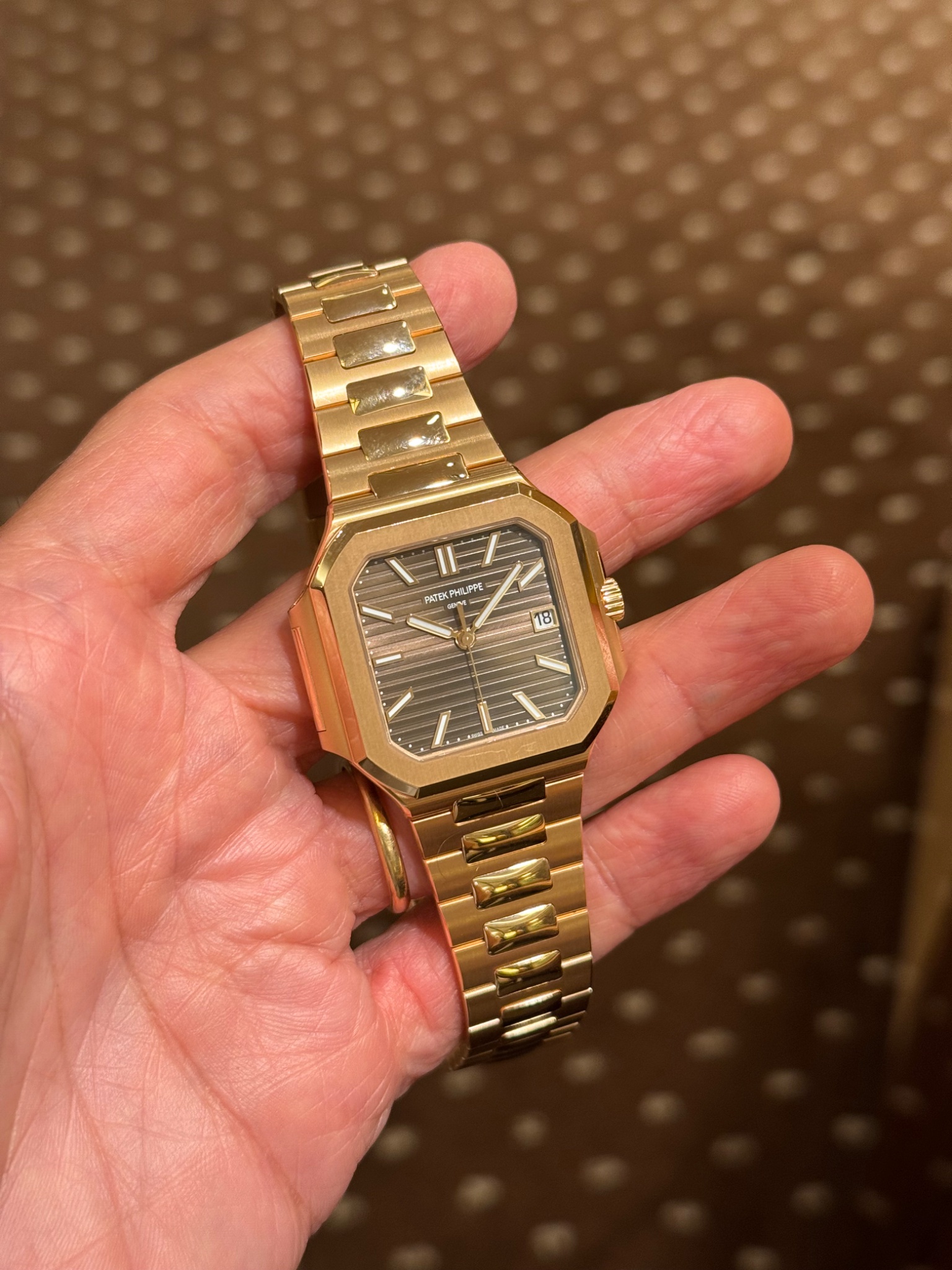
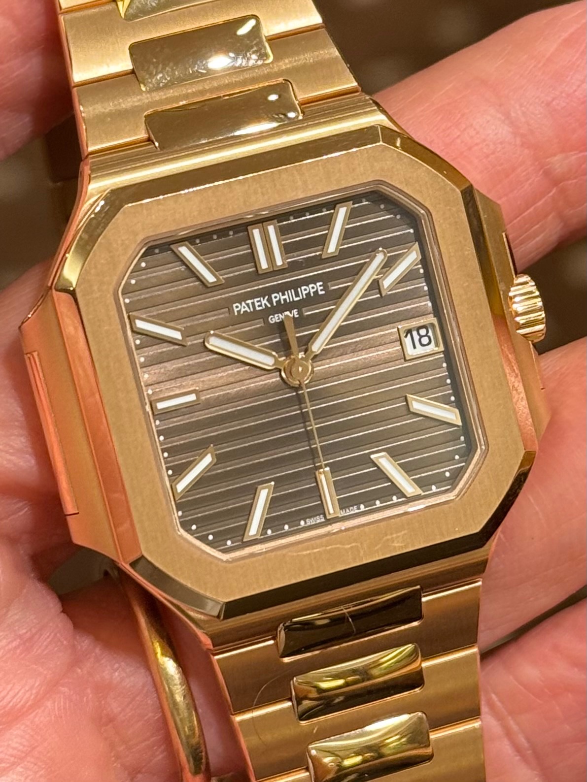
Patek Philippe Nautilus ref. 5711/1A-014: the aperture is framed, which I like, but it is a bit too narrow compared to the indices and the date disc doesn't match the dial color...
Patek Philippe Annual Calendar ref. 5450P-001: the aperture doesn't feature a metallic frame matching the indices and the date disc doesn't match the dial color...
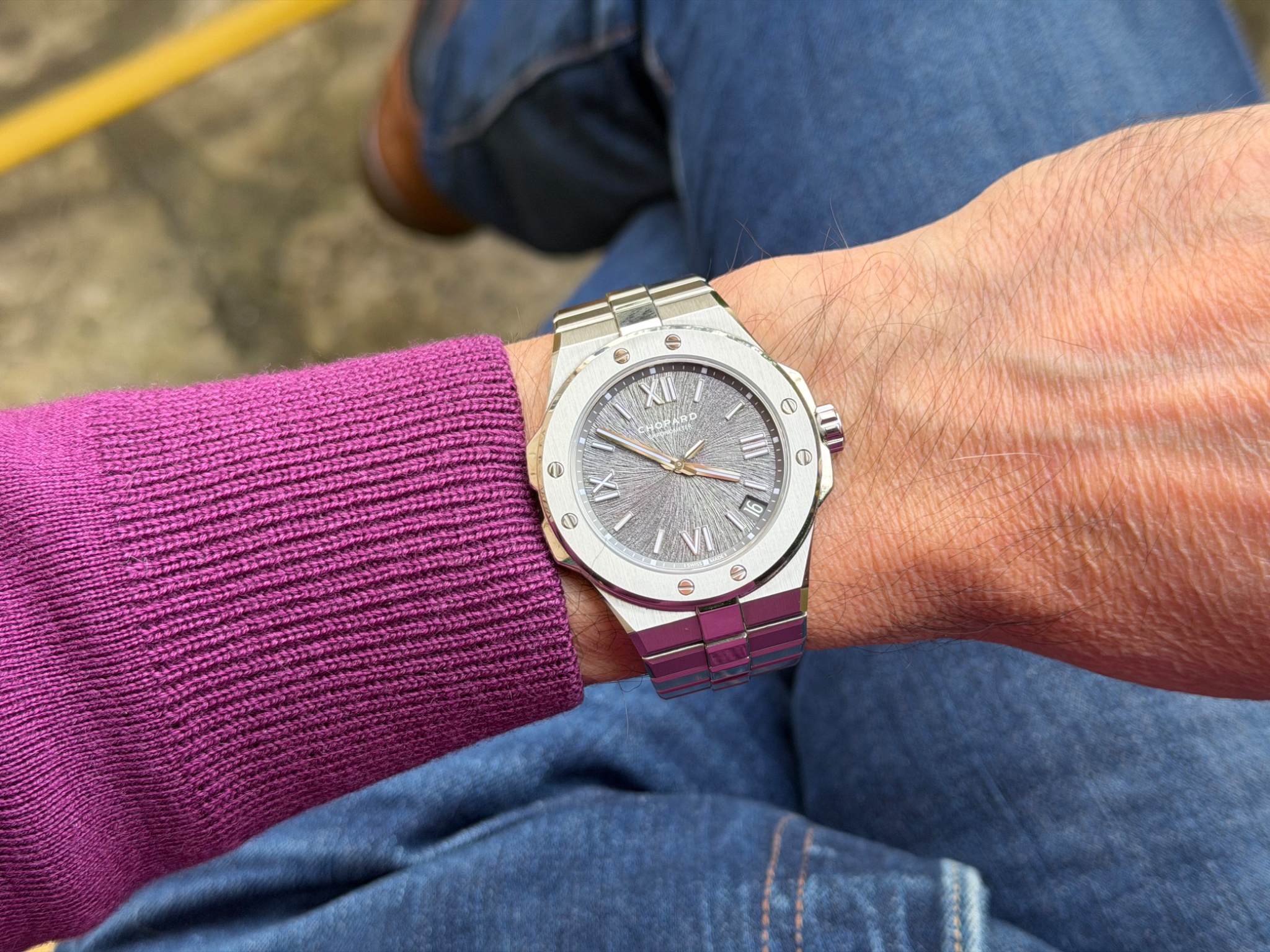
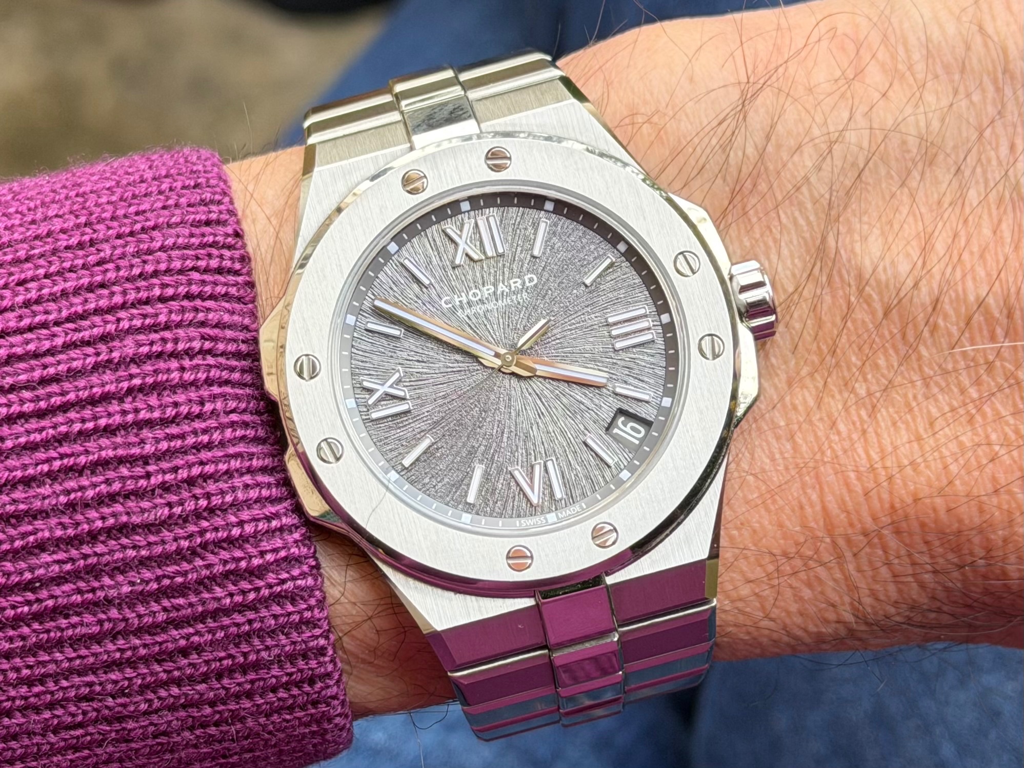
Alpine Eagle 41 Grey dial ref. 298600-3002: the date disc and the numerals match the dial color scheme, which is nice, but the placement between 4 and 5 o'clock isn't ideal.
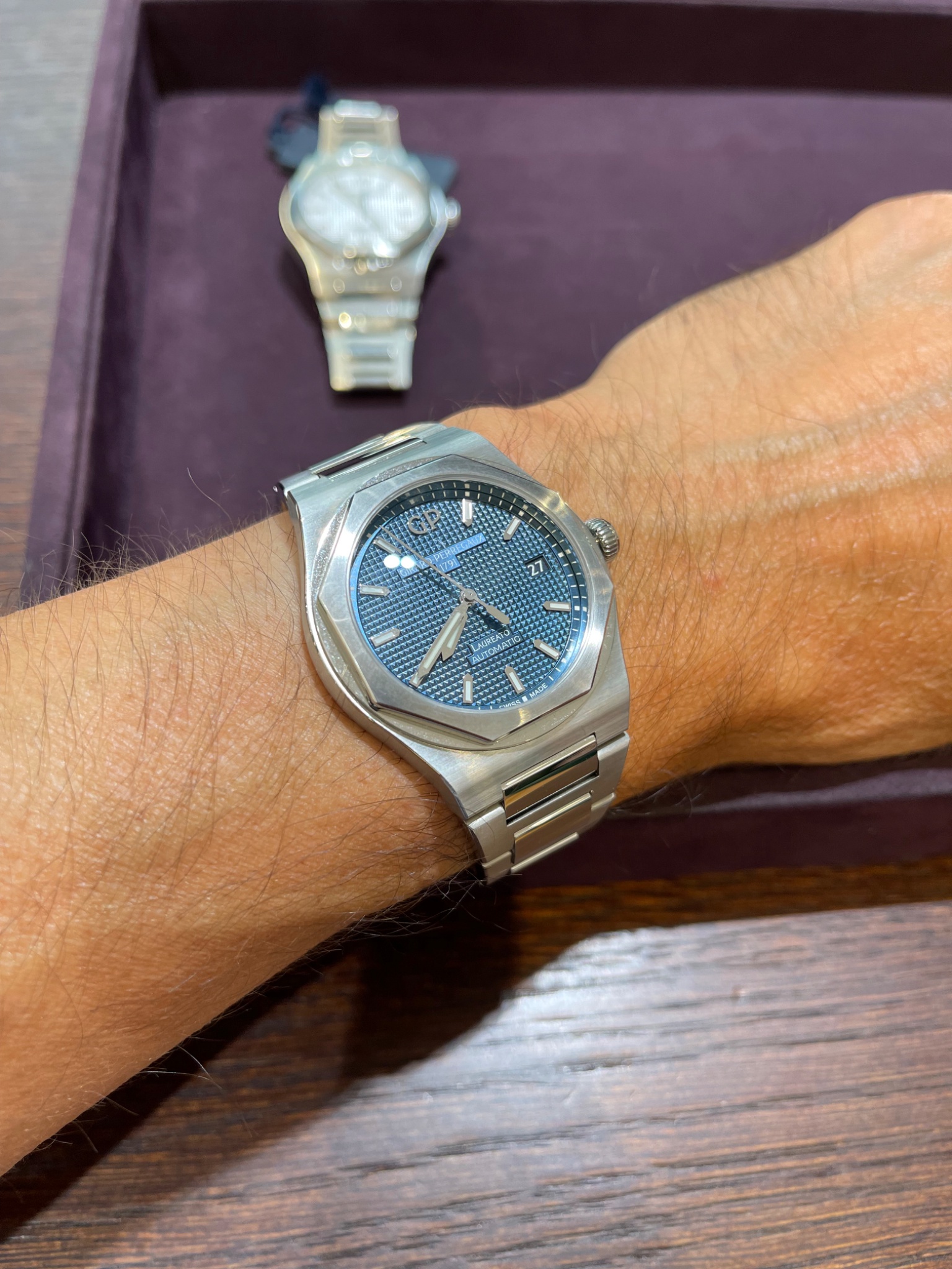
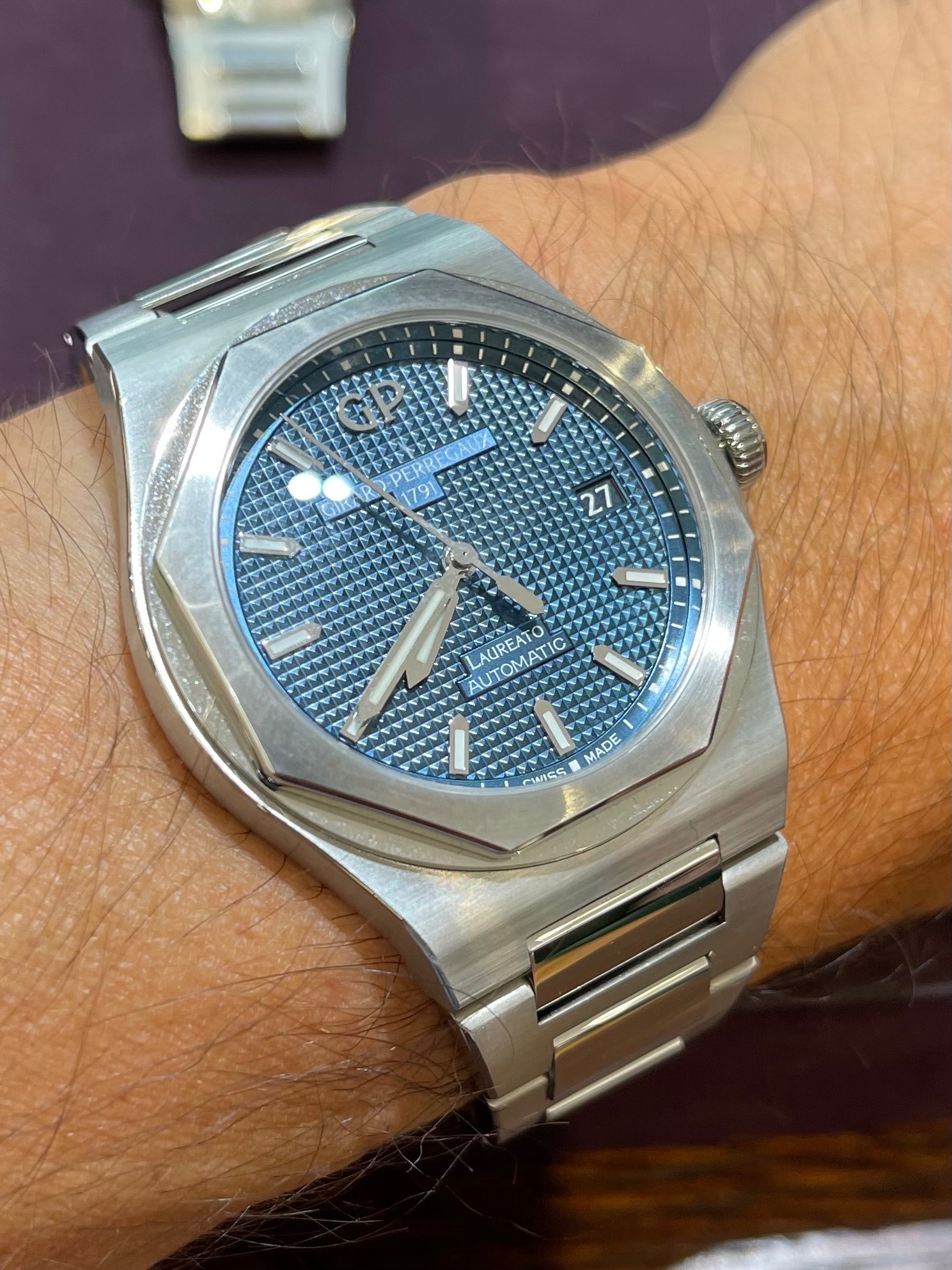
Girard Perregaux Laureato 38 ref. 81005-11-431-11A: the date disc and numerals match the dial color scheme and the placement at 3 o'clock is coherent, but wouldn't it be better if the aperture was framed?
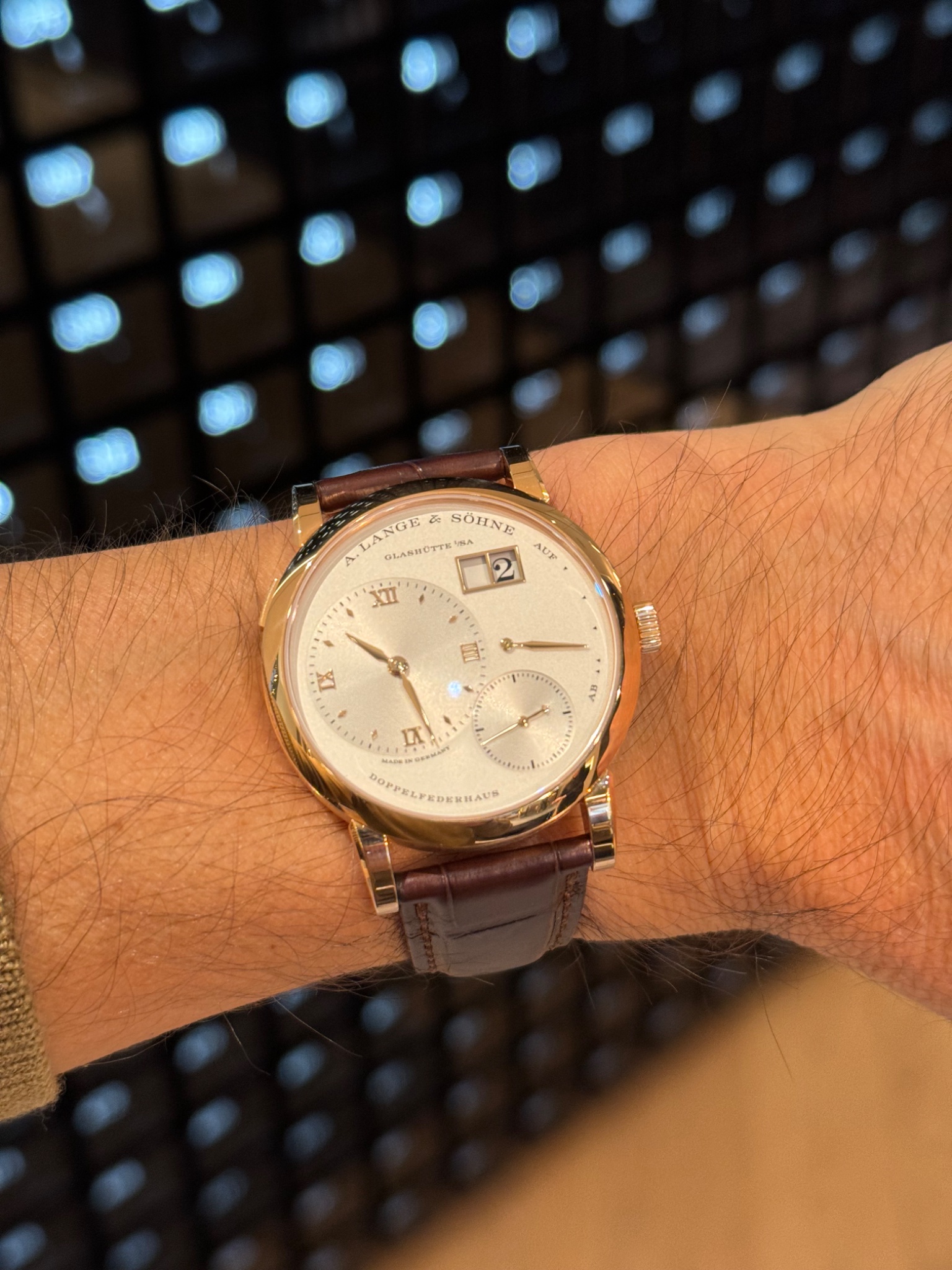
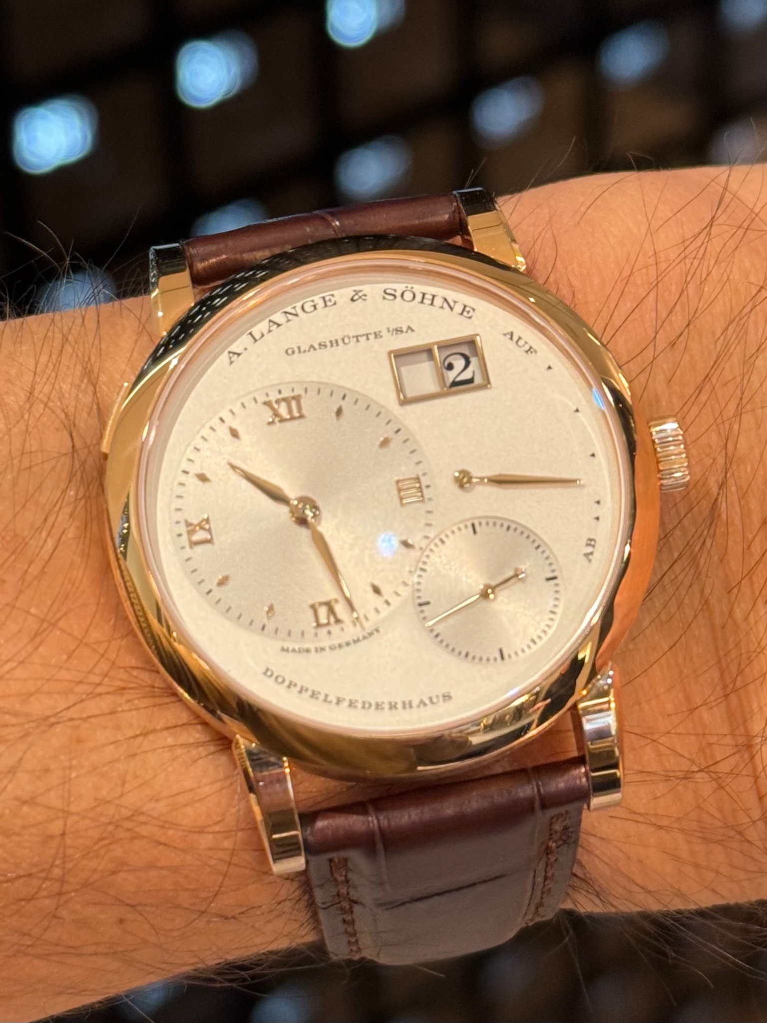
A. Lange & Söhne Lange 1 ref. 191.032: I think this is a great execution of the date window.
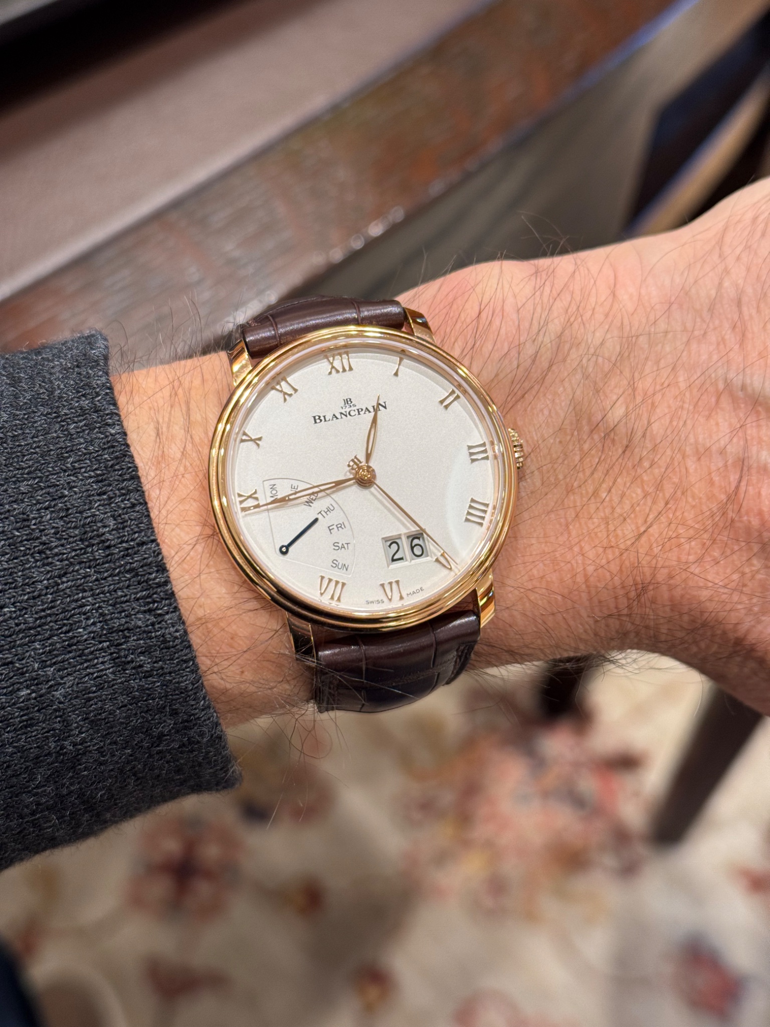
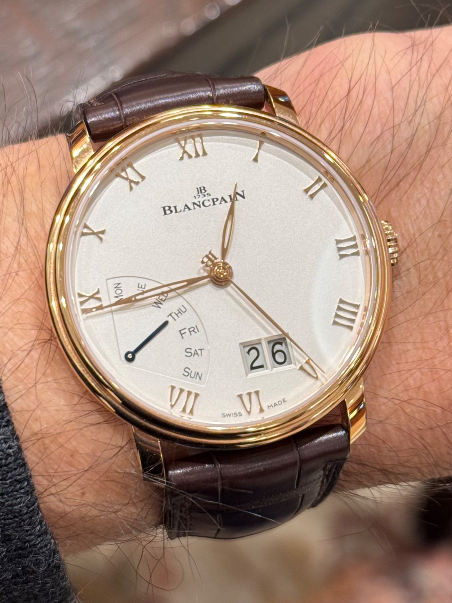
Blancpain Grande Date Jour Rétrograde ref. 6668-3642-55A: this Big Date isn't as well executed as the one above, imo...
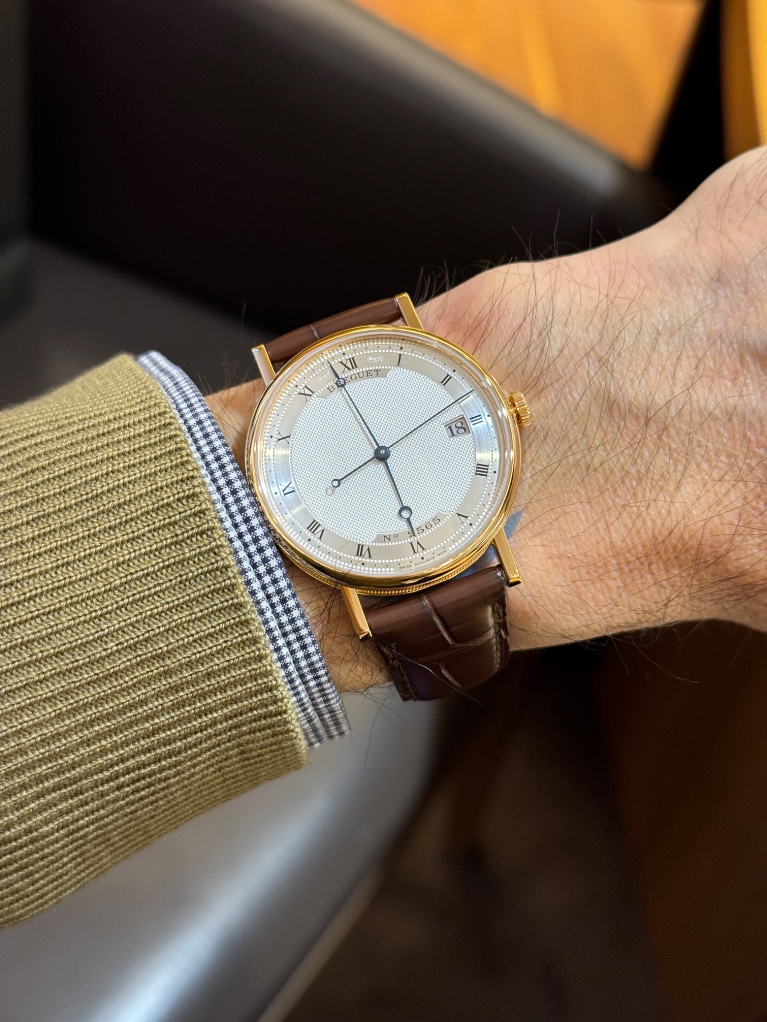
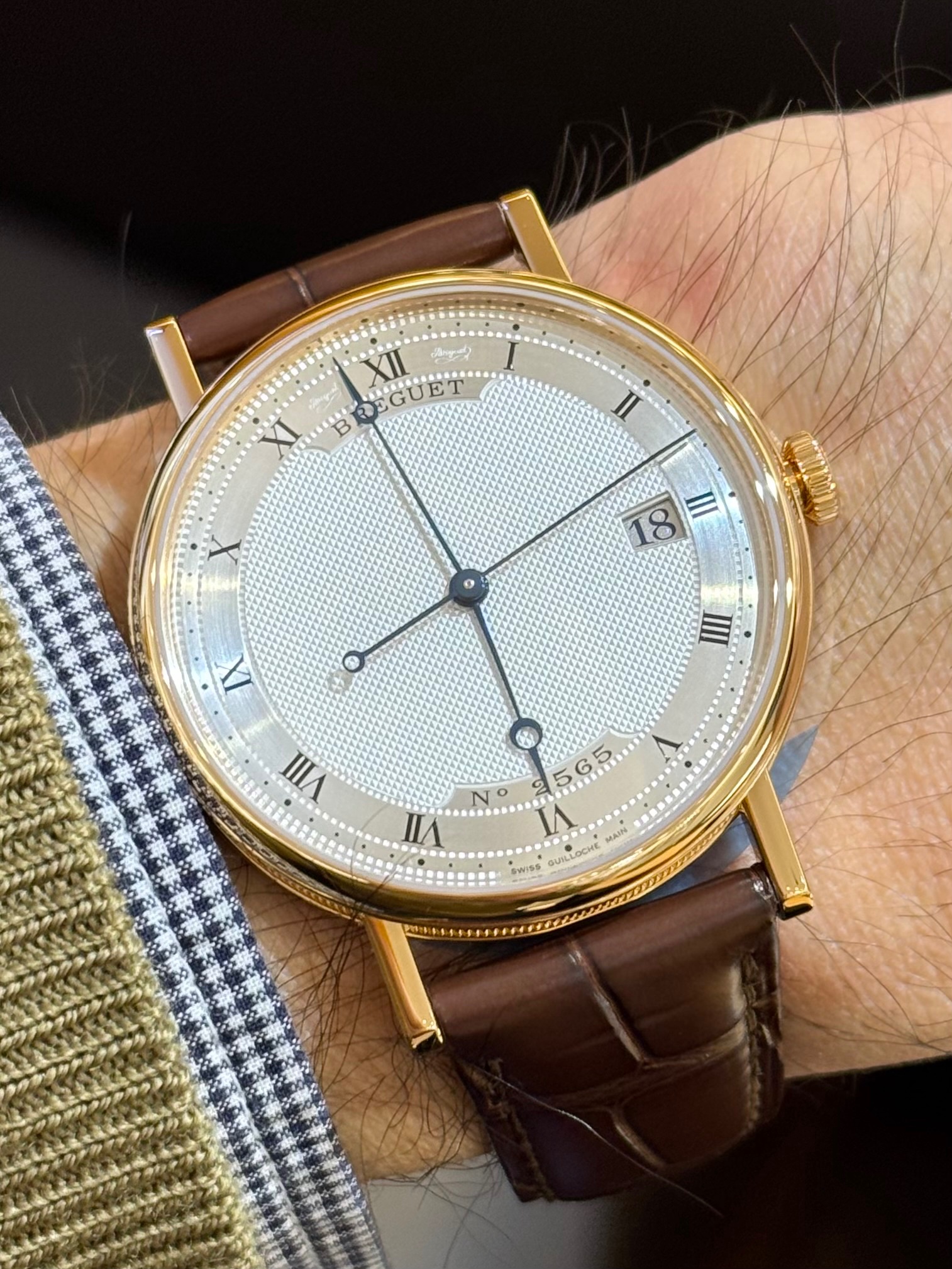
Breguet Classique ref. 5177BA/15/9V6: not bad at all, imo. The aperture doesn't interrupt the hour ring and it is discreet and well designed with a trapezoidal shape.
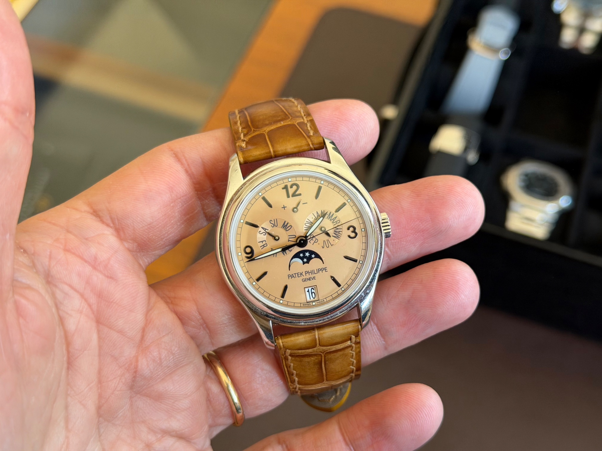
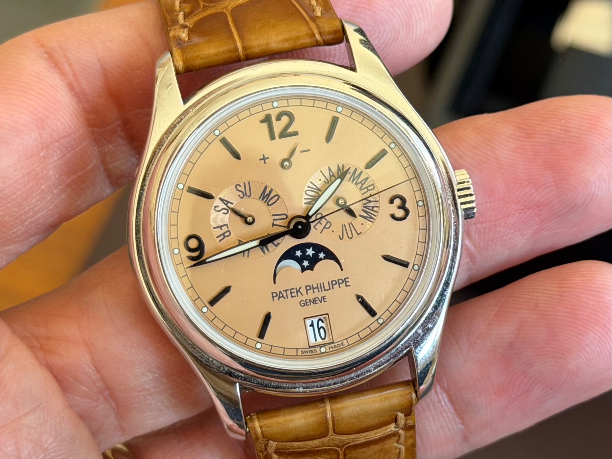
Patek Philippe Annual Calendar Regulator ref. 5235/50R-001: the aperture interrupts the seconds scale, but, other than that, I think it is well executed and coherent here.
Patek Philippe Cubitus ref. 7128/1R-001: I like that the aperture is framed. It could be a little less narrow and I wonder if it wouldn't be better with a brown disc and white numerals.
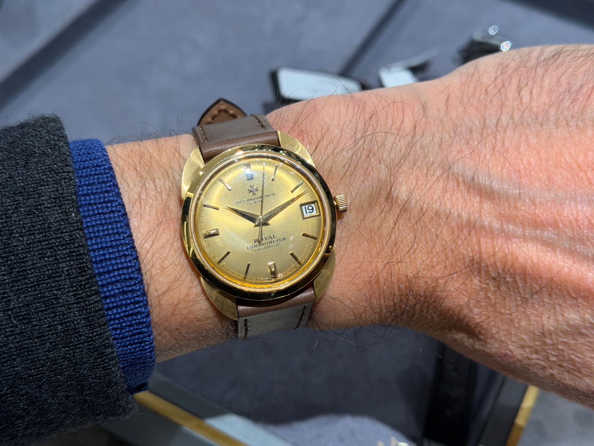
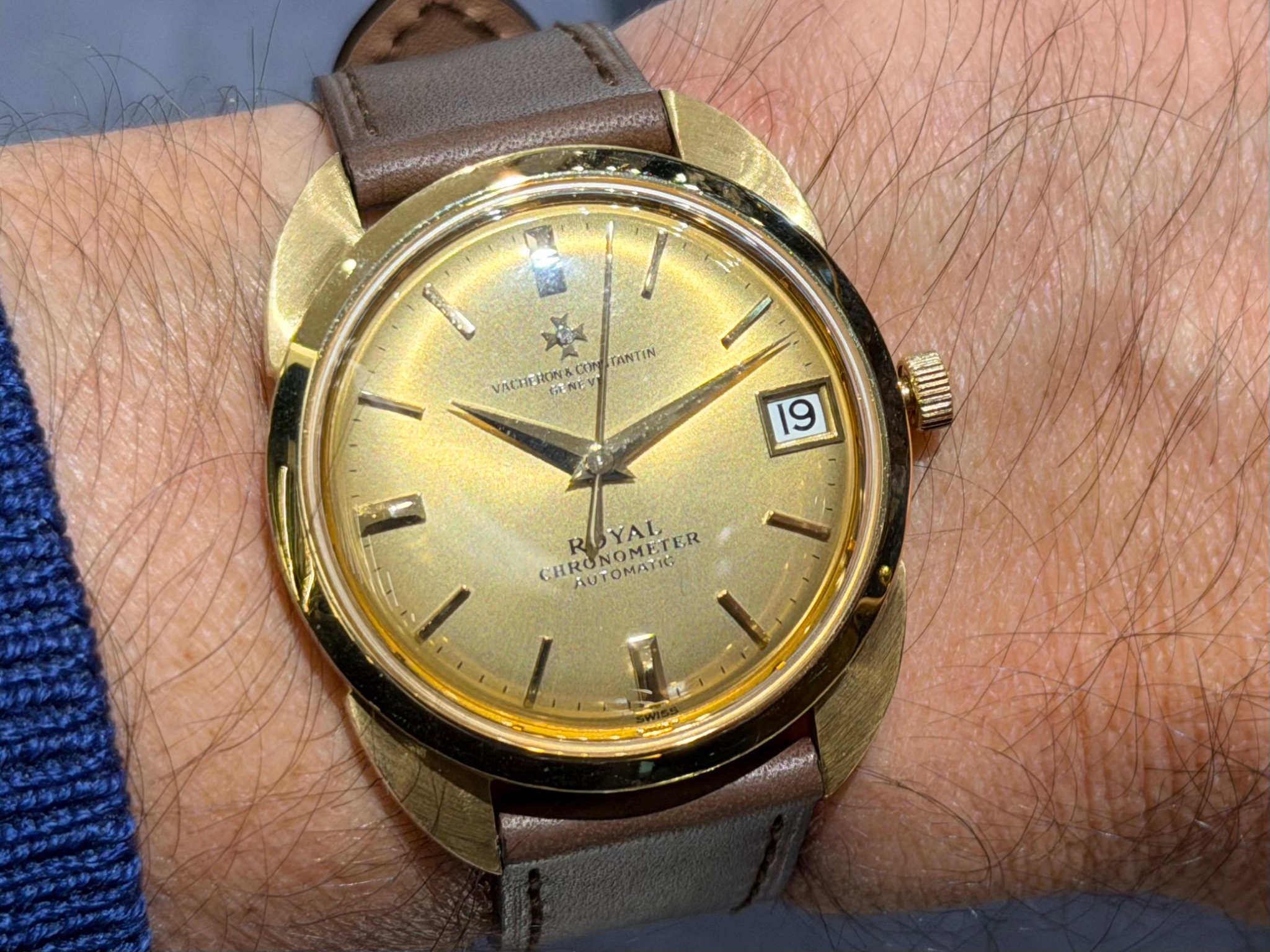
Vacheron Constantin Chronomètre Royal Automatic ref. 6694: the aperture is a bit too big and the white date disc ruins the execution, imo.
Grand Seiko Heritage Collection ref. SBGH368: the white date disc doesn't fully match the dial color.
Patek Philippe Nautilus ref. 5711/1A-014: the aperture is framed, which I like, but it is a bit too narrow compared to the indices and the date disc doesn't match the dial color...
Patek Philippe Annual Calendar ref. 5450P-001: the aperture doesn't feature a metallic frame matching the indices and the date disc doesn't match the dial color...
Alpine Eagle 41 Grey dial ref. 298600-3002: the date disc and the numerals match the dial color scheme, which is nice, but the placement between 4 and 5 o'clock isn't ideal.
Girard Perregaux Laureato 38 ref. 81005-11-431-11A: the date disc and numerals match the dial color scheme and the placement at 3 o'clock is coherent, but wouldn't it be better if the aperture was framed?
A. Lange & Söhne Lange 1 ref. 191.032: I think this is a great execution of the date window.
Blancpain Grande Date Jour Rétrograde ref. 6668-3642-55A: this Big Date isn't as well executed as the one above, imo...
Breguet Classique ref. 5177BA/15/9V6: not bad at all, imo. The aperture doesn't interrupt the hour ring and it is discreet and well designed with a trapezoidal shape.
Patek Philippe Annual Calendar Regulator ref. 5235/50R-001: the aperture interrupts the seconds scale, but, other than that, I think it is well executed and coherent here.
Patek Philippe Cubitus ref. 7128/1R-001: I like that the aperture is framed. It could be a little less narrow and I wonder if it wouldn't be better with a brown disc and white numerals.
Vacheron Constantin Chronomètre Royal Automatic ref. 6694: the aperture is a bit too big and the white date disc ruins the execution, imo.
Grand Seiko Heritage Collection ref. SBGH368: the white date disc doesn't fully match the dial color.
So, these are just a few examples giving food for thought.
There are, of course, no hard and fast rules, but the JLC and GS models shown at the beginning of this post seem particularly well done to me.
What are your thoughts?
Best, Emmanuel

New Release
Explore Baselworld 2014 highlights with small-luxury-world's overview of Tudor, Zenith, Patek Philippe, and independent watchmakers. Discover key trends and new releases.
22 replies6323 views

Manufacture
Explore Mach's Los Angeles watch tour featuring Chopard, JLC, IWC, Rolex, Grand Seiko, Vacheron Constantin, and more. Discover collector insights.
36 replies9831 views

Manufacture
Explore amanico's visit to the Breguet Manufacture in Joux Valley, detailing watchmaking processes, historical context, and iconic models.
85 replies26602 views

Manufacture
Recap of Breguet's Tourbillon Day event in Beverly Hills, celebrating the tourbillon patent with exclusive timepieces and an exhibition preview.
0 replies2256 views
Some thoughts on the date window
During my recent short stay in Paris, I tried on two watches with a date window about which I thought to myself : this is how it should be done . What do they have in common ? A framed aperture , well aligned with the hour markers. A date disc that matche...

Thank you, Bill.
In fact, this post was a way for me to try and understand why I felt the date window was really well done when trying the JLC and the GS! Best, Emmanuel

We would think after so many years, this simple design execution would have been done better…
Unfortunately most brands just don’t get it. Or they have to use parts bin and existing movement to save cost and not make a change. Breguet’s 5177 is another classic example how lazy the designers are and ignoring the dial symmetry, harmony. I am used to...
I agree with on many points,
but not on the Breguet 5177, which I find well done personally. In fact doing the date window nicely seems to be more difficult than it seems. And of course it’s also a matter of personal taste as the appreciation of the same date window may vary dependin...


I think I need another 50+ years to rebuild...
Also, since I wear my mechanicals on my right wrist now, my AEs date window is perfect for me! ...
True, it makes more sense on the right wrist!
I also own an AE and don’t mind the date window but I don’t think the 4:30 placement is ideal. Best, Emmanuel
I completely agree with that...
If it wasn't for "health" forcing me into monitoring devices on my left wrist, I'd likely have taken one look at the AE and said "that's backwards" and not even made the purchase. Funny how life works out.
Funny indeed,
even if “funny” isn’t appropriate when health issues are involved, of course…

Thanks for the information.
I think in addition to brands you have shown GO does a good job with date. Personally I like the big dates that do not have a divider/two windows showing the date.
My knowledge of GO is too limited unfortunately,
but don’t hesitate to add a photo, as a complementary comparison! It would be very welcome. Best, Emmanuel
Here is picture of my GO SeaQ chronograph.
All of their big dates basically look like this. Again just my opinion it looks better without the framing of both numbers. Having said that I would certainly add a Lange to the collection if I could 😊 Apologies I accidentally posted the same thing twice....

For what it is worth here are my thoughts on all 14 watches. Y for acceptable N for not.
Y Y N Y N Y Y Y Y N Y N N Y 😜
Thanks for your thoughts.
Only 5 N and 9 Y! The one about which I feel differently is the Breguet, which I find well done. Best, Emmanuel


Lange 1 is the only one I save
Because it was designed with the big date as a key element, it’s not just the usual ( lazy) window placed at 3/6 o’clock.🧐 4,30 it’s just weird and I just pretend that it doesn't exist 😇 Finally the Nautilus has achieved this huge evolutional leap, leavin...
I have mixed feelings concerning the
utility of the date: we can do without it for sure, but I’ve always found it very practical to have it on the wrist. I agree with you concerning the Lange 1, but it’s not the only one I find well executed, personally. In any case, thanks for sharing your ...

Simple things are sometimes the most difficult things, it seems… 🥳
But, as you show, many manufacturer do it right! I think all of your examples are well executed, although personal taste and preferences come into play as well… Especially your Breguet example is standing out, because this could have been a nightmare if t...
Like on my Alpine Eagle I don’t think
the placement at 4:30 is ideal, but it still “works”. It’s also funny that Zenith chose to orient the numerals perpendicular to the bezel, while Chopard chose the parallel orientation. Best, Emmanuel
I completely agree with you that this
“simple” thing is in fact difficult to do well. I also agree that having a date disc which matches the dial color is essential. Your Zenith is a good example of that: even though I find the placement at 4:30 not ideal at all (like on my Alpine Eagle), it ...

Thank you for a great in depth article.
The Lange 1 stands out with the date an integrated element of the complete design. The date on the new JLC is really quite good; as is the first Grand Seiko. I prefer a date that blends in ( if it can't be done as on the Lange 1. Thanks again for the post...
Thank you. In fact this post
was primarily a way for me to try and understand why I felt the date window was really well done when trying on the JLC and GS! Best, Emmanuel

Great post, Emmanuel! Quite stark differences in execution, especially amongst the higher ‘premium’ brands!🤔
Now, I will wait patiently for the battle between our friends amanico and nasseriq to commence!🤺 Get the popcorn ready!🍿😆

Great post. The simple date window can change how a watch feels.
The Breguet date window is done well and Lange is better. But the GO is even better since the two discs are at the same level vs Lange which is stacked. I am also a fan of Rolex’s execution of the date window. In all these cases, the date has been a focus...
I completely agree concerning GO.
Regarding Rolex and the Cyclops, I've always had mixed feelings, personally. Best, Emmanuel

I think you nailed it, I would agree with your assessment on each.
It has always surprised me when a high end brand handles this one thing poorly…
I think doing it right is more difficult than one might think.
This seems evidenced by the fact that the date window is so often poorly or controversially designed, even by the best brands... Best, Emmanuel

This is a great post Emmanuel, because I think we all wrestle with the date window.
I agree with your assessments of the JLC and GS framing, placement and disc colour. In your 12 additional examples and comments the two I like are the Lange big date and (we will disagree here) the Laurent Ferrier. In person I find the unique aperture bal...
Thank you, Edward.
I find your views concerning the LF interesting, even if I feel differently: Laurent Ferrier did not choose this design by chance and it therefore corresponds to a genuine aesthetic choice, even if I do not personally appreciate it. Best, Emmanuel

Principles, not a bag of rules
Is how I approach date indication. >> date is a choice that once taken has to be legible and maintain the cohesion of the whole watch Legible: There’s no point to a date that’s hard to read unless the inclusion was cynical in the first place ie simply to ...
I like your principles quite a bit, but I'm not completely fond of the
Moser PC date window: I think it would be better if framed with the same metal as the indices. And mechanical is very fine with me! Thanks for sharing your thoughts. Best, Emmanuel ...
Moser PC big date
...has big white numerals, generaly 'light' enough to balance the indices. Especially the laer 2 digit dates. The 1st of the month is a bit lightweight, but one can't have everything. If the Moser date window were to be framed, the indices would need to b...
Interesting thoughts, with which I mostly agree,
but I'm still not sold on the date window of the Moser PC as is, personally. I prefer the GS! That said, like you, I would take the Moser if offered to me ;-)
I love trying on watches
and these photos were taken over the past few months and years. I have others, but I decided to stick to these few… The JLC has to be seen in person, imo. Best, Emmanuel

Great post, dear Emmanuel! 🙏
That’s the reason I love the new Nautilus 50th Anniversary watches so much. No date!!! In the past I could only bear the pointer date versions… And I have something special for you: the Panerai 670. Some of us love it (like me), some of us „hate“ it. The ...
I completely agree with you concerning the Nautilus and Aquanaut.
And thank you for sharing this Panerai I was completely unaware of: I agree with you that the date is well integrated. A 47 mm case makes it easier to display several information in an uncluttered way! Best, Emmanuel

I'm with you👍
One thing that bothers me a lot is when the date is too crowded by the window. Seen it on some Pateks and other pieces. Let's not forget the Glashutte Original panorama date. Really well done. Lange has a blank space instead of a zero. Looks like a person...
Yes, the GO is very well done, but I don't have any personal hands-on photos...
I also agree with you concerning the Breguet! Best, Emmanuel

Another amazing post! Looking at your first 2, I think the Grand Seiko is much better than the JLC
Why? The GS window aligns with the inner radius of the markers. The JLC does not, it is pushed too far inward towards the center. Function of the movement, of course, but your article is so detailed, this is a point worth mentioning. Thanks my Friend!
Well spotted, Michael: I completely agree with you,
the GS is definitely better and you explain very well why! Thank you! Best, Emmanuel

Just to throw you a curve ball there's always a pointer date
A couple of examples Not forgetting Nomos's take on it with the pointer behind the dial. The update Photo credit: Nomos website Cheers JML ...