
pingtsai
[PuristSPro Moderator]
2063

Double BVLGARI - Double the Splendor
Double BVLGARI - Double the Splendor
A Look at the BVLGARI-BVLGARI Logo and the Watches That Give It Life
The use of a company’s logo as a design motif is a common practice nowadays, especially among big name fashion labels that seek instant recognition with their products. Many luxury brands on the market use their logos as a decorative element in all sorts of items from clothing and accessories to bags, jewelry and even watches. Being able to successfully use a brand’s logo in the design of its products signifies a certain level of widespread appeal and popularity. Otherwise, why would someone want to wear a name when it’s not their own?
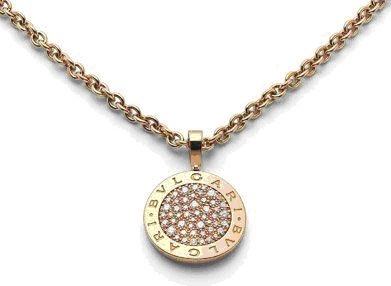
Like Louis Vuitton, Chanel, Gucci and many others, Bulgari has made use of its name and logo in many of their products. There really is no better display of confidence and pride when a company offers its products to the public. For Bulgari, the most prominent use of their logo is in their items that contain the circular engraved BVLGARI BVLGARI element. Customers can find it in all the different types of jewelry items including earrings, necklaces, bracelets and rings. They can find it in the hardware of handbags and the packaging of their fragrances. And most certainly it can also be found on the bezel of their signature BVLGARI BVLGARI watch.
It is obvious that the Italian brand is more than proud of their history, name and products - so much so in fact that it didn’t settle for just using its name. It had to be printed twice! Not many instances exist where a company repeats its name to serve as a design motif. In most cases, brands will repeat their name, logo, initial or initials to form a pattern. But in the case of Bulgari, the logo has simply been doubled and specially positioned to create a singular design element and serve as a theme for an entire line of jewelry and watches.
The common route in incorporating a single decorative element that is representative of the label is actually to truncate the name to a single letter and use that. This is the case for Hermes and their letter “H”. Other times brands will use more than one initial like “LV” for Louis Vuitton or even double the letter to create a logo in the case of Chanel or Fendi. Bulgari is unique in the way they use their logo by repeating the entire word. We have yet to see Prada release a PRADA PRADA watch or line of jewelry.
The Circular Disc and Ring
As part of their BVLGARI BVLGARI design element, the double engraved logo was also given a vehicle for expression in the form of a wide circular ring. The circular shape and ring motif is significant in Bulgari’s jewelry and watch history. Many vintage Bulgari jewelry pieces incorporated ancient Roman coins into their designs. Since jewelry was a reflection of wealth in ancient Roman times, it became well fitting to show it through the use of ancient Roman coins in its design. Using coins in jewelry was not a Roman invention but their appearance in brooches, rings and necklaces became much more common in the Roman period.
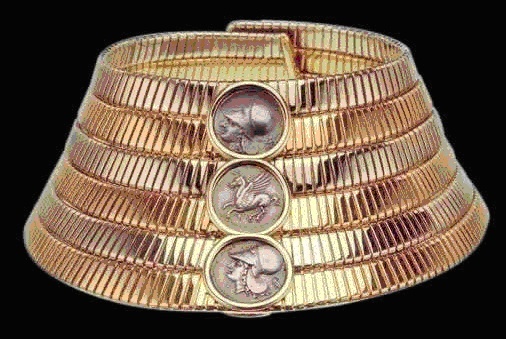
“Gemme nummarie” or coin jewelry is a concept that Bulgari has masterfully reinterpreted over the years incorporating actual ancient coins into their designs of necklaces, rings, earrings etc. in a very literal approach. The coins translated into extensive use of the signature circular disc shape throughout all of Bulgari’s products. Adding the double BVLGARI logo to its surface personalizes it and gives the shape a signature look.
The BVLGARI Logo
The BVLGARI logo, transformed into a decorative element inspired by ancient Roman epigraphy is a central feature in numerous successful collections for the company. After Sotirio Bulgari died in 1932, his sons undertook an extravagant remodeling of both the interior and the exterior of the Via Condotti store and formally changed the company logo to "BVLGARI," an application of the traditional Roman alphabet. Since then, the company has continued to embrace its rich Greek and Roman heritage in many of its designs.

BVLGARI’s logo, in Roman type, is simple and elegant and personifies the true essence of classic Roman style and aura. According to the company, “V” is only used in the logo when “BVLGARI” is written in all caps, as that is the classical Roman type. Romans wrote only in uppercase or capital letters with beautifully proportioned straight lines, curves, and angles until quite late in their history. The lower case letters were a medieval invention and didn’t show up until the 5th and 6th centuries, with a few examples dating a little earlier.
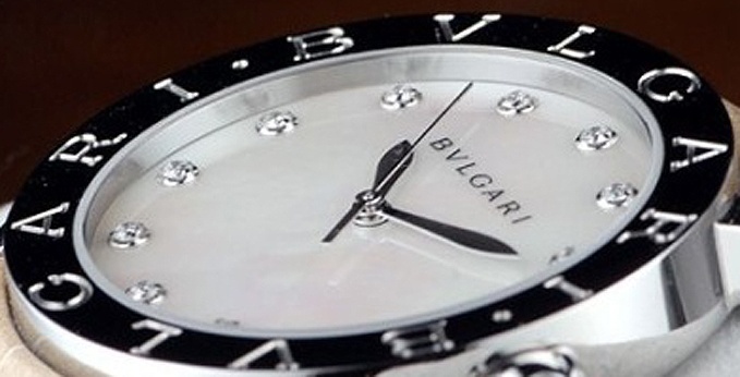
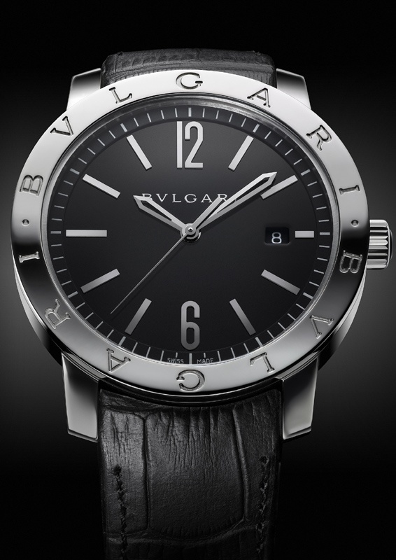
Bulgari’s Signature Watch - The BVLGARI BVLGARI and Variations
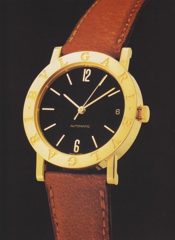
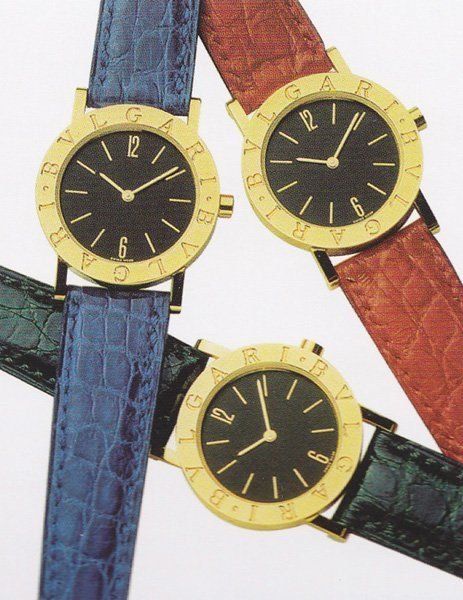
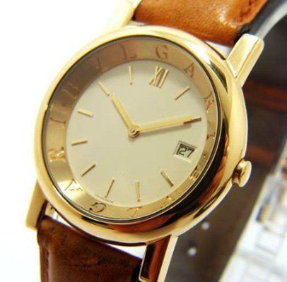
Though the company had made and sold pocket, lapel, and wrist watches throughout its history, Bulgari did not introduce a major collection of timepieces until the late 1970s. Towards the end of the 1970s, Bulgari created the watch that they are best known for, the BVLGARI – BVLGARI. The case was a flat disc shape, 5mm in height. It had a black enamel dial and gold bezel with a double inscription of the "BVLGARI" logo. The watch became the company's most recognized and highest selling watch.
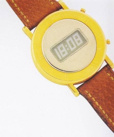
The initial concept for this top selling model came from a limited edition digital gold watch that Bulgari had released earlier. This previous example had the words, "BVLGARI ROMA" inscribed on the bezel. Created in 1975, only 100 were made to be given as gifts to Bulgari clients. At Baselworld this year, Bulgari released an updated version of the BVLGARI ROMA watch.
The promotional watch was hugely popular and as a result Bulgari used the same cases for their mechanical watches and later created and released the BVLGARI-BVLGARI watch in 1977. It gained wide appeal instantaneously and remains a signature watch design by the company till present day.
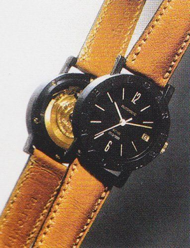
Since the introduction of the BVLGARI-BVLGARI watch, there have been several different variations on it released to the public. In 1993, Bulgari released a limited edition black plastic and gold BVLGARI-BVLGARI watch on a tan leather strap. The logo was engraved on the black plastic bezel. A limited number of these watches were sent to each Bulgari boutique. Each watch was numbered and engraved with the city where the boutique was located. The plastic and gold materials used in the watch were an unusual combination. With the uniqueness of this quality and the appeal of a see through case-back that displayed the gold automatic movement, the watch was so popular that it sold out immediately and has now become a collector's item.
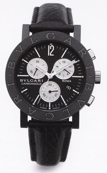
In 2005 Bulgari released another limited edition BVLGARI-BVLGARI watch, a chronograph called Carbongold featuring a black bezel engraved with the double logo. They expanded on the idea from the previous plastic model by using a more sophisticated material, carbon fiber, for the case. The watch was another huge success for the company, initiating a frenzy amongst Bulgari clients to obtain one.
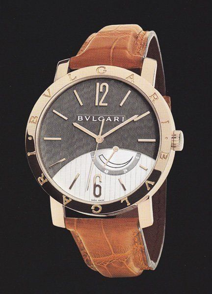
2006 was a significant year in the development of the BVLGARI–BVLGARI watch. Bulgari created new models that encompassed more intricate looking black and white dials with clou de Paris finishing. One version had a 41mm diameter case in white or pink gold. The double logos were engraved on a thinner bezel. The dials were curved and decorated with impressive satine soleil, guilloche verticale and cote de Geneve finishing. The watch had a manual wind movement that was extra thin, a 72-hour power reserve, and was water resistant up to 30 meters.
Anfiteatro Watch
Bulgari incorporated their logo into the design of some of their other watches as well, creating interesting variations in looks and shapes yet still retaining a cohesiveness with the rest of the collection. One such watch which came out in 1989 was the Anfiteatro, named for its concave inner bezel which resembled the shape of ancient Greek amphitheaters. The presentation of the "BVLGARI" logo on the concave bezel was a major design aspect of the watch but much more subtle than the BVLGARI-BVLGARI watches. The letters of the logo on the inner band appeared more as an extension of the dial rather than a separate entity. This feature accounted for the watches' classically inspired look and ultimately its popularity. It was released with an automatic movement in yellow gold with a champagne colored dial and in platinum with a white dial.
The Chrono
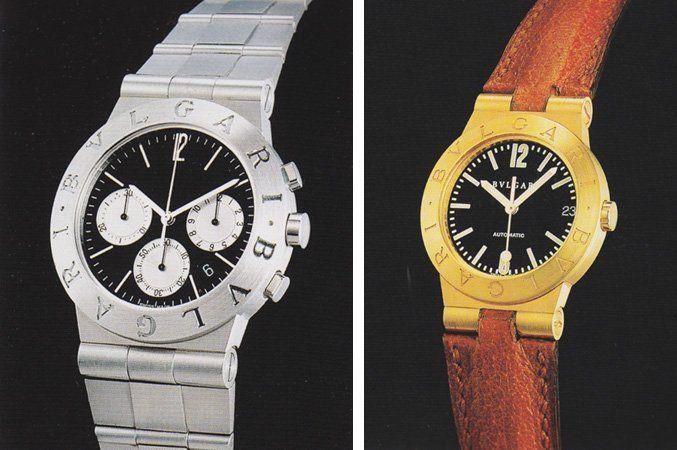
The double "BVLGARI" logo also featured prominently in sportier more practical watches such as the Chrono in 1988 and Sport Line in 1994. The Chrono was a quartz powered chronograph watch while the Sport Line had an automatic movement, black dial and fluorescent indices. Both were offered in a variety of materials such as gold, gold/steel and steel alone.
The Solotempo
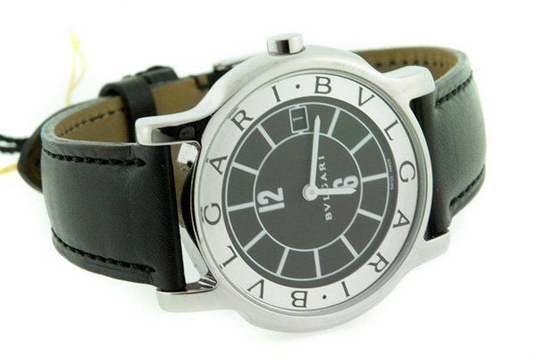
In 1997 the Solotempo was a stainless steel quartz watch with a contemporary looking dial. The double "BVLGARI" logo appeared on the outer rim of the dial and the center dual used graphic lines for the hour markers.
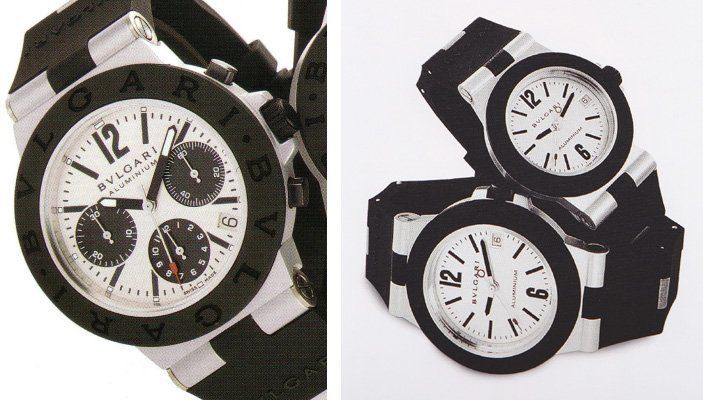
The Aluminium
The Aluminium was a modern sporty looking watch launched in 1998. The unique features about the watch consisted of its aluminum case and black rubber bezel with incised double "BVLGARI" logo. The bracelet of the watch is a combination of black rubber and aluminum links and buckle. The red tipped seconds hand provided a splash of color to a black and white dial. To promote the release of the watch, Bulgari teamed up with Alitalia and had the image of the watch painted on the side of a Boeing 747 that flew within the Alitalia fleet for a year. The innovation of Aluminium inspired the design of future Bulgari watches to come.
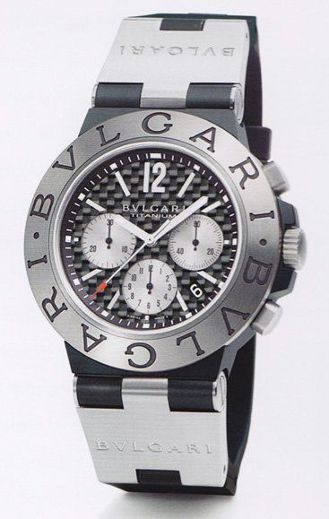
The Diagono Watches
Starting in 2001, Bulgari designated all of their existing sports watches, Aluminium, Sport, and Chrono, under the general category Diagono. These watches were grouped together for their similarities in design of the case, bezel and the use of high-tech materials. Bulgari named this all encompassing line Diagono because of the oblique cut of the bezel based on two "diagonal" lines which characterized the sports watches in the group. Also the ancient Greek word "agon", which means "competition", was a fitting part of the name as well. Today all the watches in Bulgari’s Diagono line have the BVLGARI BVLGARI bezel. To clarify, the watches in the Diagono Professional line do not.
The Bulgari logo, a decorative design element and stamp of identity on the ‘BVLGARI BVLGARI’ watch bezel of so many different variations of the company’s timepieces as well as other products. Using classic Roman lettering, Bulgari’s version is modernized with spacing and letters that are slightly wider. Nowadays the presence of the double engraved logo is synonymous with the look and feel of classic Bulgari. Its popularity and mainstream appeal is a testament to how designing and creating with pride and historical inspiration can help pave the way to commercial success.
This message has been edited by pingtsai on 2013-07-01 00:42:43


Double BVLGARI - Double the Splendor

Great article Ping. Thanks for the history lesson

Imperium Romanum
As with any design, it should evolve...
Just for clarification......
I used the majority shareholders as criterium

There's a 'hidden', or subliminal, aspect . . .
Da Vinci Code?
Kind of, in a way. Subtle symbolism . . .

I used to like the Diagono...
I think you share similar feelings that many have.

Wow, didn't know such history of Bulgari..

