
cayenne1200
647

5 days on the wrist: Some thoughts on my new 5212A
Last Saturday I could finally pick up my 5212A at my dealer after he has presented the watch to some other customers. I´m wearing it ever since and my first impressions are 100 % positive!
Here are some first thoughts which of course are all my personal opinions on that watch only:
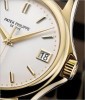
Case: The case design is pretty much simple and plain but "pimped-up" with a twist. The rounded sides and the stepped lugs are giving kind of a special appeal to the whole case.
The look from above on the case is showing a "calm" and balanced design without being boring. The lugs are a real eye-catcher and are evocative of classic watch design features. Looking from the side the lugs appear even more 3-dimensional which I like a lot.
The sides of the case are round bodied which is giving a great feel when the finger is moving around the case, similar to the case of the World Time 5130 which I also like a lot.
The proportions of the case dimensions seem very balanced to me. When I read about the newly presented model for the first time I was fearing a case size of 40 mm might be too large for such kind of watch. But after seeing the watch in real those fears disappeared at once. The 5212A doesn´t really look like a 40 mm watch; somehow it´s looking a bit smaller compared to other watch designs of that size. The length of the lugs is not too long and is perfectly matching with the case diameter and height.
Dial: Patek is calling the dial "Opaline Argente Index Noir". The colour has indeed a silvery but at the same time creme/beige tone to it. Looking at the dial through a loupe a "metallic" effect is visible at the surface. Due to this the dial appears sometimes more like silver and sometimes more like a warm grey or beige depending on the light conditions or angle you are looking at it.
The dial of the Patek 5960A white dial has a similar effect making the dial appear greyish, hard white or silver under different angles.
Imho, it is a typical Patek Philippe dial made in perfection and being incomparable to the dials of any other brand.
The dial is displaying a whole lot of information, lots of numbers and text. But for me the arrangement of all these information has been done perfectly well. The 3 circles for day, week-number and month are working very well together and the eye is able to catch all information easily.
I personally am a big fan of the indexes made of blackened gold; same style as at the 5270G-001. These black indexes (and hands) are guaranteeing a very good contrast to the dial and are making it easy to "read" the watch.
Font: I have ever seen such kind of individual handwriting-font before on a watch and I find it very much courageous of Patek using it on a serial product. Many people will like it, many people will not, so this design feature might become a deal breaker for possible customers.
For me the font is showing that Patek is consequently pursuing its own design ideas and is not reluctant to create polarising products instead of trying to please everyone. I am appreciating this very much.
The font is very nice to look at and easily readable. Even if you compare certain numbers or letters the all look slightly different like at real handwriting.
Hands: The hands are all made of blackened gold like the indexes which is giving a very harmonic look of the dial together with the black colour of the printing on the dial.
The central axis is carrying 5 hands on top of each other. That´s a really high stack of hands! This high stack of hands is creating very nice shadow effects if the watch is looked at under light falling in from the side. Please check out the pics below.
It is worth mentioning the 2 "Polo stick" hands with its red tips. The 2 hands are indicating the day and number of the week. For me these little Polo sticks are looking very cute and nice. Simply a beautiful idea of the Patek designers!
Complication: Even though I personally will most probably not use the Week Calendar complication very often I think it is a good idea of Patek to create a new kind of calendar complication. The only other Week Calendar I know has been made by Lange many years ago. So it is a pretty new and rare complication.
Strap: 70 to 80 % of all comments on the strap that I´ve read in different internet fora during the last months have been extremely negative. "Ugly", "cheap looking", "unworthy for a Patek Philippe watch" and many more comments of disregard have been written.
When I saw the 5212 on pics I wasn´t sure if I like the strap but I´ve never found it as bad as written in many comments. When I saw the 5212 in real I immediately understood the point of the Patek designers.
The strap is matching the dial perfectly in my eyes and makes it pop out in a good way. Maybe I will look for alternative straps for my 5212 but definitely not because the Patek strap is looking bad or cheap but just because it is fun to try to create a new look to a watch by finding a nice new strap for it.
Overall Impression: The 5212A is a great and easy wearing watch. It is rather light weight due to its steel case and the case dimensions. It is a great joy looking at the dial and the many black hands with the 2 little red colour spots.
If you have the chance seeing this model live I would highly recommend to take the chance. If you have the chance buying this model I would highly recommend to go for it!
Finally, I really hope that this model will not become too much of a speculator piece because of its steel case only, what I fear will happen though.
The 5212A is a Patek Philippe model of its very own, maybe like the 5235 Regulator, and worth being appreciated as such and not only as another profit asset.


5 days on the wrist: Some thoughts on my new 5212A

thanks for sharing & congrats again !
Congrats
Superb photos!

Great review of an awesome watch


Thanks a lot for the detailed and enthusiastic report! I had a chance to try it on a few times back in Italy this summer, and can only agree on the positive assessment.

I think Patek has a winner here

Thank you so much for this very interesting and well written review. There are many details I like on this watch, especially the darkened indices and the case.

Easy watch to love


Great post and pics! Thanks

Thank you for the detailed review and the amazingly well taken photos!
Thank you for letting me know!


Great review and photos of an extremely intriguing watch!

Very good review. There's a lot to like in this watch.

Thanks for an amazing review!
Thanks for the excellent write up and photos.
Incredible photos and incredible write up!!! You make the watch come alive in a most appealing way.

What a great review
Haha, Christian, I´m one of the people who love that red dash :-)
LOL, Totally fair :-)

Thanks for sharing your experience with the 5212.