
219
3826

Great report - if only they would change the font on the 5131G
they would have a wonder of the modern age. Patek persist with a font that makes the dial looked cluttered and in my opinion it is hard to read. The white metal case, blue strap, and enameling a joy to behold. The font then puts me off this watch entirely. I am sure it will be a sell out, but I believe it could be so much more.
The new 5098 and 5101 are ok, but prefer the platinum versions. Otherwise, the new enamel dial is not to my liking. Really grumpy! Just more disappointed with the 5131G - please Mr Stern, re-think the font....PPPPLLLLEEEAAASSSSEEEEEE!.
Thanks Jerome for a great report and photos
Andrew H

Live shots of the new Patek Philippe watches after Basel 2009!
It was promised so here comes the time to share pics of the new Patek Philippe models launched this year at Basel. Let me say first that now that I've seen them, many of these like often really deserve to be seen on your wrist to be fully appreciated. I'v...

Grea report. Thanks
The 5101 is a stunner but I would love to see the 5970 in real life. maybe one day Julian


thanks for this great report !
The 10 days tourbillon is a superb watch. I've seen the platinum piece with salmon dial. It was nice but I didn't like the color combination very much. The 5101R on the other hand seems to be amazing. red gold and a smokey grey dial ... WOW . Need to sell...
Thank you for your comments Bruno....
Hi, In fact all these watches really need to be seen live to fully appreciate! Hold your breath until you get to see them! Cheers Dje

I like the enamel dial...
I actually like the 5116. Very few people like the hobnail bezel, and honestly I'm not sure I'd wear one every single day since the hobnail bezel conveys a sense of formality and seriousness. However, I wished they made a 5120 with a true enamel dial. I'm...
In fact not my style either
Hi, I'm not too fan of the hobnail bezel myself (I think I'll have all time in thirty years time to appreciate it). The enamel dial is still an appealing option. I would have preferred a larger 5115 without the hobnail! Cheers Dje
Agreed. But it's completely different on the wrist.
The Patek with the hobnail bezel may seem a little old fashioned when you look at the watch. Many will simply dismiss a 5119 and instead prefer a 5196. Yet, ironically, when a young man such as yourself wears a hobnail bezel watch, you don't look any olde...
Who ever said PP is conservative
They got the first mechanical watch with email! LOL Is there a pigeon inside? LOLOL Thanks for this nice post. I really adore the Calatravas. I can appreciate the other new models but those are not really for my taste. So now I go back to dream about an a...
5970P....drop-dead gorgeous!!!
Thank you so much for the pics of that perfect watch. It will help me while waiting for it. You're absolutlely right, you must see it live because the homepage is different. Saw it live in Basel and I knew at once: Doesn't matter, sell the house, sell the...
I'm glad you enjoyed my pics and identify the watch you saw!
Thank you for your comments. So you ordered it? Cheers Dje
Are you looking for....
Hi, Are you looking for a platinum 5396 with slate grey dial? I'd like to see such thing. Cheers Dje

Thank you for this compelling report (as always!).
And you got to try on all of these watches? I'm jealous!

I am totally with you on the 5970P
It's the real deal! If I have to sell some of my wife's jewellery for it ......well, maybe not. Thanks for the live pics.- a much better point of view. Cheers Fernando

Great work, Jerome, my lucky friend
You are lucky to have been able to see all these " new " pieces in the flesh. Even if I don't know if we can speak of " New " pieces, some are rather nice evolutions, as the 5970P. Totally agree with you that this piece will ( and already is ) a Beast. Th...
I hope you'll see the 5131G soon!
Hi, Trust me the engravings are really discreet once on the wrist! The Celestial is really superb with both colours. I've always appreciated pink and white together, but this one is awesome. Of course it is another story in terms of availability! Good luc...
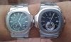
Thanks Dje, excellent pics and the 5970....
WOW absolutely bloody WOW, it looks amazing on your wrist, if i could afford it i too would cherish this watch forever....i do like the 5960R also. R's Sid

Thanks Jerome for the great report
I agree with you the new 5970P is the best looking of the lot (except maybe for the YG). - SJX

5970P
The great thing about watches, like wine, is that there really isn't a right or wrong. If your taste happens to find really cheap wine the most appealing, then that is fantastic luck. It is not wrong. It is lucky! With watches it is the same. If you happe...


Were you not wearing your duffle coat… Only kidding!
Many thanks for showing us lively amassing timepieces, and for your great and easy reports.
Great report - if only they would change the font on the 5131G
they would have a wonder of the modern age. Patek persist with a font that makes the dial looked cluttered and in my opinion it is hard to read. The white metal case, blue strap, and enameling a joy to behold. The font then puts me off this watch entirely...


Nice pictures ...
... but i think you almost killed me with the first pic (5102) ... Thanks Filip

Thanks Jerome for a great photo report.................
I have to agree with the concensus of the majority. The 5970P is stunning watch and one that I would dearly love to own. In general I do prefer a black coloured dial on a watch.
Alive but ...
... not kicking .... i'll never be able to afford a oiece like that ... i think ... Filip


Thanks Jerome...the 5101 is simply superb :-)
Agree with you that the 5970P looks very beautiful and very desirable. I'm glad I'm not into black dial and contrast white railing, need not compete with everyone to get one. It will almost be an impossible feat Cheers, CL


That 5101R looks amazing on your wrist!
Excellent report! These real life wrist shots are much better than the press photos. Thanks a million, Jerome!

Thanks a lot Jérôme !
My fav is still the PG 5098, I love it: But I really think that the "email" on the dial is a big mistake from Patek... Fr.Xavier...
I agree FX
Hi, Indeed it is too mcu and in fact I'd prefer nothing written on dials in general! Look at the PAM249! Cheers Dje

5102 pr
Amazing once again...i think it needs to be seen in metal ,but the 2 tone case is intriguing.Any idea of a rough retail price?Mo.

5970P would be the one
if I were to keep only one PP. A real star, thanks to your beautiful pictures perhaps?? Thanks for posting.

The 5970P is nothing less than amazing, but…
…the 5101R is the epitome of what we call CLASS! WOW!!!
2009s
I have looked over the 2009 vintage from these glorious pictures again and again. Fantastic photographs. I was talking to an AD who told me that having already agreed with PP for an allocation of one 5970P in 2010, PP had changed their minds. Does that ma...

Thanks Jerome
Since most of the new pieces are in YG or RG, so my preference left of no choice to go with 5970P (will I have the fate and $$ to get one)....LOLOL
Been anxiously awaiting real shots of the 5970P...
What a GORGEOUS watch! Thanks so much for posting these. I'm with Tempus...I am going to do anything I can to get my hands on one!!
Hi Skyline!
To me it is the most beautiful classic chrongraph ever seen! It is confirmed that I'll get mine this year, did you already order it? Was it difficult to place an order and will you get one? Hope to see some nice wristshots of yours soon! Good luck! P.S: P...
So far, I have known several collectors
getting confirmed by their ADs. One of them even has to pay a deposit. It seems like many ADs are starting to take orders on this beauty. Hope you manage to get it soon . Please share with us the wrist shot when you receive yours Cheers, CL
My AD says he's going to try his best...
...for me, but they admit that EVERYONE has been trying to order this watch, and they will likely only get one So, I'm crossing my fingers but it doesn't look that promising!
Good luck!
Maybe you should try another AD and give him a downpayment. That's the way I did. Regards


Hi Dje, great report! Now, as to which is the most beautiful among the new releases:
I held most of these pieces at Baselworld, and I can honestly say that from the purely aesthetic viewpoint, the most exquisite of the lot was: The 4897R. The shapes, colours and proportions of this watch are just breathtaking. And at 33mm, it's the perfec...

Great report, thanks Jerome....
I too share the sentiment with you that most of PP's press photos don't do a fine job of demonstrating the real beauty of their watches, and once again some of the new RG watches this year proved your point very well. I was having a little doubt whether t...

Great report, thanks Jerome
I personally felt that this year was an evolution year for PP. Despite this, they have done a reasonable job. I am not a fan of pink gold, so did not find most of the watches to my liking. However, I must admit liking the 5970P, it looks gorgeous.

Thank you for your pics
Hi, They too show that the engravings are quite discreet on the 5131G! Nice 5971 (I prefer the 5970P though). Cheers Dje
some really wonderful pieces
personally I like the enamel dial,although it would have been better without the "email" inskription. The celestial is a dream as always and the 5131G a perfect masterpiece( I dont mind font or engravings as others do),a shame these rare pieces seem to be...