
Ornatus-Mundi
[Zenith]
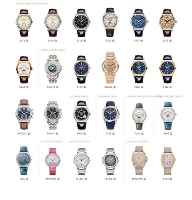
7136

BaselWorld 2017: (few) live shots from the Patek booth...
I have to say, as a Patek non-expert, that I like what I am seeing. Patek adopts increasingly a subtle shot on bolder elements (colours, details...) which I like (with the caveat I gave before). So here we go:
First one is the 5170P with blue dial and the baguette indices... lightning is not optimal I guess, but this one is very promising!
The 5960G makes all efforts to hide its deep dial structure in the press images - superb from what little these images might tell...
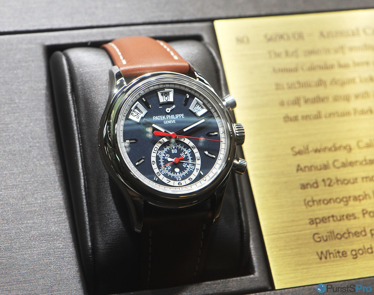
Also the 5320G Perpetual Calendar I guess is another victim of the lightning - not much to see from the new case shape. The applied arabic indices I guess must be well playing with the opaque dial face.
I still don't have an opinion on the 5940R - a solid entry for sure!

Wonderful, simply: the 6006G: the dial finishes is something I'd really love to see!

I already liked the chocolade brown 7130G World Time - with the new blue version Patek chose a very feminine blue!

7140G:

Simpler, but no less attractive: 4947G

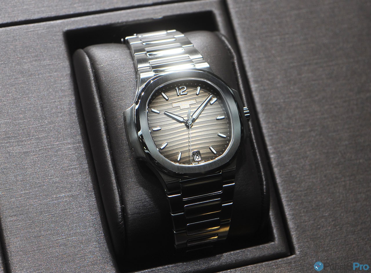
Two new dial colpours for the automatic Nautilus 7118/1A

And finally the 5072R

That's it quick & dirty!
Thanks for looking,
Magnus
Available on the marketplace


BaselWorld 2017: (few) live shots from the Patek booth...

Thank you Magnus!

Your pictures are superb!

Wonderful! Thank you

The 5320 Annual Calendar is very appealing to my eye.
New movement?
Yes, you're correct
Very impressive line-up but the winner for me is the 5170P

Preferences
