
amanico
[JLC Moderator]
403846

An interesting comparative photo featuring the Patek 5070P London Edition and the 5170P.
I found this photo at Quillandpad, to be credited to our dear Gary G.
We often compare the 5070P and the 5170P. Gary G had the good idea to take this picture, which is helpful for those who want to see how different these 2 chronographs are.
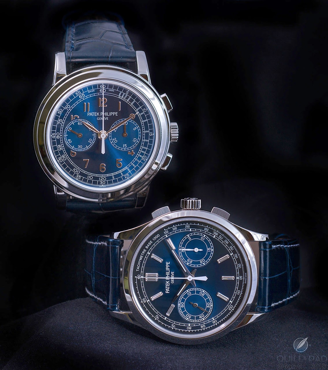
The difference of size is immediately noticeable, when you look at the location of the two sub dials.
Less centered on the 5170P, which is 2, 6 mm smaller... But under the 3 and 9 o'clock line. While they are perfectly aligned on the 5070P. The explanation lies in the two different movements.
Another interesting detail is that I don't really see a different blue hue of the dials of he 5070P / 5070P London Edition... I would like to see a side by side picture of these two versions of the 5070P, though.
For me, the winner is the 5070P. The dial is much more my taste. Even if I like the smaller case of the 5170P. I much prefer the leaf shaped hands of the 5070, too, which have the good taste to be " lumeless ".
And you?
Best,
Nicolas

Review
Mark in Paris reviews the Patek Philippe 5170J chronograph, detailing its dial, hands, movement, and comparing it to the 5070.
38 replies12776 views

Collection
Explore the Patek Philippe 5170P chronograph through the eyes of collectors. Discover why its 39mm size, blue gradient dial, and baguette diamonds make it a coveted reference.
68 replies10006 views

Reference Guide
Explore the Patek Philippe Ref. 5070 in white gold, a 'blue chip' chronograph. Discover collector insights on its design, Lemania movement, and enduring appeal.
51 replies8437 views

Collection
Join the Patek Philippe 5070G club! Discover why this manual-wind chronograph is a top choice for collectors, with insights on its design, appeal, and market standing.
37 replies8630 views

Collection
Explore the Patek Philippe 5170G chronograph's historical roots and design evolution. Mark in Paris compares it to vintage refs and the 5070.
28 replies21467 views
An interesting comparative photo featuring the Patek 5070P London Edition and the 5170P.
I found this photo at Quillandpad, to be credited to our dear Gary G. We often compare the 5070P and the 5170P. Gary G had the good idea to take this picture, which is helpful for those who want to see how different these 2 chronographs are. The differenc...

I think...
this isn’t even a comparison and the market recongnizes greatness in how prices evolve and punishes overproduction.... London exhibition re-editions are an unsettling thing for us collectors. Have a good weekend.

I wasn’t aware of the blue London edition
I feel, that perhaps, they made it too close to the original P - as beautiful as it is...the salmon is an other story- being totally it’s own.

Of course it's a comparison.
The 5170 is the current piece, 5070 is the previous. Family lineage is clear to see. I understand you are a collector and clearly from all your posts here and on TRF you much prefer the 5070, nevertheless the comparison is valid and many do prefer the sty...
Thank you and I understand
But it is like comparing a 1463 and a 5070... no comparison and different leagues. And I venture to guess a buyer of a 5170p isn’t also looking at 5070p for many reasons but price being the first as the latter is now trading 3x the former. Best
You keep reducing this comparison to money.
The comparison is the pieces and their function. The 5070 was Pateks basic dress chrono, the 5170 now fulfils that role. The 5070 when new was cheaper than the 5170 and I really do believe that many people considering £70k+ would also consider £140k+. Mor...
I agree with all your points Russell.
Let’s suppose the 5170p was discontinued shortly, and over the course of 10 years its price appreciated to above the 5070p, would it then be a better watch than the 5070p? The comparative price of the 5070p over the 5170p seems to be driven very much by i...
More than price..
Thank you my friend. More than price, but price is a reflection of the markets belief or findings as collectors speak with their wallets in the end. 5070 was huge at the time so very sporty and not so dressy and it was as you know pateks first manual wind...

gorgeous picture of two amazing pieces
my personal favorite iteration of the 5070 reference is the London G with salmon dial.... the London J with brown sunburst dial is pretty darn good too. I struggle to understand however why Patek chose to make the London P so similar to the regular produc...
+1 the London P should have a different dial
black enamel would be very interesting cheers


5070P for me though the other is also very nice
You said it there, it’s in the dial. Also the applied Arabic hour markers are much more my taste on a chronograph versus baton markers.

Did you mean to say....
... that you don’t see a different blue hue between 5070p and 5070p London edition? Between the two types of 5070p, there is a difference in the blue hue. Not huge, but there is a difference. I prefer the blue of the original.
I didn't see the London Edition, so I can't judge, but I quote Gary G on that matter.
" To my eye, at least, the color of the limited-edition watch is a truer blue than Reference 5070P-001’s blue-grey, and the tone is somewhat lighter. But as you can see in the photo below, depending on the angle and conditions the perceived “lightness” of...
I have seen the 5070p v 5070p London together
And there is a difference. The London has a lighter hue to it. Also seems more “shiny”.
As a comparison.....
It’s not the lume that is the issue of taste for me. It’s those diamonds. Without the diamonds it would be easier to compare. The diamonds make it 100% no-go for me. But I would still take the 5070 over the 5170 every time. It has the Factor X.

If only they could make the subdials of the 5070 with the case of the 5170
I am partial on the subdials so if I have to choose it will be the 5070. Regarding dial colors, I am not sure too that the London edition is the same as the regular 5070P. I hope the subdials will go back on the 3-9 line one day...

I prefer the dial of the 5170
It’s cleaner and less cluttered. The diamonds of the 5170 although beautiful aren’t for me.


5070p for me also.
Whilst the 5170p is a nice version it just isn’t a match for the 5070p. Lume on a Chronograph for me is a show stopper also. The 5070 Oozes class and Patek DNA.... to me at least. Great shot though of 2 great Watches. M.

Hi Nicolas, for me the winner is the...
5070P because the crown is aligned with the middle of the sub dial and the overall layout is symmetrical !


There are elements I’d take from each.
I prefer the case size and lugs of the 5170. I much prefer the bezel of the 5070. I don’t love how the subdials eat into 4 numerals on the 5070. In general, I prefer numerals over batons. The fact that the batons on the 5170 are diamonds make me love them...
I have a problem...
... with the 5170: it looks very much like a Lange, but lacks the dial complexity needed by a great Patek. In this regard the 5070 is better, although I don‘t appreciate this extreme symmetry of the dial the amount of white typing and the beautiful big ar...
5070
While I do like the 5170 dial gradient a lot, I prefer the 5070 for most of the other aspects mentioned. Also I greatly prefer the stepped lugs vs the 5170s. I saw a London 5070J recently for sale it has a cool brown dial as an aside. Best

5170P for me please, I'm really loving this reference more more and more
5070 is indeed rarer and sort of better investment, but I still prefer the other one. Those diamond markers are really appealing 😊 The picture is awesome, thanks for sharing!
Thank you
Thank you for posting the photo and creating an interesting debate. My preference is for the cleaner and more legible style of the 5170 although I prefer the leafed hands of the 5070. The smaller track and case of the 5170 make the face less cluttered. Lo...