chintu
505

Richard Mille - A lesson on how to kill legibility...
With all the hype about space-age materials and the uber lightness of the Richard Mille, I wanted to take a closer look at some of the much acclaimed pieces and chose RM11 as a study. This is an annual calendar + chrono combination with some extra zing added.
The watch boasts of variable geometry and several firsts including some titanium base plate etc; but rather than going starry eyed about those esoteric tech and materials, I just wanted to see how a wearer will tell time or use some of those chrono functions ( which incidentally has a 60 min countdown timer function as well - find out where it is!).
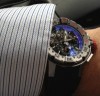
Not being able to see it in the metal, I took the easier route of downloading the images from the web & this forum.
What greeted my eye is a riot of colours; odd sets of hands that merge into the dial face; and a jumble of indicators and sub-dials. A tiny window between 4 and 5 shows a microscopic number ( guess what it is!!)
The fat hour and minute hands with the cut-away parts to help get a glimpse of the sub-dial when they are crossing those can at best be described as an attempt to solve a problem and nothing to do with design coherence..
The minute hand is quite short of the indicators owing to that shape of the case. And the chrono seconds-hand stays so far away from the markers due to the tonneau case, that it would be a miracle to read the exact second when the hand is stopped.
Is the "day-of-the-week" important in an annual calendar? Oops... RM thinks it is not. ( of course several other brands have dispensed with this important indicator in their annual / perpetual calendars as well)
Can anyone use the chrono and get the readings off these sub-dials at a glance? Most likely one may squint into the dial gamely and make an educated guess and least of all if I imagine the Formula 1 driver trying to read the chrono or even try to read the time, with his hands on the wheel!!!
I am left wondering if in pursuit of esoteric materials and lightness, the core principles of watchmaking have been consigned to the side?
While the rose gold version seems slightly better, the rest of the offerings ( TPTcase) go more south in terms of the legibility factor!
For a minute forget that this is a RM and then look at the watch so that there is no bias. The one that can readily decipher the functions and display without any discomfort is a winner for sure. The pics below are rather large and imagine the actual watch size...


Review
Andrew H reviews the Richard Mille RM060-01 Voiles de Saint Barths from the 2015 regatta, highlighting its crucial navigation features for sailors.
14 replies7341 views

Complications
Explore the Richard Mille RM027 series, including RM027-02, RM027-01, and RM027. Discover ultra-light tourbillon watches, innovative materials, and extreme engineering for Rafael Nadal.
51 replies37527 views

New Release
First look at Richard Mille RM70-01 Tourbillon with Alain Prost. Discover its cycling odometer, NTPT case, and unique asymmetrical design. Limited to 30 pieces.
23 replies9891 views
Richard Mille - A lesson on how to kill legibility...
With all the hype about space-age materials and the uber lightness of the Richard Mille, I wanted to take a closer look at some of the much acclaimed pieces and chose RM11 as a study. This is an annual calendar + chrono combination with some extra zing ad...


Well written!
Quite obvious that RM-watches aren't made with the primary purpose of telling the time!


I believe the people buying these care about the watch more as jewelry
and there is nothing wrong with that for this market. You are obviously correct that function wise the dial is a complete failure. However, jewelry and fashion wise the watch is obviously a complete success. I personally never liked RM. Tried a couple on ...
Of course
..each Brand has its share of loyal fans and that it what makes watch collecting unique and exciting and evokes strong passions.
The only visibility that counts is making sure others know what you are wearing...
...any actual time-keeping functions are incidental.

I like RM and I like the RM 011 very much. Legibility is only one aspect for a watch maniac.
If you would wear the watch you will learn to use it. If not go for another brand. There are many. Talking negatively is not necessary. Where is the lesson? Just talking badly.
You are perfectly welcome to have your views
And so do I have mine. Just that our views are different. This forum is about independent views. I have not been arbitrary or trolling , but highlighted whatever I felt to be the inadequacies of the RM with the relevant images. Watch review is not about m...
You may have your opinion and you may write about it.
Thats what I do as well. But I would never talk or write about a lesson or a study. That sounds objective. But you gave us your opinion only.

In fairness I have written negatively
about JLC Duoface because much to my regret I owned one that was a fail (others on this blog have said the same) in just about every category. I think if you have personal experience you have every right to post it as it is a service to other purists. I t...

I was lucky to see RM from the beginning through an AD and have seen the progression. The RM 05 is one I'll always regret not buying early, a fantastic piece (can a RM be called lovely?)
Annual Calendar pieces are often busy and struggle with legibility. I think you make some good observations about this one and have presented your points well. Ideally a watch should be functional but to what degree is perhaps a subjective judgement. Ther...
End of the day it’s purely aesthetic...
I’m sure (not from personal experience 😆) that they function properly but not my personal taste...to each his or her own.🤗


Legibility is imho not that bad though I certainly agree on other points
Have you actually seen a RM11 irl? I'm guessing the legibility arguments you've made here are based on pictures not experience. IRL the depth of the movement helps the hands stand above and distinct from what's below. Under more dynamic lighting the brush...
Seen others but not RM11
I have stated that my impressions are based on pictures at the start of my write up. I had seen quite a few of RMs in the metal but not the RM11. I chose this to discuss since the calendar and chrono complications are present and both are more wearer-enga...
Rubbish
Flat pictures posted don't do them justice, I wear an RM11-01 as a daily , most legible watch I have ever owned, one glance is all it takes to tell them time., yes there is a lot going on ,but its an annual calendar with a chrono & countdown , so it d...
I especially love the early RMs (personal preference)..
RM005, first RM automatic watch. I bought a similar case size RM002-V1 last year yet to pick it up due the COVID restrictions. Yes, RMs IRL are amazing watches. ...
02's are cool
love mine as well, nice size, and mesmerising,.... owned this one for 10 years plus & would never sell it ever! ...
Thanks Doubleup
004 went...never really got on with it, appreciated technically what it was but it was white gold and heavy on my wrist, never really gelled with it...slightly less weighty was the 27 -01 I managed to bag along the way....and as seen as you like my pictur...
Wow!! I did not know you had this marvel.
Awesome picture and congrats on such an amazing piece. You can post pics of this anytime and I am sure I speak for Everyone here saying that. I don’t think you can get any lighter coming from the 004. Thanks for posting

I disagree...
legibility might be an issue for certain models, but certainly not for rm011, very easy for me to tell time at least... and i doubt anyone has an issue to tell time on rm035-01. btw, they are the most comfortable watches i ve ever owned, super fun too. ...
If i were to get an RM, it would be an 11-03
Was able to handle one in the flesh a few years ago. Asking was about USD140K if i recall correctly. So I naturally balked. I didnt even attempt to haggle. But i found it robust and i was amused by the flyback function. What i did was buy other flyback ch...

Hard to read
Legibility is a horror when see the 11 dial. That makes me reject the 11, even when i could afford one.