
GLau
[Patek Moderator]
12052

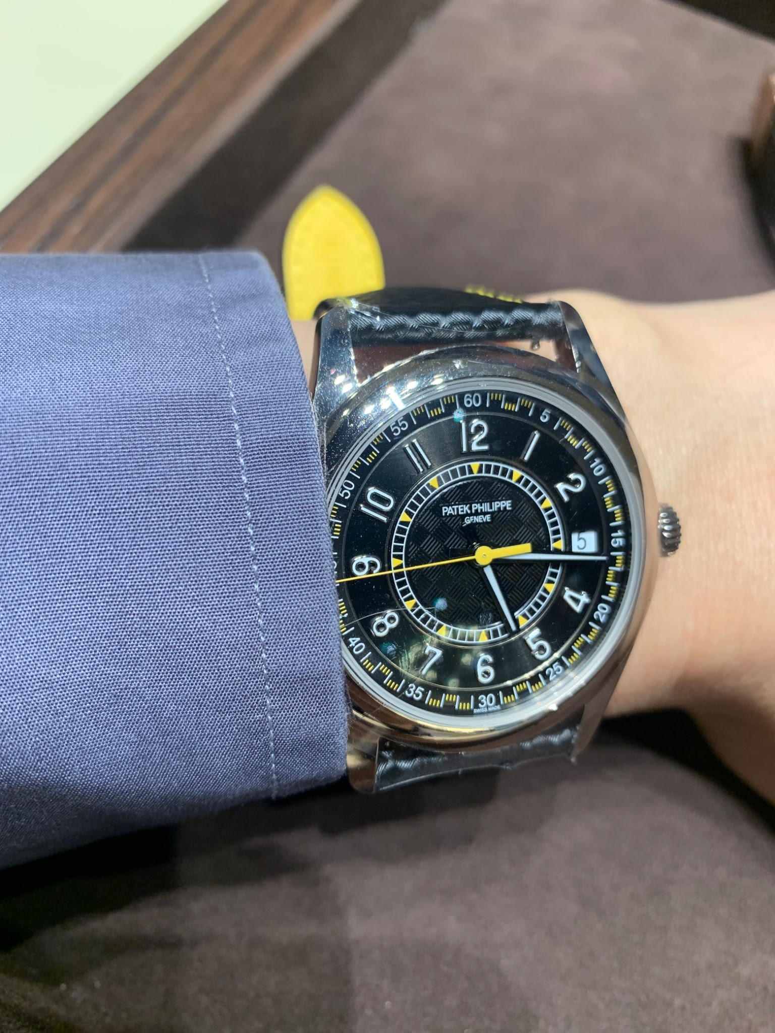
Inspired/Poisoned ☠️ by CBB’s post on 6007G, I had to go
see it in the metal !
Fortunately an AD has one for me to try.
Although similar to 6007A, the differences are striking and these changes create a dynamics and fun dial.
I was enamored with it my wrist ! 😃
Although I did not see the other two colors, I would bet that they are also attractive in the metal.
What is your take on three different colors ?

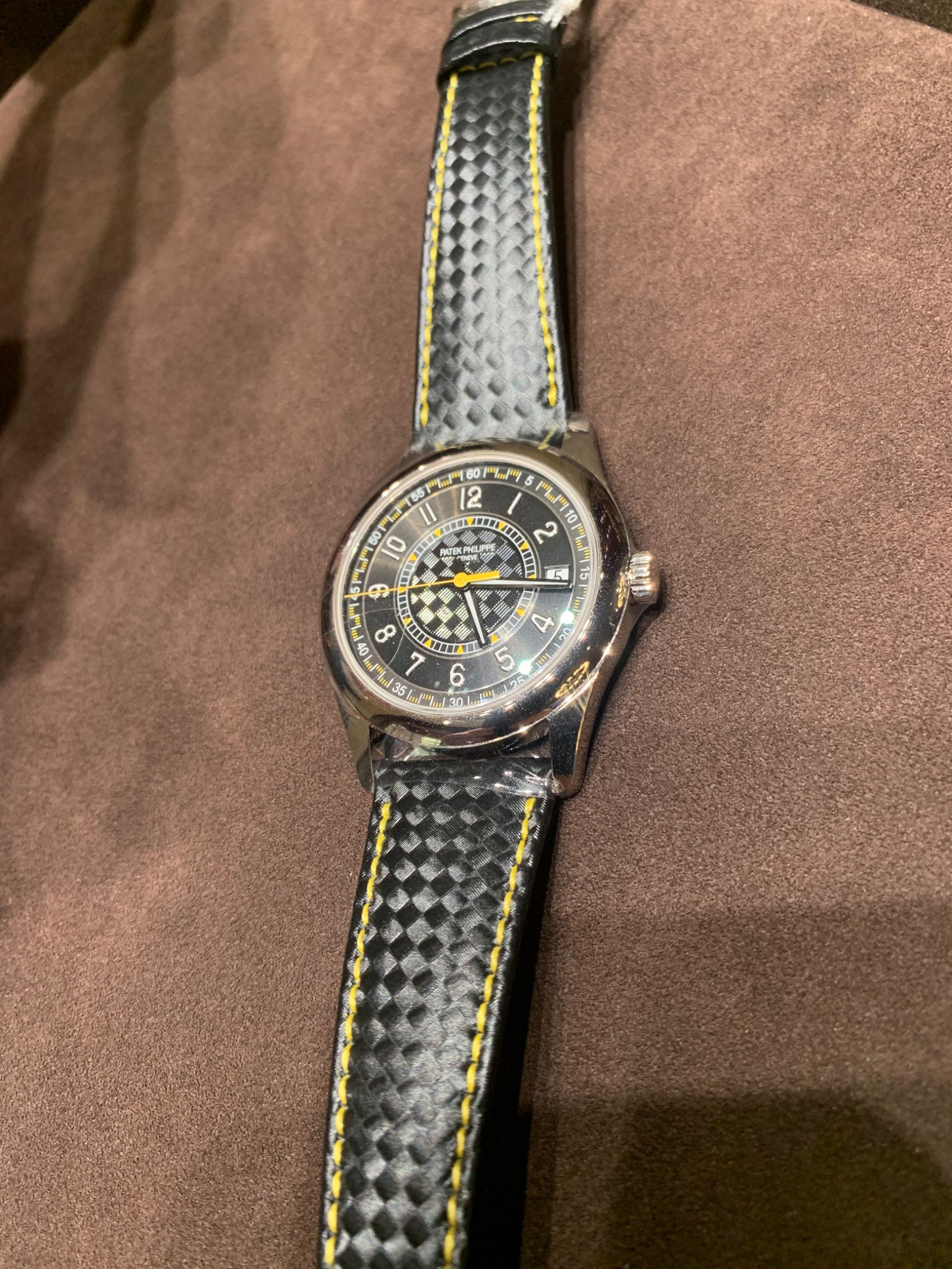
Embossing on the strap creates a carbon fiber pattern
The bottom of the strap being yellow adds a stylish touch !
Inspirational/Poisonous post by CBB www.watchprosite.com
Inspired/Poisoned ☠️ by CBB’s post on 6007G, I had to go
see it in the metal ! Fortunately an AD has one for me to try. Although similar to 6007A, the differences are striking and these changes create a dynamics and fun dial. I was enamored with it my wrist ! 😃 Although I did not see the other two colors, I wou...

good question Henry ! There was
no trigger to be pulled It was a display piece only :-(

Not my cup of tea, but it looks great on your wrist!
Sometimes I feel that this watch only gets recognized because it has a famous name on the dial - if it didn't have a famous name on the dial, would we still like it as much? But then again, it's perfectly okay that I don't like every single watch. And it'...

+1 I honestly wondered the same thing that you articulate so well…
there is nothing ground breaking about this release, and I actually don’t like the font of the numbers. I found myself comparing it to certain Omega Speedmasters, and those are easily more impressive in many respects, IMHO…but, they aren’t PP. Still, it’s...
Thank you for so politely expressing your opinion!
I'm okay with the font of the numbers on this piece. But the whole dial just looks off putting to me. It's not beautiful. And the date isn't beautiful neither. The 6000G - another sporty automotive inspired piece - had a slightly similar font. I liked tha...

Agree
Me too prefer both the 6000G black dial and the 6006G over the 6007G…. Personally the date window and the larger size is what I like less… but I think the 6007A looks quite appealing but mostly as it is in steel and the color choice is the main draw. Grea...

Low key
This is certainly one of the most low key Patek… I’m not sure if it is even recognized. Maybe a “safe” watch to wear in the streets again! Fun and colorful!!
Good point Patekfinity !
Not a safe queen but a safety queen to be worn out and about without being noticed because it does not like other hyped sports watches

Agreed, not too much but loud enough !
I guess the same will go for the red and blue. Just need to see them in the metal.

IMO brighter colors are used to
diversify the collection and to appeal to the younger collectors

your comments are funny ! :-)
Similar to me (enamel slave/addict), you are now the self proclaimed slave/addict to the "famous name on the dial" which represents a high % of the entire Patek collection ! Have you been dragged in ?

The color is lovely on your 6007A.
Rarity and historical significance wise, overall G is no match for the A !
That's a nice JLC AMVOX1 you got here... oh, my bad, didn't read the name on dial
seriously ? PP took all the codes from that memovox (even down to the fake carbon look strap), they just forgot the alarm complication ...
