
Seeks
3740

Hard choice indeed! I have started threads for both my ck2998..I love these dials!
.. and surprisingly the watch that gets more wrist time is the Black 😎 and was the watch I took with me when i visited Omega in Biel/Bienne last year.
Here are couple of postcards....
Best of health !


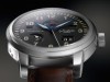
Omega Speedmaster 2998 Black and White.
Last week, I pored the blue and white version, here is the black and white. Funny how close and different they are... At the point we can say they are complementary? Official pictures, which are, for once, very good: My pictures, taken at the Bienne HQ: A...


Tough.. The blue and white with that relaxed contrast or the b
If I had both in my watch box, I might be reaching out to the b

It is a draw for me.
If I would not have the blue variant,then this one would be very welcome in my collection.
I had thought about that option.
But my next plans are more on consolidation of the collection than expansion. Getting older forces me to make choices….


Funny how different they are based on a few colour changes
I would vote for the blue. The b&w is more legible but screams a little too much. I would wear the blue one on a dark blue cordovan. An Omega FOIS is on my potential list, but with the traditional all black dial.

Hard choice indeed! I have started threads for both my ck2998..I love these dials!
.. and surprisingly the watch that gets more wrist time is the Black 😎 and was the watch I took with me when i visited Omega in Biel/Bienne last year. Here are couple of postcards.... Best of health ! ...
I seem to remember you doing a smilar blue/black poll a few moons ago..
Did Blue gather more votes than Black at that time ? Oh well...


Blue is identifiably Speedmaster. Black, . . .
. . . less so. The reason could be as rudimentary as the contrasting red script and chrono seconds hand. Blue is a departure, but without contrasting elements. Blue for me, and yes, I thought about getting it when it was introduced four years ago. Art