
AnthonyTsai
[PuristS]
22366

Panerai PAM359 - what are your thoughts on this new dial?
With Marc(Cap)'s recent posting of his new PAM359, how do you guys feel about this new dial design?
Are you indifferent?
Do you wish Panerai not deviate from their original dial design?
Do you commend Panerai for creating a new dial design?
Please share your thoughts!
Cheers,
Anthony
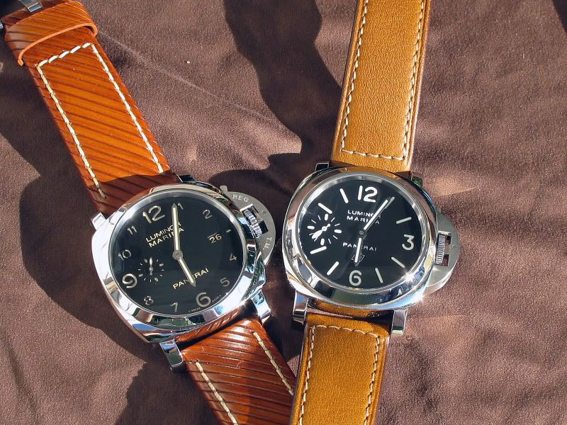
New PAM359 dial design on left
Photo by Marc(Cap)

New Release
Explore Panerai's 2010 SIHH novelties with AnthonyTsai's video and wristshot report. Get a real-life view of PAM359, Radiomir models, and more.
37 replies36002 views

Reference Guide
Compare Panerai PAM 249 vs PAM 448 California dials. Explore movement differences, historical links, and collector preferences for these Radiomir models.
26 replies23623 views

Review
Explore Panerai's SIHH 2012 Ceramica collection, focusing on the PAM 438 Tuttonero and PAM 441 Luminor 1950 3 Days GMT Automatic. Detailed review of design, movement, and collector insights.
11 replies12712 views

Review
Arie - Mr Orange reviews the Panerai Luminor PAM 574, comparing its size to an ALS 1815. Discover its P.1000 movement, unique features, and wrist presence.
18 replies9483 views

Collection
Arie - Mr Orange shares his journey acquiring the Panerai PAM 574, a smaller 42mm model after finding previous Panerai watches too large. Discover if it's the charm.
20 replies8122 views

Collection
Explore the Panerai PAM 366 and PAM 498 'FU' watches. Discover their differences, movements, and case designs in this collector's comparison.
10 replies7690 views
Panerai PAM359 - what are your thoughts on this new dial?
With Marc(Cap)'s recent posting of his new PAM359, how do you guys feel about this new dial design? Are you indifferent? Do you wish Panerai not deviate from their original dial design? Do you commend Panerai for creating a new dial design? Please share y...

Not my cup of tea.
Did you notice that the " 8 " and " 10 " are cut in the middle? Strange to see it on a Panerai, as this is a typo we saw on the Master Compressor Memo, since 2002. I'm more intrigued, not to say disturbed, by the blend of big and small numbers on this dia...

I don't like tea either
Not my cup of tea either. Just does not do anything for me, quite to the contrary. Regards, George

Innovative, intriguing, cute but.....
I wouldn't buy it....tomorrow. I guess it will take a while before I'll get used to it. Cheers - Sergio
Sorry mates, the font is not really new, nor are the 'cut' 8 and 10
It's really in the DNA and good on Panerai for using it,,, BTW, I like the 359 very much, the dial is very clean and aesthetically appealing. My 2 Asi...

Thanks for the historical feedback, Asi
On the cut 8 and 10. But, on the Mare, the numbers are equally sized, and there is no date! Best, my friend. Nicolas

yes !
it is True to Panerai's DNA.. i like the 359 a lot cause it's Unique compared to the Classic Luminor Dial. to me it doesn't make sense to collect a Bunch of Luminors that look almost the same.! so why not something Different??! nce picture Asi .!
That's how I feel too
I like it everytime Panerai makes these little but very noticable changes in a particular model. Gives us more variety of Panerai's to choose from. Cheers, Anthony


+1 Bruno.M1
the date window disturbed the strong design of a complete set of 12 sandwich numerals.
Maybe Panerai will create a date-less PAM359 version in the near future?
I think it's a good possiblity IMO. - AT
I like it but...
... I agree with earlier comments, the date does not contribute, it doesn't on any Panerai dial for that matter in my opinion. And it would probably be even nicer if you had all the numbers in the same size and while you are at it, get rid of the small se...
+1 Rob
the date window can be gone but not so sure about the small second. It would mean that they need a new movement variation? I wont fancy all numerals being the same size...i would like to see some kinda of visual focus at 4 compass points. Just my opinion.
I like the design concept, but not the execution....
The design certainly has historical roots in the old Panerai clock design, but I can't help but think that the font size on the 312, 320, 359 etc is just a bit too small.
For the PAM359, I'm warming up to the small hour numerals
If Panerai removed the date at 3 o'clock and replaced it with a large "3", I think the PAM359 dial would look extremely balanced since all the non-quarter hours are smaller in size. Cheers, Anthony...

agree with you Anthony and also suppress the sub second
at 9 in order to clean the dial My 2 cents, Patrickh
When I first saw the pics
I wasn't really a big fan of the 359. After seeing it more and more I'm starting to like it. The all polished case, patina on the dial and numbers make it stand out from the other similar models.

Beauty & Beauty of the BEAST
the 359 must be looked at in the context of it as a " elegant clean vintage like looking watch" , and as noted above true it already excited in panerais dial but that doesn't make it the norm ,the essence nor the DNA , panerai always been about being bold...
I would prefer it without the date and replace it with '3'....
I am yet to see the 359 on my wrist, so, it is too early to make further judgement on the piece... But I love the color of the numbers though... Just my 2 cents. Cheers and HAGWE,,,

I don't mind it at all
I do like the look of the dial a lot. I agree that without the date and a 3 and brushed case it would be cool! That been said I wouldn't mind if someone gave it to me !

Going have to decide when I see the 359 in person..
but in the pix i prefer 312. Best Drew