stromer
2453
stromer
2453

To date or not to date?
I am very late to chime in but it took me a while to make up my mind about the new Master Chronograph.
And even if you may not want to hear it any more it has something to do with the date display.
In general I am very pleased with the way JLC filled the Chrono gap in the Master line.
And I am not going to start again the discussion if there should be a date display or not.
Personally I prefer having a date on a watch that is intended to be useful. Which a Chronograph is by default in my opinion. But I can also live without a date. Real Speedies don't have dates and they have proven to amongst the most useful watches in the world.
But enough of that. There is a date on the new Master Chronograph, so let's talk about that. There are three things that I would like to add to the discussion:
First I would like to remind you all of the Master Compressor Chrono (eg. ref 1758470) that - I am informed well - houses cal. 751 also and has the date at the 6 o'clock position.
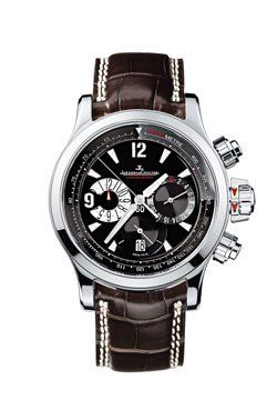
(picture taken from JLC web site)
So in technical terms that should have been an option. Probably it is none in aesthetical terms for the Master Chrono.
Second I absolutely agree with Nikolaj who painted a version with a horizontal date. Seeing the new Chrono I immediately remembered the previous model of the Master Hometime that showed very nicely how this would look like:

(picture taken from this post by raydbonz)
Third thing is the most serious for me. The designers chose the font on the date disc matching to all the other tiny inscriptions on the dial. That would have been very nice if there was not the large modern applied 12 on top of the dial. The classic font in the date windows contrasts to that in a quite unpleasant way. Again the previous Master Hometime - but also a 40 years old Memovox - can show how nicely better matching fonts of the date and of the large numbers on the dial work. At least it is a Sans Serif font. I think it is more important to make these two match than it is to match the date with the other tiny inscription on the dial.
So my choice would be: Leave the date out at all or change the design to make it look more like the old Hometime. The way it is now indeed makes the Chrono give away a lot of its great potential. Which I consider a pity because I like a lot the rest of the new Master Chronograph.
Of course this is my very personal option that none of you is expected to share.
Best,
Martin
Thank You Nicholas!
By: Robert206 : January 25th, 2010-16:15
Thank you for the report and beautiful pictures. This new model is a truly stunning surprise. I've posted a number of complaints on the other popular JLC forum regarding a lack of taste in design coming from the firm in the past few years (with a few nota...
Well, Robert, I'm one of these weird guys
By: amanico : January 26th, 2010-14:00
Who can appreciate these classic pieces, and at the same time some more audacious ones... I'm very happy to see Classics like the Chrono, the Memovox, and the Duomètre, not to mention the MGT Grande Complication, indeed. Please, wait for the Memovox post,...
Well, Goh
By: amanico : January 27th, 2010-13:49
I have a first information, which needs to be confirmed, but it seems that for the moment, a bracelet won't work on the new Chrono, as well as on the Memovox. Will have a confirmation of this information in a week, and will come back to you. Best, Nicolas
Wonderful...
By: Goh : January 30th, 2010-06:41
Thanks Nicolas for the information. The 'normal' version in SS with the heated blue hands would be my choice, along with the Master Memovox or Memovox Int'l. It is unfortunate that I was rejected for the forth-coming preview of the SIHH 2010 collections i...
Lovely, Lovely, Lovely...
By: nikolaj : January 25th, 2010-22:31
All three of them! I love the proportions and the dial lay-out and - whereas I would have been of a different opinion a few years back - I fully approve of the solid caseback on these pieces. I must give seperate praise of the chrono hands: Heat blued! I ...
Very nice
By: foullis : January 26th, 2010-00:19
Thank you the report Nicolas. Very nice, perfect robust/simply ballance. It looks like good for everyday wearing. Beauty hands, dial. SS case better for my taste... Cheers, Milan This message has been edited by foullis on 2010-01-26 00:21:06
Instant classic
By: AT : January 26th, 2010-05:03
I am really impressed, this looks like a watch for the long run. Love the rectangular chrono pushers and the overall balanced feel of the watch. This is the kind of watch you'd give for someone graduating or getting married and that represents the right v...
Absolute winner IMO
By: Starman : January 26th, 2010-06:07
Yes Nicolas, I think I fell in love with this watch the moment I saw it on the JLC website. I considered the Master Hometime a year ago, but went for the RDM. I felt there was something missing in the new Hometime dial. But everything else was superb; 40 ...
Hi, Starman
By: amanico : January 26th, 2010-22:55
When I first saw the noew Honetime, I was hoping that JLC adopts this case for their new releases, and that's what they're doing, now, with this new Master Chrono and the new Memovox. So, the case is an excellent point, IMO. The case back is not a big dea...
THX Amanico
By: nikolo FR : January 26th, 2010-07:06
It's really beautiful. I really love the retro look. The dauphine's hand are wonderful. So simple, so perfect. I agree the solid back, better than showinf a 976 like movement... A bit expensive maybe.. And i wonder why they put luminous dots at 3 and 9 .....
Thanks for
By: DaMctosh : January 26th, 2010-07:52
another of your tireless reviews, Nicholas. I have to admit that the Master Chrono was initially one the biggest disappointments IMO from JLC this year when I first read the SIHH 2010 news. I suspect many of us have been waiting for a classic chrono with ...
My thoughts.....
By: MiniCooper : January 26th, 2010-11:12
Thank you Nicolas for a great review..... A well designed watch but I do have some doubts whether this will be a successful one for JLC.... A very solid & retro design that does "hit" the heart of watch lovers..... a classic dial and a Jaeger craftsmanshi...
Fantastic...
By: Patrick : January 26th, 2010-11:30
Great review, thank you Nicolas. The watch is awesome and I like the engraved back, but it would appear that the gold seal is indeed a thing of the past. Not particularly bothersome, but a change all the same. Best, -P
About that date...
By: tee530 : January 26th, 2010-11:39
Nicolas - I'll add my thanks, despite your disclaimer. This is a beautiful watch, and a very worthy addition to the Master control line. JLC made the right choices with the size and the materials, IMO. The LE is my favorite. But that date window seems awk...
About the Date...
By: amanico : January 26th, 2010-22:18
If I remember well one conversation with Magali last year, she told me that the Cal 75X always has a date located at 4.30. So, if you use such a Cal, you can't modifiy the location of the Date. And indeed, if you look at the EWC, the Amvox II, or the MC D...
An absolute marvel
By: Maverik : January 27th, 2010-01:04
JLC did a very good job this new marvel. Thanks for the great review. How is the legability of the dials on the normal version? In the photo the silver on silver looks a bit hard to see. For that reason the Boutique edition seems to be the winner. As for ...
Hi, Rik
By: amanico : January 27th, 2010-03:57
To me, the legibility is not questionnable, on the SS normal version. I guess the choice between the normal and the Boutique Edition will depend on everybody's taste. Some will prefer the understated normal Chrono, others will better consider the Boutique...
I completely agree...
By: nikolaj : January 28th, 2010-00:05
That no lay-out can please everybody. Date or no-date, I am not so picky, but I must agree with some here that the angled date window stands out more on this relatively clean dial (compared to say the Amvox2). From a theoretical perspective, would it not ...
To date or not to date?
By: stromer : January 28th, 2010-08:51
I am very late to chime in but it took me a while to make up my mind about the new Master Chronograph. And even if you may not want to hear it any more it has something to do with the date display. In general I am very pleased with the way JLC filled the ...
Really thanks, Nicolas.
By: E.J. : January 26th, 2010-14:06
Nice review and awesome pics. I must admit that, when I´ve seen the first pic, a watch came into my mind.... the Duometre! Then, when I´ve continue reading your post I´ve seen that you made mention about it... By the way, an impressive, elegant, beautiful...
Nice
By: bimbeano : January 26th, 2010-14:50
Nice .... what's more to say, it is just a very no-nonsense, pure design. Doesn't it make one think of a VC chronograph or am i wrong here? Anyway, the caseback is crazy too and my favorite would be the SS. JLC has really done some beautifull things latel...
Many think of JLC as..
By: moc : January 26th, 2010-15:15
a big mish mash of dozens and dozens of models going from the most affordable reverso to the Gyro.A big pot where the Maison seems to discriminate and make money from the most commercial numbers in its collection(Reversos,master control etc..) in order to...
As I said, John,
By: amanico : January 27th, 2010-14:30
It may be a problem for some, not for others, but one thing is sure, with the 75X, it is not possible to put the date at another place... Heve a look at trhe Memovox, I will post it next week. Best, and thanks for sharing your thoughts. Nicolas
Hi Nicolas
By: vitalsigns : January 27th, 2010-16:03
Right, I understand that the date cannot be shifted without significant re-working, but my strong preference would be to omit the date entirely, which presumably would require much less re-working and IMO would have given it a much more classic look. The ...
Well, first of all...
By: dxboon : January 29th, 2010-21:31
...EVERYTHING is more chic in French, n'est-ce pas ? I think this new chrono is a great offering from JLC. A wonderful throwback, full of charm, IMO. I do slightly regret the date window, but for me it's not necessarily a deal-breaker for this piece. The ...
LOL, Daos...
By: amanico : January 30th, 2010-07:40
I think that after a while you tend to forget the presence of this Date Window on the dial... That was, at least, my impression after a while. Well, as you have your permanent entrance at the BH Boutique, it won't be too difficult for you to get one, IF y...
Wonderful post Nicolas!
By: bill2016 : January 31st, 2010-05:48
I agree, a superb watch. I feel it really fills a gap in the JLC line - a chrono in the Master Control range. It also fills a gap I feel missing in the watch market - a dressy chrono made by a top tier manufacture that is still reasonably priced - the onl...
Date? Yes!
By: fcwatch : February 5th, 2010-21:22
Hi guys! first I would like to congratulate this dedicated website and everyone who contribute to this great experience! Over the years I've collected many pieces myself and I have to say: such chronograph will not be appealing if it hadn't had a date! A ...
Thank You
By: fcwatch : February 6th, 2010-22:27
Thanks a lot, Nicolas! It is an absolute pleasure to join this community! I will try to input as much I can, as well as learn and absorb as much as I can from you all. It is interesting how you mentioned alarm, since it is one of my favorite complications...