bjacknot
125

So not a...
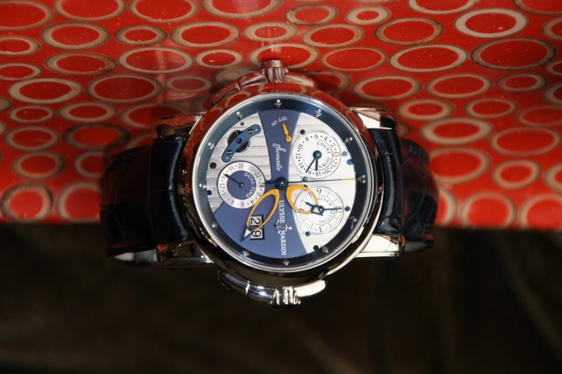
... not a lot like the watch photographed on the back cover on many watch magazines. I was expecting to see the triangular subdials for the countdown and alarm dials, a modernized cote de Geneva pattern in the lower half of the main dial and the Ulysse Nardin name to ride above the date on the right side of the dial. I really like the watch used in marketing materials, and I, too, am disappointed by how the current dial deviated from both the advertisement and the original. As an owner of the original I thought the Sonata should have remained in a classic case and not in a sportier case. However, I did like the advertisement watch and felt the transition to the sportier case/design was well done. The watch you presented fell short on this account and you summed up the appearance quite well.
This message has been edited by bjacknot on 2012-09-25 06:24:16
Available on the marketplace
374 Ulysse Nardin listings are live on the eBay market and 203 collector listings on the WatchProSite marketplace.


New Sonata.Impressions after handling the real watch

Dear Mo
So not a...
I n ever saw the promo pics you are talking about but..

man, that is BizzzEEEE
Mostel,the look and feel of the Sonata is an acquired taste

I actually like the new one...

From what I see here: no comparison for me
I won t Mark!

Call me shallow but the icing on the cake on the "older" sonata...
You are right!
The original... well original with the super red hands :-)

I need some time to anser you, and need more time to see it in the flesh.
To BJACKNOT and AMANICO
That is what I thought... That may be the best version for the latest Sonata.
A little better...
Mo Betta
One last chime in...
Interesting and quite surprising...
One picture for kicks...


Thanks a lot Mo for this great report!
Thanks fx

The final picture is most convincing.
Think you Michael
I like it
A couple more shots