Chimaera
359
Chimaera
359

Hmmm
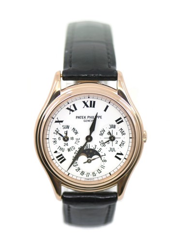
I think the discussion is cluttered by reducing comparisons to "it's a 3940" or "it's a 5140". As may have been concluded from my first post, the reality here is that the dial is in fact neither of those - it is a mixture of both, together with some altogether novel changes such as the hands and batons, as well as the colour. Also missing from the comparison is the treatment of the minute track: on original 3940s the fonts etc were necessarily small because the already small (relatively speaking) real-estate on the dial was not fully utilised because the minute track was stepped in from the dial edge. "My" 3940 has the minute track further out so the dial diameter/area is greater. The larger font is therefore capable of being accommodated, and indeed the larger font on the PP logo is consistent with the larger font of the day/month. In fairness I too would in fact prefer a smaller logo because I'm a believer (like all here) in understatement. I do wonder though if that would have created some disharmony against the day/month script that is nearby. Who knows, but beauty is in the eye of the beholder and we all have our preferences!
Available on the marketplace
Fantastic!
By: Mark in Paris : August 12th, 2015-14:18
First, thanks a lot for sharing these pictures with us, as it is a watch very rare impossible to meet today. I've seen the 3940P not long ago and was impressed by how elegant it looked, especially about the size. It is very unique due to the salmon dial a...
Re:
By: Mark in Paris : August 13th, 2015-08:55
Rcg, Chimeara took the time to share his detailed thoughts and pics about his rare 3940G, a watch we won't have the chance to see that much. If something is not your taste, I'm sure there is another way to say it, rather than "hideous". You wouldn't like ...
Logo2
By: rcg412 : August 13th, 2015-09:10
Mark. It's not a personal comment. It's s comment towards the new 3940. I love the 3940 and I think it looks awesome in the salmon dial. But the fact they took an elegant watch and added the oversized logo from the 5140 make it look unattractive! The eleg...
Hmmm
By: Chimaera : August 13th, 2015-09:32
I think the discussion is cluttered by reducing comparisons to "it's a 3940" or "it's a 5140". As may have been concluded from my first post, the reality here is that the dial is in fact neither of those - it is a mixture of both, together with some altog...
I do not think
By: dr.kol : August 13th, 2015-13:10
that a discussion "should the numbers be this or that" adds any value. We should just admire your rare perpetual and enjoy the very special colour of dial. I have just one question: I just had a close look at the London Exhibition version of 5070. Indeed,...
Re: and my guess
By: Mark in Paris : August 13th, 2015-09:41
I completly understand rcg, but it is the post of a new owner (not just a review of a watch in a detailer's shop) and it could be taken personnal. Saying " make it look unattractive" as you do now is much nicer! Of course we appreciate your honest opinion...
Fascinating...
By: Chimaera : August 18th, 2015-06:19
..fascinating, fascinating. Thank you for your comments and for furthering my education. This 3940 is indeed a strange one! Just one point of possible disagreement - I think the Geneva Seal certification process is limited to an evaluation of quality of w...
Geneva / Patek Seal
By: Chimaera : August 21st, 2015-02:16
Hi Moritz The difficulty is that as far as I know PP have not published the specific criteria needing to be met to merit the PP seal. In contrast the Geneva Seal is the subject of formal legislation, and regulations made thereunder. As such it is more tra...
exactomundo!
By: COUNT DE MONET : August 21st, 2015-03:00
That is also my opinion and question: is the watch still Swiss watch??? Or more specific: a watch made by the traditional Swiss way? To bear the Swiss logo it needs ONLY to be made more than 50% of the value in Switzerland. The Geneva Seal is going much, ...
Hmmm...
By: Chimaera : August 21st, 2015-06:32
This is a fascinating discussion. Let us also bring into account "advanced research". It is a matter of received wisdom that the ne plus ultra of traditional watchmaking is Switzerland - on that basis most everyone finds comfort in Swiss manufacture. But ...
Yes, interesting.
By: dr.kol : August 21st, 2015-07:05
But to be honest, I am not very worried about the "Seal" let it be Geneva Seal, Fleurie, COSC or PP Seal. The manufacturers are hardly satisfying the demand of quality by their clients with different seals. The end products must correspond with the expect...
Yes, precisely.
By: Chimaera : August 21st, 2015-07:28
As I said earlier, I get the necessary "warm & fuzzy" feeling from these pieces being PPs, not from one or other Seal. PP's No. 1 asset is reputation and we all know that those are very difficult to earn, and very easy to lose!
Yes and no :)
By: Mark in Paris : August 21st, 2015-12:06
I share your interesting point of view: what brings new material is not traditional anymore as the handmade crafting exercize is out of the equation for a Silicon part. That's why the word "traditional" is very important in your sentece. However, I would ...
Dear Count,
By: dr.kol : August 24th, 2015-01:32
I agree 99%. BUT: with silicon some benefits are achieved. I.e. longer power reserve, better accuracy, etc. Steamships were the original modern vessels and they were the romantic option in passenger transportation. The latest generation of passenger ships...
My dear Kari,
By: COUNT DE MONET : August 24th, 2015-01:53
I love your vessel comparison! It is not to turn back the time to have or sustain romance in our lives or in our watch lovers live's in particular. Steal for instance was able to reach mystical status when it was developed thousands of years ago, as with ...
My Dear Count,
By: dr.kol : August 24th, 2015-06:46
This is getting interesting but I can't express myself as well as I would like to. English is still a foreign language to me... Last time I spoke about vessels - let us speak about cars and take another perspective. I'm expecting a Porsche Targa 4 GTS. I ...
Off topic
By: Mark in Paris : August 24th, 2015-08:37
I couldn't resist to reply to your "Porsche turbo vs atmo" remark... as I just had the same thoughts since I heard about this in the 991 2nd Phase (to come in September maybe) or, more recently, the Cayman/Boxter. I thought this was maybe the right time t...
Thanks Mark,
By: dr.kol : August 24th, 2015-08:52
Often development is good, sometimes it is serving more the producer/other interests. When it comes to cars, I have my taste. I am often driving my wife's BMW 435ix Cabriolet and my god how I hate the turbo engine! With watches the same applies. I can tol...
Indeed,
By: dr.kol : August 24th, 2015-09:27
"traditional" is a better word. Like said, English is not my mother tongue. I have tried the six cylinder BMW M engine. I liked much more their previous V8 engine. What I like in the traditional flat six is the feel of power without any kind of turbo dela...