
Chromatic Fugue
1903

5960 photos and review
Hi everyone -- I posted some quick shots of my new 5960 when I got it a couple of weeks ago and promised to follow up with this review (and better shots). For the longest time, this reference wasn't really on my radar. Over the past 5 years, I've enjoyed reading the never-ending "5960 roll call" thread started by our friend keks. But I had never seen a 5960 in the metal; the only similar watch I had tried on until recently was its successor, the 5905, which frankly overwhelmed my wrist. I had thus assumed that, at 40.5 mm, the 5960 would also be too large or at least too top-heavy. I was very pleasantly surprised to learn otherwise when I happened to see a pre-owned one for sale a month ago.
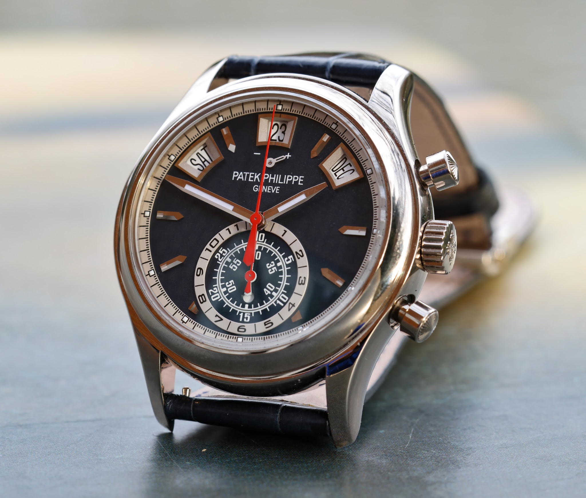
I didn't buy that particular watch, but I was intrigued. I spent hours reading through this site, asking questions of current owners, and comparing various photos online. I eventually decided in favor of the final variant, launched in 2017 and recently discontinued (along with all other 5960s). This is the 5960/01G in white gold, with a matte blue dial. There were a lot of extremely subjective criteria I thought about when making this choice.
First, I wanted something versatile I could wear with jeans, etc., and this version seems slightly sportier than its platinum or rose-gold cousins. And I'm a sucker for red accents.
Second, although I love the steel models, I prefer somewhat heavy watches to light ones, and the steel models become pretty light once you remove the bracelet (as I would have done). That said, this version is *extremely* similar in appearance to the drop-dead-gorgeous black-dial steel version, except that the dial here is matte blue rather than gloss black (and has the tasti tondi pushers).
Third, so much of the soul of these watches lies in the execution of the "bullseye" in the bottom of the dial; the bullseye on this model seems particularly well-integrated with the rest of the dial. The blue in the interior predominate as a microcosm of the blue of the dial as a whole, and the reasonably thin silver outer border is a microcosm of the silver race track along the edge of the main dial.
Fourth, there are a few small details on this version that I love, including the framed borders for all three windows (rather than just the date window, as on the other non-steel versions) and the tasti tondi pushers (see photo below).
Some impressions after a couple of weeks. I swapped out the original tan strap, which didn't really work for me, in favor of a blue strap that the seller threw it for free. It isn't my first choice of strap, but I've special-ordered a shorter strap with white stitching, which I think should work pretty well. I'm also pleasantly surprised by the wrist feel: I was worried that the watch would feel top-heavy or floppy, but it doesn't. The watch is generally very legible as to the time of day, even when the hour and/or minute hands overlap with the bullseye. My only critique is that the hour and minute hands sometimes obscure the chronograph reading within the bullseye. But that "flaw" is obviously inherent in the nature of this movement.
So overall, I'm very happy. Here are some photos showing why!


5960 photos and review
Hi everyone -- I posted some quick shots of my new 5960 when I got it a couple of weeks ago and promised to follow up with this review (and better shots). For the longest time, this reference wasn't really on my radar. Over the past 5 years, I've enjoyed ...

Yay! Major congrats on this acquisition. I own it too
and it is exactly the details that you mention that sealed the deal for me over one of the platinum versions that I also looked at extensively. A beautiful watch that packs a lot of punch with no less than 4 complications (chrono, flyback, annual calendar...
Thanks!
Yes, it’s a curiously under-hyped reference for all it offers. Which is of course great.

The chrono is great..
apart from the visibility issue I mentioned. Very glad that it records up to 12 hours rather than 30 minutes (and not sure why the larger 5905 abandoned that feature). I’m also glad that it’s vertical clutch, enabling us to keep it running without concern...
To be clear —
visibility isn’t an issue with the hour and minute hands. The issue (which isn’t a big deal) is that the hour and minute hands sometimes eclipse the chrono hands — for example at 4:25. Eagle vision wouldn’t be able to solve that problem! Otherwise I’m wit...


Lovely review
Thanks for sharing your thoughts! I have long been a fan of this reference and it is great to see that it is slowly getting the recognition it deserves. In my opinion one of the most interesting modern references by Patek. Mainly as it appeals to a wide r...
And many thanks to you for
starting and maintaining the roll call thread, which sparked my interest!

great review and pictures
I am torn but tend towards the pt version - surely it is a top collectible watch in any iteration

Just a fantastic watch
I owned the white dial steel version for a time. I believe we have different wristfeel preferences--I was extremely happy with the lighter weight of steel. Nonetheless, I think that if I were to get one today, it would be your version. The blue dial and, ...
I do love that white dial steel version.
As they say, there are many 5960 variants, but this one is mine.

Thank you for the review!
This is one of PP‘s best. I have been tempted for years but I am constantly flipping my preference among the different variants. Time will tell…
You do really need to handle them in the metal.
And one will smile back more than the others …

Congrats on this wonderful watch and thank you for sharing your thoughts.
The 5960, for me, is the most appealing of modern Patek. I've fallen for it years ago, its modern sporty classic watch. The wrist feel, the presence, the look, its a sexy watch. I97% perfect watch for me and the only thing missing to make it a perfect wat...
That would be nice …
but I must say it’s great to have pushers that are ready at a moment’s notice and don’t screw down.

Thanks for the fantastic pictures!
All of the iterations of the 5960 look great. Looking in shop windows I was never very keen on this white gold version on the original brown strap, but once it’s on a blue strap it looks super to me. Enjoy! All the best, Jon

Beautiful watch and pictures.
Looks perfect on your wrist. Congrats, and enjoy the beauty.

Thanks so much for writing this interesting and detailed owner's review !
The framed windows represent a great touch indeed. Love the red hands which accentuate the dark blue dial very well ! Enjoy it often.