
i_am_Sam
2841

A Photo Essay of the PreVendome Logo
We've seen many PreVendome Logo picture over the internet. But rarely we see many detailed picture of it..
Here's my attempt to capture the beauty of the PreVendome Logo...
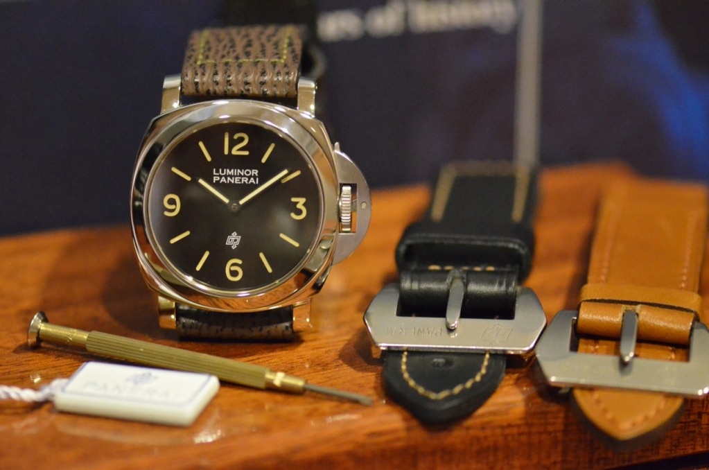
I really think that the pictures can tell you more about itself...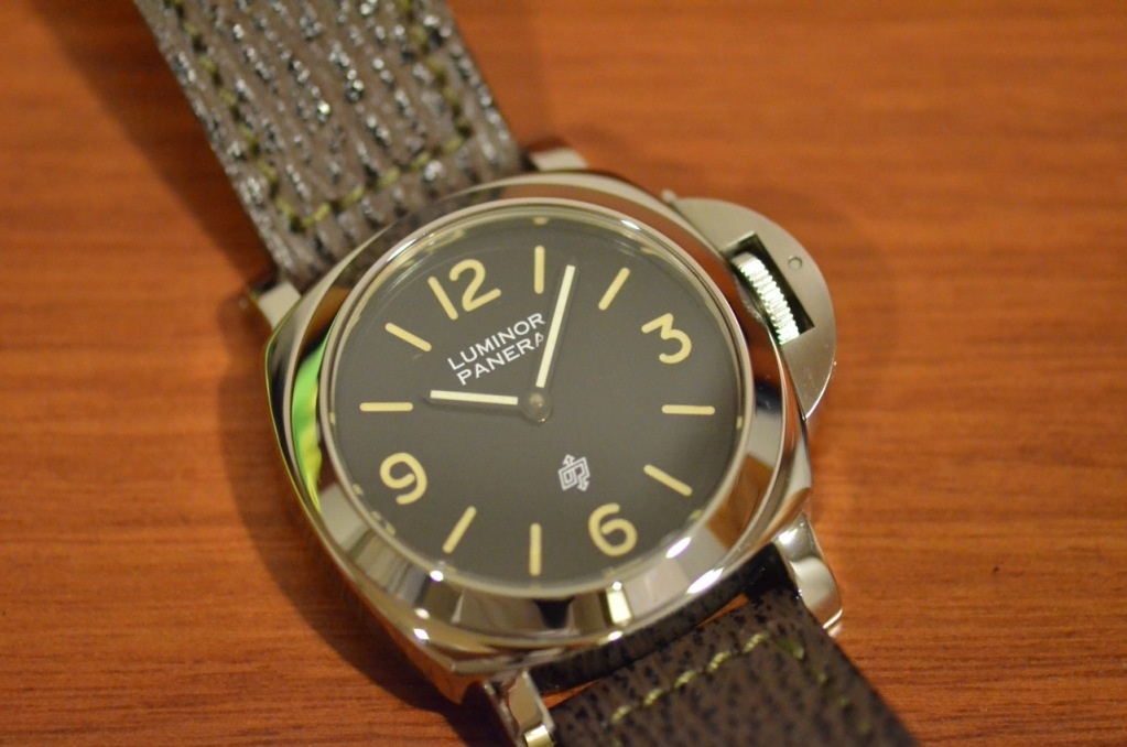
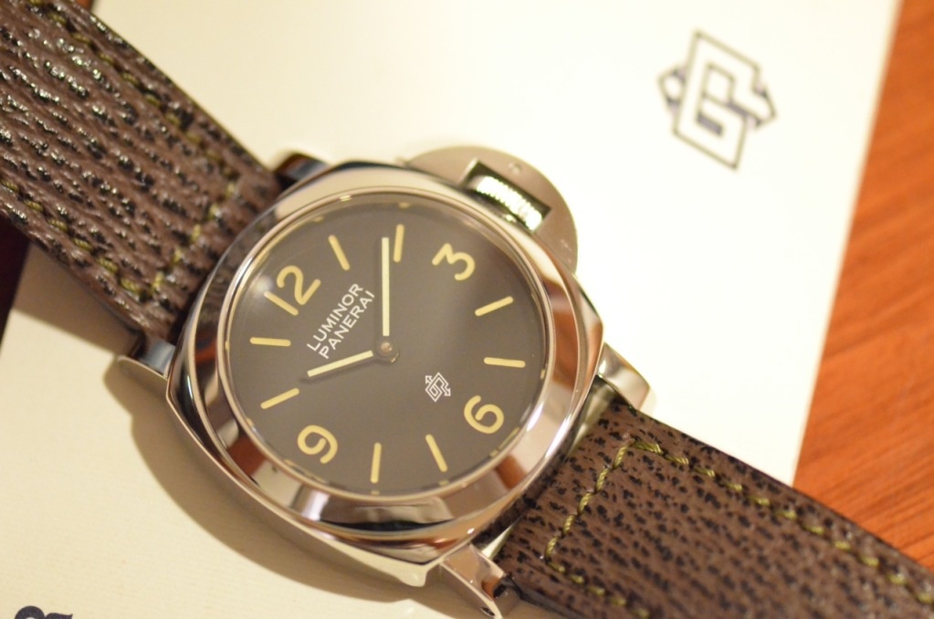
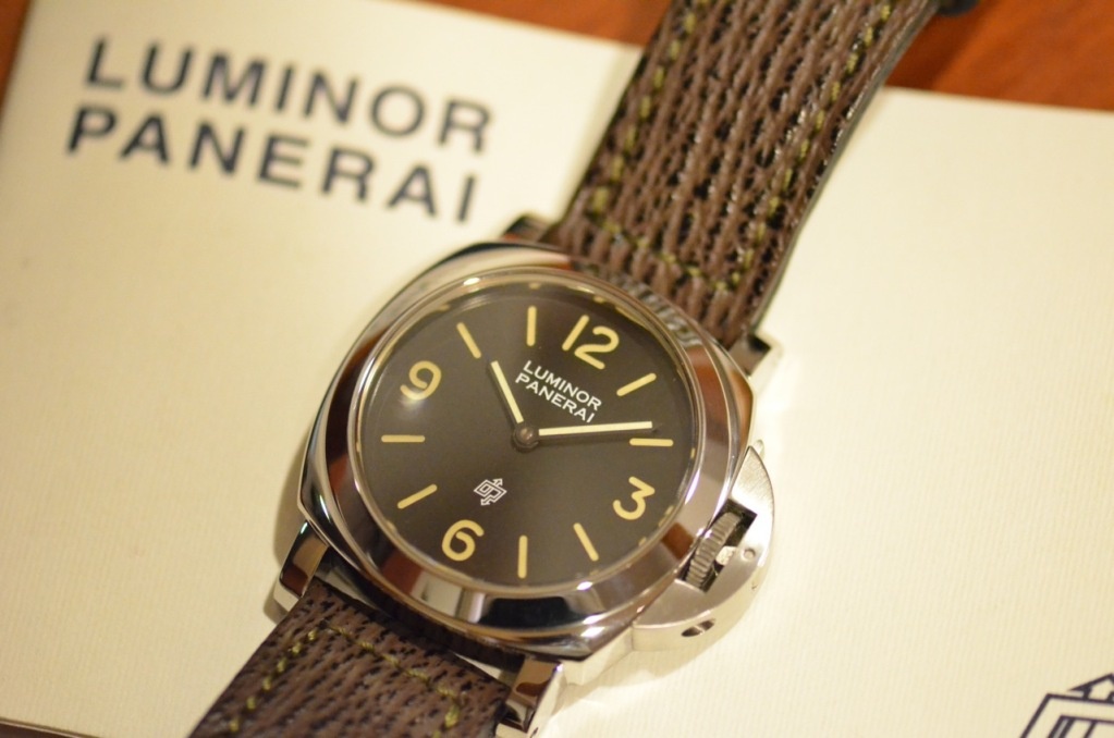
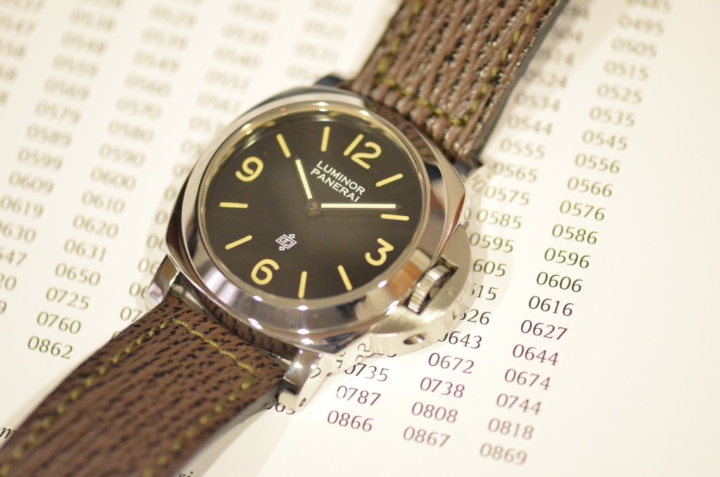
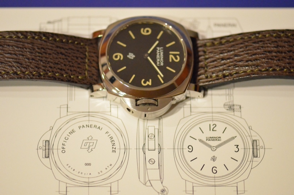
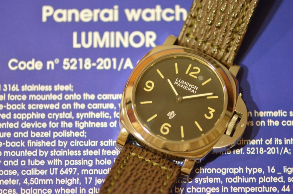
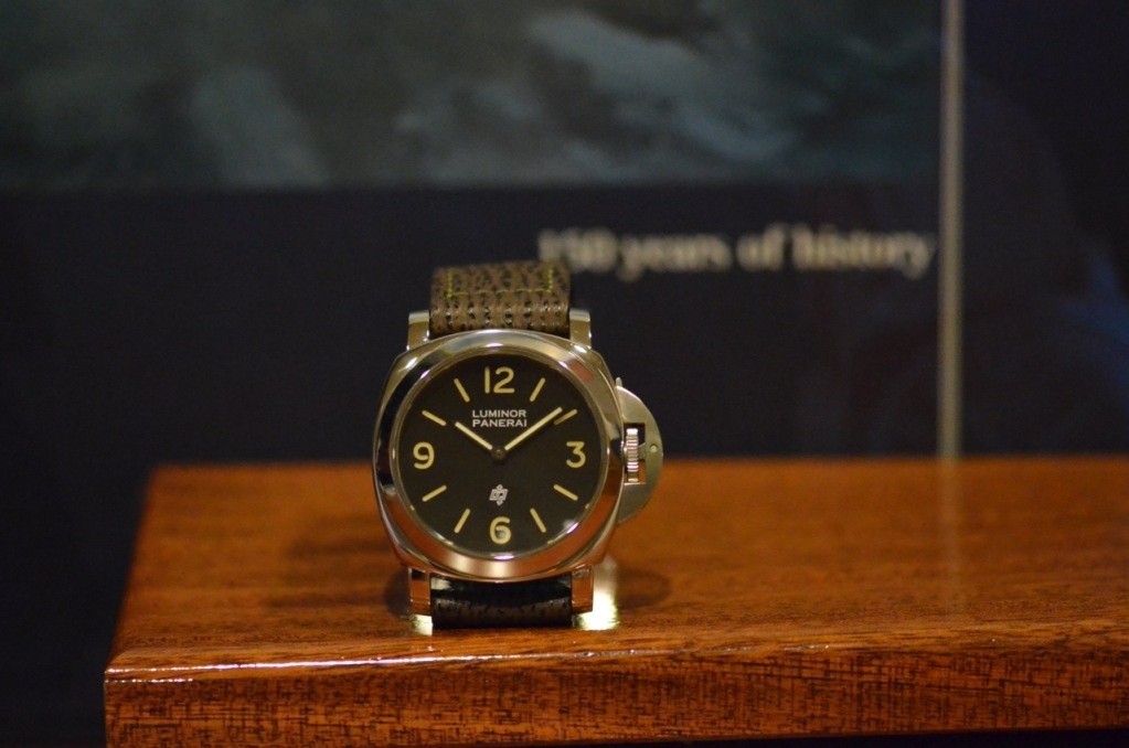
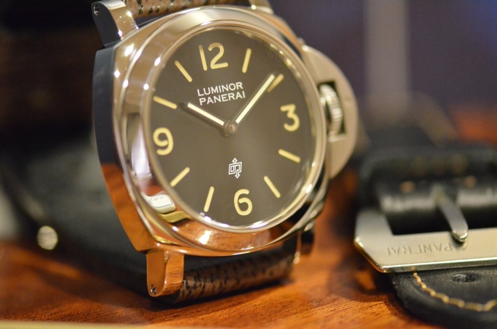
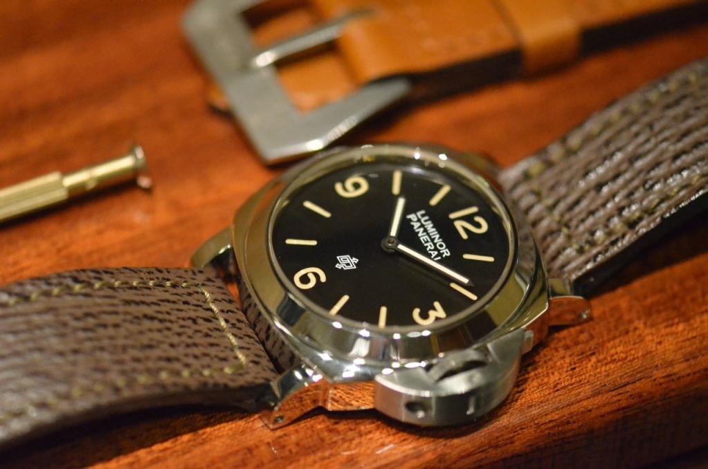
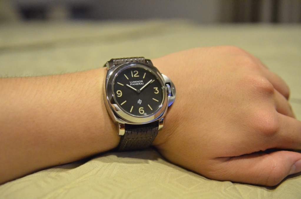
We can see from the picture bellow the details on the dial..
How the black dial can appear a bit brownish in different light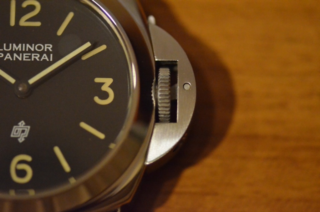
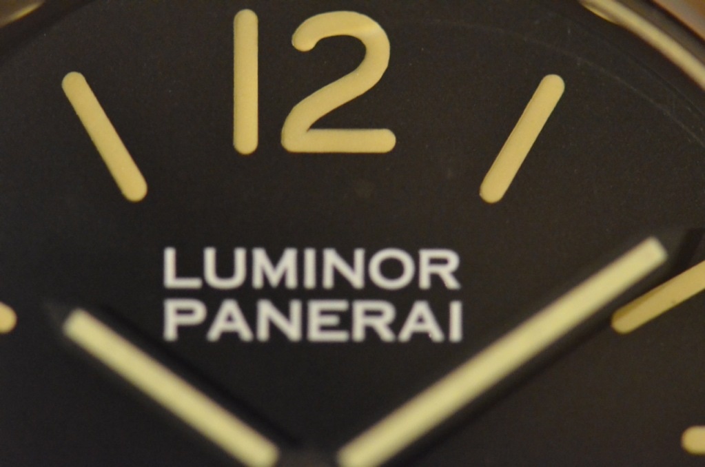
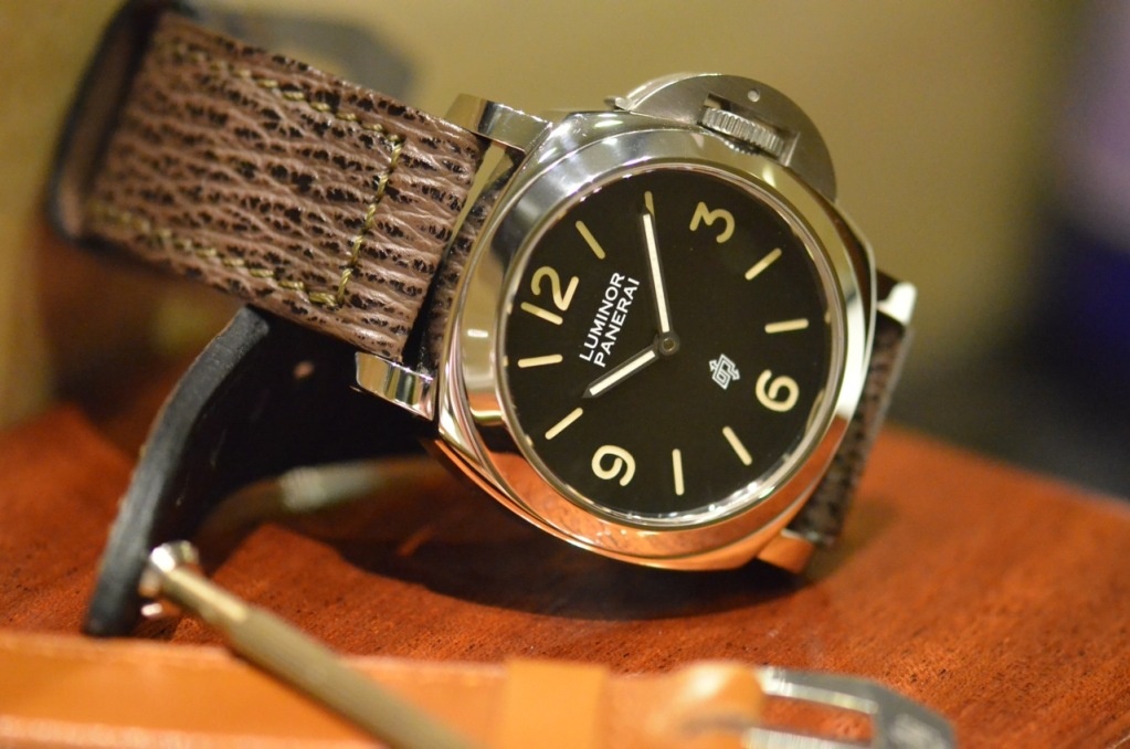
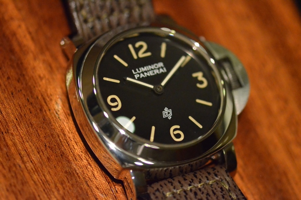
What I want to show here is the font used on the PreVendome models are different from the Vendome models..
It's a minor detail but it makes big difference if you compare it side by side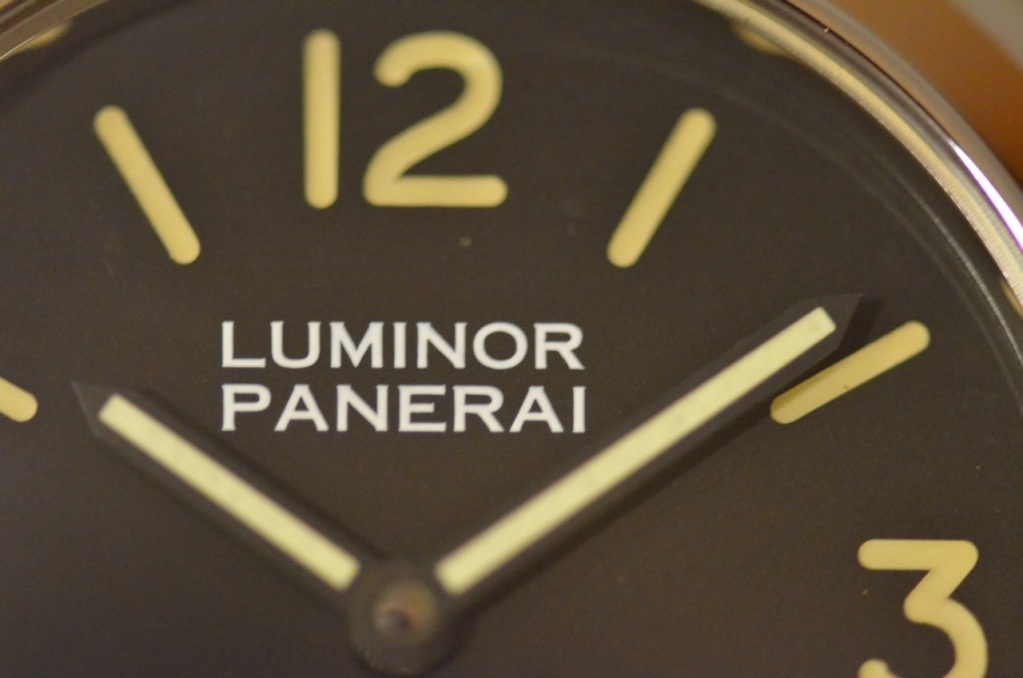
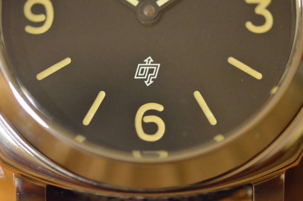
The FAT, creamy colored Tritium Index are just beautiful...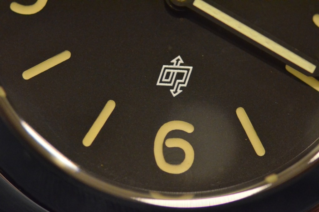
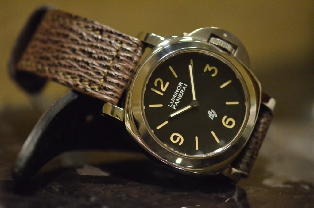
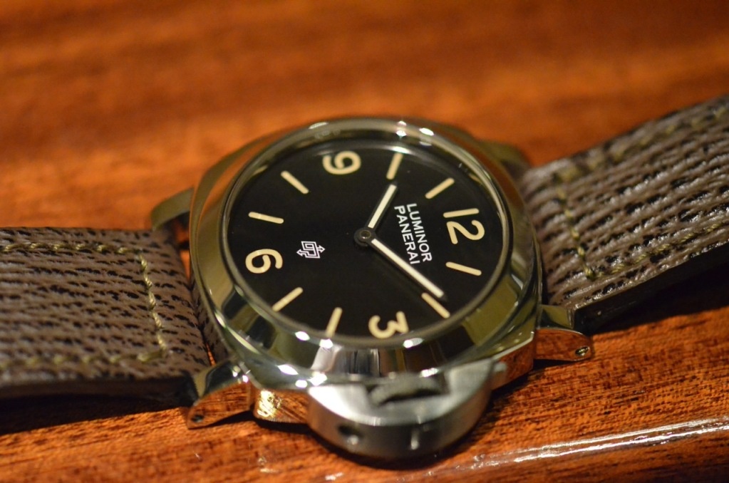
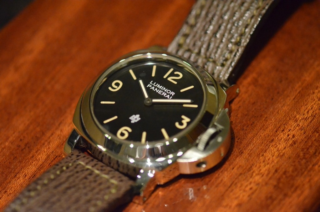
We can see clearly how the dial is closer to the crystal compared to the Vendome models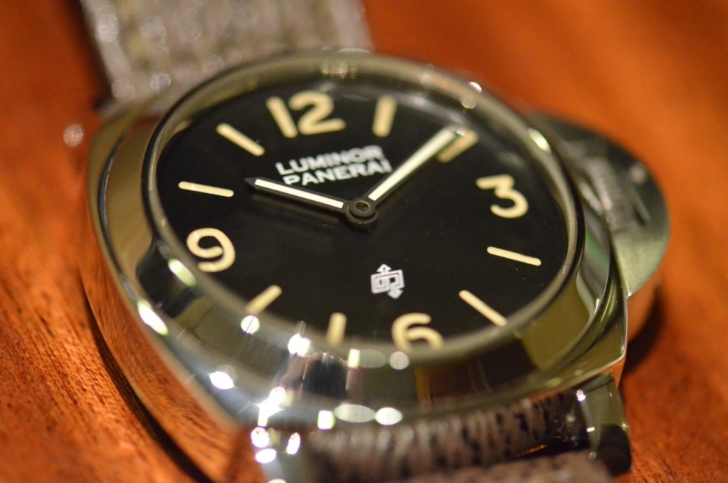
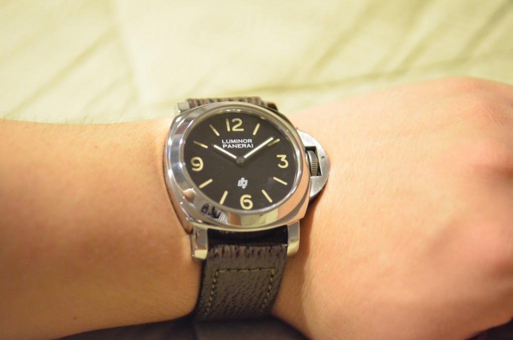
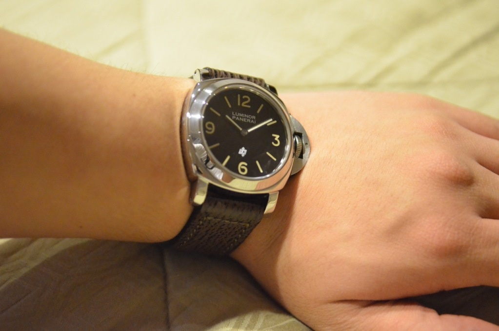
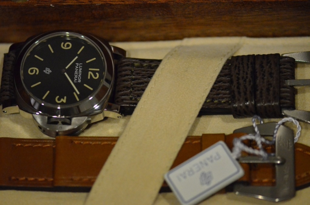
I will always say this, I really love how 44mm Luminor sits on my wrist...
It just feels perfect.. It looks rugged but still "polite"
Best,
Sam
This message has been edited by samrotandi on 2011-04-06 10:35:15


A Photo Essay of the PreVendome Logo

Nicolas..
Thanks again Nicolas!

Great photo essay!
Thank you Phil!


so true
That's right Tony...

U should use the 7D instead,LOL. Seriously, very happy for you


Thanks Ed!

No woman was or will ever be loved.....
I do love it very much....

Your photography has improved with your growing collection!
Thanks Horo!
Great pictures. !!!

Perfect catch sam, but
Well....
excellent choice Sam

Great photos!!
It is, Anthony...
