Comments:

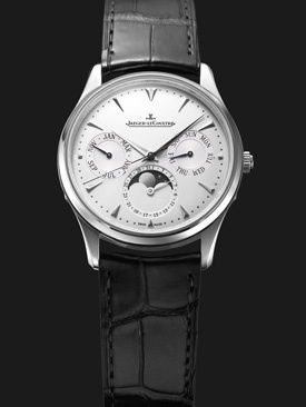

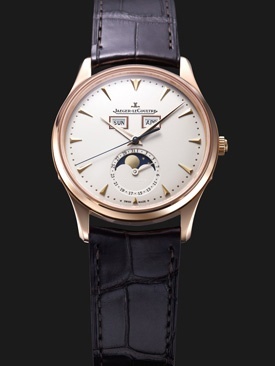


Then, not the 2, ugly, nor the 3, too Patek.
On the base of the first one, I would remove the date from the moonphase indicator, to put it all around the dial, on the outer part of the dial, like on the Vintage one.
38 mm would be a perfect size.
Aaah, date in red, please.

Best,
Nicolas



... 3 is more legible. But we still have the issue with the pointer date, so in fact Foversta's Lange example is the best choice!
Andrew

altough I really like the new mut moon. Its not a triple calendar but its superb, except that I don't understand why they have to add 'automatic' below the moon phase....



IF....we had a triple cal manual..what would you prefer, 1,2 or 3???
MUT moon 1
MUT moon 2
MUT moon 3
Fun!
In my eyes #1 looks really cool - perhaps partly because of the metal. Such a watch in the size of 33-34 mm would also make a nice watch for the ladies.
Best, Kari
3 for me... very JLC...
About the number 1... you also have the Lange option:
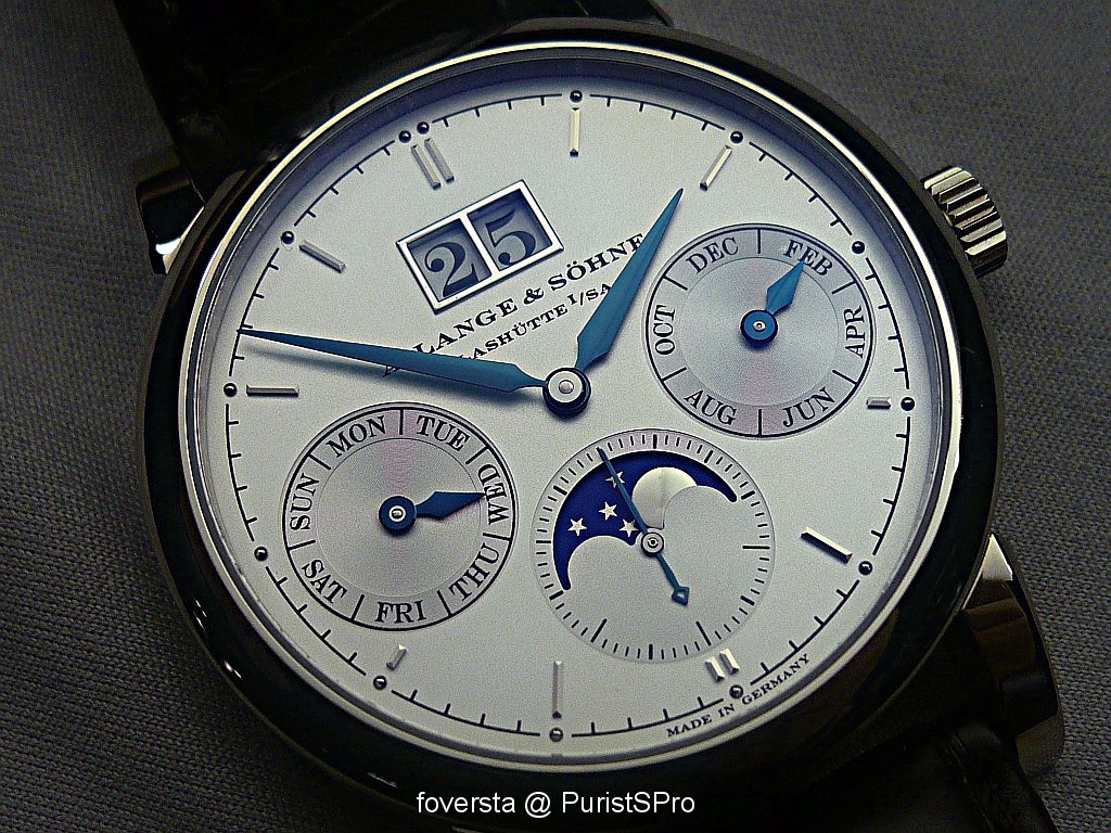
After all, the big date system comes from JLC...

Fx
After all, the big date system comes from JLC...
Fx
I would first dream about some tear drop lugs.
Then, not the 2, ugly, nor the 3, too Patek.
On the base of the first one, I would remove the date from the moonphase indicator, to put it all around the dial, on the outer part of the dial, like on the Vintage one.
38 mm would be a perfect size.
Aaah, date in red, please.
Best,
Nicolas
Like this?
Would you make an exception for a color metal watch then?

Best,
Tyler
Cover of Zaf's book
Best,
Tyler
So this is 1b - or maybe rather a number 4, moving on top ! :))
Variant of 1 - with the appeal of the
fabulous Vintage TDM, how very nice !
- Tear-drops , drops of hope..
- Black dial (?)
Pls let the Red arrow for the date pointer re-appear.
- 39mm sounds great
All what is, has been ( Ben Akiba, I think)
- to a degree..
Best,
Hs
PS:
- for sure not no 2, BTW
fabulous Vintage TDM, how very nice !
- Tear-drops , drops of hope..
- Black dial (?)
Pls let the Red arrow for the date pointer re-appear.
- 39mm sounds great
All what is, has been ( Ben Akiba, I think)
- to a degree..
Best,
Hs
PS:
- for sure not no 2, BTW
I like # 3
To me, it seems the more balanced, and less cluttered of the two. Yes, the hands will ocassionally obscure the month and day windows in a way that makes them difficult to read, but I feel that it's a small price to pay for a cleaner look and to make it easier to use the watch for what I'd be doing 90% of the time: discerning the time of day.
Both 1 & 3 look great to me...
I would also agree with amanico that moving the date from around the moonphase to around the edge of the dial, with a red, or perhaps blue, date hand would be another option.
Perhaps drop the sweep second, and fit a sub-second instead.
Some teardrop lugs, about 37-38mm, and then it would be perfect.
No. 3 is a bit 'vintage Patek', but in this case, that's not a bad thing.
Thanks for sharing these mockups, I really like them.
grumio
Perhaps drop the sweep second, and fit a sub-second instead.
Some teardrop lugs, about 37-38mm, and then it would be perfect.
No. 3 is a bit 'vintage Patek', but in this case, that's not a bad thing.
Thanks for sharing these mockups, I really like them.
grumio
1 for a classic look, but ...
... 3 is more legible. But we still have the issue with the pointer date, so in fact Foversta's Lange example is the best choice!
Andrew
3 for me
altough I really like the new mut moon. Its not a triple calendar but its superb, except that I don't understand why they have to add 'automatic' below the moon phase....