
Writing on the dial... when, if ever, is it okay?
I was enjoying pics of a tourbillon today, when the whole spectacle was ruined by A BUNCH OF WRITING ALL OVER THE DIAL.
I am of the school that even the word 'automatic' is pushing it. But it occasionally balances a dial nicely, this one word. I'm guessing back in the day, to 'announce' the function of the movement was necessary... to know what you were getting into. Then, as the years went on, the word CHRONOGRAPH started popping up all over the place on dials... Somehow, this crosses the line for me (although there are exceptions). I just do not understand the need to explain what a watch is, when you can see what it is (an automatic you can not see, at a glance.) Finally, these tourbillons with writing in a circle on the outline of the entire dial, explaining 'dead seconds this and that, etc etc, etc.' is completely baffling to me. Why would I ever want this unnecessary description? As a collector, it's not needed--nor can it possible impress the layman, who has no idea what a dead seconds is anyway! I find all this writing to be a genuine dealbreaker for me. I like purity. Simplicity. Modernity. But not necessarily un-complicated watches. I love chronographs. I love perpetuals. Especially with the moon at 12, like IWC. I love moonphases, especially Lange... so this is not 'against' complications... well, anyway...
If I could I would erase these descriptions--all of them! I do not write '5 Fingers' on my hand!
 This message has been edited by Mostel on 2009-12-06 17:38:19

Completely Agree, Mostel
KIll off "Reserve de Marche", "Tourbillon" often placed around the exposed cage - what else would it be?
The only acceptable ones are "Chronometre" and even then I only like it on vintage pieces. Depth rating is OK (when it's not some stupid depth and actually meets ISO, not some in-house joke spec). Automatic is acceptable.
In any case, it comes down to aesthetics in the main part, and like you, I think it detracts.

I also agree
. Sometimes, like you pointed out, it is nice to balance a dial.As we have seen with some pieces (Ochs & Junior), no writing at all is needed!
br,
Dirk

I also have a fairly narrow view
If the watch has a solid case back I can see the argument for having "Automatic" on the dial as a reasonable person may not know it is automatic, especially if buying the watch a couple of decades after it was produced.
I have a harder time accepting:
- Chronograph, Hours, Minutes
- Quantiem Perpetual
- Tourbillon (unless it is not visible from the dial and the watch has a solid case back)
- The case material
- Extreem
- Limited
I could go on. My last three purchases have only the the brand name and in one instance the brand and model. My first watch has a lot of writing on the dial. I still love it as my first "real" watch, but there was a thread a few years ago about writing on dials that significantly impacted my view of the subject.

Agree, but not on 100%
A agree for "simple simplicity"... That is really good working method for desining a watch. And I really appereciate it.
But sometimes "overlettering" have sense.
"Overlettering" is very destructive for dial design when designer is losing taste and put letters just to fill the empty space. In that case I may wish only to fill some's empty space in his head.
cheers - Alexey from snowy Moscow
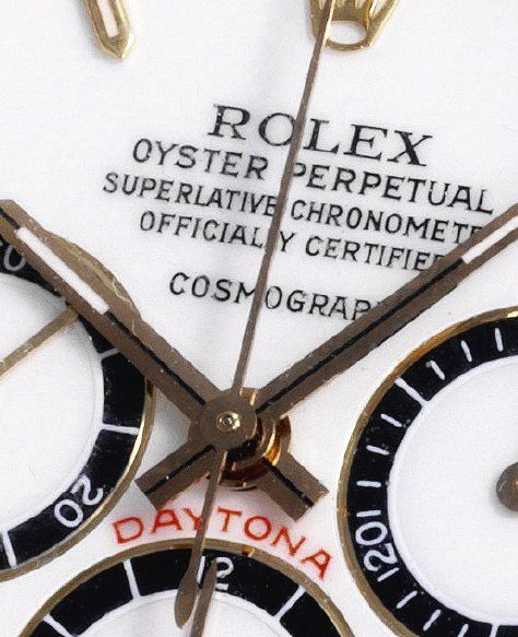
Rolex--no way to explain why--is an exception
I can't tell you why it does not bother me on Rolexes... but it doesn't. IN fact, as I've said 1000 times, my favorite casual watch is my Sub LV. Maybe because this sort of writing is 'very Rolex'?
Complete De-Badging
is my ideal. All the writing on the dial not only distracts from the design or even reduces legibility, in many cases it seems to me a sign of insecurity: we're not 100% sure that people recognise our product, so we had better spelll it out for them. IMHO, a strong watch design should speak for itself. Who here wouldn't recognise a Cartier Santos, a Patek Nautilus or a Jaeger Reverso at fifty paces? So why clutter up the purity of your vision with name tags, logos, self-explanatory dial labels or other such nonsense? Do we need to be reminded ever time we look at our watch that it is a chronometer, a chronograph, or an automatic? If they feel that this information is important, why not engrave it on the case back?
Just my tuppence.
Alex
Insecurity--indeed!
I have to agree!!! But I once mentioned this about a specific brand and got FLAMED in a big, big way. No one wants to think their favorite watchmaker is insecure and needs to write 'Muscles' on his biceps! (I totally, utterly agree with you!!!)
But again, there are exceptions. As noted with Rolex (for me) it's hard to explain why the exceptions are exceptions.... as with all things, personal taste. Thanks to all for replies! This message has been edited by Mostel on 2009-12-07 18:20:51

Ah...but there r anomaly
However, a little while ago i have fallen in love with perhaps the mother of all sin and did struggled...
pic curtsy of Kong
then i was secured enough with my feeling
after all, the cool come from inside
cheers,
Ed~

An example of de-badging.....
What do you think of the de-badging?
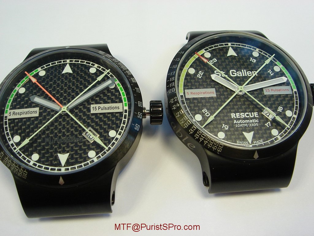
Right: Original St Gallen Disinfectable Rescue
Left: De-badged PuristSPro All-Black Rescue (PPro ABR)
Also changed yellow to green safety zone, all-red luminous seconds hand, stealth black SuperLuminova PPro logo at 6 o'clock.
The plaques for 5 Respirations and Pulsations are required as this is a pulsometer and respirometer. Otherwise, we would have removed them as well
$1500 plus shipping and your country taxes.
To order our club fun watch (PPro ABR), please send an e-mail to: ABR @ PuristSPro . com (remove spaces)
Do not use PM as that deletes your e-mail address.
Regards,
MTF
I definitely prefer the one on the left.

I have nothing against a light Writing, like the Brand, for example.
If it is not too visble, and if it is not located in a stupid place.
As we speak about Writings, what about a sterile one?
No marking at all, nor on the dial, nor on the case back...
Best,
Nicolas This message has been edited by amanico on 2009-12-07 23:12:09
Is that a (forgive my ignorance) Rolex?
Funny, Rolex would look naked without the writing. Thanks Nicolas!
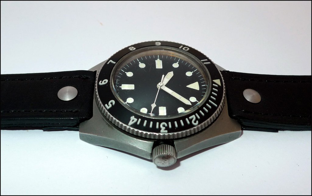
No, Mostel..This is a Benrus Type I so called Sterile because of
The total lack of writings...
A very special watch, used by the Navy Seals in the 70ies.
Best,
Nicolas

Well, I prefer a light writing on the dial....
I don´t understand the "books" writted in the dials, as happen in Rolex, for example. In Rolex I prefer the No Cosc models because the writings on the dials are no so "heavy".
In general, I don´t like the extremely writted dials. Less is more, I think...
In another way, I love the no writted dials, as happen in my ex-loved Cali...
Best
Emilio
I also thought about the Cali, Emilio. Nice example!
This message has been edited by amanico on 2009-12-08 08:38:40

i do agree too
i do agree with you about how writing sometimes on the dial creats a whole lot of mess, a non balanced look, on the other hand its true, a word or two on a dial wont pull someone trigger to gain knowldge in watchmking world, though it would for some but not all.
writing is suitable when needed and when the usage of the writing is contaning more than the brands name then that needs a justification.
Faisal

I happen to like
I don't mind a small "product line" nameplate, like the "ingenieur" at 6'oclock on the IWC or the "Delphis" on the Chronoswiss, nor a small indication, like the "Return a vol" on the Breguet XXI. I mind pointless indications, like writing "chronographe" on a chronograph, and HATE pointless subdial labels, like the recent Piaget chrono or JLC and any number of other brands writing "Reserve de Marche" over what can ONLY be a power-reserve indicator.
I am not a huge fan of the use of "Chronometre" or "Certified....", just because it takes up so much space. On the other hand, I am somewhat nostalgically entertained by the older Roger Dubuis with the Bullentin d'Observatoire.
A
I'm definitely not against the NAME of the watch on the dial
good point! I love the Ingenieur logo on the dial--I remember one old review of the original Inge--and it said that the name Ingenieur on the dial gave the watch its 'joie de vivre' and I could not agree more. I am 'mixed' on putting a number on the dial--okay, I'm against it. I'm also against the caliber on the dial--but not enough to be really against it., such as on the extraordinary Duometre... I wish it wasn't there, but is a quibble, in this case....
A time and a place...
...my own preference is dial as plain as possible. I like large areas of simple colour, broken up by centre seconds, or the motion of hands.
However this can lead to very formal ridge designs. How to add variety? The purist way is probably with a complication e.g. moon-phase or multiple sub-dials (chronograph). The short cut is probably writing- this gives the visual complexity that is inherent in a complication i.e. more information for the brain to process. Of course a hand-painted dial would have the same affect but in a different way.
Still- I couldn't agree more with your statement. Every watch I have ever fallen in love with was simple: IWC GST aqua timer, IWC Small port, IWC mark XII, IWC pilot dopplechrono, IWC yacht club, IWC Da Vinci Perp Cal.....maybe a trend is arising! All these watches only have IWC or international watch company and automatic on the dial (and automatic as well as swiss made is too much).