Comments:


BaselWorld 2017: (few) live shots from the Patek booth...
I have to say, as a Patek non-expert, that I like what I am seeing. Patek adopts increasingly a subtle shot on bolder elements (colours, details...) which I like (with the caveat I gave before). So here we go:
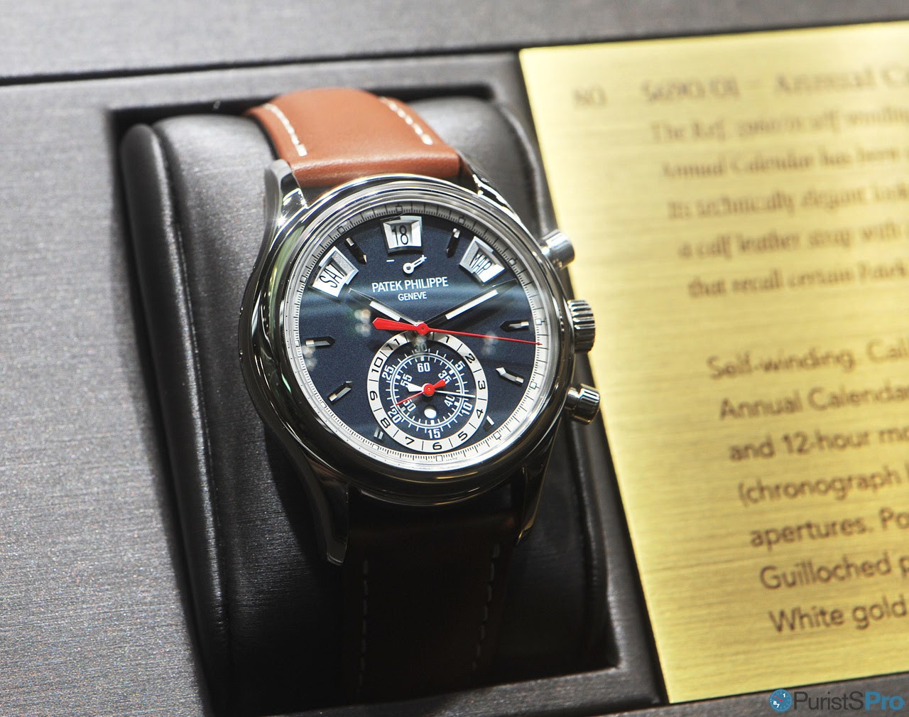
First one is the 5170P with blue dial and the baguette indices... lightning is not optimal I guess, but this one is very promising!

The 5960G makes all efforts to hide its deep dial structure in the press images - superb from what little these images might tell...
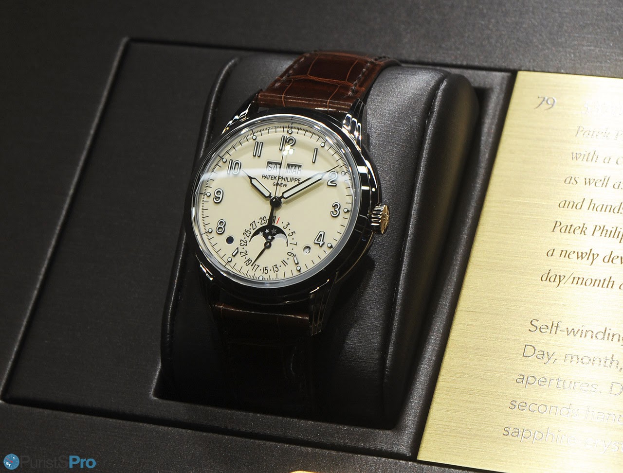
Also the 5320G Perpetual Calendar I guess is another victim of the lightning - not much to see from the new case shape. The applied arabic indices I guess must be well playing with the opaque dial face.
I still don't have an opinion on the 5940R - a solid entry for sure!

Wonderful, simply: the 6006G: the dial finishes is something I'd really love to see!

I already liked the chocolade brown 7130G World Time - with the new blue version Patek chose a very feminine blue!

7140G:

Simpler, but no less attractive: 4947G

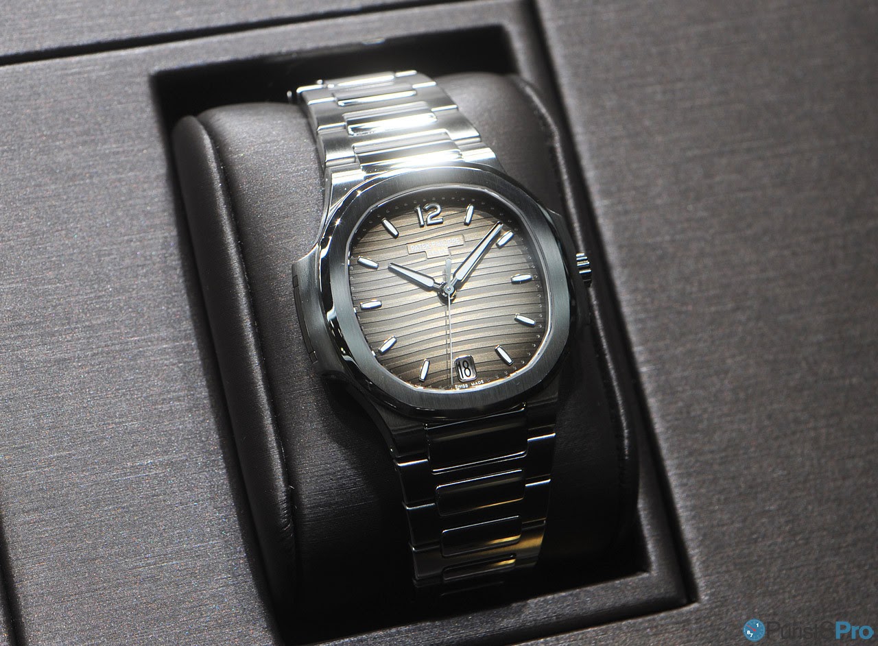
Two new dial colpours for the automatic Nautilus 7118/1A

And finally the 5072R

That's it quick & dirty!
Thanks for looking,
Magnus
First one is the 5170P with blue dial and the baguette indices... lightning is not optimal I guess, but this one is very promising!
The 5960G makes all efforts to hide its deep dial structure in the press images - superb from what little these images might tell...
Also the 5320G Perpetual Calendar I guess is another victim of the lightning - not much to see from the new case shape. The applied arabic indices I guess must be well playing with the opaque dial face.
I still don't have an opinion on the 5940R - a solid entry for sure!
Wonderful, simply: the 6006G: the dial finishes is something I'd really love to see!
I already liked the chocolade brown 7130G World Time - with the new blue version Patek chose a very feminine blue!
7140G:
Simpler, but no less attractive: 4947G
Two new dial colpours for the automatic Nautilus 7118/1A
And finally the 5072R
That's it quick & dirty!
Thanks for looking,
Magnus
Thank you Magnus!
Can you oblige with a photo of the 5078G if possible please?
Thank you!!
Your pictures are superb!
Thank you very much Magnus. This 5170P and 5320G look fantastic. I'm eager to see them in the real.
Have a nice time in Basel.
Best, Mark
Wonderful! Thank you
The 5170 5960 5320 all look so superb, wow. Patek really outdid themselves this year
The 5320 Annual Calendar is very appealing to my eye.
I love the numerals, hands and dial color.
M4
New movement?
While I know other perpetual have the base 324, I do not believe any other ones use this specific perpetual movement is that correct?
Yes, you're correct
Indeed the 5159 with retrograde date houses the 324 caliber but not in that configuration. Thus, I read the PC module is new.
Best, Mark
Very impressive line-up but the winner for me is the 5170P
The 5320G is also fabulous, but the 5170P has it all.
Beautiful blue dial, tachymetre scale and yet very different then the other 5170G versions.
The diamond hour markers do not disturb me a bit as I am not found of the Breguet numerals of the 5170P.
I will certainly cause some stir/fuzz when I say: at first sight I prefer the 5170P to the 5070P (especially BrunoM1 will react to this comment)
Preferences
I am with you on this... given a choice would choose 5170P över 5070P. But as you note I have no doubt there are some divided opinions on this.
5170P for me please
Thank you, that will be all.
Oh all right, one of those blue Aquanauts too, for my extreme sporting activities undertaken from a comfy deck chair on my yacht.
Best
E.
Oh all right, one of those blue Aquanauts too, for my extreme sporting activities undertaken from a comfy deck chair on my yacht.
Best
E.