
Wristenthusiast
486

Nautilus Dial differences, what do y'all think?
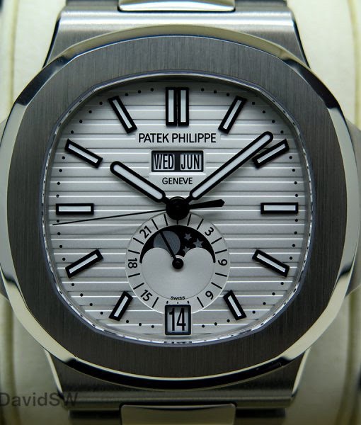
So I just realized that the white dial Nautilus 5711 as well as some of the newer Nautilus Chronographs and calendars have different dials than previous.
the old style has the PP/Geneve printed in-between the stripes (last picture) where the newer versions have made a small platform to print the PP/Geneve (first three pictures). what do all of you think? I prefer printing in-between the stripes, just like i prefer the AP printing on the Royal Oak to be over the tapestry as apposed to on a little platform. just wondering the crowds thoughts.


Comparison
Patek Philippe Nautilus 5711/1A vs. Audemars Piguet Royal Oak Jumbo 15202. Explore design, movement, comfort, and market value in this iconic comparison.
114 replies63898 views
Collection
JoshTheCanadian shares his 15-year journey to acquiring the Patek Philippe Nautilus Ref. 5712A, offering a unique perspective on its market evolution and wearing comfort.
6 replies4394 views

Vintage
Explore Patek Philippe's 'Million Dollar Dials' with Miranda, focusing on the historical significance and collector desirability of Breguet and salmon dials in references like the 570 and 5196.
19 replies6976 views
Nautilus Dial differences, what do y'all think?
So I just realized that the white dial Nautilus 5711 as well as some of the newer Nautilus Chronographs and calendars have different dials than previous. the old style has the PP/Geneve printed in-between the stripes (last picture) where the newer version...

Platform for me.
Although the printing between stripes is truer to the original and also maintains the continuity of the stripes, IMHO, the platform is more pleasing to the eye. Feels asif a little more thought and work has gone into making the dial.

Platinum with....
the plain white dial is to my tastes . Thanks for the pics! Cheers, Filip

