Comments:


Nautilus Dial differences, what do y'all think?
So I just realized that the white dial Nautilus 5711 as well as some of the newer Nautilus Chronographs and calendars have different dials than previous.
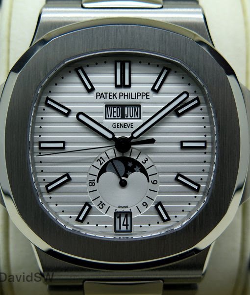


the old style has the PP/Geneve printed in-between the stripes (last picture) where the newer versions have made a small platform to print the PP/Geneve (first three pictures). what do all of you think? I prefer printing in-between the stripes, just like i prefer the AP printing on the Royal Oak to be over the tapestry as apposed to on a little platform. just wondering the crowds thoughts.
Platform for me.
Although the printing between stripes is truer to the original and also maintains the continuity of the stripes, IMHO, the platform is more pleasing to the eye. Feels asif a little more thought and work has gone into making the dial.
Platinum with....
the plain white dial is to my tastes  . Thanks for the pics! Cheers, Filip
. Thanks for the pics! Cheers, Filip