
small-luxury-world
[Patek]
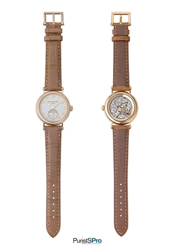
8725

Part V: COMPLICATIONS
Timekeeping instruments that provide functions beyond indicating the time and date are called complicated watches. Some are useful, some are romantic … and some are just beautiful – noting more, nothing less.
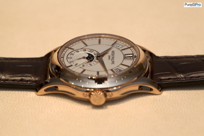
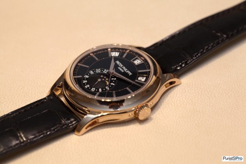
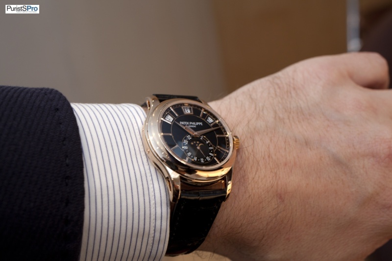
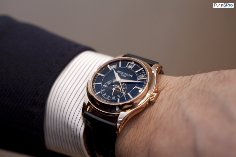
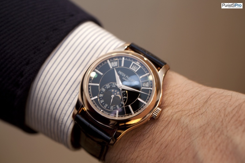
Ref. 5960P
There have been several versions before and even the black dial was introduced with an R case before. Nonetheless the P version with black dial is very addictive.
Live/wrist pictures :
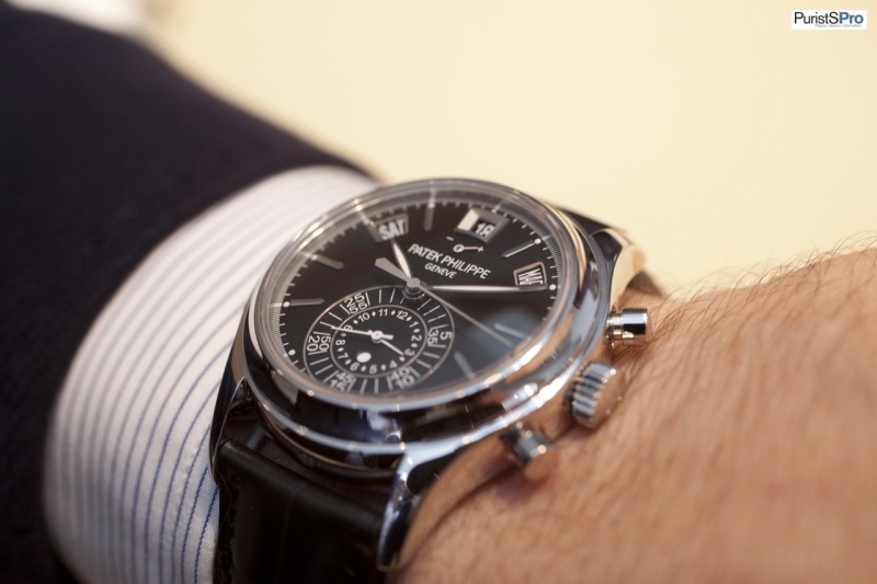
The latest version is probably the most wearable one, especially
when you have a smaller wrist and you are based in the western part of the
world. The black dial makes it look smaller and the white metal fits just
perfect. I can imagine quite a few people will fall for it 
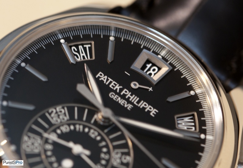
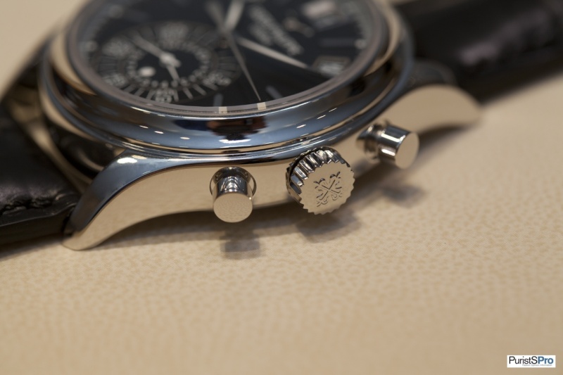
Ref. 5170G
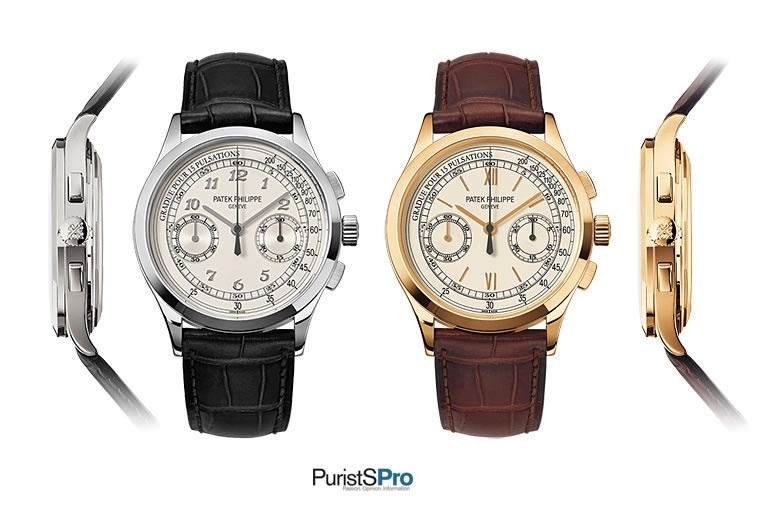
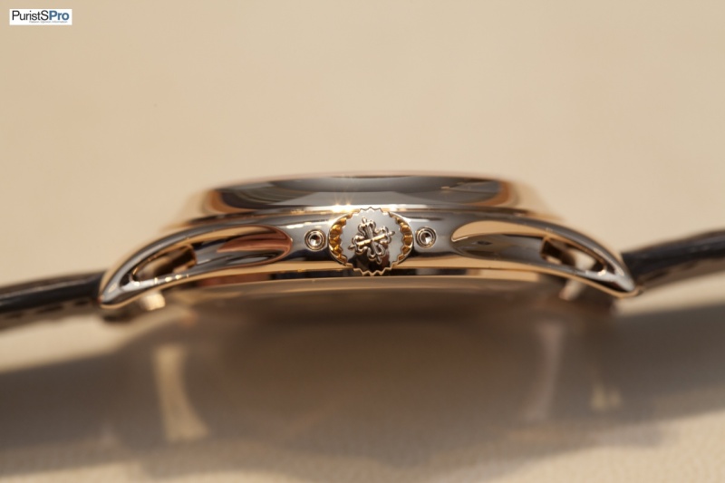
There already have been quite a few discussions around the 5170 in general and I trust all of you know the "technical" details.
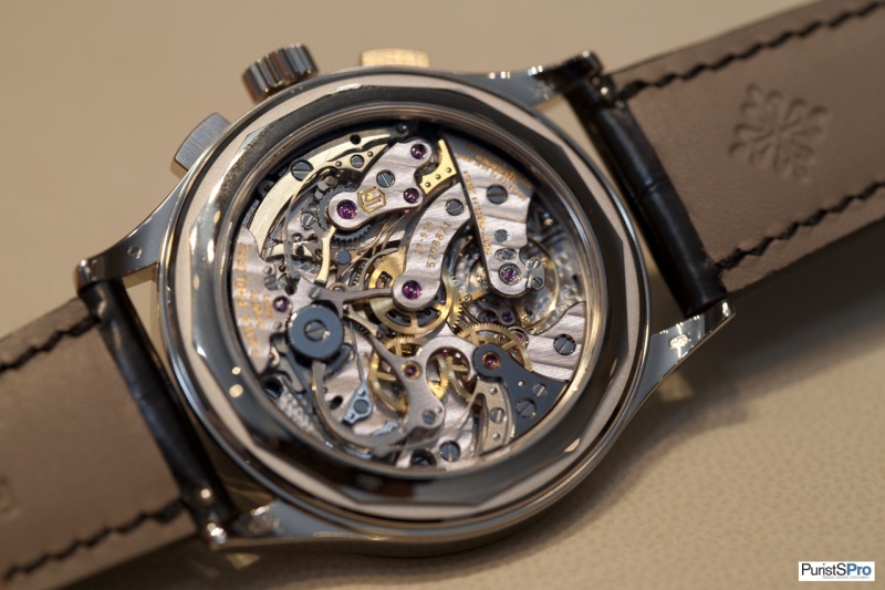
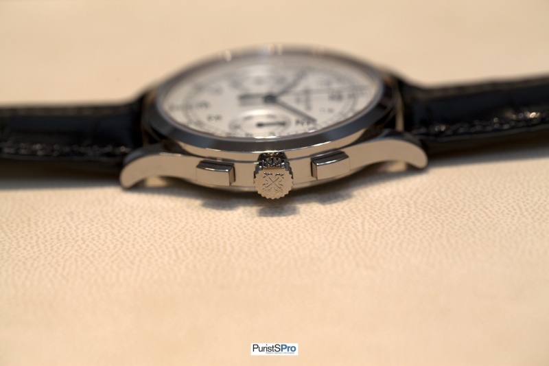
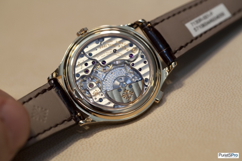
Nothing new on the back side and the side view looks familiar as well.
It gets different when we look at the dial.
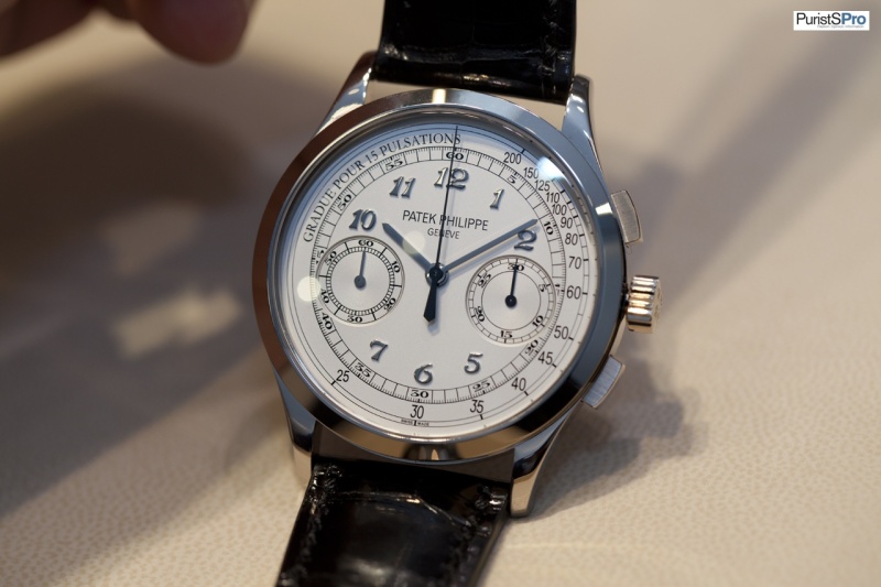
For some the Breguet numerals have been a big surprise, but they fit quite well when we look at the history of chronographs from Patek Philippe. Like the J version it looks a bit cold on the first view and has to be seen in detail.
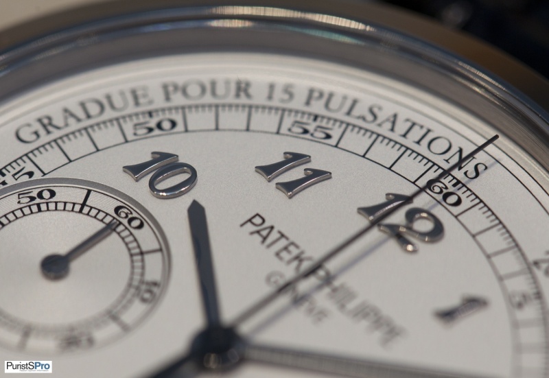
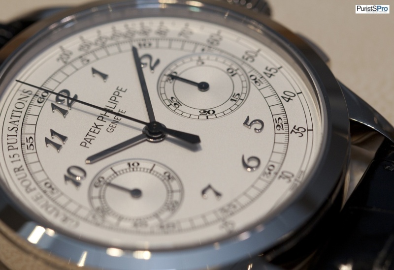
You still think it is cold? I think it is very classy and
beautiful. Understated comes to my mind.
Sure it is not the best what PP is able to do (just think about the outstanding 5950), but in that price range it is sublime.
Please, may I ask for a favor : no additional price discussions and glories for the 5070.
There already have been a lot and can be found by search function, if needed. Thanks!
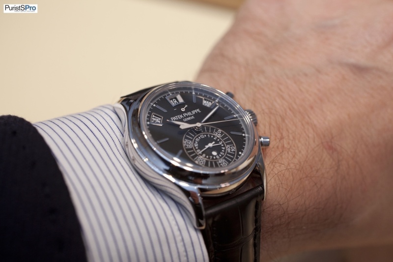
On the wrist :
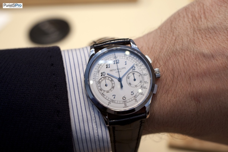
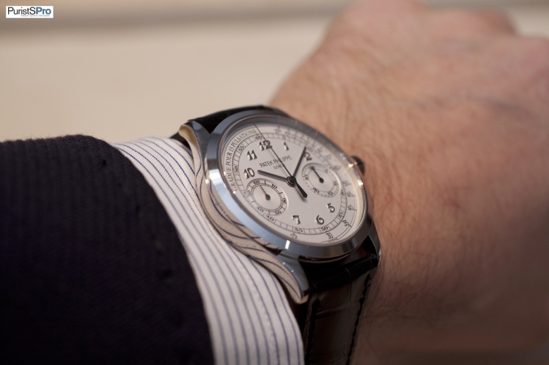
Well, judge by yourself. Just make sure that you saw it in metal before your final judgment. You will be surprised about the details you don´t see on pictures, even on macro´s. For me it is a real beauty for what it is and I could (probably) live with it forever.
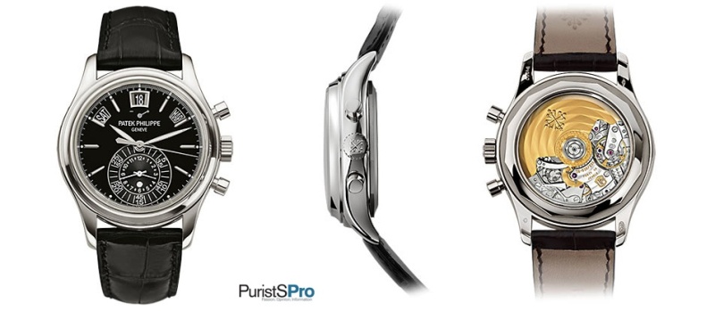
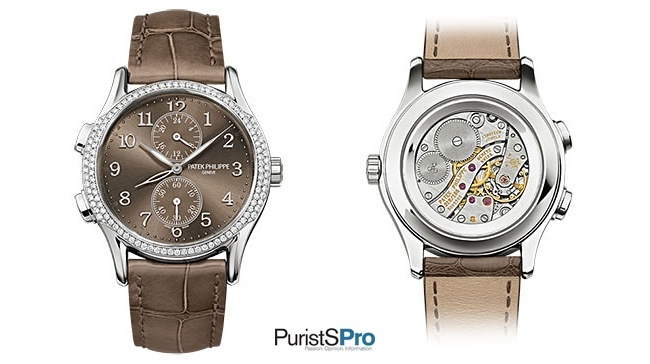
Ref. 5146/1R-001
New version - nothing more, nothing less.
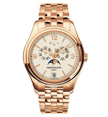
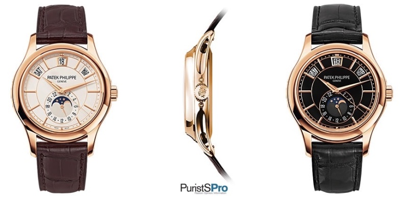
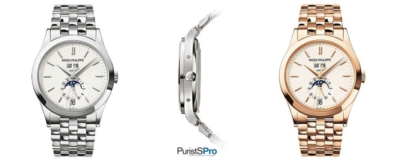
Ref. 5205R
When the G versions have been introduced in 2010, it was like
a (little) shock for some of the very conservative Patek collectors. Especially
those kinds of lugs (side view) have been discussed or shall we say ignored by
some. Nonetheless, today I think there is a quite a big “fan group” for that
watches and I can see why – easily. Me, I liked it from day one – especially the
side view
This year it was introduced in rose gold and with two different dials.
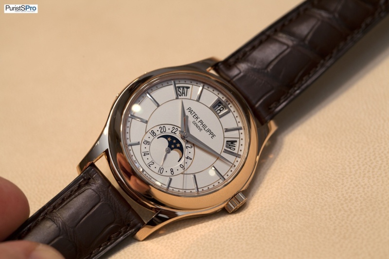
Can you imagine it was not available like this before? Very classy, isn´t it?
On the wrist :
Looking at the wrist shots I can see that I had an unsteady hand. Why? Well, it´s up to you. But if you guess, it was just too tempting. It´s not that wrong …
Just took pictures on the wrist from the black dial version, but this is not meant as a ranking.
Conclusion :
Both new versions are very beautiful and a very nice addition to the collection. Only bad news, it will be even more difficult for “fan´s” of the 5205 to choose.
Ref. 5396/1R-010 and /1G-010
Two new classy versions of something we have seen before.
Ref 5130J
“Just” one more version in J or a new trend back to yellow gold?
Live pictures :
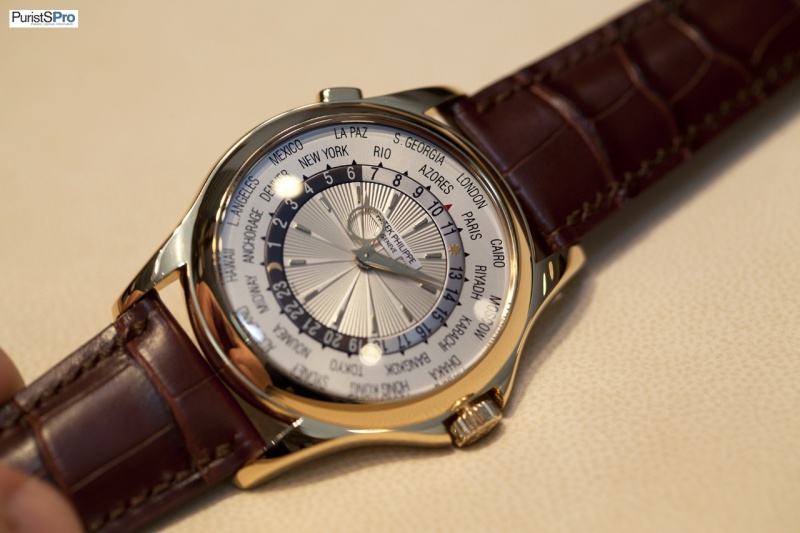
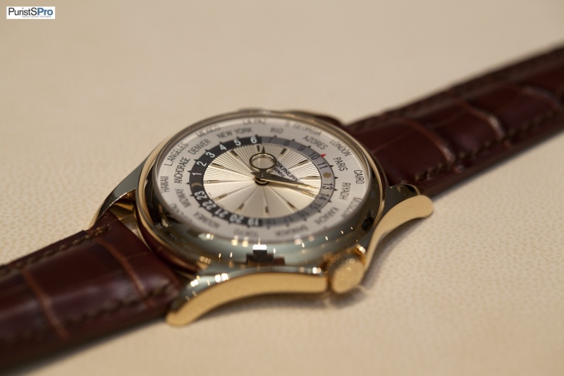
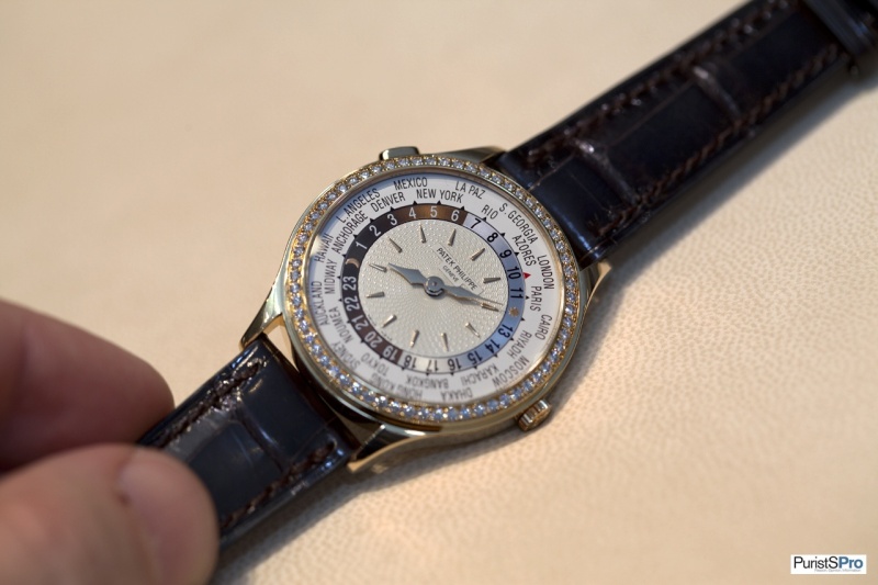
Ref. 7134G
I have a weakness for the Calatrava Travel Time in general, but to make it short: I am not a big fan of this version. Without the signature on the dial it could be from so many other brands. Maybe it is just me.
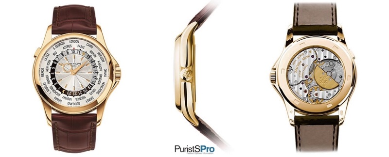
Ref. 7130R
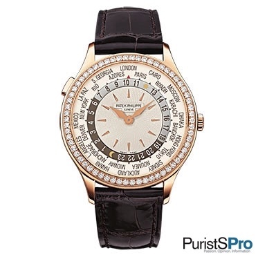
Live pictures :
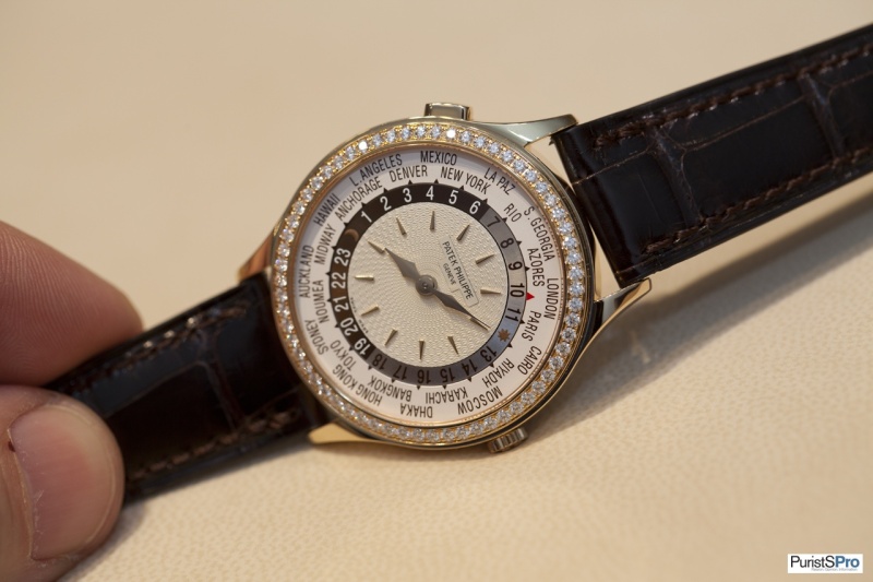
Last year I attended a Patek Philippe owner´s dinner and the ladies on my table had a strong weakness for the G version and I can´t blame them for their taste. Think they would love the new R version as well. Especially because of the hands I like it a lot.
Ref. 7121J
Didn´t take pictures of it, but think it is a very nice and
classy watch. Only the officer´s-style case is seductive for its own, but the
tone-in-tone moon-phase adds also some kind of romantic. On a dark brown strap
it should be even nicer. By the way, I love that buckle
Baselworld 2013: Patek Philippe
Part I: CALATRAVA

great posts Oliver..thanks !! You also busted my watch budget...
Part II: GONDOLO
At the wrist...

5200

I told earlier that the watch is too big for me
"that is very personal"
Thanks Mike ...
Part III: NAUTILUS
Lovely pics, Oliver - thanks for sharing!
Nautilus for the wife ...

RG Nautilus is a big hit for me.
Mark, I am with you ...
I fear

thanks for the nice pics...
Fricks, my pleasure.
how did you like the 5160R?
Fantastic!
sam1234, thanks a lot for your very kind reply!

Thank you for the wonderful pictures and writeup!


Thanks Oliver...
My dear Magnus ...

Great report with great pictures!
I like 5200 too...
Good luck!
Georg, thanks for your kind reply and ...
Part IV: GRAND COMPLICATIONS

Part V: COMPLICATIONS

Final conclusion:
Thank you Oliver,
Excellent report, Oliver
5170G all the way...!!!

Very nice Report Oliver. I would say that the elephant
Thanks, Oliver

Many thanks Oliver..........
