
Mike H
[AHCI Moderator]
11080

I could not agree more...
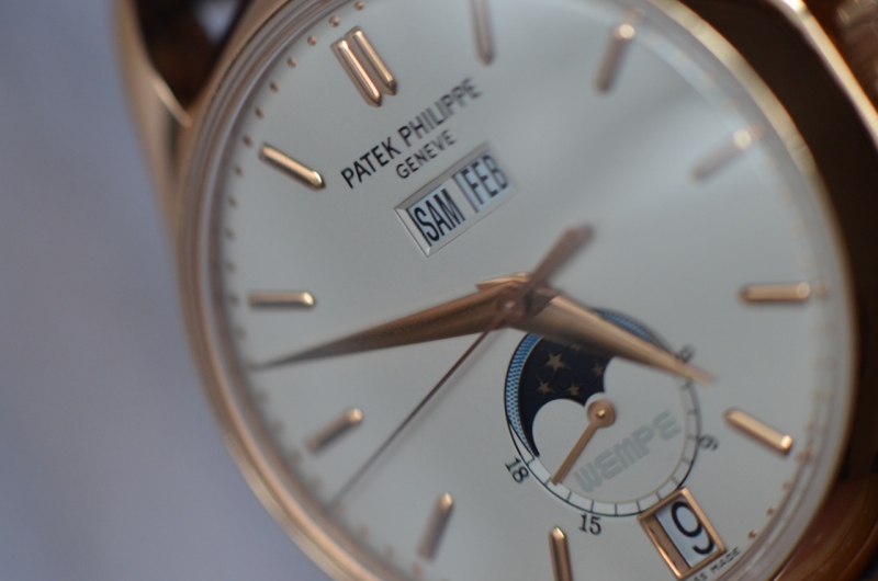
Wempe is indeed hardly readable on the dial. It is actually funny to notice that Wempe name appears white or grey depending on the light and angle.
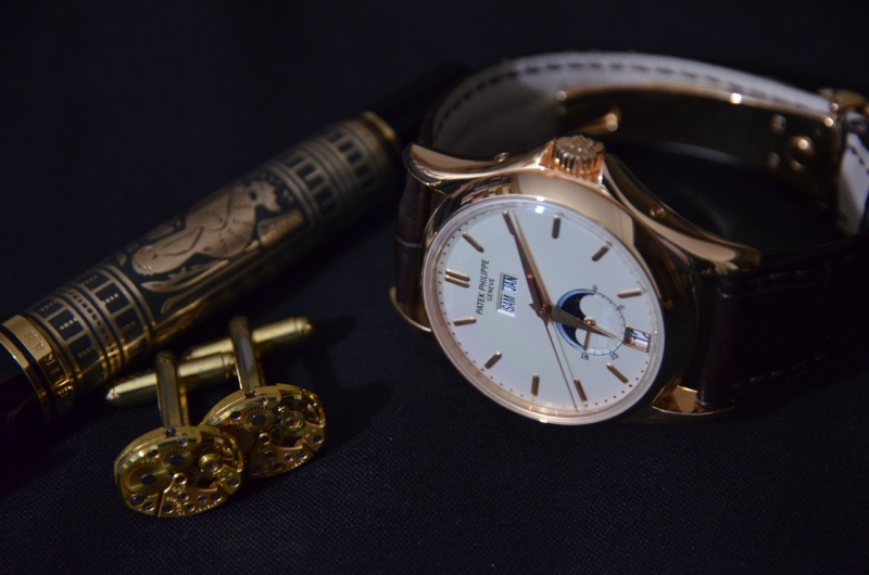
As for me this 5125 is certainly one of the nicest annual calendar (if not the nicest) ever made by PP. I particularly like the architecture of the dial reminding me of the 3448 (which of course is another category as it is a PC).
Otherwise this one would fit nicely in my collection too...
Credit : Boutros for this last pic only
Best,
Mike

Double or single?
Some collectors like the purity of only the watch manufacture on the dial. But in the old days it was common to find the retailers name on famous names in the watch world. Serpico Y Laino for many Rolex, Tiffany signed dials for Patek. One of my favorite ...

All I can say is...
your wrist shot of the Nautilus is beautiful! Whether single of double doesn't matter when you have a watch that lovely (and captured on a nice photo to share with us). :) cheers robin
simple and pure
Not a big fan of superfluous writing on dials, keep it pure and simple for me. It's just extra advertising as best I can tell, especially so if the co-brand has no relation to the manufacture process. I don't think it detracts necesarily, but for me at le...
Thanks
For your kind words. If I tell you what camera I used you most definitely might not believe me. The photo was taken in natural light while waiting for my tram on the way to work. Best Edmond
The only time I liked double is 5125.
Wempe not only had the good taste (to only have a very subtle Wempe name on the dial), but also the clout with PP for the design of such an understated, elegant and timeless piece. In my opinion, 5125 belongs to the same classical design category as 3970 ...
I remember
The wempe / Patek colaboration quite well. Did Wempe have an influence on the design too? I think all Wempe editions look similar. Could this be the reason that Wempe is not actually written on the dial (at least I cannot find it). Thank you for sharing! ...

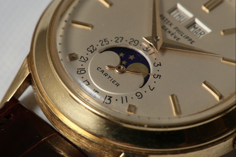
Wempe is written on the dial,
in the subdial below the moon. It is a very light grey/blue... Picture: Antiquorum ...
Wempe
Thank you for sharing this picture. I personally don't find the wempe signature discreet nor do I find it attractive. Thats my opinion though. The Tiffany version is more discreet and elegant. But it is a double signed dial and that is what counts! Lets s...
There is also the....
2013 PP 5396G. Signed by Tiffany. Read : Anyone has this ? 100 LE (I think)
Nice!
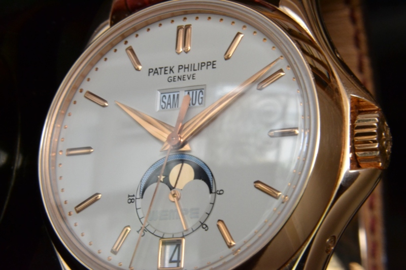
I was looking from my laptop before. Now I am at home on my large computer and can see it very clearly. It is very discreet. This I like. I wonder if it faded or was always like this? Very nice. Thank you for sharing....E
I could not agree more...
Wempe is indeed hardly readable on the dial. It is actually funny to notice that Wempe name appears white or grey depending on the light and angle. As for me this 5125 is certainly one of the nicest annual calendar (if not the nicest) ever made by PP. I p...

Beautiful pictures
Your watch and pictures of it are just stunning. Thank you for sharing. Best Edmond

Single for me, at least most of the time.
Single - a retailer instead of the brand is quite often fine for me, if we talk about vintage. Double - is a NoGo for me, most of the time. Only if it is very tiny and not obviously and only with a very few watches I could accept it. In your case it would...
Interesting...
Oliver I find it interesting that you have this attitude. You are the moderator for one of the strongest and most powerful brands in the world, yet you prefer watches with 'ideally' no logo. Maybe you should move over to the' independents' that are starti...
Dear Edmond, even when I am the moderator ...
of one of the strongest brands I don´t see the need to like everything they do. Example: the increase of the brands name on the dial (at some of their watches) is something I don´t like and this is not the first time I talk about it. Also I think quite a ...
Thank you for such an enlightening post!
I have always loved the Patrimony Contemporaine and KV. Now I know why! The only 2 that stood the test of "brandlessness" in my opinion...
Brands
Oliver- thank you for your lengthy reply and thoughtful post. I agree with much you have written. And I like the Japanese bike story. I studied brands in my MBA I have a tremendous respect for brands with history. Rolex. Patek. Jaeger. They deserve the pr...

Double or single
In a cocktail or drink its always nice to have a double , you cant savor the drink if its single. But in pateks does not matter. Lovely nautilus chrono. Best & congrats Geross
I love the double stamp dials...
I think it just adds a little to set them apart. Alas I do not have a PP double stamp. My only double stamp is a rolex that I have with a corporate logo but it really evokes some history,,,,COMEX
Even when double stamped,...
One of the stamp is usually smaller in font. What if they are of the same font size ?

Ambivalent....
......i don't have any watches that have a retailer signing other than a Ricciardi 1680 Rolex....and with that one, the marking is underneath the lugs so very unobtrusive. I would say the evidence supports the idea that I don't like it....but in fact, i w...