
joenghenry
3534

Hands-on preview of 5231G
Dear All,
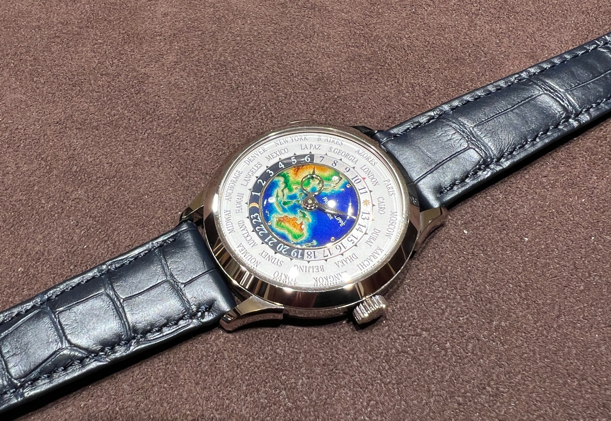
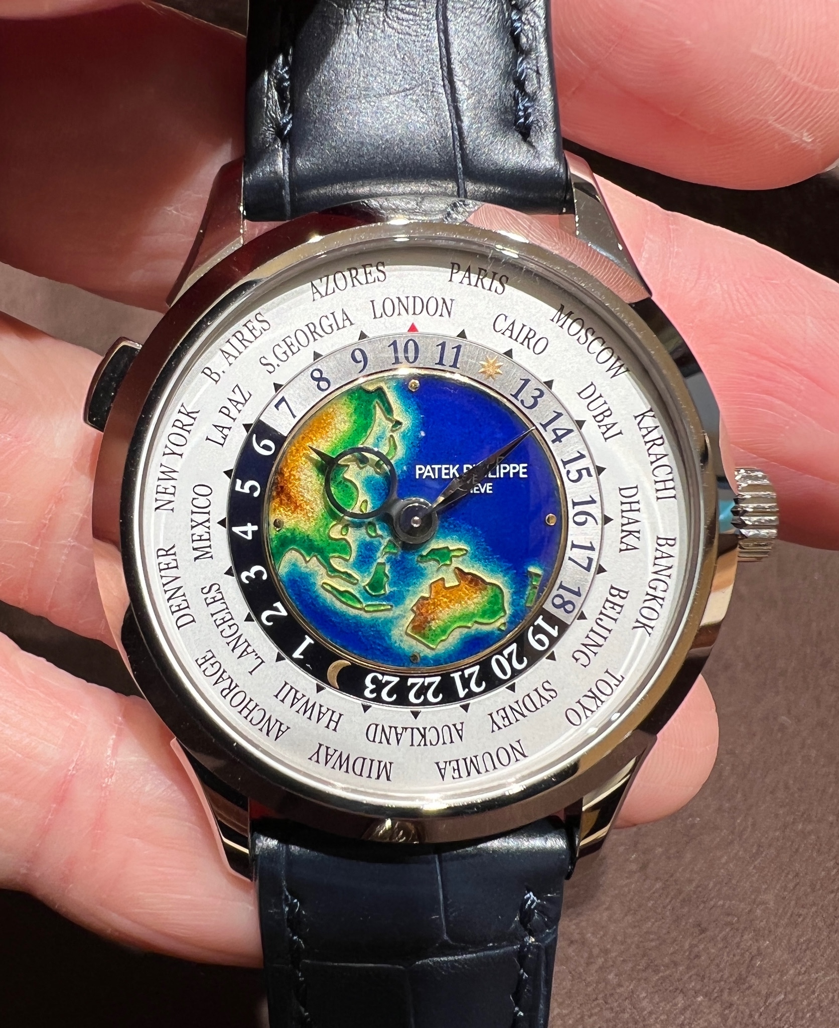
It’s the first time for me to see a cloisonné world time in Patek’s preview of novelties at AD. The 5231G is more beautiful than I have expected.
1. The colour of the ocean is particularly vivid, with different shades of blue.
2. The map composition is also different from the former 5131G, with more emphasis in the Oceania.
3. One interesting new feature which caught my eyes is the colour rendition of the shore region. Instead of just having light blue around the land (as in 5131 and 5231J) it now shows the base colour of the dial around the land, mimicking low tides with water fading away.
The 5231G is so different from 5231J, they will definitely make up a good and complementary pair.
Wish my AD can help me get the allocation of this wonderful reference soon……
Have a great weekend, everyone.
Cheers, Henry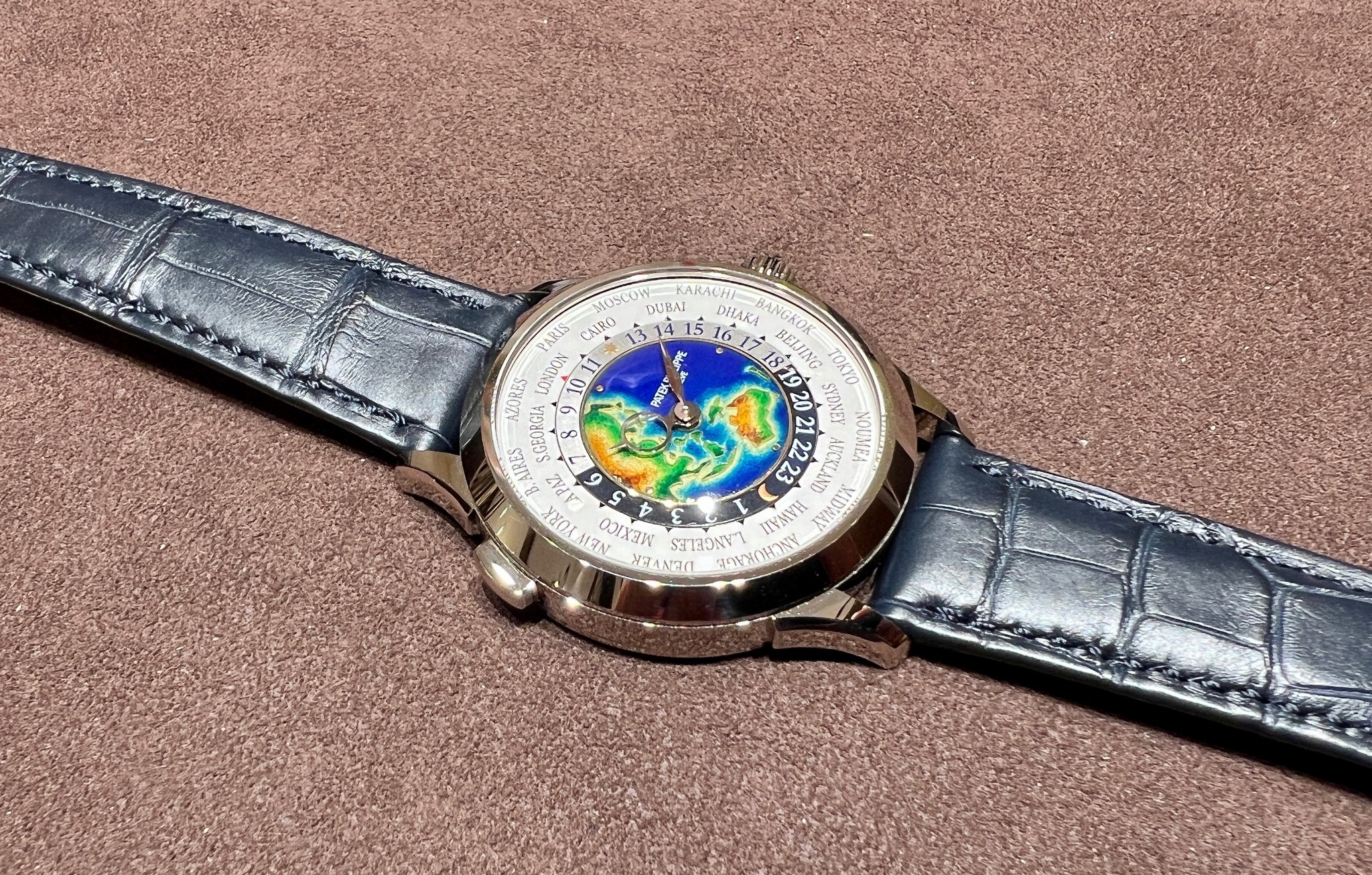


Hands-on preview of 5231G

Thank you, my dear friend.


Striking WT and thank you for his stunning photos!

Good review of an iconic reference !

Thank you, Peter. Keep my fingers crossed too 😊

Fantastic coverage thank you!
Thank you, Sham. You won’t be disappointed when seeing the cloisonné enamel dial.

Thank you, Prof. The cloisonné enamel of 5231G is truly attractive.

it is a beautiful watch, cross my fingers for you
Wonderful piece!
+1, I'm sure distribution will be consistent all of over the world, but definitely a very meaningful piece specifically for the *huge* SEA (and Oceania) Patek market! Hope you can be allocated one if you decide to apply! ;-)
