
heartbreaker
818

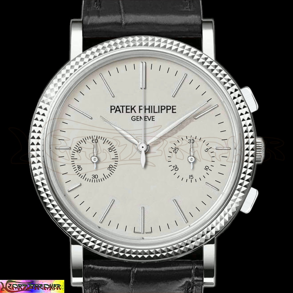
Case and look from the 5139G, movement from the 5170J
The core idea is a hand wind chrono based on the caliber CH 29-535 PS and using the hobnail bezel case of the Ref. 5139G.
Yesterday I've posted a first proposal (here), today I'd like to show a new one, with a design strictly derived from the 5139G.
I've made a search on the internet, but I haven't found nothing like this and I'm wondering if, in the current PP line-up there could be space for such a timepiece; who could say "no"?
Do you like it?
Ciao!
Review
Hands-on review of the Patek Philippe 5327 Perpetual Calendar. Compare its new 39mm case, dial, and caliber 240 Q to the 5140.
68 replies42267 views

Collection
Explore the Patek Philippe 5139 perpetual calendar. Dive into its Caliber 240 Q movement, Clous de Paris bezel, and collector opinions on its design and appeal.
13 replies15103 views
Reference Guide
Explore the ultra-rare Patek Philippe Ref. 5049P, a limited edition perpetual calendar. Discover its unique stepped bezel, black dial, and collector insights.
30 replies7340 views

New Release
Explore Patek Philippe's Baselworld 2011 novelties: six grand complications, including the Ref. 5270 chronograph and new women's complications.
7 replies7078 views

Reference Guide
Explore the Patek Philippe 5070 chronograph: an in-depth review, historical context, and collector insights on its movement, design, and place in haute horlogerie.
247 replies226974 views

Reference Guide
Mark in Paris recaps 2016 Patek Philippe articles and previews 2017 Aquanaut and Caliber 240 anniversaries. Essential guide for collectors.
30 replies149252 views
Case and look from the 5139G, movement from the 5170J
The core idea is a hand wind chrono based on the caliber CH 29-535 PS and using the hobnail bezel case of the Ref. 5139G. Yesterday I've posted a first proposal ( here ), today I'd like to show a new one, with a design strictly derived from the 5139G. I'v...

:-) Yeah, that's a funny criticism!
Next time, I'll do it in a futuristic style, so that your great grandsons will appreciate it, ok? ;-)
I'm not sure it can work for a Chrono. I am much more certain ...
It can work on a simple watch, such as a Calatrava. Best, Nicolas.

How would it look like
if you would put the 5170 dial on blue and a white metal case. And remove the pulsations scale? Best, Kari
Hi Kari!
In november 2010 I've posted a proposal about a 5170 with white metal case, but I totally agree with your suggestion: a blue dial would be just gorgeous. First version (november 2010, inspired to an old PP chrono). Second version (same vintage style, with...
Thanks a lot!
The blue is too bright... From the different versions I can clearly see one thing: it is very difficult to design watches and as a consumer I am in a great position: if I don't like the design the manufacturer is bringing to the market, I can just forget ...
You're welcome, Kari!
It's me I have to thank you for your comment! To design a watch is indeed very hard. It's not only about finding the best solution for a given need, but a true expression of personality. I'm only a watch-lover with mediocre computer skills and I think tha...
I have liked many of the designs.
However, to understand if a watch is really nice or not, one has too see it in real and touch it. I just received a new watch and it was much nicer "in metal" than I ever could imagine. Good luck with your effort - perhaps you will see one day one of them...

first 2
I like the first 2 But I'm not a fan of these sunken subdials. (I know the movement is made this way) but for me they should be alligned at 3 and 9 o'clock
Those subdials...
I find the position of those subdials more suitable for contemporary-looking timepieces, than for classical ones. It's my personal opinion, of course, and I'm sure PP will find excellent aestethical solutions even with this new chrono dial layout. Ciao!

I like the first one the most.
And think platinum...go for slate grey dial. The hobnail is IMHO, more suitable for plain dial, prob enamel even. Have you also thought of perhaps a fume dial, like the new Moser pert 1? Best, Horo
Gold, platinum, plain, enamel, fumée, light, dark...
A million of styles, versions, aestethical messages. Choices come one after the other, endlessly. Ciao!


My pleasure, Fx!
I have to be fully honest: I'm still not completely satisfied by my proposals and I'll try to add a touch of boldness. Please, keep in touch, your opinion are not only welcomed: they're the forum's soul!!! Ciao!

Mmmhhh, yes it's clear!
Calm down, please, there's no need to scream, triplebridge. I'd be very happy if you would like to discuss your point of view. Thank you for your attention. Ciao!

haha
.. its not that bad.. good job on the creation... but its not the best looking watch... its a schizophrenic watch.. trying to be both dressy and sporty but ultimately too much of both and cant work either way... doesnt make sense... but love the creations...