
The "Tribute to Trabant" GO ....
(c) J. Seemann
For years, we criticize watch manufacturers for using plastic spacer rings in their watches, and here we applaud and pay extra money for them? Ye, really, times are changing - fast.
Marcus

Hi Art...

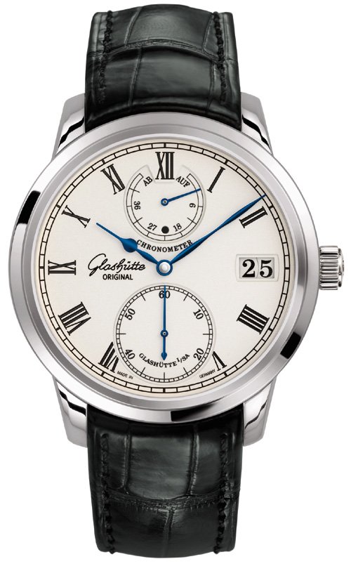
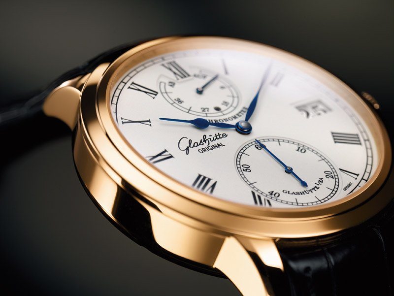
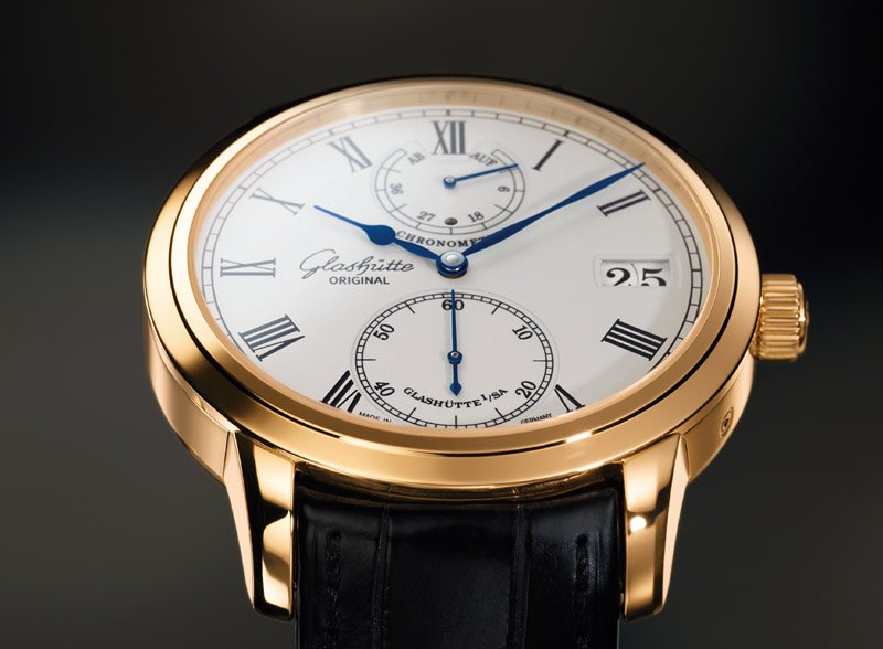
I've saved the best for last ;-) . . . introducing the Senator Chronometer . . .
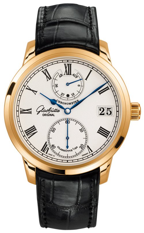
. . . rose gold . . .
. . . and it's attendant unique manufactory movement, the new cal 58:
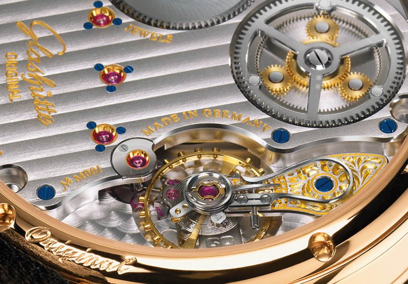
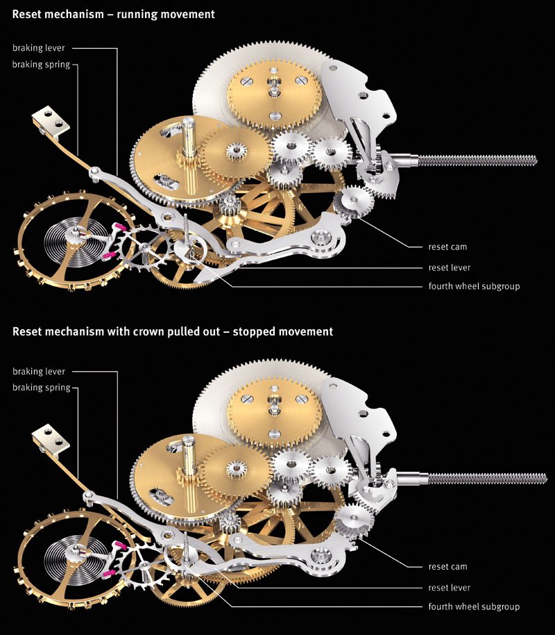
The watch is delivered with a chronometer certificate. The designers at Glashütte have imbued the cal 58 with a re-setting mechanism that causes the seconds hand to instantaneously set at 12:00 when the crown is pulled out, and the minute hand is automatically positioned at the next minute marker. When the hands are moved forward, the minute hand stops precisely on a marker, which enhances the precision and consistency of time-setting. The power reserve indicator at 12:00 is the beneficiary of a newly developed planetary gearing system, and there's also a day/night indicator located in the reserve display; the Panorama Date at 3:00 has been enhanced to change over instantaneously in contrast to the usual gradual changeover of other models. This movement is exactly the development I've been hoping for, and confirms my confidence in G O's commitment to tradition as well as innovation. Here is an illustration of the re-set mechanism . . .
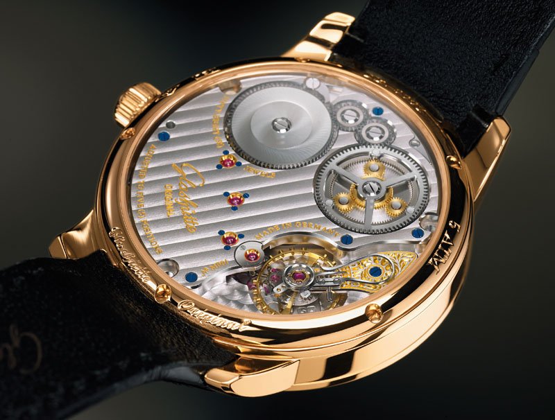
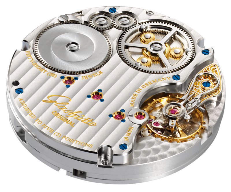
. . . and the enhanced image of the movement sans case:
I'll leave you with a few more pictures of the most desirable novelty from Glashütte Original . . .
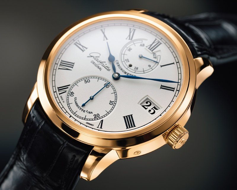
. . . cordially, Art

A few suggestions for improvements
1. To remove the Roman numeral IX in order to move the logo of Glashutte Original leftwards so the dial will become more balanced.
2. The word "Chronometre" can be in red colour
3. a Meissen or enemal dial?
4. On the back of the watch, the movement is absolutely stunning but kind of imbalanced as there is an large empty area on one side. May consider open an hole on where the logo of GO currently is to reveal certain part of the movement beneath the plate so as to creat a balanced layout.
Just my humble opinion.
Zhiming

Agree with you, Art
This Chronometer is the most beautiful Lange ( with the Meissen ) this year.
It reminds me a Lange Chronometer in LE for Wempe.
I love it, its dial its beautiful movement...
Does it exist in platinum?
Best,
Nicolas
The more I look at the white gold, the better it looks.
Can you satisfy my curiousity as to what kind of white gold is used - is it nickel or palladium white gold?
The difference is explained in a useful article that can be found here:
www.utilisegold.com
Grateful if you could let me know.
Cheers, Dirk
I'll have to check, Dirk, although my instincts . . .
. . . tell me the press release would have mentioned the use of palladium had it been the case . . . thanks, Art
I just heard from Our Man in Glashütte, Dirk . . .
. . . and he confirmed the white gold Senator Chronometer has a high palladium content which permits a high level of polishing without discoloration . . . cordially, Art

Now we're talking!
I just want to pester you for a few specifics:
1. what are the dimensions?
2. What is the corrector at 4 o'clock?
3. When do we get to see some real pics?!?!?
thanks for all the reporting!
A
Hi, Aaron . . .
. . . Our Man in Glashütte just confirmed my surmise that the pusher at 4:00 advances the date. The dimensions are 42 mm in diameter by 12.3 mm in height, and I'm working on a photo session with my new personal favorite . . . cordially, Art
Disappointing
Why can't they have quick-set dates anymore? That pusher breaks the flow of the case, and isn't nearly as user friendly
So close to a perfect piece

A
I think the reason the PanoDate module is adjusted by . . .
. . . a pusher rather than from the crown has to do with the operational aspect of the watch, Aaron. If the cal 58 were to have date-setting adjusted from the crown, there would be an inherent possibility of pulling the crown out too far accidentally, causing the balance to stop and having to re-set the watch again . . . not a good thing, especially if you're in the middle of a timing trial ;-). Cordially, Art
That sounds a bit shakey....
As I recall the Cal. 100 has the same pusher-set date. Also, how often would you have to reset the date during a timing trial, you'd have to keep the watch wound all the time anyway....
A
There could well be a technical reason, too, Aaron . . .
. . . along the lines of mechanical limitation, as the instantaneous re-set function and minute hand synchronization is operated from the crown . . . perhaps there's only so much mechanical duty the crown can perform before compromises in performance appear. We won't know until more technical information is released . . . cordially, Art

Finally the chronometer!
There are other brands that take the aproach of modern or even experimental materials, lubricants, balance design, wheel trains etc, which I appreciate much. Compared to that what G.O. is bringing to us here is traditional watchmaking at its best and in a way deliberately old fashioned in a heart-warming way. I love it!
Best regards and read you,
Martin
I fully agree, Martin . . .
. . . and you captured my sentiments perfectly: the Senator Chronometer exudes the charm and mystery of watchmaking. There is a place for technical achievement, of course, and there have been many worthy efforts to advance the state of the art from both the mainstream manufacturers and the independents, but speaking personally, I would prefer a modern incarnation of an exquisitely crafted traditional watch. Cordially, Art

Just a quick couple of comments …
Just a quick couple of comments to echo others, Art.
This Chronometer ticks the right boxes. I love the dial layout, the large subseconds and date, the blued hands and the thoughtful mechanical goodies like the zero reset. The size on the wrist will be important – let us know the dimensions when you can. I wish the regulator was on a double swan neck, but the planetary gearing is a great mind puzzle and breaks up the plate.
Look forward to some live pictures.
Andrew

Finally, something worth discussing about this year!
As others said, this is one of VERY few watches that I feel worthy mentioning in this year's Basel line-up. Dream design, wonderful mechanism (not only second, but minute AND jump date!). Looking forward to seeing it in metal.
Best,
Ken

A bent toward classicism, I think.
I find the aesthetic to be consummately appealing. And oh, that movement!


That is a very nice watch, the chronometre
The movement looks really sensational, too.
I really like GO's offerings.
Thank you!
This message has been edited by Mostel on 2009-03-26 23:14:53
I'd order it immediately ....
Regards,
Marcus
You hit the nail on the head, Marcus! We had exactly the same ...
It's just stunning - and one of the most beautiful watches we have ever seen.
And, last but not least, the case houses some really high-end technical features.
Best regards,
M&G
That makes four of us ;-) . . .
. . . and not even having the pleasure of seeing it in the metal yet, I feel it's going to be my personal favorite watch . . . cordially, Art