The Lip Blancpain FF, and the 50th Anniversary
When you have a look at the magic world of FF, and playing the game of the comparisons between the Original and the Re Editions ( which is a game I love a lot..LOL ), you discover very interesting things.
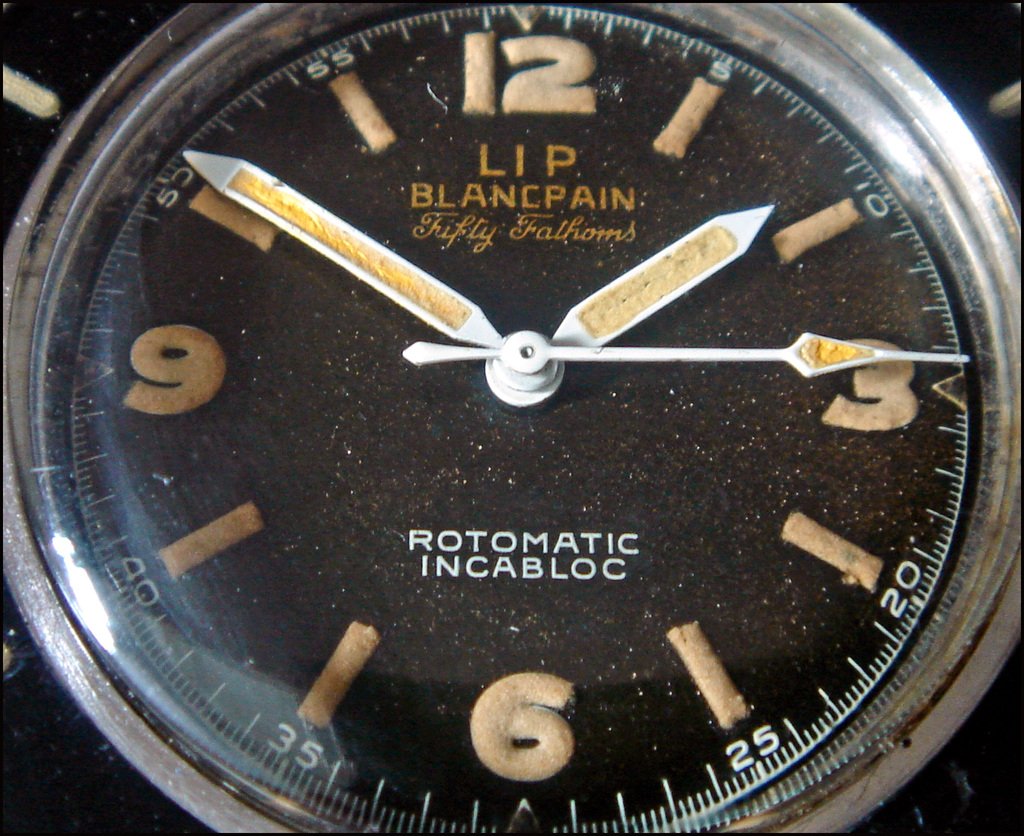
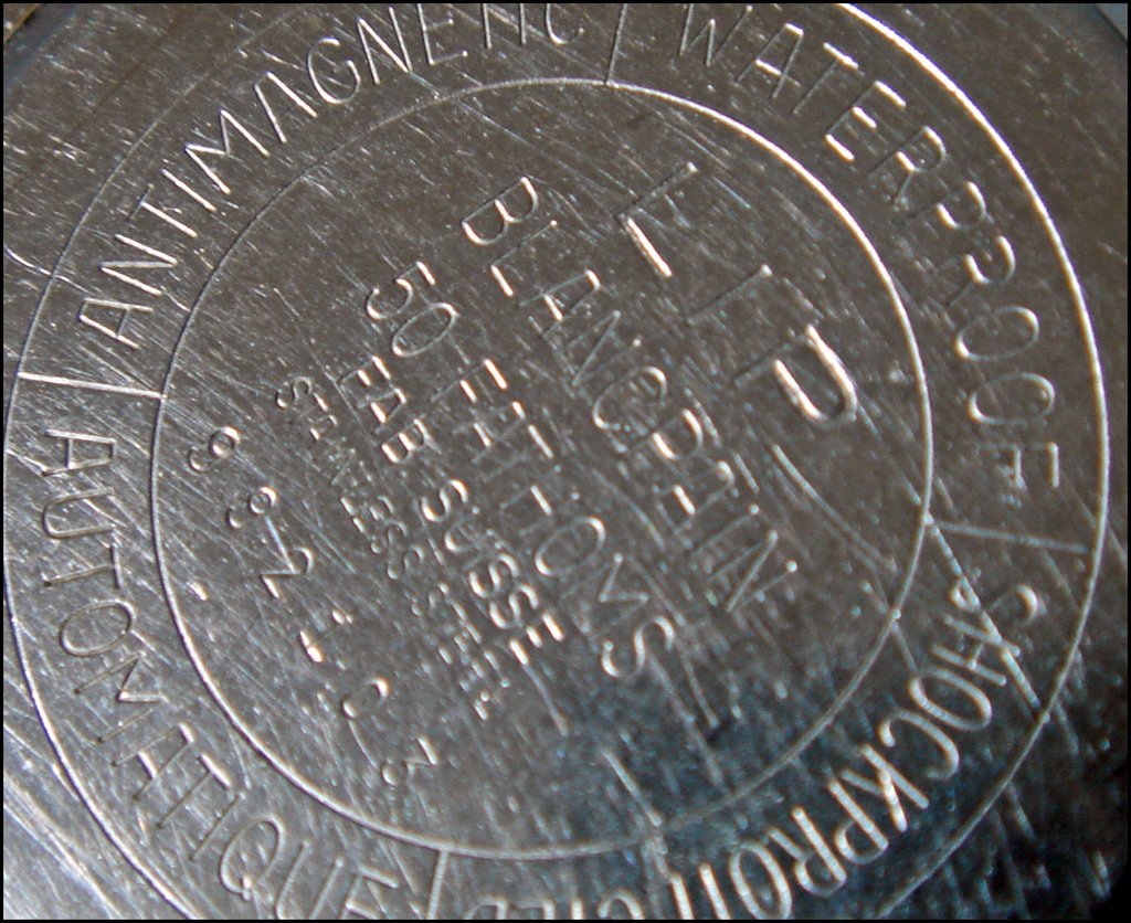
Here is the Blancpain Lip:


For once, the indexes are not round, as on the Mil Spec or the " No Rad ", but rectangular, as on the Early FF From 1953.
But a FF is and will always be a FF, a spectacular watch, with an elegant case, a huge plexy, a very nice dial which gets with time a superb patina.
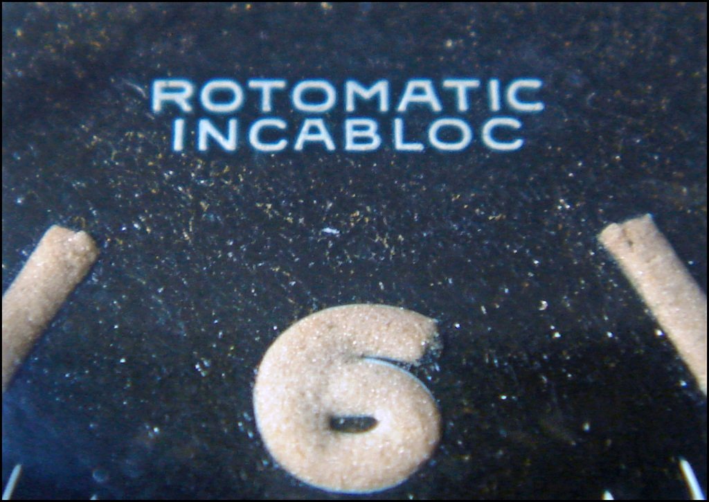
Have a look at these Macros:


These Golden Writings are awesome..They match with the patina of the indexes and numbers!
And you will certainly notice that the dial is turning a bit brown...Which adds Beauty to this FF!
The interesting thing is to compare it to the 50th Anniversary:
Same numbers, same rectangular indexes ( although circeld on the 50th Anniversary ), and ...
Same bezel, which is very pure with this graduation each 15 minutes!
Quite the same size ( 1mm bigger for the Original ), and the 50th Anniversary is a bit thicker...
Same details we also can notice on the FF From Year 1953, with the exception of the lack of " Lip " on the dial, and the white writings instead of golden on the Lip...
These Blancpain FF Rules, indeed!
Holpe you will enjoy this post!
Best.
Nicolas

Spectacular pictures !
the dial is not only brown, it also has a stardust aspect !
Thanks for taking the time to share these pictures with us.
Cheers
Jeff
I Think I have to thank you to have let me this watch for
A pair of days, my friend...
Well, maybe not, as now, I'm in trouble.
This watch is so gorgeous!
Its patina is awesome.
I think we have to speak, now...LOL
Best, Jeff!
Nicolas, aka Galavar...LOL
of course beautiful a always!!
gorgeous FF, its stunning.
The real question is where/how to get the big rubber strap on the new 50th Anniversary.??
Does that fit all the new FF models?
I always thought that strap really made the watch look great.
How does the strap wear? Is it comfortable?
I would love to see a wrist-shot of that strap
 .......it could sway me to look into a FF.
As always great pics and--- what a piece
Cheers my friend-
This message has been edited by donzi22 on 2008-11-27 05:06:22
Donzi,
It may be possible to ask to your Blancpain AD a strap like this one, but I doubt it will fit the 2007 Edition of the FF...
BUT, I like a lot the strap of the 2007 FF, it is gorgeous and works perfectly with this watch.
You want a WS???
Wait...

In fact, it is much too big for me, and not that comfortable on the wrist...
The Bracelet is much nicer, and much comfortable , too, on this watch...
Best!
Nicolas
understood....
cheers-

I can't take no more ....
... why do you guys make me suffer that much ????
Nicolas, this one will make you so happy you'll have to keep it !!!!
Dial is outstanding, it is a nice completion on your other FF's ....
Best to you my friend .... see you on saturday ?
Filip
Right, Filip, it 's really a nice completion to my other Vintage FFs
And Hope I will be albe to add it in my collection.
A great dial, a nice patina, and a true and strong character...
Really have to do my best to get it...
As for Saturday, give me a call, my friend....
The crowd will be very impressive tomorrow, but give me a call, we'll try to meet!
Best!
nicolas

Great report Nicolas...
A great job.
It´s a spectacular watch, indeed. And the macro shots are awesome.
This dial and the patina are really impressives.
The 50th aniversary is a great re-edition, with some details equal to the vintage model.
Certanly, thes FF Rules!!!.
Another piece for your amazing Diver´s Collection???.
Well, Emilio, you know my love for Diver Watches...
Yuo perfectly know that I can't resist to a beautiful specimen...
Now, Luck has to be on my side...
Best, my friend!
Nicolas

spectacular pictures...
... thanks a lot for sharing! The details of the Lip FF are stunning...
I really like the Anniversary, but - as you mentioned previously - there is just too much writing on the dial, which is a distraction to the otherwise clean design.
Best
Henrik
I agree with you on the 50th Anniversary writing
Too much writing, on this lovely watch...
As for the Vintage Lip Blancpain, I'm totally in love with...
With this kind of watch you reach the simplicity, the Purity, the Essential of a time keeper.
A really awesome piece...
And when I think that I was saying to myself " well, just one or 2 Vintage FF "...LOL
Best, Henrik!
Nicolas