
Baselworld 2012: De Bethune
Founded in 2002, almost 10 patents, more than 10 calibres and quite a few more than 10 world’s premiere innovations. Conception, R&D, prototyping, manufacture, finishing, assembling and testing – everything is done in-house, today. They started with a slightly different design and movements from Venus, Enicar and others. Design – more classic in the past, but you can still see their typical/uncommon shape for the lugs in the latest models.
Their current products are innovative and advanced in both technology & design, yet also incorporate traditional elements to bridge the gap between the past and the future. In 2011 they have been awarded at the Geneva Watchmaking Grand Prix with the “Aiguille d´Or”.
The whole story is even more impressive if you think they do less than 200 watches a year (at least that is what we have been told).
So, let´s have a look what we were shown in Basel:
Dress Watch Collection
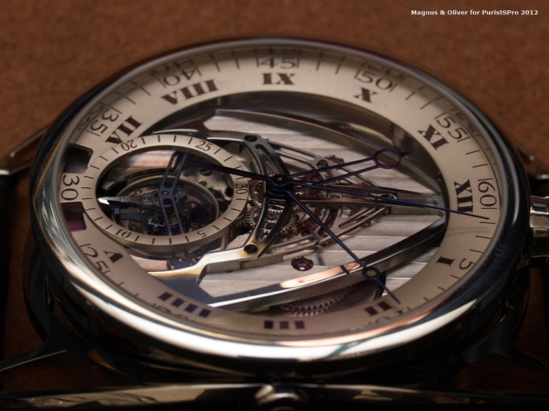
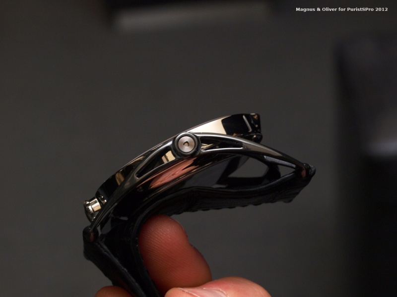
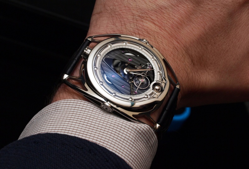
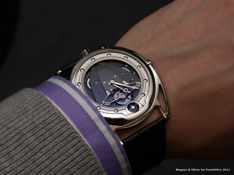
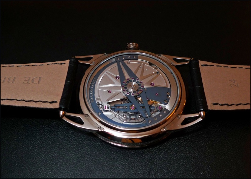
DB28ST
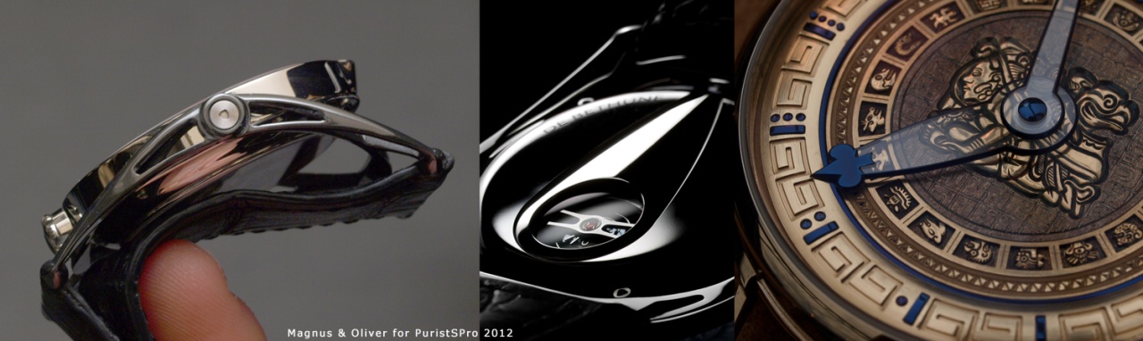
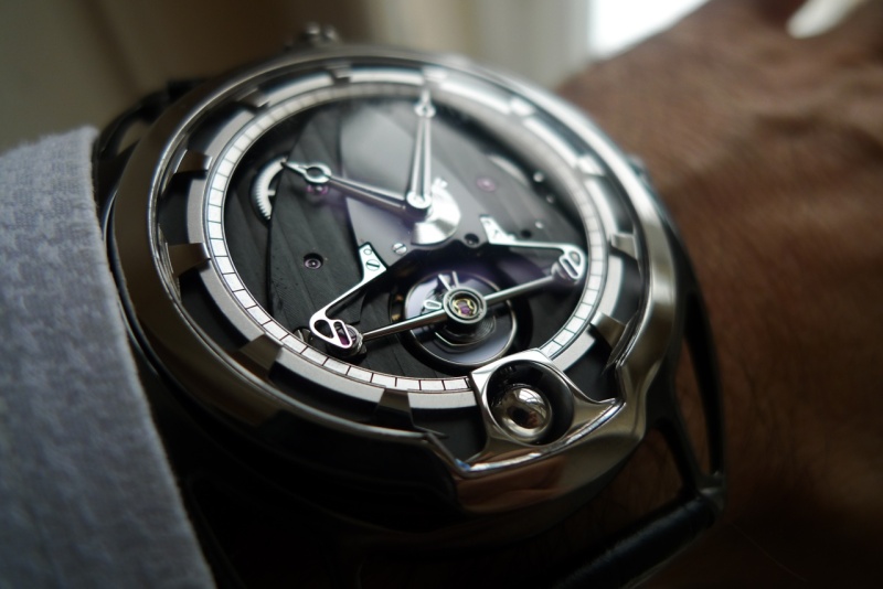
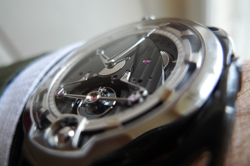
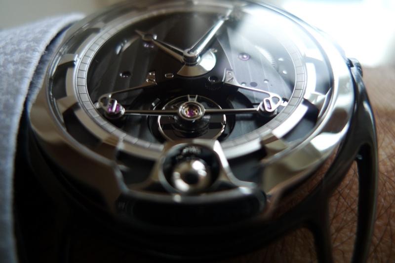
The new dead-seconds tourbillon with its open-worked dial has one of the most distinctive DB looks. Its rocket-shaped movement bridge as well as the flexible lug system have evolved into widely recognisable DB features.
Case: 43mm; polished Grade 5 titanium
Movement: cal. DB 2119, manual-winding movement; hours, minutes and seconds; dead seconds tourbillon; 4-day power reserve
Some of the movement features have been shown in the stunning DB25T before. This time it comes in the case of the DB28 collection and the tourbillon can be seen easily, to mention only a few details.
The flame-blued dead seconds hand is eye-catching and even more in reality while moving.
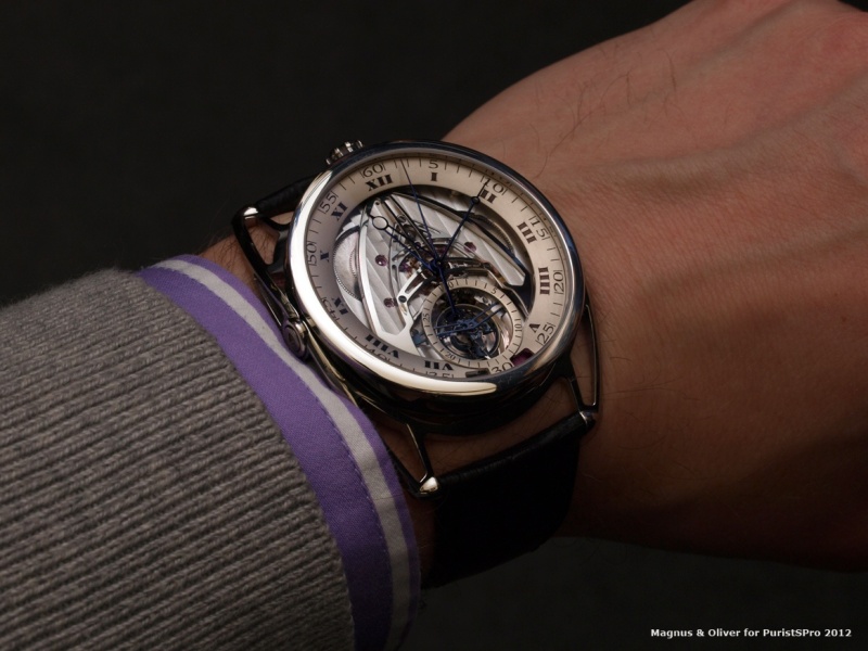
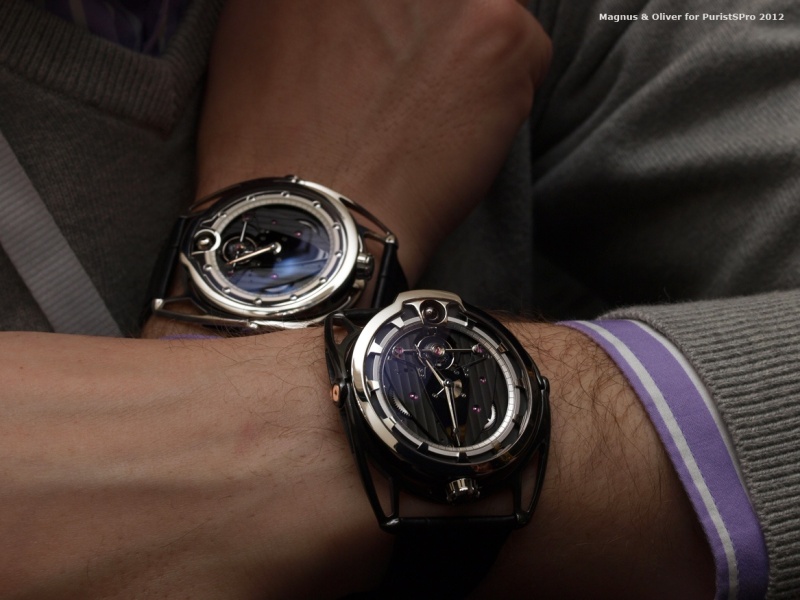
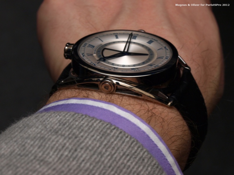
On the wrist it is comfortable.
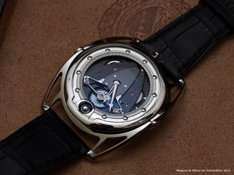
... and even more gold on the back. A captivating contrast to the blackened movement bridges!
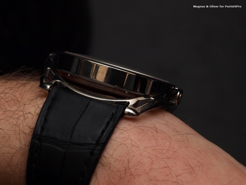
One distinctive feature of DeBethune from day 1 were their lugs. This watch features cleverly designed 'floating' lugs which allow for a very comfortable 'ride' on the wrist. They are available in two different lengths.
As you can see from above, there are two versions, one with lugs in polished titanium, the other one (above) with those in anthracite zirconium (both limited to 50 pieces). Here a group shot à la Mr Hayek Senior:
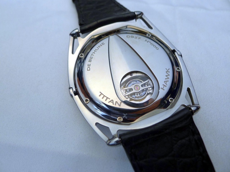
DB27 Titan Hawk
The dial is wonderfully sculptured and three-dimensional. It certainly exudes the class of vintage pocketwatches of the likes of a Breguet or Leroy. The central date hand reminds of a geographical instrument, a sextant for example.
- Self-regulating twin barrels providing 6 days of autonomy
- Silicon/white gold balance wheel with flat terminal curve
- Triple pare-chute shock-absorbing system
- Silicon escape wheel
- Titanium/heavy metal oscillating weight
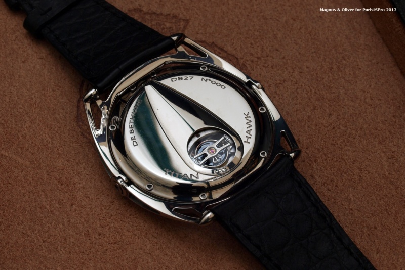
Its hard to say, but the watch has something timeless in its appeal that only De Bethune achieves. Well done!
Classic Collection
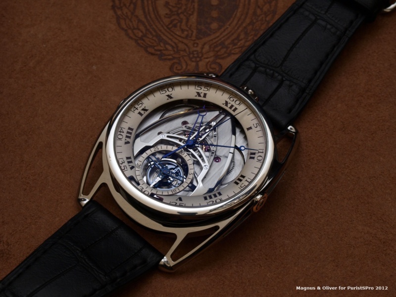
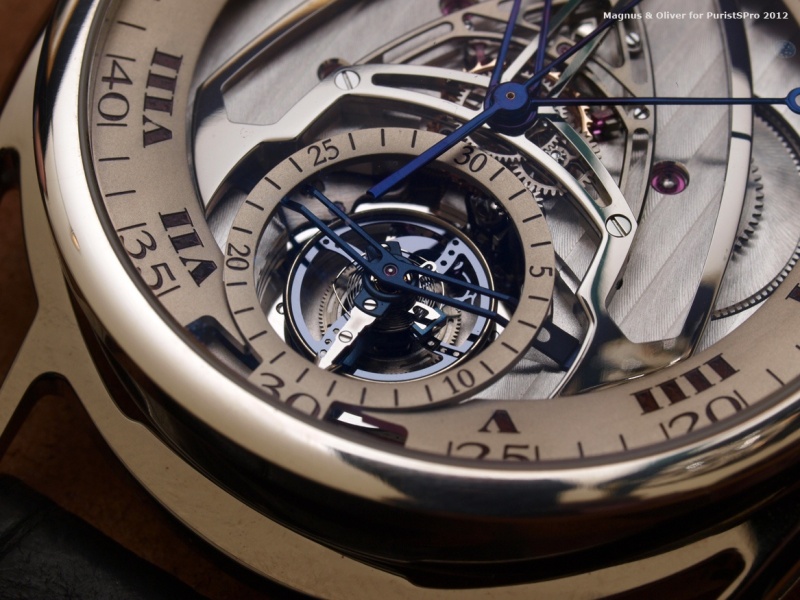
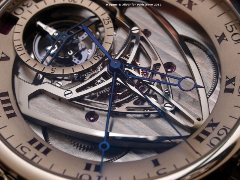
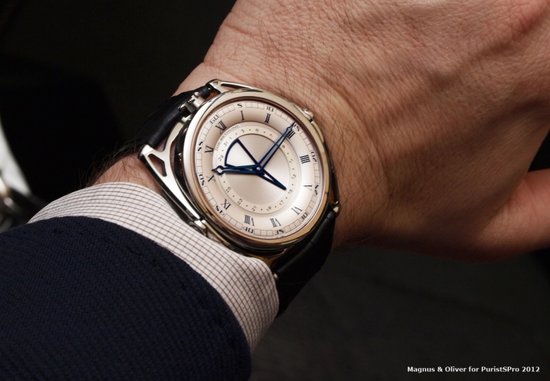
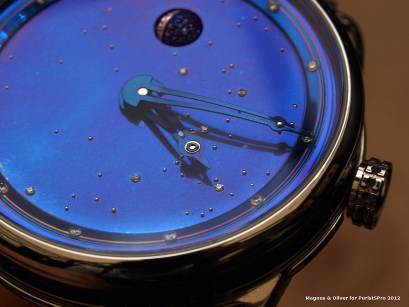
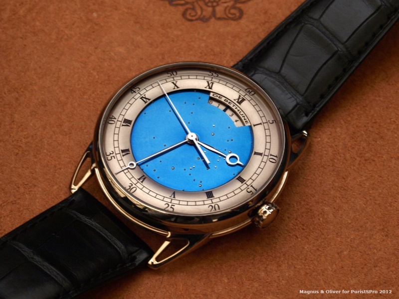
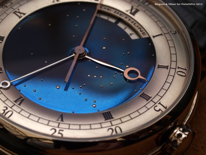
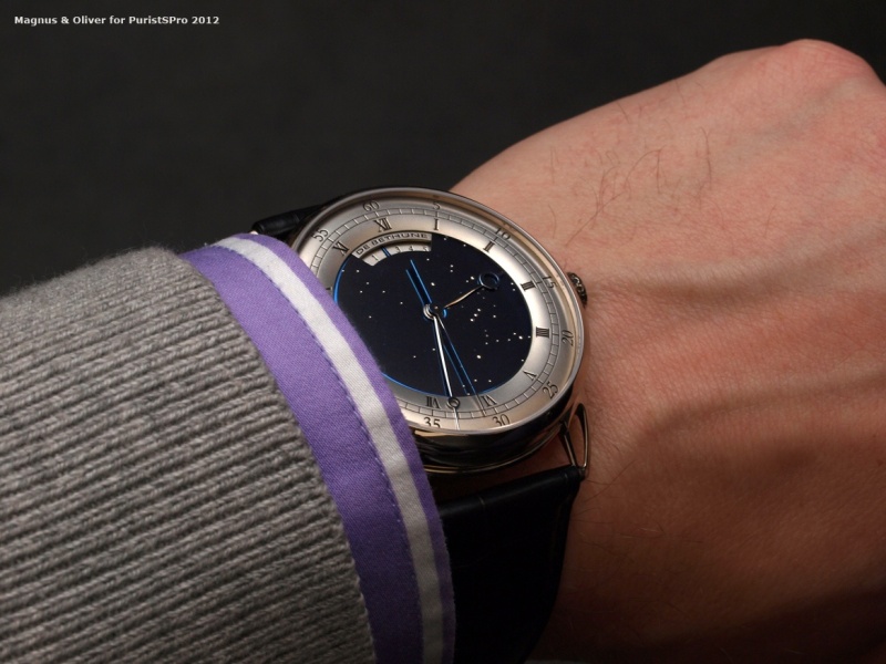
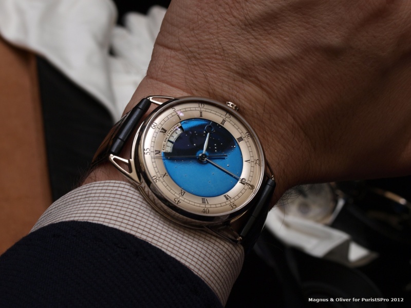
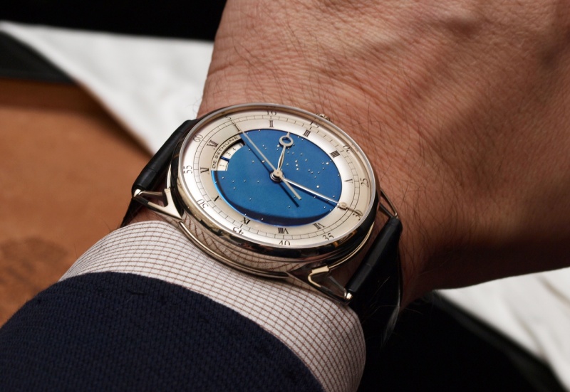
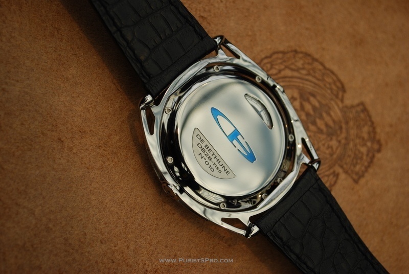
DB25s Jewellery
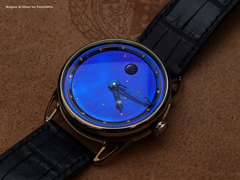
The magic here comes entirely from the gorgeous heat-blued dial crafted from mirror-polished titanium with white gold stars and 21 diamonds. The moonphase itself, accurate to one day in 122 years, is indicated by means of a platinum and steel sphere set with 44 diamonds and 44 blue sapphires:
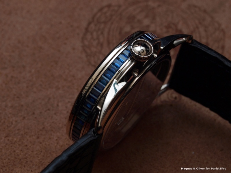
The case is a drum-shaped 40 mm white gold case set with 61 baguette-cut blue sapphires totalling 5.29 carats. The thickness is 11 mm:
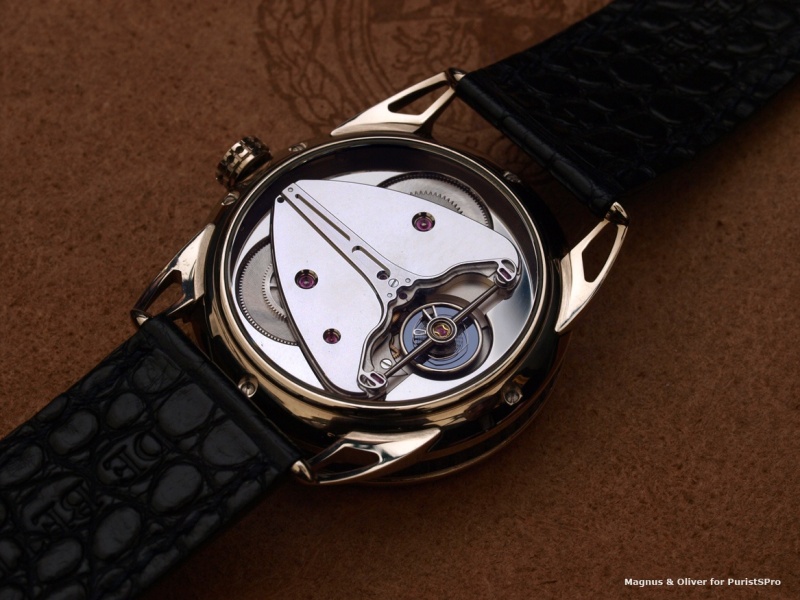
The movement is a De Bethune Calibre DB 2105, a mechanical hand-wound and hand-decorated movement sporting a mirror-polished mainplate with high polished steel parts and titanium bridge:
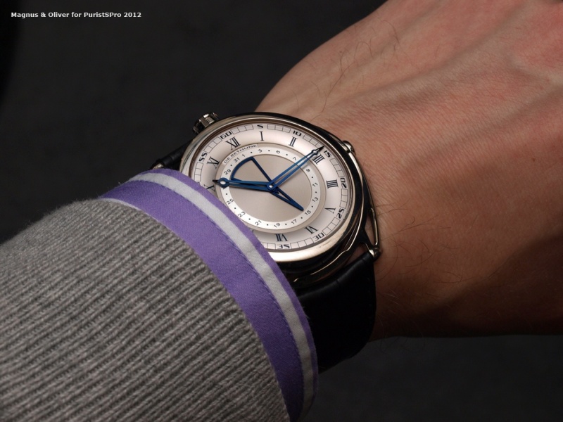
The dial is just another drug infusion to the already addicted. The combination of heat-blued steel with a sterling silver chapter ring is almost out of this world; ethereal, captivating and just sparkling with excellence in aesthetics and craftsmanship:
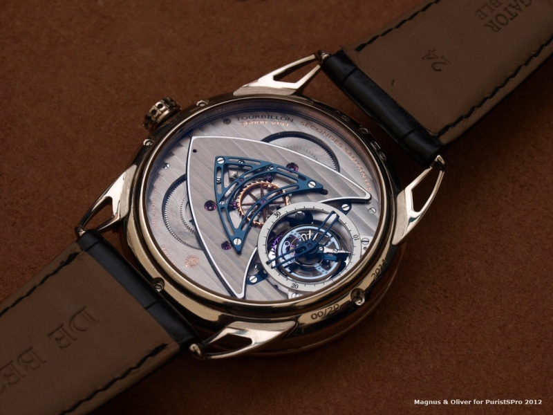
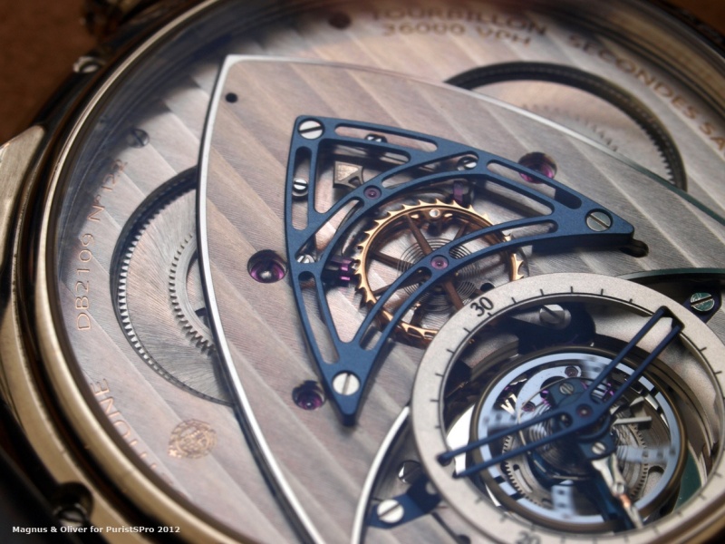
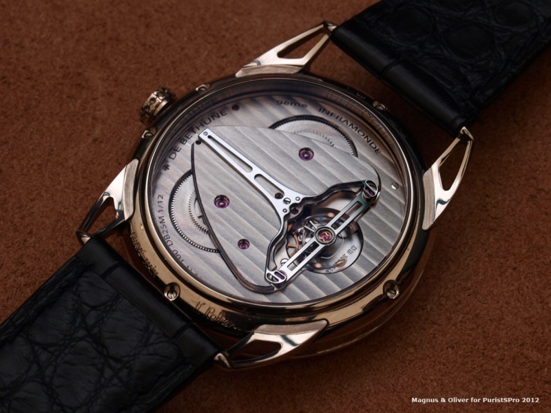
If we turn it around we instantly admire a sculpture of a movement. The Seconde Morte mechanism with tourbillon ( 36,000 vibrations per hour; power reserve: 4 days  is clearly closely related to the one in the DB28ST. Is it a problem to
see that kind of beauty over and over again? No, not at all
is clearly closely related to the one in the DB28ST. Is it a problem to
see that kind of beauty over and over again? No, not at all 
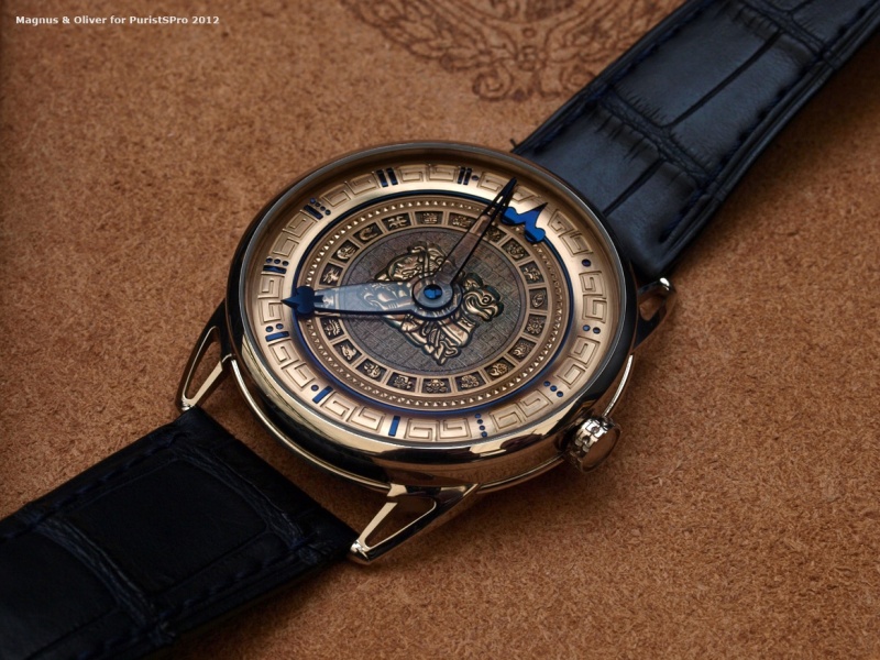
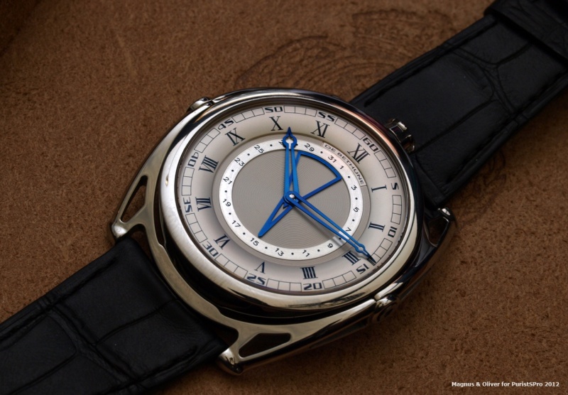
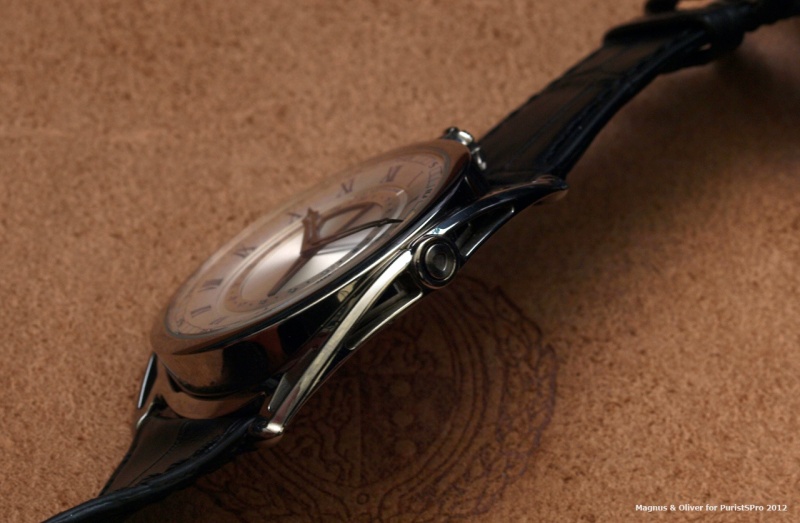
The base watch is a DB25, a 44mm watch. De Bethune put all its efforts and energy in the elaborate dial. The press kit offers a good explanation on the finesse of the dial. Thus, we simply quote it here:
"The solid gold dial of these timepieces has been hand-engraved by Michèle Rothen, and enhanced by 31 flame-blued steel inserts. The hour circle displays the numerals of Mayan numbering system, while the inner ring presents the 20 glyphs of divinities, animals and sacred objects representing the various days of the calendar.
The dial centre features the baktun, a period glyph used in particular for calculating the “Long Count” and comprising 144,000 days.
In order to highlight the subtle visual equilibrium of the dial, the hands are made in sapphire rimmed with blued steel according to an exclusive De Bethune procedure."
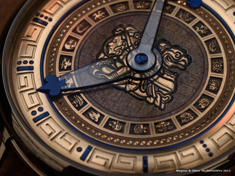
The Maya is driven by the Cal. DB 2005 (6-days PR).
A watch that certainly will continue to appeal even after 21 December 2012 ;-)
Conclusion
De Bethune's approach to watchmaking is incredible and outstanding. Approaches like this are hard to imagine under the roof of any of the big watch groups. Especially when we look at some hands, cases, dials … from some of the big brands today, DB´s attention to the detail is “crazy”. Big brands changed their hands and saved about ten times in costs, compared to earlier ones … Is there a business case behind De Bethune, even when there watches are far from being cheap? We don´t know, but the result is impressive – for sure. The worst thing we can say about DB is that they change their hands, balance wheels … faster as one is able to place his order. It is almost impossible to track their innovations, even when we talk about the same reference.
Magnus
De Bethune is a manufacture exactly to my taste - technically and aesthetically innovating, surprising but yet so humble. Real watchmakers with a clear vision and the power to deliver. In terms of design it is an up and down for me, but not because the designs are more or less well done, but more because one design speaks more to me than the other.
What
sets De Bethune apart from other manufactures is their apt blend of
aesthetics and technology. What I mean is that however you look at their
timepieces the outer appearance matches the watchmaking masterpiece
inside. There is a rare harmony in appearance and content that makes a
De Bethune instantly recognisable, and yet each watch may differ
tremendously from the other in terms of aesthetics. What a feat!
I also would like to mention that while they constantly try to push the horological borders with new constructions and materials (reference is made to the escapement, for example) but at the same time strive to perfect the traditional arts. The DB25T is a case in point. Featuring an elaborate tourbillon escapement with modern silicium parts mated to a more restrained case and dial. The dial then is entirely traditional with a sterling silver chapter ring and a heat-blued steel dial. It may not look so but to be able to hand-manufacture an evenly heat-blued piece with a large surface like in this case is a most remarkable feat.
It is for these reasons that I select the DB25T as my personal favourite for 2012. It is the essential De Bethune watch for me. It speaks all its dialects fluently!
Oliver
It was not the first time
that I had a look at their watches, but it doesn´t happen every day -
unfortunately. Each time I look at their pieces I get closer to the brand and
especially when it comes to design they are getting better and better. I like
the uncompromising approach even when I was not totally impressed by the
finishing we saw at some of the novelties. At the end of the day the people
behind DeBethune are humans as well and that is ok
DB27 Titan Hawk - what
I like on this one is the style and the "affordability", but the small
window on the back offers only a very limited view on the movement. The
latter would be a show-stopper for me. If I would go for DB I want the real thing, I want to see it all - the full beauty
Some of the DB 28 versions available are to die for and when I put them on my wrist it is always hard to give them back. But does that kind of "Rock´n Roll" fit to my lifestyle - longterm? I hate to ask questiones like this, but in real life we all have our budgets ...
At the end I agree (once more ) with Magnus, the DB25T
is THE one if you can do it only once. There is "Rock´n Roll", classic,
science, romance ... in the details. I guess one would get lot´s of
compliments from totally different kind of people, even when most of
them have no idea what it is. Would love to admire all the details day
by day, to take 1000´s of pictures ... and on top comes the wearabilty.
Only my piggy bank ... I have to work on this :-(
Magnus & Oliver


I can't get tired of reading about De Bethune,
and this report is particularly appealing. Thanks to you both for sharing your point of views and your feelings about these watches.
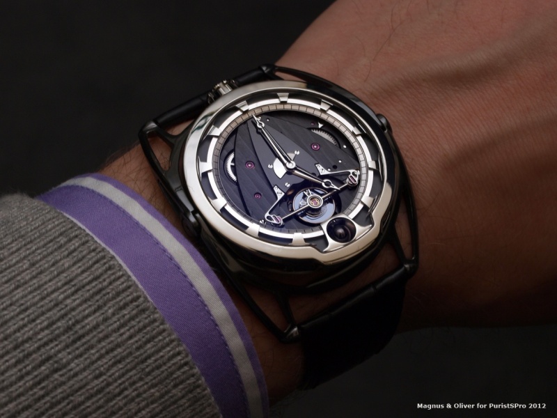
The DB28 ST (Second Tourbillon) is, for me, the one I would take from 2012 novelties (By the way, I thought that the DB25T was a 2011 watch, was I wrong ?).
For me De Bethune's style is also deeply colored with futuristic designs and thus the DB28 case and the most beautiful opened dial of the 28 ST is the one I'll put in 1st position among all their offering.
But I understand that the DB25T is more discreet and is more easy to place on one's wrist. Question of personnal taste. There is one think I didn't really like about the 25 version: the index ring (in sterling silver) is not made with the kind of finish I like. I prefer for example the normal DB25 one, by far. Maybe was it because it was a prototype but I didn't like the look of the outer ring silver surface (even If I think the numerals' style is perfect).
To make an adition to what you reported, the DB28ST's bezel is in Platinum (a difference with other DB28s), and the watch is released in 10 pieces only for 2012.
I noticed that the DB28ST has a plain case back (sapphire for the DB25T), but this is due to the fact that the DB25T's show is available at the DB28ST's front side. Thus, we have a more discreet DB25T with a flamed-blue sky on the front.
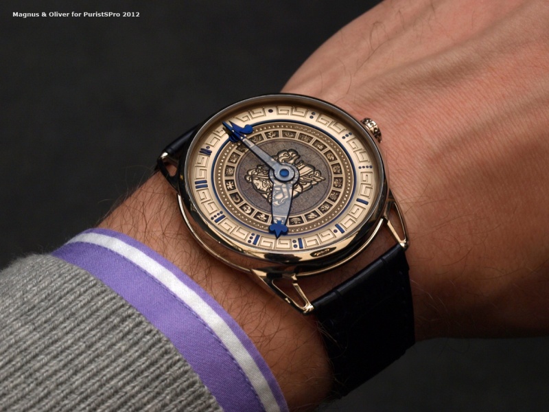
I must say the watch sits perfectly on your wrists and makes me jalous of your wristshots!
As I said on last wristshots post from Fx, I was lately able to see the Maya. From what I saw It seems that the dial has lost this darker look on the central engravings we could see on Basel's pics. I don't know if it's due to the pictures or a change in choice.
I thought at the time it was presented that it wasn't the kind of product I wish they launched. Too "bling" and what was the point , etc ... But I must admit that in the flesh the dial is absolutely stunning. Very very thin engravings, very well balanced and it is obvious that it's a real work of art. I was wrong and it could have nearly be my 1st choice for 2012 if the technical level of the DB28ST wasn't so exceptionnal.
A very nice surprise to me.
Finally, the new DB27 is really something I like more and more from the pics (haven't seen it in the flesh yet). At first, I thought the plain case back with the little window was a shame but the more I look at it, the more I understand it. I wouldn't accept it on a DB25. But this rounded caseback we see on many DB28 versions is finally a good choice since the finish decorations is not deepened. The pilosophy is preserved with the focus on the balance wheel. A very nice entry level DB.
Thanks again Oliver and Markus for the share and the work.
De Bethune seems to be still my favorite of all brands.
Cheers,
Mark
This message has been edited by Boréale on 2012-10-12 16:11:19
Mark, thanks for your perspectives and additions...
I would say ...
it's a question of shape and theme.
But this is only my own opinion and, hence, remains subjective of course.
For me, the DB28 collection is more futuristic and also its case is quite round (quite distinguishing from the lugs).
On the other hand, the DB25 is a modernized version of a pocket watch (kind of neo-retro trend), which style is older looking compared to a DB28 (D. Zanetta is more involved in the style design and is, from what I heard, an expert in pocket watches).
Thus, when I saw the DB28 or the 28ST or the DB27 (same collection), I find the plain case back (as an "officer" type case back, more round) completly matching the case. I guess a sapphire flat case back would have shown a visual break between the case's flanges shape and the caseback's.
I see in the little round window a kind of aircraft or shuttle little window allowing to look at the balance wheel: style very futurisitc, imho.
My feeling is that if the DB28/27 line had been equiped with a sapphire case back the plates decoration would have needed to be completly different from the "cote de geneve" etc ... I would have found weird to couple a DB25's plate decoration (whether it be a manual or an auto wind), or DB15 etc ... with the DB 28's.
I guess it also helps the client to make a clear distinction between the 2 collections.
I feel that the plain case back on a DB25 wouldn't have been appropriate as the shape wouldn't have matched the flat front glass and the more classical look.
This is how should look an equivalent of the DB27 movement: the DB25 auto (the balance wheel, the weight of the rotor are different but I guess they are similar, even though I didn't see it):
My opinion and taste is that I prefer the polishing work and clean style of the plain casebacks rather than this.
When you take a DB25 in your hands, ofr the 1st time, and you watch the front side, you are very surprised when you discover the modern movement afterwards. This contrast is part of the interest of the sapphire caseback on a DB25.
On a DB28, I guess De Bethune would have had to do as much as the global futuristic design for the movement. If not, I guess it would miss the point.
DB27:
DB28 (the DB28ST is nearly the same but with no window):
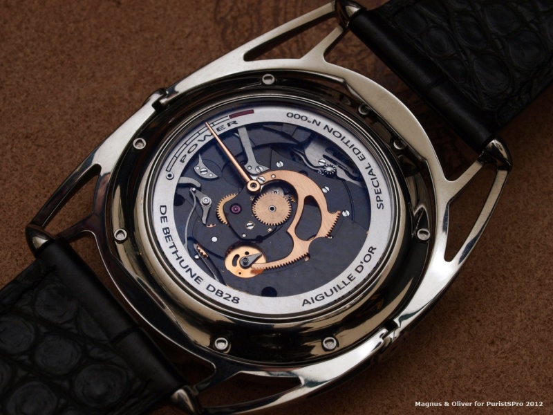
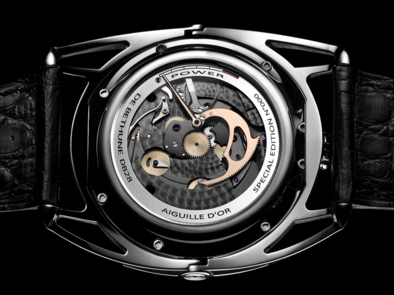
One exception here with the DB28 "Aiguille d'or" Limited edition:
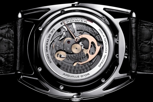
I must say, even if they chose a different decoration from more traditional ones, I don't really like it that way, even if this is still very nice. But I think I got used to seing them the other way and thus that my opinion is biased.
But you understand this is just my opinion and how I see things.
I'm curious to know how do you appreciate the caseback choice ?
Best,
Mark
Mark, you just opened a totally new dimension...
I will have to think about this a bit. BTW, also Daos made a comment in that direction in her response to François-Xavier's presentation of the Roger Dubuis Velvet collection. She criticised the design of the rotor in a ladies' watch.
Thanks for this eye-opener!
Cheers,
Magnus

Mark,your analysis is just perfect..
Not see through at any costs like it seems to be these days,and De Bethune being the fantastic brand they are they know that for sure,great sign of maturity if you ask me.
So I fully agree on the DB28 caseback...but what do you think of the transparent case back of that lim edition?is the movement interesting enoughto show off like that in your opinion?Or some distinctive feature of the case have been lost?
Personally I love that rose gold power resrve hand in contrast with the dark plates......I could settle for both really...
Thanks for your Great points on "our "fav independent....
Mo
You point it right Mo
Concerning the LE caseback display, it's a really tough question to answer to.
Firts, I didn't see it in the metal yet, and I guess this must be something. As you say the contrast between gold and the black finish must be beautiful.
Nevertheless, my feeling is that this overall "Aiguille d'or" case back design (style, shape, balance) is quite different from other DB's open works: the DB28's face or a DB25's back especially. And thus, I would say it is not as appealing/interesting.
Maybe I should place myself as if I was on the verge to buy one, and only had to choose the case back I wanted (and if the rest of the watch was identical).
I think I would say that the brand has already chosen for me: what we like from Indies, and from this brand in particular, in the spirit and choices they make on their collections.
Thus, when they decide to choose plain caseback displays, it's a part of their langage and their will. Hence, a part of the watche's soul inherited from the designer.
They chose one way or another, and thus defined the meaning of the caseback type for each watch.
And I think I would go for a regular DB28, i.e. with a plain caseback.
But this is a very personnal feeling (that may change from one month to another) as it is purer but that I don't consider as more true to the spirit of the brand (just a little bit ^^).
Your question is a trap :p
Thanks for the kind words by the way Mo, especially from someone who share this passion for this brand.
Cheers,
Mark
This message has been edited by Boréale on 2012-10-15 16:45:04
Thank you!
"it look breathtaking and perfectly fitting on your wrist"
sidneyc, thanks!
Oliver

Teutonic connection....
Damjan ...
Thanks!
Oliver

One of the reasons why...
Great report, guys! Bravo!Cheers,
Daos
Dear Daos, I could imagine the Mayan ...
Thanks!
Oliver
Rock'nRoll or...modern classics?
Ever since i layed my eyes on the DB 25 first version with blue dial and automatic movement,I soon realized (even if a few years back my knowledge is not what it is today)that I was in front of something special.
Once more ,De Bethune is above ,well above many ,my 100% favourite independent,no doubt.You Just can t not be overwhelmed by its complelling creations,innovation,style,personality,quality...
Funny how you mentioned that many in the industry still wonder how and WHY on earth they put so much in their watches,far from being cheap ,as you said,but still"cheap" for the amount of work and solution on every model of their production.
An everflowing waterfall of novelties,calibers,design mavericks.....NO CORNER CUT in De Bethune for sure
The genious of Denis Flageollet matched by the artistry of Mr Zanetta is a match made in horological heaven.
Again,the style is not for all,but boy,thats a signature style,like it or thank you very much!A sign of one of the biggest personality known in the industry.
And when you had enough,anew set of hands,a new dial,a new concept is created,just amazing....
I visited the manufacture twice and another visit is due soon,only after the visit you realize how deep their commitment to quality is,no corners cut...
Thank you guys for the report ,marvellous,I must say that apart from the unobtainable ones,my vote goes for the Mayan dial(I really wish it was mine...really)and the special edition DB28...just tickling me....a lot....
Put it like that ,at this stage in my life I still need some extra Rock'n Roll...so as far as I am concerned...bring it on!I might not deprive myself of extra Joy.....and in the future?Maybe I will collect more De Bethune even at a late stage of my existence....they might have become a classic of the classic by then.....to me they will be anyway.....
Mo
True commitment from the heart,
Today, not many brands can bring me what I found in De Bethune. The 1st novelties I'm curious to learn about, in Q1 since the last years, are theirs.
I'll have to go on pilgrimage to visit them on day.
Cheers,
Mark
easy to arrange one..
Lot´s of passion ...
Factory visit, well this is something I would really like to do
Oliver

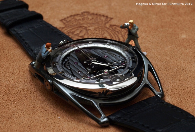
The following pictures is amazing, you perfectly catch the reflect of the silicon balance

pifpaf, thanks for your kind reply.
Oliver

So much to discuss in your report...