
Antiqua wearing impressions (with new photos)
Well, it's only been a week, but I have been wearing the Antiqua the great majority of that time and have made a loooong list of wearing impressions. I hope that you are not getting "Antiqua fatigue" from this rapid-fire series of posts, but I am really inspired by this watch! That's not to say that it's the perfect timepiece -- haven't found that one yet, but the quest is great fun. That said, the "love" column substantially outstrips the "not sure" and "don't love" categories on this one. All photos are mine, including some from our January 2011 visit to Vianney's atelier. Without further ado, let's get going...
What I love about this watch:
1. One word: Steampunk.
The design ethic really appeals to me, and I dig the whole idea of "the future as predicted by the past" as a guiding principle. We see the future through the lens of present-day items and technologies -- so having a submarine or space ship with heavy, riveted windows would seem to make perfect sense.
2. Started "it" all -- the modern design movement in watches. I received a message from a well-known industry figure the other day (let's call him "Max B.") who called the Antiqua "the missing link between tradtional and contemporary watchmaking." I think that Max would know! Put another way, the Antiqua itself (in Missing Link" guise) can be seen as an object that itself drew on the past to predict the future.
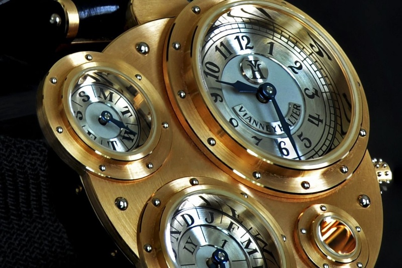
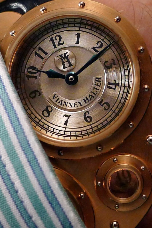
3. That case. Not just the design, but the finishing. If there are cases that are more beautifuly done, I have yet to see them. And, my sense is that the case design works to keep the finishing intact -- my watch is a fairly early production number, and the edges and polished surfaces still look great. There seems to have been a great deal of thought given as well to which surfaces and edges to finish in what way -- whether brushed or polished, beveled at what angles, etc.
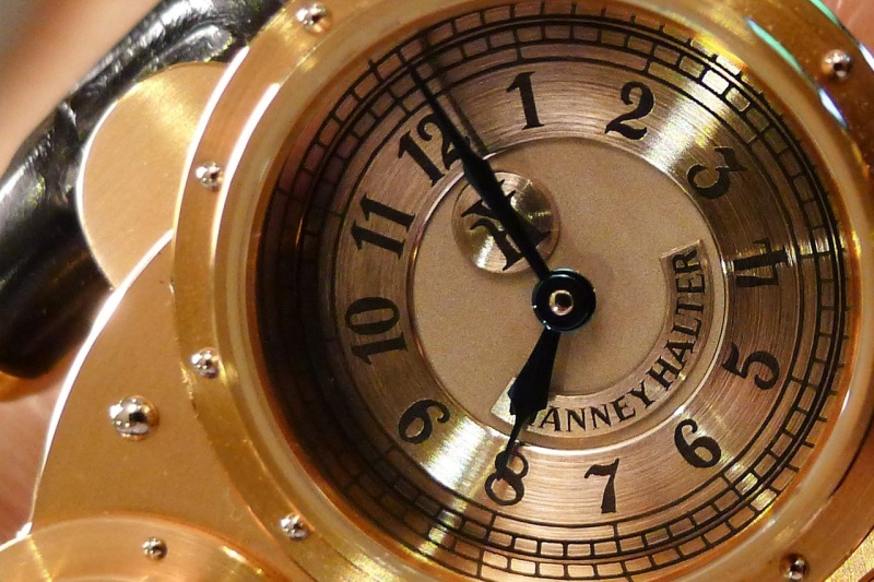
4. More on the case: the portholes are gorgeous, and the polished inner chapter rings give real life the watch, reflect the dial indices in interesting ways, and throw light on the dials themselves. SJX' great review was where I first read about these chapter rings, and he's absolutely right in calling them out as a key feature of the design.
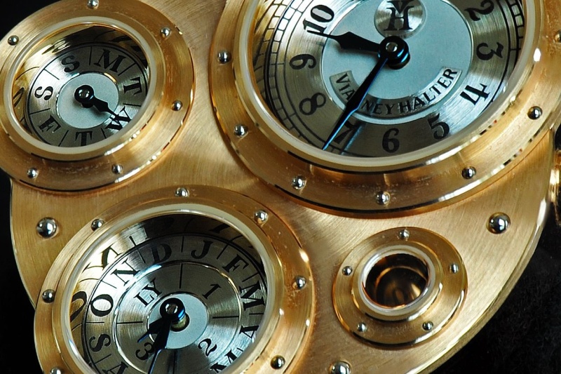
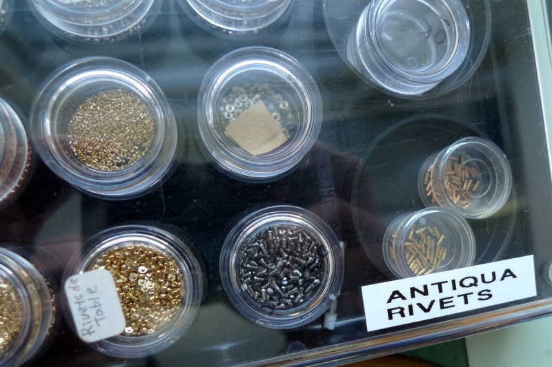
5. Rivets. Lots and lots of rivets -- according to Vianney's website, 104 in all (I haven't counted them). Different colors, sizes, and shapes -- all finished and installed by hand.
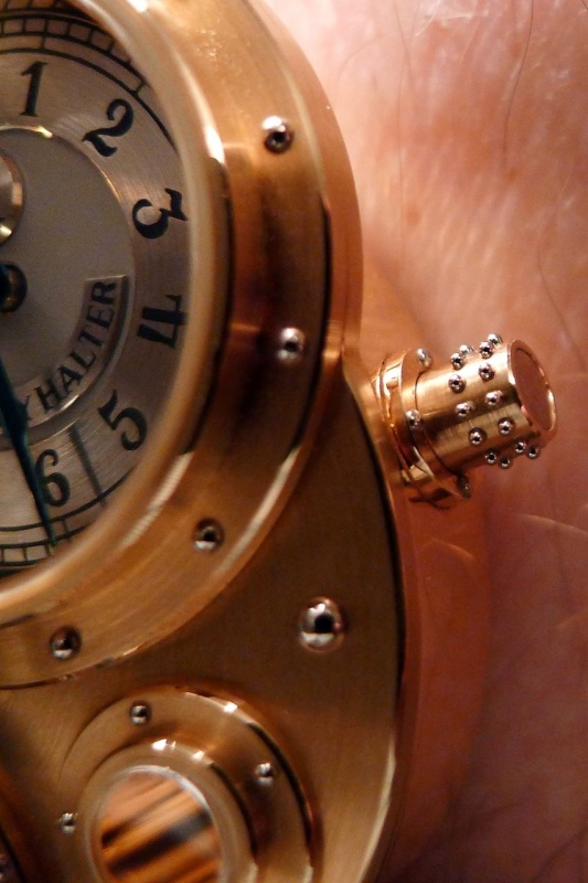
6. The crown, which is rivet-studded and sits on a base that itself features four rivets. See also my comment on the crown in the "not sure" section below -- but it is a work of art:
7. It may not be obvious in the photos, but the main porthole for the hours and minutes is large enough that its edge covers the center of the underlying case. This may not seem a big deal, but when I briefly owned a VH Contemporaine the center point of the circular graining of the "table" fronting the case always drew my eye. As a result, I was obsessed with the solid case as opposed to seeing the open windows. With the Antiqua, the effect is just the opposite.
8. Underneath it all, it's bascially a round watch.
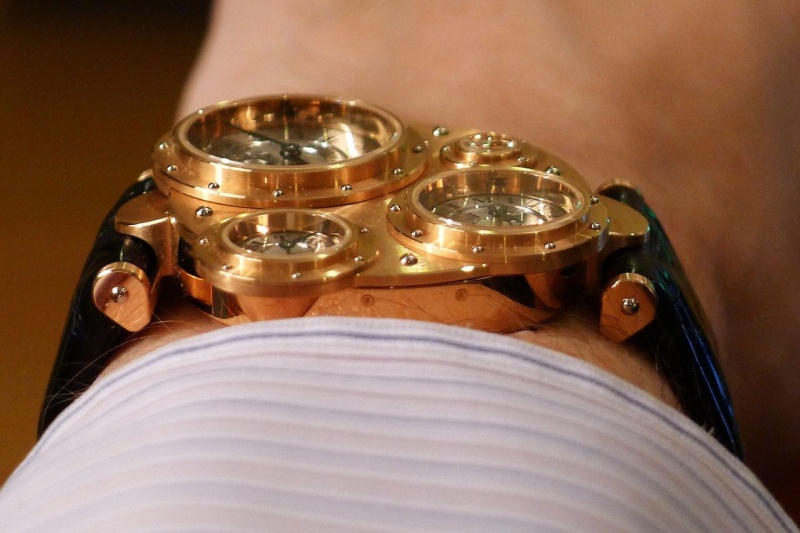
9. The fact that the hands sit above the main body of the watch allows the main body to be quite thin for an automatic QP watch. And, the bezels are not only of different sizes, they are different in height -- really drawing the eye whenever you see the watch at an angle.
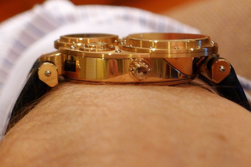
10. There are pushers (month and day of the week) but they are seamlessly integrated into the case design and execution.
11. The watch sits beautifully on the wrist, as you can see above. I don't have a big wrist, but the size of the watch is great and the lug design allows the strap to come straight down around each side of the wrist. By the way, the idea that the Antiqua is a huge (or even big) watch is sorely mistaken. I know that some early reviews characterized it as large and bulky, but I find that difficult to believe even by 1998 standards. By today's measures, this is actually a quite modest piece. For comparison, here's the Antiqua with another favorite:
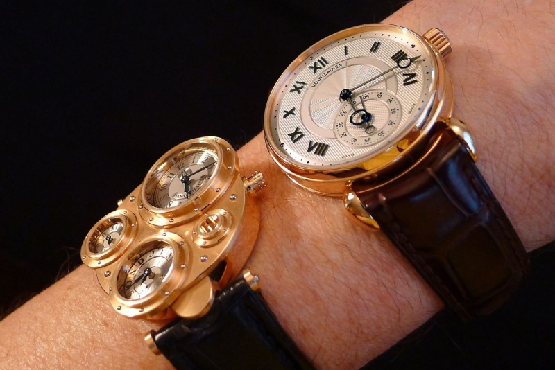
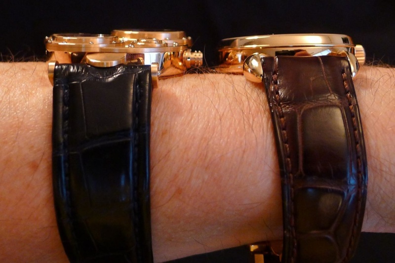
For the picture below, I used the miracle that is Photoshop to overlay the case of the Antiqua on the Observatoire (both taken from the same image). The main body of the Antiqua is actually smaller than that of the 38mm Observatoire.
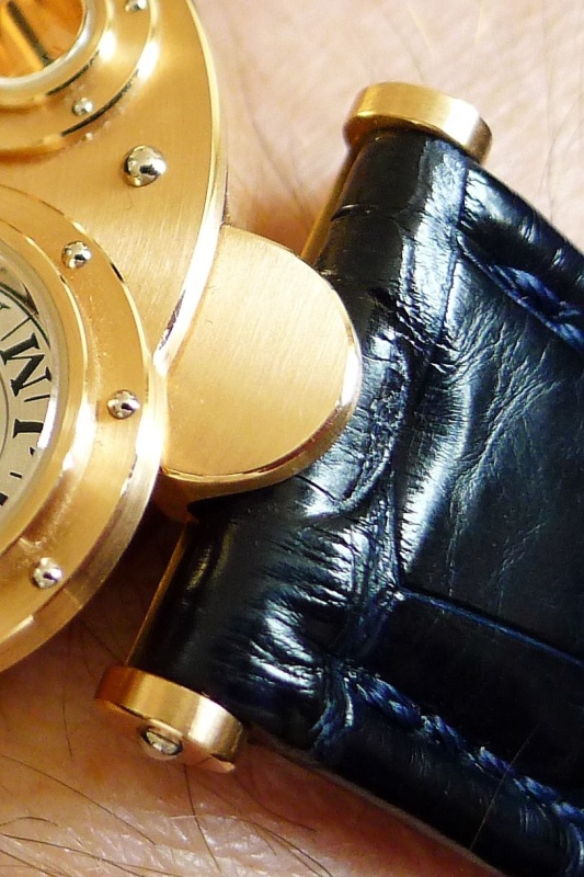
12. Great lugs. Very interestingly shaped and attached with half-moon extensions to the case -- and as noted above, really helpful in making the strap hug the wrist:
visib
13. Nice strap -- as you can see in the photo above, there is a semi-circular indentation to make it match the lug. Semi-gloss croc, with a rounded end a la Lange to ease it through the clasp. The strap on my watch must be an extra-long as I'm on the last hole, but it still works just fine.
14. Before I leave the exterior features, I should mention the rich golden glow of the RG version. The color of the gold itself is super, and the fact that the "table" of the watch is both RG and visible (although not too visible thanks to the size of the portholes) gives this watch a warm feel that's hard to describe (and difficult to capture in photos).
15. As an adjunct, this watch looks great in indirect light, especiallly pink light late in the day. More on the flip side of this later, but in pink or soft light the combo of RG and the PT dials can't be beat.
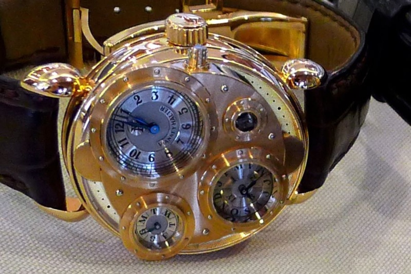
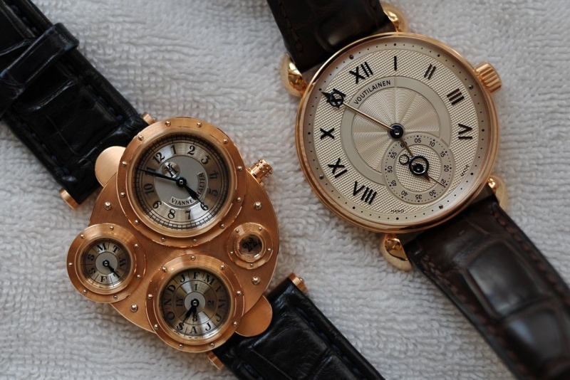
16. Speaking of the platinum dials: they are fantastic! The decision to use platinum was an inspired one, and gives the watch a really distinctive look. Compare below with the silvered dial of the Observatoire -- it's a completely different look:
Each dial is multi-part, has different levels, and different finishes (frosted and grained). And, the dials are clearly visible because the crystals have AR coatings.
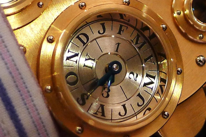
The dials start life as separate pieces, and are hand engraved, which with platinum is no easy feat. I understand that on the gold dials used on Vianney's other watches, the numerals and divisions are pre-scribed -- but on the PT dials of the Antiqua, it's all done free-hand. Once the markings are engraved, they are filled with lacquer. Here's a view of some dial parts before lacquering:
What else? Lots:
17. The hands: great shapes, nicely domed, and beautifully blued.
18. The posts on which the hands sit -- thick shafts with rounded, mirror-bright tops.
19. Let's not forget the movement! First of all, it's a QP -- what else for a time traveler to take? Second, the design had to be tremendously inventive to put the indications in the appropriate spots on the surface of the watch. There's also a lot going on in terms of multiple vertical planes -- not as much as a Datograph, perhaps, but still quite impressive.
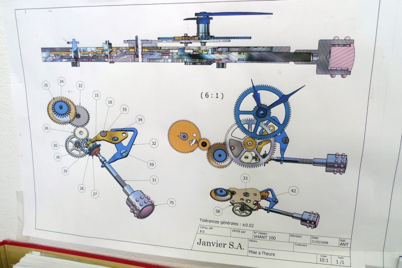
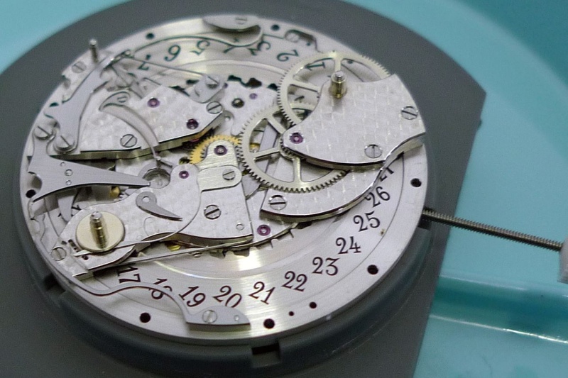
Note the finishing on this side of the movement -- really pretty.
20. The movement has an instantaneous day/date change at midnight -- I do mean instantaneous, and I do mean right at midnight! Both the day hand and the date wheel snap over with an audible sound as the hour and minute hands align at the top of the dial. I haven't seen what happens at month end -- will be interesting to see whether the month change is as rapid.
21. The year indicator points directly to the middle of the year (1, 2, 3, or LY) -- none of the creeping around that one sees with other QPs.
22. 28,800 VPH, ticking away almost silently.
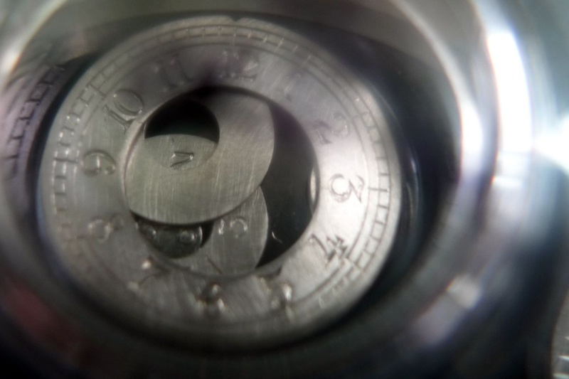
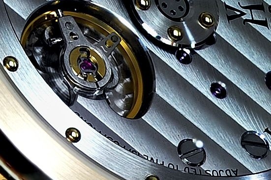
23. The famous (and patented) mystery rotor, with the sapphire section connecting the rim and center -- and lots of rivets. The rotor spins like a top at the slightest provocation, with the whirring rivets giving a real sense of movement.
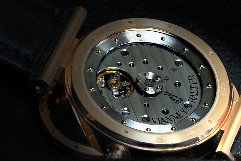
24. The hidden transition to the balance cock from the main bridge. If you look carefully you can see it in the photo above, but from most angles it is almost impossible to see:
25. It takes 900 hours of labor to make.
26. It comes with a matching winder box. Rather unfortunately, someone in the chain of custody of this particular piece kept the winder (dang!) so I am now on a quest to find another...
27. Speaking of winders, the winder feel is silky smooth. It's an automatic watch, so there won't be that many opportunities to wind it, but the action is almost effortless.
28. I can now interact with Vianney as an owner rather than just a fan:

29. It is an impossibly beatiful thing made in chaotic surroundings.
30. The good bits peek out from under your dress shirt
31. As Steve Jobs said when he introduce the iPad: "it is just so lovely to hold!" And to wear...
Well, that's a long list of loves! There are a few things I'm not so sure about:
1. The mystery rotor reveals little -- it would be great if the interior bits of the movement (rather than that 7/8s plate) filled the view through the sapphire rotor.
2. The port for the date is both narrow and deep. The one on the Contemporaine is superior in this regard. I know that this is a result of the layered movement design here, but it's not my favorite bit.
3. The clasp, while it has the trademark rivets, seems almost feminine to me. While I'm at it, the same might be said for the printing on the movement. For a watch that so many people think is brutish, in real life it's actually almost dainty! The Classic Janvier is a meatier interpretation of the same themes, and points to how the Antiqua might have been subtly different.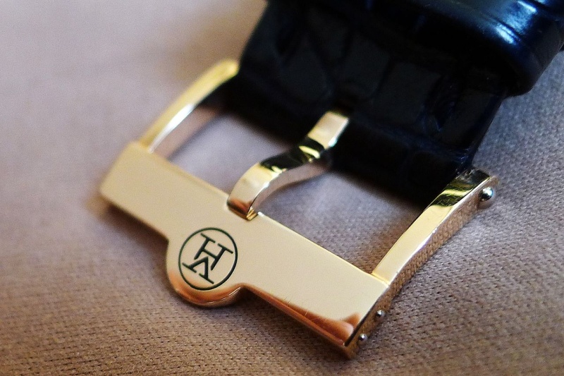
4. The movement isn't entirely in-house -- but given how extensively it's reworked and the large portion of parts that are made in-house, that's really a niggle.
5. The crown is tiny! Look again at the comparison shots with the Observatoire and see just how small the Antiqua's crown is.
6. The hand engraving makes each watch unique. Unfortunately for me, it seems that on my "Vianney Halter" name plaque on the main dial, the engraver ran out of talent just after "Halt..." 
7. Love the 28,800 VPH -- not sure about the smallish balance wheel.
8. The watch (and in particular the PT dials) looks so great in soft/pink light -- it's not quite as pretty in harsh lighting conditions. Still pretty, though!
I haven't had any experience with sending the watch for a servicing, but my guess based on the reports of others is that my reaction will likely fit on both the "love" list (what outstanding results!) and the "not sure" list (gee, that cost a few bucks!).
OK -- getting close to the end here. One thing I don't love:
1. Karma. What, you say -- Karma? Yep. I'm not sure whether the whole story of the Halter Barnes collaboration will ever be known, but it does make me a bit sad that there were bad feelings between the designer and watchmaking genius as a result of the process of bringing this watch to market. A gorgeous result, but at some human cost...
That's all! If you've read this far, it's a tribute to your stamina -- and I appreciate the opportunity to have shared these thoughts with you. As always, all of the above represents my opinions as opposed to fact, and I gratefully welcome all comments, suggestions, questions, and criticisms.
Best,
Gary G

thanks for the comprehensive - and honest - review
Great comments, Amery
I understand your point on the "cargo hold" date display -- perhaps it's my aging eyes. The conundrum is that I would not want to increase the size of the date porthole, so there you have it.
I was quite disappointed not to get the winding box, but will continue my quest -- in the meantime, I will follow your advice to wear the watch!
Winding feel is fantastic, as you say. My guess is that as with other high-end automatics, this one really isn't meant to be wound by hand that much -- but the tactile sensation is marvelous. I certainly don't feel that a larger crown is needed for functional reasons.
The setting instructions are great! Find midnight, then advance to 3:55 am (not 4:00!), then set the date to the 1st of the month, then set the time, then adjust the months, and so on...on the good advice of tahoeblue I read these instructions very carefully and followed them to the letter when updating the calendar mechanism, and it worked a treat -- from now on I will just try to keep it wound.
As far as the limelight goes, my sense is that Vianney is misunderstood. Or, perhaps, that the nature of his operation (in particular, the near-bespoke nature of each piece as compared with repeatable production techniques) requires that the owner sacrifice some attributes (absolute reliability and inexpensive servicing) to receive the other benefits on offer. That said, I think that there must be many hundreds of owners of VH watches who have never had as much as a single mechanical issue with their watches. The other thing is that the market cries out for novelties. Yes, the Antiqua is marvelous, but even for an independent there is some expectation that new pieces will be forthcoming. In my view VH is certainly a deserving member of the upper range of independent watchmakers -- and I think that his membership in Time Aeon, for instance, suggests that other leaders in the field feel the same.
Thanks very much for your remarks, and for your ongoing enthusiasm for Vianney and his work.
Best,
Gary

What a post, Gary!
Thanks, Steve
I agree with you -- as I noted in my write-up, I think that the Janvier gives a hint to how to apply the same design ethic in a more contemporary way.
That said, the Antiqua is a thing of (delicate) beauty! Will be interested to see in a couple of weeks how MB&F allows the future to predict the past with its more classic look.
Best,
Gary
Great Photos Gary

Gary you really love your watch.
Thanks for the great post, I feel that I know this watch much better now and I appreciate it much more.
Best regards,
George
It's true, George!
I'm glad that you found the added details interesting. This one really speaks to me, I must say.
Best,
Gary
Great post Gary
I think you're going to like this one in person
The only issue for you will be finding a PT case with PT dials
This watch has so many interesting details, and draws the eye from every angle. When I write up my wearing impressions on various pieces, the first list is "what I love about this watch." It occurs to me that there are some instances in which I loved lots of "things about" a watch but didn't love the watch as an overall creation. Here, I'm drawn to the watch at multiple levels -- not just in terms of a tick list of neat features.
Best,
Gary

that was an absolutely phenomenal posts
one of the highlights of the year for me. What a great piece, and thanks for the insights and especially the photos on the wrist that makes it much easier to conceptualize this watch that I have never seen in the metal. Outstanding.
Thanks a lot
Andreas
You are very kind, Andreas!
Glad you liked the "real life" photos -- most of them aren't exactly works of art, but I hope that they give a good sense of what the wearing experience is like.
Best,
Gary

Brilliant post Gary!
I still vividly remember seeing one of these for the first in Basel 2001 at the AHCI stand, asking VH to show it to me, very briefly strapping it on and thinking, wow that is one fabulous watch!!! At that time I did not truly appreciate VH's genius and/or the amazing details of his work. I certainly do now!
I fully agree with you, his habillage is second to none in my opinion. One only needs to take a look under a loupe to reveal many details typically unseen, that each time I look, blows me away. Having owned a Classic for almost 4 years now, it always brings a smile to my face, when I put it on.
You will truly enjoy this one for years to come, congrats on finding one, and thanks for the superb review.
Cheers,
Tim
Tim, you are right
Many thanks, Tim
My search for this one has been a poorly kept secret, for sure! Thanks once again to the members of this forum who assisted in making it happen.
I think one of the reasons I'm so happy about this watch is that I had always assumed it would be beyond my reach -- a true "grail," to apply the over-used term we put on our wish list items. This is almost as if a G-F Invention Piece 2 suddenly came on the market at a price I could afford (by the way, fellow members, that's a hint...although I have little hope on that one). This is a "big boy" piece -- sort of like moving up from an 8-cylinder Ferrari to a real 12-cylinder one
A friend of yours and mine was wearing his Classic the other day, and I was reminded (surprised, really) by how much I like that watch as well. It isn't a big piece, but somehow looked bigger than I recalled. Same great case and dial work.
Now if you can find me a winding box, you'll be my hero forever...
Best,
Gary

A great review of an iconic watch...
Don
This message has been edited by DonCorson on 2011-09-24 15:11:07
Appreciate it, Don
In terms of the details, for many of them I was able to draw on the many excellent existing articles and reviews that have been done over the years, but there were several things that just came from observing the piece over the course of a week. I do love that instant day/date change -- worth staying up to midnight just to see it go!
Best,
Gary

great post Gary
Glad I could make this piece more "real" for you
...although as you know there is no substitute for holding it in one's own hands!
Best,
Gary
Thanks for the wonderful post.....
Quite an education on this timepiece. Was rather impressed with it before reading your review, but even moreso now.
Feel free to post additional scans as you take them.
Darren
Thanks! I may give the camera a bit of a rest for now
...but I am sure that as with other favorite pieces of mine, I'll be returning to this one in the future. The interesting thing to me is that it is a fairly easy watch to photograph, but very difficult to photograph well -- and I'm not satisfied with any of my shots yet. The old truism that watches look better in person than in photos is particularly true in this case, I think.
Best,
Gary

This is one of the greatest posts I have ever read !
I have saved it and will reread it many times.
You have done justice to this most beautiful and important watch in the modern era. Thank you Gary. I am a big fan of Vianney Halter, and I firmly believe it's just a matter of time when every purist recognizes, understands and appreciates the master and all his masterpieces. I hope everyone will get chance to read this great post of yours.
I am deeply grateful for your remark
As I mentioned in a response higher in the thread, I do think that Vianney and his work are misunderstood. Steve H has a great criterion for watches: how will they be seen 20 to 30 years from now? I think that time is already writing the legacy of this piece, and that people will be talking about it for many years to come.
Thanks again for your kind words.
Best,
Gary

I saw this yesterday, and almost read it twice...but
I resisted. Because I was at the races, and after race events, and too tired to read the whole article. I didn't want to split it initial parts or a cursory reading. So I saved it for my Sunday reading(Forgive me Lord, I missed Mass this morning, and I am making inferences and preferences about sunday readings), and boy.....was I rewarded with an GREAT owner review.
I always wanted to write about owniership proposition and experiences on the Antiqua, but as the months roll by, I just too lazy to do it.....guess one has to strike whilst the horology iron is hot.
Best x2,
Horo
Uh oh...
...now I've gotten you into trouble with the Lord! Just to add to my burdens
Thanks very much for your note, Horo. It took me a number of evenings this week and a fair amount of my Saturday to concoct this post -- perhaps one of the few benefits of being away from home for prolonged periods is that it gives me a bit of time to be more active on PuristS. So I wouldn't think of you as "lazy" at all -- just busy, and with other priorities!
Glad you enjoyed the review of a watch that is important to both of us.
Best,
Gary

Fantastic Post
Appreciate your comments, Seth
Great to hear from another VH owner! As long as we're on the clasp, the thing that bugs me the most about it is that the VH on the clasp is a different (and considerably sanitized) shape/font from the way that the initials are depicted on the lozenge on the hours/minutes dial and printed on the movement.
As for the engraving, I agree with you that it's mostly endearing. In any case, I'm not looking at my watch through a macro lens all day! In real life the engraving looks perfectly fine to the eye.
Thanks for the encouragement to express my personal observations -- I think that if expressed in a constructive way, there's nothing wrong with saying that our beauty queens have a zit or two...
And once again, thanks for your kind words!
Best,
Gary

Well done, Gary!
Thanks, Davo
Now if I could only pick up some tips from you on wrist shots, I could really get somewhere!
Best,
Gary