Has anyone seen the new 5396 in metal cp.to 5125 yet?
Hello all,
there were several posts here about the new 5396 design,but no real "in metal" impressions yet,but only pictures from official sites or catalogues AFAIK.
I also read posts here which compared those "almost twins"-5125 in REAL life pictures to pics of the new 5396 dial design taken from prints ,giving the 5125 much better cards of course -but such comparisons are of no value IMO.No one can compare a catalogue pic to a real photograph of a watch with all subtleties of lighting etc.!
Therefore I wonder if anyone yet had personal impressisons.
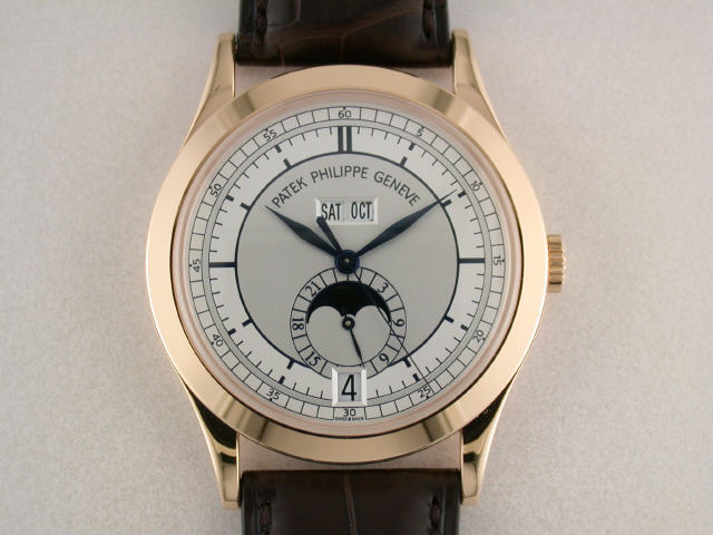
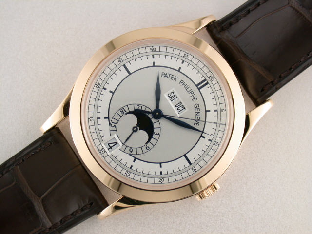
As far as I saw it has an extremely classic and beautiful case and dial layout (reminding as closely as possible of the classic designs of the 3448 family,only slimmer...) and PP seems to have at last answered the plea of countless watch lovers to make a watch looking like 3448 or the limited 5125 as regular model -and probably deserves a kind "thanks" from us 
(Could it be that they finally decided to build this watch so long asked for because even PP feels a lack of demand caused by the general problematic economic situation and needs a new "blockbuster" ??)
The critical voices(e.g.24 hours indicator,shared by 5125) I personally cannot follow.For me it's me the most classic PP since decades and surely one of my absolute favourites among the current collection.
Unfortunately it will never get any collectors' value as there is no kind of limitation and thousands of it will be built and resale -if necessary and inevitable - will be difficult and at a great loss therefore.
A comparison to 5125 in metal would be very interesting yet.The lack of crown guards makes it much more appealing to me,no Wempe written on the dial too, and 38 mm diameter seems a perfect and more contemporary size.
I never liked the crown guards of the Wempe watch.A sportive attribute to a classical design.In person ,the YG version of 5125 did not convince me at all,too bulky (thickness over all compared to the rather small diameter of 35mm) and lack of elegance ,the RG version might be nicer and a temptation,but I never saw one in metal,and prices on the second hand market are still far from being reasonable for an anual calendar.The limited number is an interesting attribute of course,but value might suffer now with this new 5396 dial.
thus my question here.
kind regards,
lutz

Deleted posts and or pics...
-MW
I only saw pictures of the PP5396 Rg. Beautiful but deleted? I do not understand. Tks
Pics and remarks
Here are some pics that I found on the net.
Please delete if it violates any regulations!
Awesome watch but I don't like the 24h indicator (useless imho) and that "Geneve" is separated from "Patek Philippe" and squeezed into the small space between the day/month windows and the center.
Also I don't understand why it's approx. EUR 4,000 more expensive than the 5146R which even has a power reserve.


thanks for the pic update,comments:
thanks definitely great looking,esp.the last pic.,for me a probable PP icon if production numbers remain small.
Funny, the repeated critical remarks about the 24 hour marks.The 5125 had them too,and 3448etc had a seconds-scale there looking just the same.A 24 hour scale is very useful sometimes,first when setting the watch to avoid setting the month at the critical period usually between 7pm and 6 am,second after a nap it tells You if it's 6 p.m.or a.m.
5146 cannot be compared to this watch,the 5146 dial is far from being classic Patek IMO,very busy and the proportions never appealed to me.
The only problem might be that 5396 "only" is an anual and no perpetual calendar.
regards,
lutz
I like the New Rose Gold version
Geneva under the day/month is better than in the half circle layout of the sector dial.

Saw the actual watch...
a few days ago at an AD.They only had the WG and I was very very tempted to walk out with it.However, I have been wanting a RG watch for a while and thus will wait a lttle longer. It's everything I thought it would be and more!
cheers
fernando
question
fernando,
how did you feel about the word Geneve squeezed into the center? And the dominant large letters of Patek Philippe?
Is it disturbing when looking at the actual piece?
Thx!
No problems...
in my eyes.It was legible and felt perfect on my wrist. For a daily wear Patek, this one is hard to beat.
re:5396RG

Ready down here Fernando


5396R
thanks for the pic. Could you also post a pic of the old 5396r for comparison ? Just wondering which one appeals to me more. Thanks Dude !

I saw it in person, and came away with the same opinion.
Upon first seeing photos of the new model, my first thought was that it had effectively "resolved" the old one. However, with the sector dial 5396r sitting next to it, I was surprised to discover that I preferred it to the new one.
possible reason:
While having seen the old dial many times at dealers,the new one just from the pics here,I still think why You might like the old one better sitting next to the new one:the old one is dual coloured and much more to "see" on the dial-for me much too much going on on that dial- while the new one is classic restrained,which I normally prefer.In the long term one gets less frequent tired of simple and plain dials.But I have to see it in person first of course till I can properly judge.
thanks

agree with Quan, I saw and handed it,
Mech.

I would prefer rounded bazel vs sharp-edge..
Bests
Vit
I don't like.....
Yes I know, sacriledge not to like a PP.
But IMHO the balance of the dial is all wrong.
Everything is in a straigt line straight down the middle, there is nothing off to the sides.
Patek Philippe
Day Date
Geneve
Hub
24 Hour Dial
Moon Phase
Date Window
It looks like a totem pole.
Just my 2p's worth.
D in W
interesting point,
Hi Dave,
I wonder how it feels,when I see it in person,as beautiful pics can deceive,that's true.
It reminds me of the impression of many Pateks,they often look a bit pale and too austere in comparison to more decorated dials of other brands which have much more "glare" effect .But probably this is a strength of classic PP designs (without subdials-which I don't like at all),one hardly gets tired of them,they are timeless,some kind of puritan looking watches(Calvin moved to Switzerland once ....)
The "too vertical" impression is something I shall check when seeing it in metal,not sure what's the difference to 5125 with about the same design only less prominent 24 Hours scale.Handling the5125 in YG, I was disappointed I have to admit,proportions of case and dial did not really speak to me then.
kind regards
Lutz
The Totem Pole
Yes indeed, looks like one:
The new 5396 will live on with this nick name...
This message has been edited by Expat on 2010-02-26 04:02:39Agree and more
I agree with Dave.
And it's not about simplicity as he owns the 5127R if I recall correctly.
The dial would look more balanced if the day/month windows were shifted to the sides and a little downwards.
That way there would've been also enough space to print Geneve under PP and not between windows and hub.
Looks really kinda squeezed in there.
However the brand name solution of the sector version is also suboptimal, rounded around the windows, with the word Geneve in the same size as PP.
IMHO!

I agree with Dave
This message has been edited by Mostel on 2010-02-27 08:26:52
a little perplexed....
Thanks to the numerous replies to my question,very interesting views.
As far as I saw in the pictures, I was really impressed,one of the most beautiful PPs I know.
On the other hand,when I first saw the 5125 2003 in picturesI immediately disliked the case,when I saw it in metal as YG version at a second hand dealer who offered the YG one to me my impression was even stronger that case,size and dial (colour and wempe logo) are not convincing -not to speak of the ridiculous price he asked for.
The old 5396 disappointed me because of the cluttered dial,now the new one seemed to be just what me and everyone wisshed for,...
The new one seemed to keep all promises,
But -
reading all the replies I am extremely surprised that apparantly almost nobody likes it.
The pictures are great,a high candidate for a new purchase I thought,but now I shall be careful and am really curious now if it really is so disappointing in metal as it seems to be to many watch lovers.My dealer will get one in August he told me ,so some time to wait.
cheers ,
Lutz