
New VC Perpetual Chronograph.....Does anyone
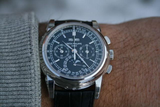
It looks like a super beautiful ,enlarged version (43mm) of Patek 5970.
Very beautiful, especially the moonphase but a bit too similar to the Patek gene, imho.
Vacheron.watchprosite.com
*CL

I think the new VC perpetual chrono is stunning!
I just wish the movement were larger so the Day & Month is further away from the center of the dial.
- AT
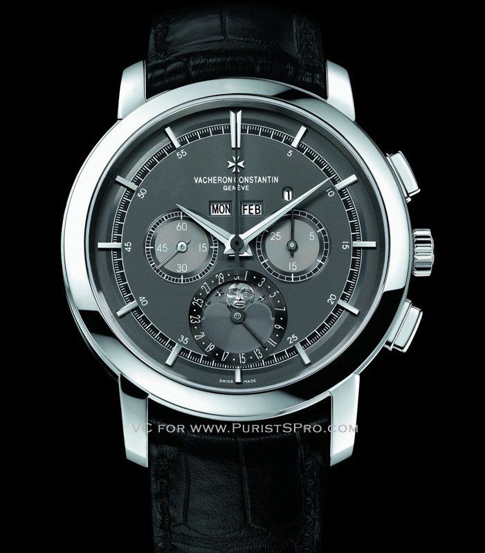
I also do think it is stunning....
That moonphase is sublimely super....but then again I still do think it is more Patek than VC.
Maybe most Perp Calendar tends to look somewhat the same.
Just relook at the pix, agree with you totally about the day/month aperture.
Cheers,
CL

CL, I made the very same comment................
On the VC thread under the Basel/SIHH 10 forum.
The only difference, appears that I don't like the moonphase. Why can't they smile??
I would much prefer a "normal" style moonphase.


Wouldn't a smiling moon look a bit like a "Happy Face "?
In my view it looks right as is ...

This is probably the best of the new releases for me.
I'm vey taken in by the extremely elegant and clean dial layout and I hoe, as I posted in the SIHH thread, that the kugs do not make this wear big.
I am researching the paladium material so any info would be helpful.
this could very well, if I can afford it, be my first and only VC.

IF i am an NBA giant .... say 6'10"


Beautiful!
A stunning watch, I like the 'cleaner' look of subdials and
the leap year in aperture.
Now this is a beautiful watch... stunning! Does anyone know the Swiss list price? [nt]
Certainly very nice, but
not even close to the 5970 IMHO. Clean design, and a step in the right direction for VC. Some very nice details, but when compared to the 5970, where the whole is for some reason so much greater than the sum of the parts, this one does not impart the same feel for me at all.
5970 has a much better balance for me.
comparison picture of the 2
No doubt the vacheron is definately a great looking watch. The dial looks to be cleaner but ironically because of the placement of the day date window plus the size of the font the 5970 is easier to read.
I love the moonphase and the colors. The case is large for me but thats a personal touch.
I merged pictures of both side by side for comparison and look forward hearing everyones comments.
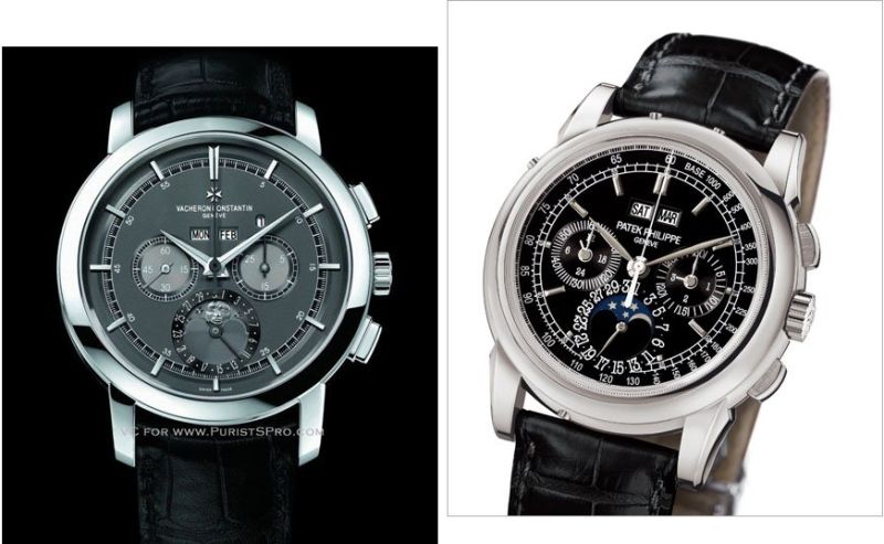
Comparison ....
So theVC doesnt have the 24 hour hand indicator, as for the chronograph, VC only has a 60 seconds, 30 mins register ?? Is that an added value for PP 5970 ?
With two pictures putting next to each other, PP clearly has a much nicer watch case design with more character. In terms of the color of the dial, the moon phase details, VC seems to have put a touch more effort.
THe one feature which i wished VC has done, was not to put the two registered so close to each other, partly due to the movement and the space restrictions base on the calibre itself .. my opinion.
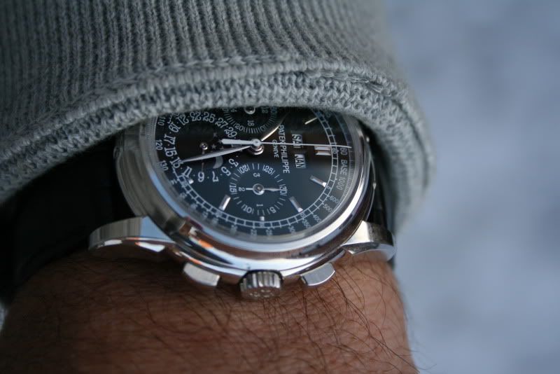
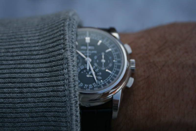
Lemania
Don't both the Patek and VC use the same "Nouvelle Lemania" base movement? That would explain a lot of the resemblance.

Yes they do, it's the same base plate.
The VC may look less busy, that's not hard with a much larger case and dial.
The moonphase is the big plus of the VC IMO. On all other points I prefer the PP by large!
Cheers
Dje
I so love the dial of the VC...
but I think it is a victim of oversized case, small movement with registers and apertures all squeeze together.
Comparing these 2 pictures, the VC has more life but the 5970P wears alot better and has more balance.
Jmho.
*CL
Patek wins in my book
The 5970 just works....The size is perfect and looks so much more balanced.....
M.
curious
When you say the 5970 looks so much more balanced could you expand on what you see that makes one more balanced than the other?
The major drawback to the vacheron (for my old old eyes) is the size of the font and location of the windows makes it a tad more difficult to read.
john
Hi John, To my eyes the 5970 just looks more symetrical and pleasing to my eye...
Only my 2c though.....
Regards
Miles.
Miles...Thanks for the reply
I have always purchased watches that appealed to me. For me its one of those moments when you see the watch it either hits you with a "gotta have it" or its ok. When asked what it was specifically I sometimes have a hard time isolating the exact element that made me want it. Its that instant eye to brain connection I guess.
I do have some issues with the vacheron but like the dial and case design. Prefer the case and legibility on the 5970. Both have good aspects to them and both I believe are at the top of the field
John
Thanks for the comparo
for me aesthetically, the VC's more elegant (subjective I know) dial and how the moon is applied makes it the winner for me...for aesthetics.
You brought up a good point on the PP actually being more legible despite the much busier dial.
You may guess I would say this but........
M.
Honestly, neither is good looking IMHO, small movement in BIG case. Period.
Your pics again are stunning
but I actually prefer the more elegant, cleaner look of the VC and how VC has done this moonphase. I may think otherwise when I put it on my wrist but until then, th epics of the new VC looks better to me. To each his own I guess. Now if this is priced like the PP, then I would go for the Patek if I could afford it seing how Patek resale holds up so much better.