Comments:


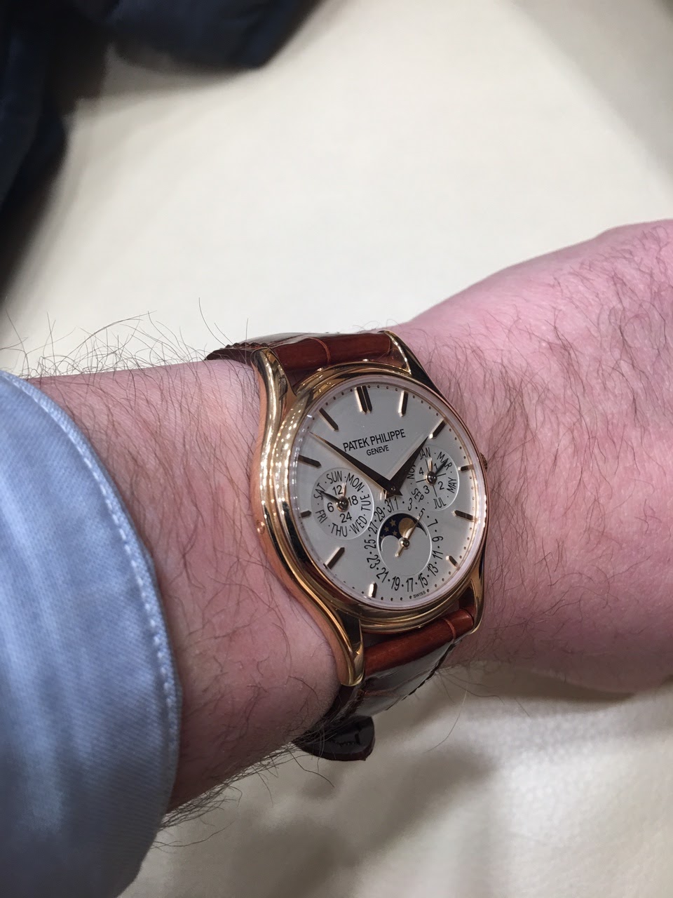
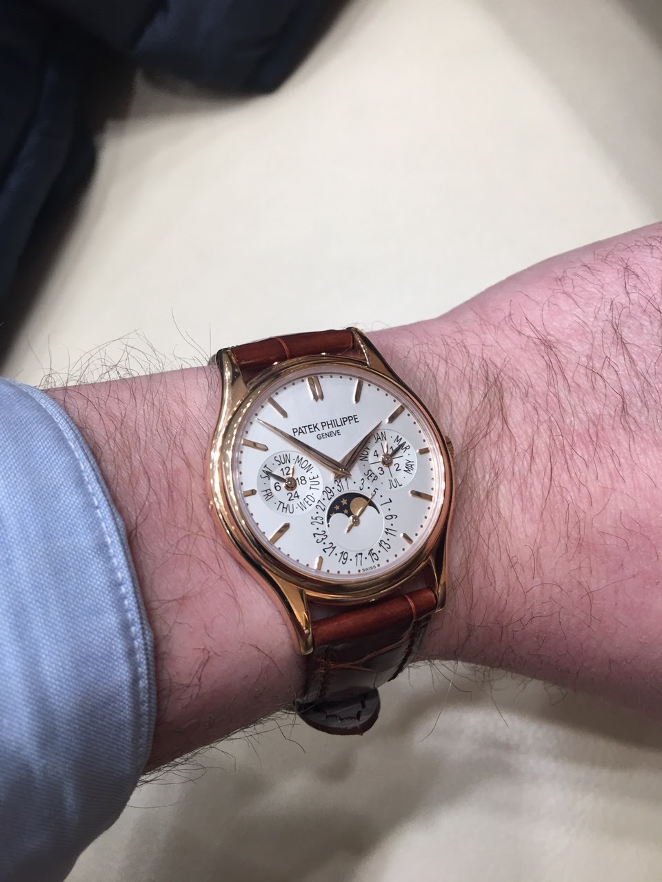
Perpetual Calendar Shootout! 5140 vs 5327
Just tried these both on and can’t decide! Which one do you prefer and which one do you prefer on ME relative to the photos?
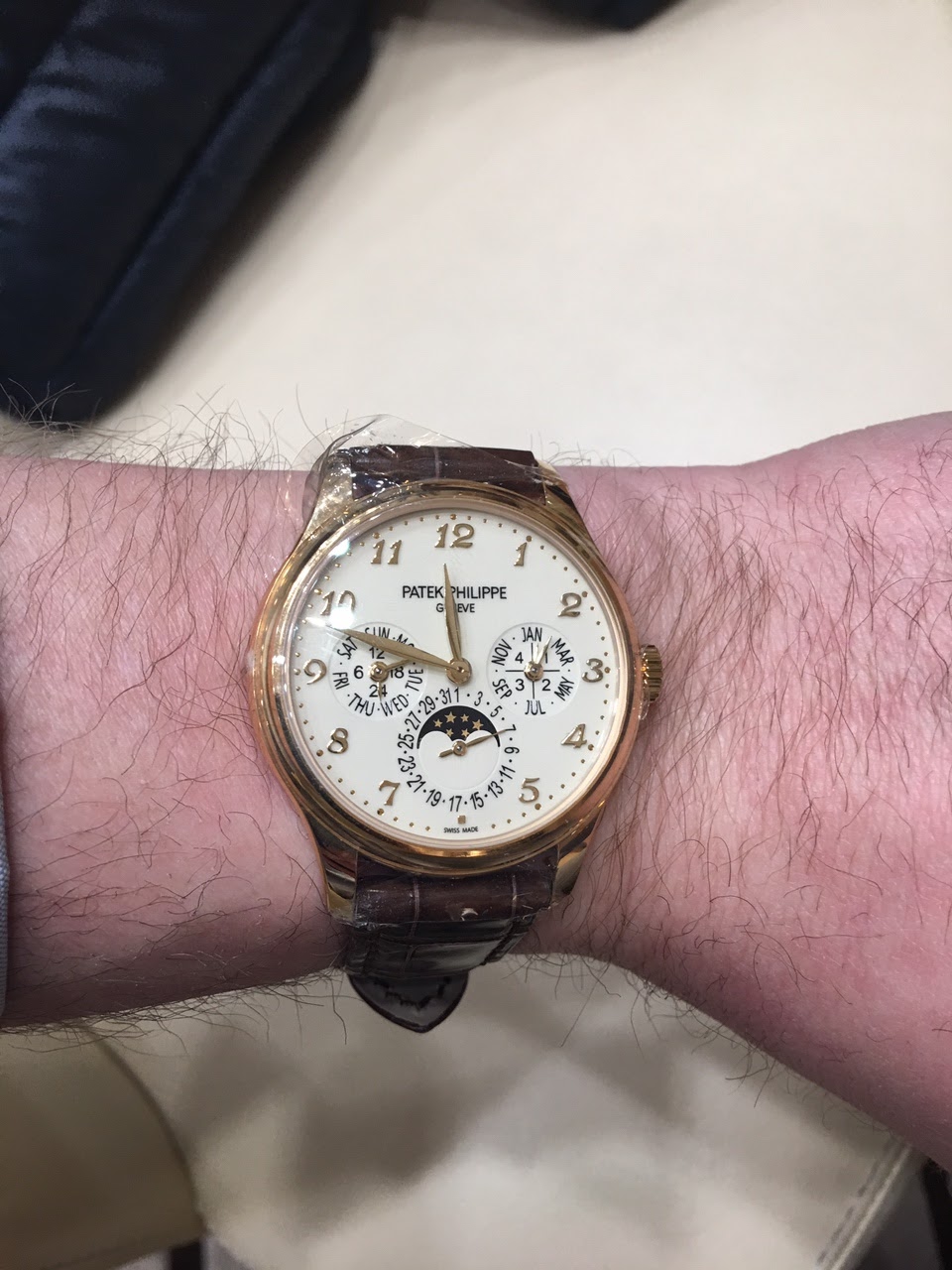
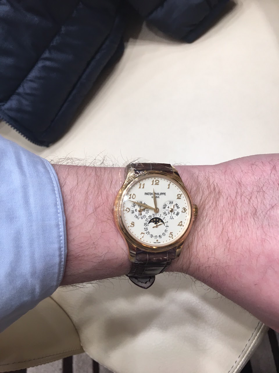


5327
When I look at a 5140, lovely as it is, all I can think is that it's a slightly larger and less perfect version of the 3940.
The 5327 does its own thing, and it's a good thing. Love those numerals and the swoopy scalloped case.
If it is just 1mm give or take I'd always go for the iconic design, in this case the 3940, ...
... and between the 5140 and the 3940 it is just 1.2mm IIRC. In my eyes Patek's three sub-dial PC has been getting a little less attractive with every new iteration. The beautiful balance of the 3940 has been lost on the way of upsizing the watch w/o modifying the movement. Reminds me of IWC's pilot watches that continued to get bigger and less attractive after the Mark XV or XII before they turned the corner to some extent with the current Mark XVIII.
I love all these polls and round-robins, but if I'm allowed, I stick to my vote for the 5320 among the PCs ;-) [nt]
No message body
I’ve counted out the 5320. What would you choose between 5140 and 5327? [nt]
No message body
It probably won't be helpful, but let's rank them this way: 1) 5320; 2) 5140R (brown dial); 3) 5327R (your pic); 4) 5140R (your pic). [nt]
No message body
I am having the same exact debate.
I keep going back-and-forth between 5140 and5327.
I really like the slightly larger size of the latter and the slightly more modern look.
So I think 5327 is it. The cream colored dial with the rose gold is beautiful too.
I really like the slightly larger size of the latter and the slightly more modern look.
So I think 5327 is it. The cream colored dial with the rose gold is beautiful too.
I like the 5140 in this comparison.
I thought I'd prefer the 5327, but the 5140 looks more classic and timeless.
Maybe it's the LED (?) lighting, but the 5327 looks washed out and a bit plain.
The lighting is bad and the 5327 is wrapped in plastic whereas the 5140 is not. [nt]
No message body
To me, the black printing on the cream 5327 dial might seem...
too "black". It seems to stand out too much relative to the beautiful rose Breguet numerals. The black printing on the silver dial looks more natural. Just a comment after a quick look.
What I don't like about the 3940 is the shaded area on the 24 hour left subdial..it looks like a smudge and to me is unsightly. When I see the 3940 my eyes just go straight to it! Is there a 3940 version without this?
No message body
I have seen some versions...
...where this is pronounced. And other versions where I don’t see it at all. I am sure that there are experts on this forum that have more knowledge in this area.
If the 3940 is a non-starter, then I would go with the 5140, ‘squished’ numerals and all...
If the 3940 is a non-starter, then I would go with the 5140, ‘squished’ numerals and all...
If one wants to have the feeling of a "substantial" watch then the 5327
If one wants to forget having a watch in the wrist then the 5140.
The 5140 would be my choice.
The 5140 would be my choice.
If you are a `classic` person go with the 5327 for the numerals. I prefer the cleaner look of the 5140. [nt]
No message body
Tempted to say 5327....
But I think it’s the 5140 for me. I find that the baton markers help to draw my attention towards the dial, and on the whole keeps a busy looking dial less busy if you know what I mean. The Roman numerals on the 5327 makes the watch look a bit too ‘rich’, though I should say it’s an attractive layout. Tough call...but traditional baton markers on a PC for me suits it better
Both works fine and it comes down to your preference on...
size and baton hour markers vs Brequet numerals


Looks great. The more modern of the two and more versatile with its stick hour markers rather than Breguet numerals. [nt]
No message body
