
Mark in Paris
[Purist]
10488

To sum up I would say
The red color and the design of many marks don't fit with the classic aspect of the watch. I think the dial is not harmonious.
The new one knows how to combine classic and modern (especially the sharp angles).
Furthermore, I don't like the Font of the indexes (escpecially the Power reserve part)
In fact there are many aesthetics elements I really don't find balanced in the old one.
I think that many of the new aspects of the last Master Geographic come from the Duometre à chronographe, which I like very much.
To conclude, the new one is much more elegant, from my point of view of course.
Voilà ^^
Cordially,
Mark
This message has been edited by Boréale on 2011-07-27 02:22:31
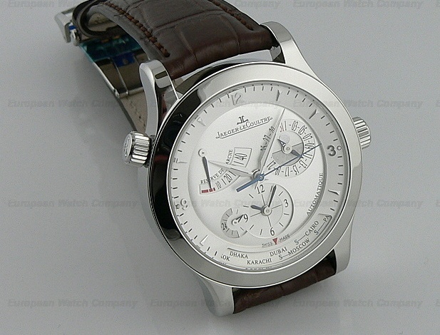
Master Geographic 150.84.20 vs 1428241
Hello, Just wanted your opinion on the new master geographic jlc. I'm looking to buy one for my husband for a wedding present and am choosing between a very well kept (papers/ box etc) older version and the new version about $2000 more. are there pro/cons...
I wasn't very fond of the master control watches ...
until these changes applied on the last Master geographic (from an aesthetics standpoint). I must say I like it a lot. However I can't help you concerning the mechanics side. Cordially, Mark...
what are the reasons?
Thanks boreale! what is it you didnt like about the older model that you do about the newer one?
To sum up I would say
The red color and the design of many marks don't fit with the classic aspect of the watch. I think the dial is not harmonious. The new one knows how to combine classic and modern (especially the sharp angles). Furthermore, I don't like the Font of the ind...

I might be on my own
But, I prefer the older model. I simply prefer it's proportion and the feeling it exudes. I find the new master geo to be a bit on the sterile side (as though it has lost it's soul). None of this probably makes much sense, but there it is. By the way, I w...

I used to prefer 1428241
.... for its size (my wrist is smallish at 6.45" or 164mm), but may look and handle "cheapy" (but well made inside, mind you). But this years new Master Geo is very well made that can be seen from outside and the size may be okay even for my wrist. With $...
Now am really confused!
Thanks guys! My husband has a medium sized wrist, although he's a big guy. so perhaps the newer version will look good... although i think there is only 1mm difference in diameter. Am now also contemplating the Rolex 1680 red submariner as an old friend s...
Generally speaking, "value" is discussed OFF SITE.
.... we do NOT talk about "value" here on PuristSPro. That is the attitude here. But your "concern" is well understood. Having said that, all I can say is, do the search for the past model "value" elsewhere on the net. For the specific new model, no one k...
thanks ken! but what's your opinion on which watch is more special?
Hi Ken! thanks! it's not neccessarily value im too concerned about. but really which watch you might think is better and why? Jlc Master Geographic 1428421, Jlc Master geographic (new version) or the Rolex red submariner that was made in his year of birth...
Other proficients, please chime in....
I do not own Rolex - have owned one long time ago. So, I am biased. The new Geo may be good among the three, provided that I know next to nothing about Rolex as a brand and models or vintages. FWIW, I own an Omega Speedmaster Professional made close to my...
thanks ken! so you would go for special significance or practicality?
Thanks ken! i thnk that the new JLC actually has day light savings, so that would be really helpful... although he mostly travels in the us right now. so i'm a little confused... a watch with special meaning is more important than practicality? would birt...
That really depends on the owner/wearer..
... so I cannot answer. The trait about such things should be rather universal, not only for watches, IMHO. Good luck! Ken

I liked the older models
However I have to say that this latest model above is very nice now. The last one of two variations were not great in my opinion. Here is my own Master Geo. I love this one. Happy Watching justindependent...
Thats the same model i'm looking at!
that's the same model exactly! i like it too! but now confused over the rolex red submariner or this one! the rolex is like double the price what do you guys think of JLCs ... do they hold value in general? no pricing talk, just what's a better investment...

new vs. old
From what I remember, the new one allows for day light saving whereas the old one does not. There is now a s next to certain countries.

Please bare in mind that if you keep thinking about investment vs value..
Please bare in mind that if you keep thinking about investment vs value it will ruin your buying experience and clouded your judgement on getting something special for your wedding. I'm sure that is not what you want. Ask yourself this Am I buying it to s...
hmm good points!
yes i will take on more debt... but not so much that it will be too crippling. i'm trying to negotiate with the dealer for a better price. if i can get it down 2k or so i'll be happy. then it wont be too much different then a new jlc. but you are right, i...
In these day maybe a gold bar retain better value.
JLC or Rolex ... let say 99% of the watches don't keep their value in monetary terms. Value in memory or legacy of passing down a family heirloom ... you only need to read this wristscan.watchprosite.com Best Tyler
Value. Who knows
As mentioned by someone else, most watches do NOT keep value. If you read posts in here, the kinds of watches that people own are a very small minority of what's actaully purchased outside in the real non WIS world. Certainly a watch at this price level I...


Trying with a different twist ...
Been following this a bit - now just a personal chip in, - but with another perspective maybe: A) The Watch - side: 1// the JLC Geographic itself : old vs new ; for me, it is NOT ( only) the issue of "value" maybe more of significance, of heritage, a bit ...
good points- robust vs. finese/ daylight savings vs. manual?
Wow that really broke it down thank you! I can see what you are saying, robustness of the red sub vs finese. I'm concerned about the red sub as some people might think the rolex is a little too "common" and jaeger is more "elite" for lack of a better word...
You cannot have it both ways .. Unless .. ;-)
.. Well, how shall I put it: - you go for the Rolex Sub ( Double Red !) FIRST, - and maybe next year or 2013 you consider the JLC Geographic ( the 2011 model), Simply because it will be still available ( the new one for sure), even the older might be find...
You are so right!
I think i'm leaning towards the rolex red sub as it's so hard to find because of the date etc. only thing is i found this INCREDIBLE deal on the JLC older version. nearly new and about 5k or so... I wish i could buy both! What do you do when you are choos...
YES - exactly that ! -- ;-)
My principle ( I learned from good friends and also experts here) - go for the unique AND rare first - better than to be sorry .. Worry later ( the likelihood to find the other - in that case one of the JLC 's is pretty high) BUT pls realize: - you aleays...

Can I just ask....
do you have a sister..? I'm astounded by the effort you are going to to find a nice present for you future husband on your wedding day..!! To be honest all the pieces your looking at will make your husband a very happy and lucky man and I wouldn't pay muc...
Thanks andy! that's very sweet!
To be honest, i'm a little bit obsessed at this point now. i think i have officially fed up all of his friends with questions about watches and so had to come and post questions on this forum! I just really want something he loves, and the fact he hasnt e...