
Modernahab
1151

Then & Now: JLC Reverso Chronographe Rétrograde & Tribute Chronograph

Riding in Tandem
I won’t dwell on the history of the original rose gold Reverso
Chronographe Rétrograde, Ref. 270.2.69, issued as a limited edition in 1996, as
it’s been covered previously in depth on this forum, and in summary in this 2022
article from the Monochrome
Watches web site. I will only say that in addition to being a
groundbreaking technical achievement on the part of JLC, the Chronographe Rétrograde
is my all-time favorite JLC reference, and perhaps my single most treasured
timepiece.

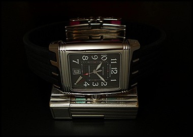
Ref. 270.2.69
The anniversary series of complicated rose gold-cased Grande
Taille Reversos, of which Ref. 270.2.69 was a member, was initiated on the
Reverso’s 60th anniversary year of 1991, with the Reverso 60ième.
Appropriately, my wife thought to gift me with the current Reverso Tribute
Chronograph in stainless steel, Ref. 216.8.S0, for my recent 60th
birthday. Having lived with the 270.2.69 for several years and having had a
little bit of wear time with the newer model, I’m experiencing the two as
having very distinct identities, despite the commonalities between their
movements.

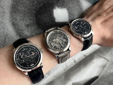
Reverso Tribute Chronograph
The caliber 860 in the Reverso Tribute Chronograph is
obviously a direct descendant of the Chronographe Rétrograde’s caliber 829,
though with a few significant differences. The plates and bridges on caliber
860, whether in the stainless steel or rose gold case, obviously lack caliber
829’s rose gold finishing. Moreover, unlike caliber 829, the new caliber
displays the time on both the recto and the verso side. However, the
date and “Arret/Marché” indicator on the recto of Ref. 270.2.69 are lacking in the
Tribute Chronograph. I’ve come to suspect that these functional distinctions
may contribute as much to the aesthetic differences between the two references
as do purely visual design decisions.

Caliber 829
Purists will no doubt revel in the lack of a date window on
the Tribute Chronograph, and while some may criticize the recto dial as stark,
I find its clean, crisp, faceted applied indices and subtly colored gray-blue,
sunray textured dial to be quite effective. The finishing on the Tribute
Chronograph’s hands and indices is worth noting. Exceptionally brilliant
polishing and precise faceting bring the dial to life when on the wrist in a
way that still photography cannot capture. On the other hand, I will say the
date window on the Chronographe Rétrograde seems to me well-placed and
well-executed, with its own crisply faceted frame and a type font closely
matched to the hour numerals. I also very much appreciate the recto-side
indication as to whether the chronograph is running.
Comparing the two watches, it strikes me that with its
additional indications, multiple levels, and fine-textured guilloché work*, the
recto dial of the Chronographe Rétrograde leaves the viewer well-prepared for
the mechanical complexity on display on the verso. Taking an entirely different
tack, the Tribute Chronograph recto seems deliberately designed to maximize
contrast with the intricate verso. So, while there is a certain aesthetic consistency
between the recto and verso of the Chronographe Rétrograde, flipping the case
of the Tribute Chronograph makes for quite the surprise. I take a certain
pleasure in the no-doubt calculated shock when the workings of caliber 860 are
revealed, and I credit the current JLC design team with great cleverness in
engineering this effect.

Caliber 860
I have not so far mentioned what may be the most-discussed
contrast between the Chronographe Rétrograde and the Tribute Chronograph: the size
of their respective cases. While the Grande Taille case of the Chronographe Rétrograde
measures 42mm x 26 mm x 9.5 mm deep, while the Tribute Chronograph is a
comparatively massive 49.4mm x 29.9mm x 11.14mm deep. I’d wondered in an earlier
post what might have possessed JLC to set caliber 860 in such a large case,
especially in light of the apparent trend back away from the gargantuan watches
of decades past.
Some time spent contemplating the subtle differences between
the two movements led to an epiphany (or two) regarding the size of the Tribute
Chronograph. While caliber 829 measures 4.5mm high, caliber 860 is a full
millimeter taller – perhaps to accommodate the components that connect the hour
and minute hands between recto and verso. Then there is that second set of 3-D,
faceted dauphin hour and minute hands on the Tribute Chronograph’s verso.
Stacked, these hands (along with the faceted applied indices) presumably
require about another millimeter of space under the verso crystal. Combining
the resultant 11.14mm height of the Tribute Chronograph with the length and
width of the Grande Taille case could have yielded the proportions of a brick. The
dimensions of the Tribute Chronograph might well be a stratagem for maintaining
reasonable height-to-area proportions on the wrist.
Further close comparison of the two references revealed yet
another possible case (horrible pun!) for the Tribute Chronograph’s dimensions.
In lieu of a blank spacer around the caliber 860, the Tribute Chronograph verso
echoes the minute track and the applied indices of the recto dial. These go a
long way toward improving legibility of the time on the verso, while also
providing unifying design cues between the two sides of the watch. Were the faceted
indices on the verso retained in a Grande Taille case, their proportions would
be awkwardly stubby, as suggested in the cropped and rendered photos below. Granted, all of
this is conjecture on my part, but it does at least suggest there may have been
solid practical and design considerations behind the size of the Tribute
Chronograph.
 I should add that in neither of the two watches are the
verso sides exemplars of legibility, though the Tribute Chronograph does score
over its predecessor on this account. In addition to the minute track and
indices, black sectors on the chronograph minutes and seconds chapter rings and
corresponding white-painted segments on the chronograph hands result in less
squinting when reading elapsed times on the Tribute Chronograph. Operating the
two chronograph mechanisms also offers different tactile experiences, though I
don’t know how much of this is attributable to the greater age and history of use
attaching to my Chronographe Rétrograde. Whatever the cause, the Tribute Chronograph
pushers engage with a more distinct (and very audible) click, while the Chronographe
Rétrograde, though not without offering some tactile feedback, has a smoother, “buttery”
feel and is practically inaudible.
Finally, a word on the straps. Two quick-release straps are
supplied with the Tribute Chronograph, both courtesy of Casa Fagliano, and both
sharing a single stainless steel butterfly clasp. One is done in medium-blue denim-like
canvas with smooth, midnight-blue leather accents, the other is entirely in
midnight blue leather. The seen below, the all-leather strap dresses up the
watch significantly, though the dressier presentation strikes me as somewhat at
odds with the Tribute Chronograph’s large size. I look forward to trying some bespoke
ridged reptile or exotic leather straps, as I have used as alternatives to the
Fagliano straps on my other Reversos.
I should add that in neither of the two watches are the
verso sides exemplars of legibility, though the Tribute Chronograph does score
over its predecessor on this account. In addition to the minute track and
indices, black sectors on the chronograph minutes and seconds chapter rings and
corresponding white-painted segments on the chronograph hands result in less
squinting when reading elapsed times on the Tribute Chronograph. Operating the
two chronograph mechanisms also offers different tactile experiences, though I
don’t know how much of this is attributable to the greater age and history of use
attaching to my Chronographe Rétrograde. Whatever the cause, the Tribute Chronograph
pushers engage with a more distinct (and very audible) click, while the Chronographe
Rétrograde, though not without offering some tactile feedback, has a smoother, “buttery”
feel and is practically inaudible.
Finally, a word on the straps. Two quick-release straps are
supplied with the Tribute Chronograph, both courtesy of Casa Fagliano, and both
sharing a single stainless steel butterfly clasp. One is done in medium-blue denim-like
canvas with smooth, midnight-blue leather accents, the other is entirely in
midnight blue leather. The seen below, the all-leather strap dresses up the
watch significantly, though the dressier presentation strikes me as somewhat at
odds with the Tribute Chronograph’s large size. I look forward to trying some bespoke
ridged reptile or exotic leather straps, as I have used as alternatives to the
Fagliano straps on my other Reversos.

All-Leather Fagliano Strap
For now, I’m very glad to have both watches, and
I do not think that they’re redundant in my collection. It’s good to have an
integrated, shaped chronograph movement back in the Reverso catalog, and I
think the Tribute Chronograph is well-executed. That said, based upon its size,
warm-toned precious metal, more intricately detailed recto dial, and unique
history as the first hand-wound integrated chronograph of the mechanical watch
revival, I will always have a very special attachment to the Chronographe Rétrograde.


Then & Now: JLC Reverso Chronographe Rétrograde & Tribute Chronograph

Excellent comparison, my friend.
Actually, the Tribute is NOT a dual time watch - a point I of popular misinformation I had planned to mention, and managed to forget.

Beautiful pieces.
The crown on the rose gold reference has been criticized for its size, and also defended as being necessary/appropriate, given the chrono pushers.
A lot of enjoyment to come!
OK, here's som more...;-)
I was thinking that I would buy that version of the Grand Sport decades ago.

Both of those Reverso are quite nice, and the size differences are manageable

Great comparison. What a pair you have there...

Thanks for this in depth comparison!


Thank you for a well-considered comparison.

A really interesting and exciting comparison of these two marvels.