

Do you have good eyes? Could you please have a look at this IWC?
I know that this is not an IWC forum but it is the closest thing to it here. And, fearing that I may embarrass myself elsewhere, I don't know who to turn to but you guys so if you would please bear with me. A few days ago I was stretching my left arm out ...
I've just done that. The three hand pinions are aligned. The marker at three is...
...a bit lower like the numerals. Thanks for the advice. At least now I know the three hand pinions are aligned. Ruckdee
Typography in general and design of a dial
Classical fonts are designed following optical rules, which makes them indeed slightly different in size at the same print size . Some characters go below "zero" or end above "top". Making all characters exactly the same absolute size, would make a text l...
It took me quite a few minutes to comprehend all information. But now I can see...
...more clearly what you were so kind to take the time and explain to me. And I thought that there was no sense behind all these little details. Thank you for the insights, magellan. Ruckdee
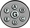
I've seen this brought up before...
...I think on TZ some time ago, in a fairly heated discussion, if I remember. Someone had noticed something similar to your observation, that the "4" on the Portuguese dial did not appear perfectly equidistant from the "3" and the "5", whereas the 8 appea...
Magellan has convinced me, too. Thank you for the tip about that TZ thread, Tom.
I tried to search for it for more background reading but to no avail. But regardless I am now relieved that my watch is not defective and that something rational is behind all these. Thanks again. I happen to wear the Portuguese today also. Ruckdee
No problem...
...re-reading it was entertaining. In the end, you can look at this way: any idiot can drop evenly-sized numerals onto a rectilinear grid imposed on the dial to achieve Cartesian regularity. It takes patient human genius to create the integrated beauty of...
Not wanting to sound dismissive, but...
Forget about it. It looks great in my opinion - one of my very favourite IWC watches. Cheers David
Ha ha ha ha ... that's a good one, David.
You managed to give me a good laugh after a long day of hectic work, changed copies, bumped up deadlines and missed calls. Thank you, thank you. Ruckdee
That's nice Ruckdee...
Seriuoslt though - I do love this model very much. Cheers David
an even better example from Ulysse Nardin
There is an even better example - i have in my own collection: Do have a look at the dial of the Ulysse Nardin Maxi Marine Chronometer with arabic numerals. (There are a lot of pictures in the UN forum) 11 and 1 are in - geometrical terms - placed out of ...