SJX
[Purist]
8540

Why I like the MB&F Horological Machine No. 3
Why I like the MB&F HM3
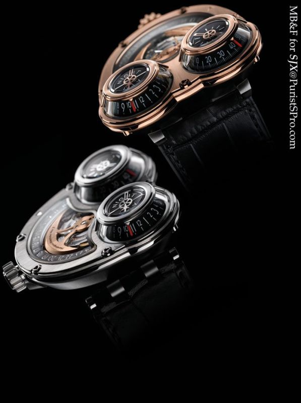
The HM3 Starcruiser and Sidewinder
I saw the first watch created by Maximilian Büsser & friends in 2006 – Max was meeting two prominent Singaporean watch journalists to show them the Horological Machine No. 1 and I was fortunate enough to have been there. I was impressed by the HM1, the movement with its four barrels was exciting, but it was not my cup of tea.
At the time HM1 was launched, the inevitable comparison was made with Max’s work at Harry Winston and the phenomenal Opus series. Max was a visionary when he helmed Harry Winston and I am certain his tenure at Harry Winston will be regarded as significant by historians thanks to the impact it had on independent watchmaking, particularly at the most avant-garde levels. The HM 1 was brilliant and comparable to some of the Opus watches, but it was not quite as good as the best of the lot, the Opus III and V (though it might be unfair to include the Opus III in comparison since it doesn’t exist – yet).
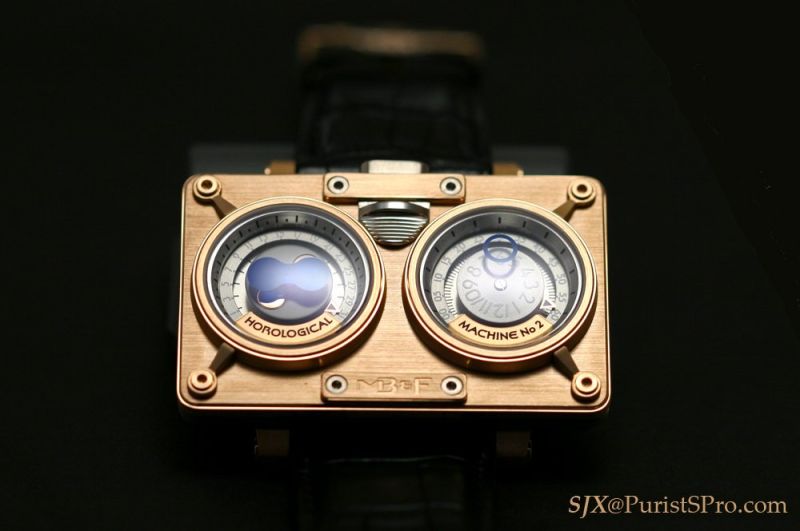
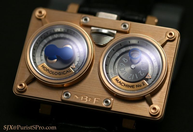
The HM2 in rose gold
Then the HM2 was unveiled. I saw that watch in 2007, once again meeting with Max at the Swissotel in Basel, and I liked it immediately. It was clearly inspired by the HM1 in terms of the time display, but I very much preferred the design of the HM2. That being said the HM2 does not sit quite well on my wrist due to its shape and size; I have heard similar comments from others about the fit of the watch.
And now here we are with the HM3. Finally Max has gotten it right – I like it tremendously.
There are hints of the Vianney Halter Antiqua in its design – Max frequently cites the Antiqua as one of the most remarkable watches ever made – but where the Antiqua is Jules Verne, the HM3 is Star Trek. The HM3 is far more quirky and offbeat than any of the other Horological Machines. It is an attempt to be different, but the HM3 does not come across as trying too hard. In fact, I daresay the HM3 looks elegant, with sleek lines and polished edges.
As with all the creations of MB&F, the HM3 is housed in a beautifully constructed and finished case. Max has a sophisticated eye and the attention to detail is evident in the watch. The screw in the case are different from the screws used in the HM1 and 2; if you look closely at the screwheads you'll notice the slots reflect the shape of the case. The metal work is excellent all round; the sapphire crystal and cones are all perfectly fitted.
I like the HM3 despite its poor legibility and despite the boring Glucydur balance so brazenly displayed on the front.
The watch is damned near impossible to read quickly. In fact, at certain times when the red pointers are at opposite ends of each cone, the wearer has to move his wrist in order to read the time on both cones. Even the date, large as the numerals are, is difficult to read because it’s indicated by an inconspicuous triangle.
But is that a flaw? Not in my opinion. The primary rationale for the creation of such a watch is clearly not legibility. To judge the HM3 for being difficult to read is akin to panning Frank Lloyd Wright for using too many straight lines or the Rolls-Royce Phantom for being too long a car.
Now if the HM3 had rotating discs with fixed pointers indicating the time, instead of rotating pointers on fixed discs, the watch would have been a lot easier to read. I put this to Max – he did try that solution but the weight of rotating discs caused the amplitude of the balance to drop to an unacceptable level which impaired proper timekeeping. Using a Valjoux 7750 would have easily solved that problem – I did mention the idea to him – an HM3 with a Valjoux base would truly be a courageous, and perhaps foolish, product.
The base used for the HM3 is the same Girard Perregaux calibre used for the HM2. It is proudly displayed on the front of the watch, despite being technically and aesthetically mundane, though it is made more interesting by the rose gold, battle axe-inspired rotor. However, taken as a whole, as part of the entire watch, the exposed movement just looks right.
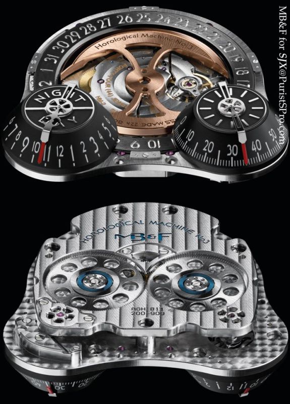
Movement of the HM3
First and foremost, a watch like this is a design, not a complication. While the HM3 is not a grand complication, the module created by Jean-Marc Wiederrecht and Agenhor certainly display a good deal of creativity and competence. As a whole the HM3 is well executed – design, fit and finish, and wearability.
That latter point is important – the HM3 is the easiest Horological Machine to wear. It is a big watch, diameter is 47 mm, but it sits well on any wrist, unlike its predecessors, which were uncomfortably impressive on the wrist.
While there are many who dislike the HM3 – and Max is clearly quite proud of his polarising product – I am not alone in liking the watch.
An owner of both the HM1 and 2 shared his thoughts with me on the HM3: “I like the HM3 because it is not a deviation from the direction that I felt from [Max Busser] when he first did his Horological Machines. [The] continuity is quite reassuring. Shows that the path he is taking has at least a few more ways to go before going down another galaxy. Physically, it wears much better on the wrist than the earlier ones… it sits quite well on the wrist without actually having the wearer feel the fullness of the watch. [Design-wise] I think this has more angles to appreciate for what it is. Kudos to [Max] for furthering the realm of [the Horological Machines].”
So which one do I like better? The Sidewinder or Starcruiser? Both names are equally silly (sorry Max) so I have to decide them on their merits. I definitely prefer this watch in rose gold (I like the HM1 and 2 better in white gold), but I like both the Sidewinder and Starcruiser right now. Max noted that the Starcruiser is the original idea for this watch, and the Sidewinder variation came later on. So if I had to choose only one, upon pain of death, I would pick the Starcruiser.
- SJX
This message has been edited by SJX on 2008-10-30 07:33:32