
aaronm
2923

What an unusual Tourbillon
the dial-view is nice, but from the back it REALLY looks like it came from the ETA spare parts bucket!
A

Baselworld 2012: Corum Report
The 2012 collection of Corum is mainly focussed on the Admiral's Cup with new complications joining the line. Good news for me, I like it. Honestly, I'm quite impressed by the new strategy of the brand: prices are more realistic and they start to take adv...

The tourbillion is it
fX The tourbillion with the multiple guilloche is beautiful. As always the RG looks fantastic on you. I would like to see the SS on you to compare. Nicely priced for a great look. Innovative. Best, Joe
Thanks!
It's like Cinderella, my wish and you provide. I like this one. But I think the RG is yours! Joe
What an unusual Tourbillon
the dial-view is nice, but from the back it REALLY looks like it came from the ETA spare parts bucket! A
Humm...
Don't agree with you Aaron. There is something in the lay-out which makes it very different. Fx
Not the layout...
but the individual pieces. Particularly the winding train and especially the rotor look identical to pieces I've seen in standard ETA designs a


Could you explain what is going on
with the back of the last watch? It appears to be a ring inside a ring but no evidence is seen on the dial side. Is this an optical illusion or is the inner ring part of the alarm function? Thanks for the report and pictures. I agree that Corum has some a...
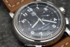
Back of the chargé d'affaire.
The backcase was designed in order that the Schild movement doesn't appear to be lost in the case: the movement by itself is the classic movement, without any change except the upper bridge. Thanks for your comments! Fx

Thank you for the great report!
I always liked Corum, mostly due to its nautical theme, but never owned one. The annual calendar is very nice, but I am not sure about the tourbillon. In my opinion, a tourbillon should be the epitome of a watch brand's lineup (if there are not even more ...
You raise some good points Marcus
I didn't notice at first the absence of markers on the counters, but now that you mention it their non-existence is glaringly obvious! In fact it puts me off the design a bit, just a bit. I could probably live with it though because let's face it - if you...
Regarding the chronograph counters ....
I agree that the perfect legibility for a chronograph would rather demand a central minute counter hand than a small subidal. But I think if there is only the latter, it should at least be possible to use a chronograph in a manner it was designed for: to ...
Thank you Marcus for your comments.
I will tell you something funny about the chronograph: I often remark some strange details like the cut scale of the Arena Genta chronograph or with the Midnight Tourbillon Chronograph. But here, as any subdial is done the same way, without any specific s...

Thanks for the Corum report Fr.Xavier. I feel Corum designs are steadily improving
each year, and their designs are now much more easy on the eyes IMO. Love the alarm watch too! Cheers, Anthony

Chargé d'Affaires For me
Love the dial design the details on it... and the complication as well , what size is the case? Thanks FX. Faisal