
ChristianDK
[F.P. Journe Moderator]
15064

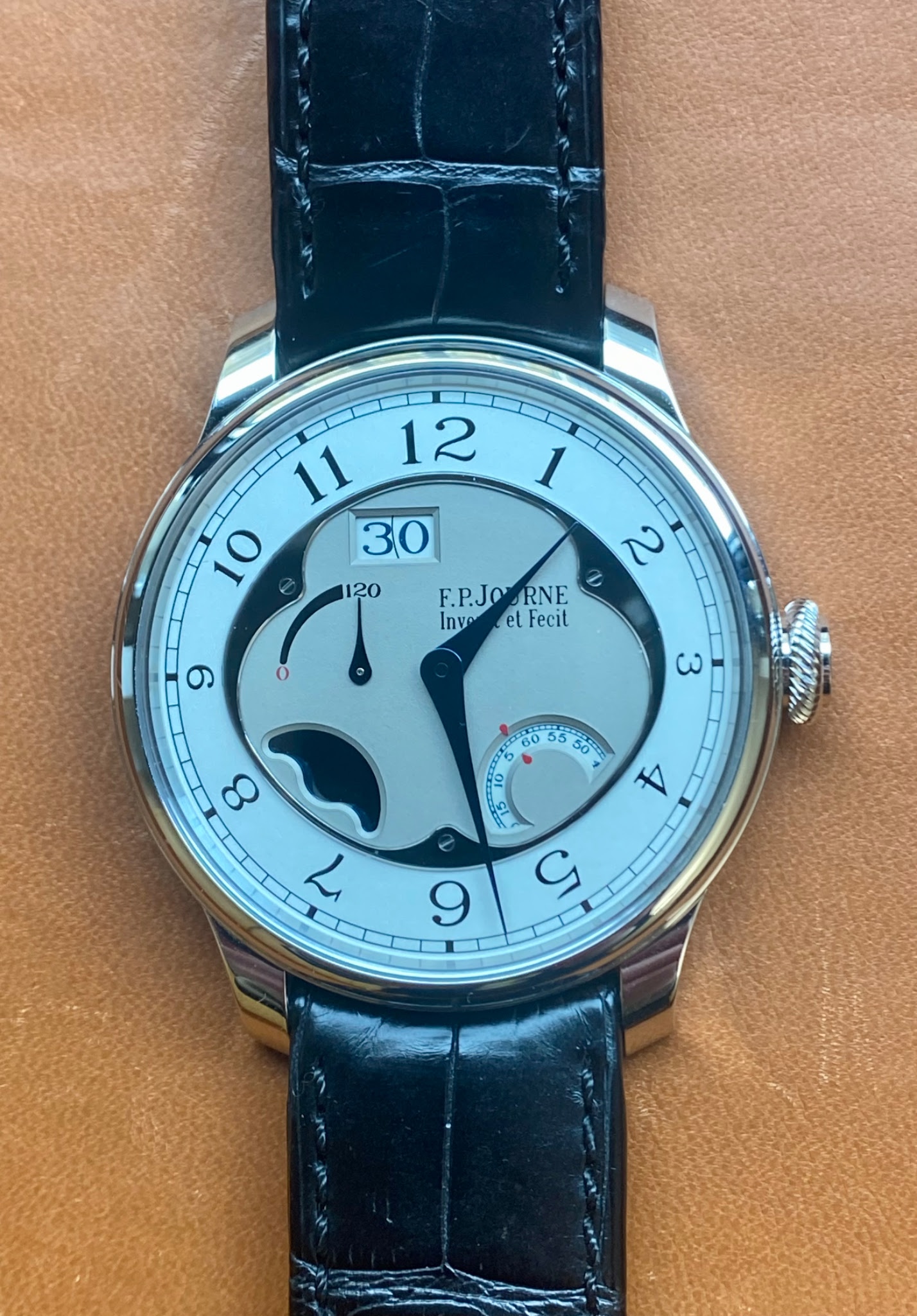
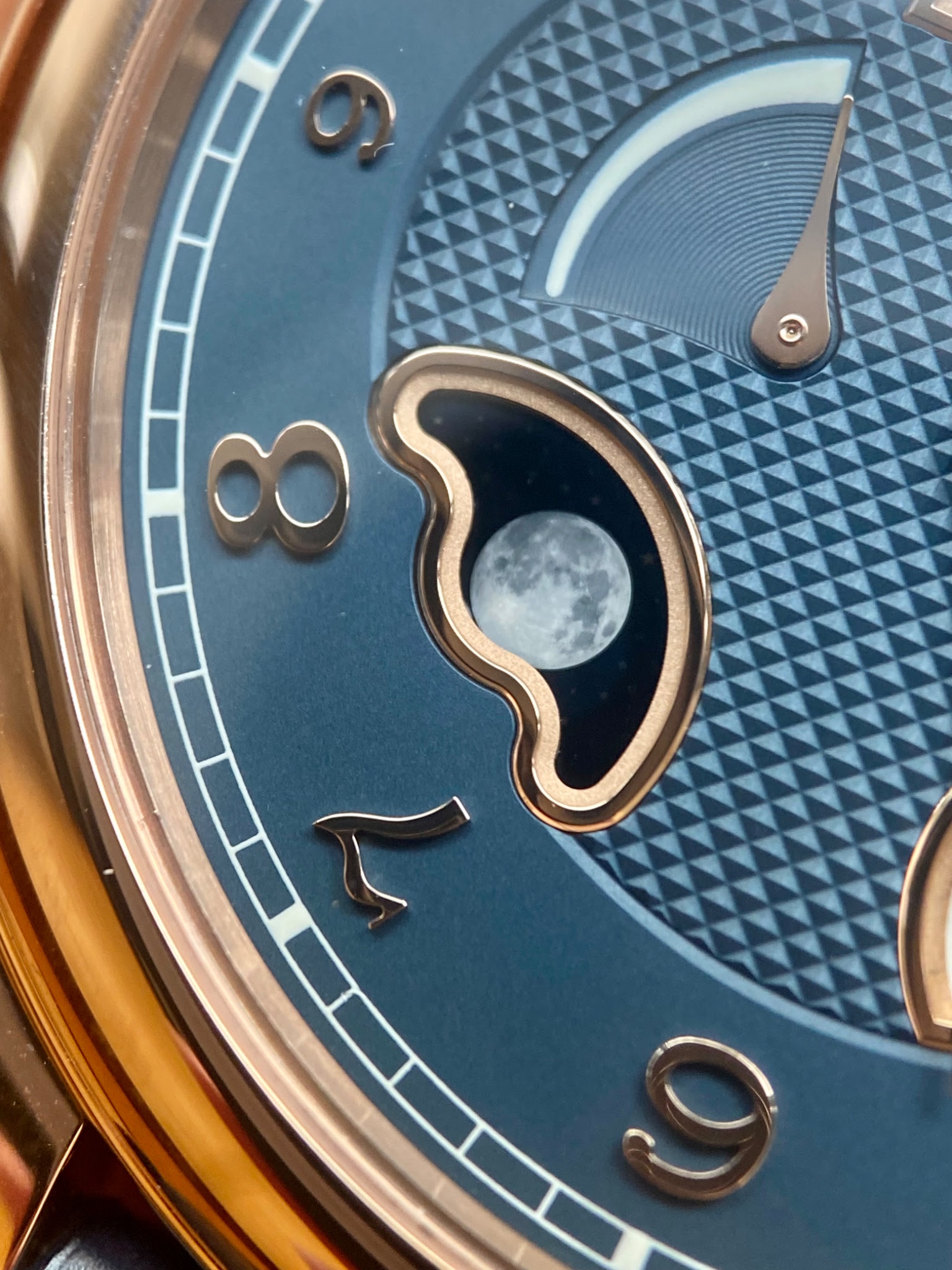
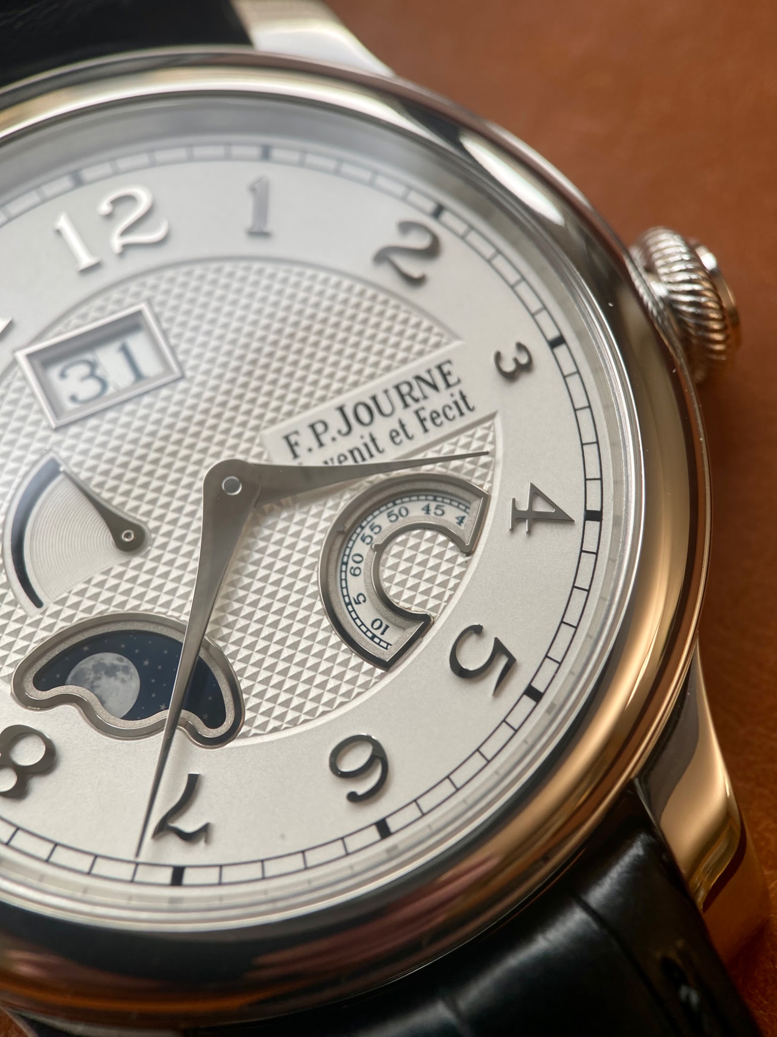
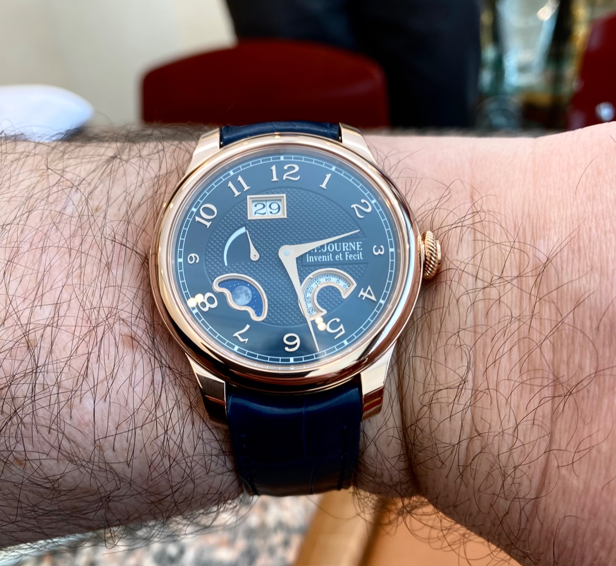
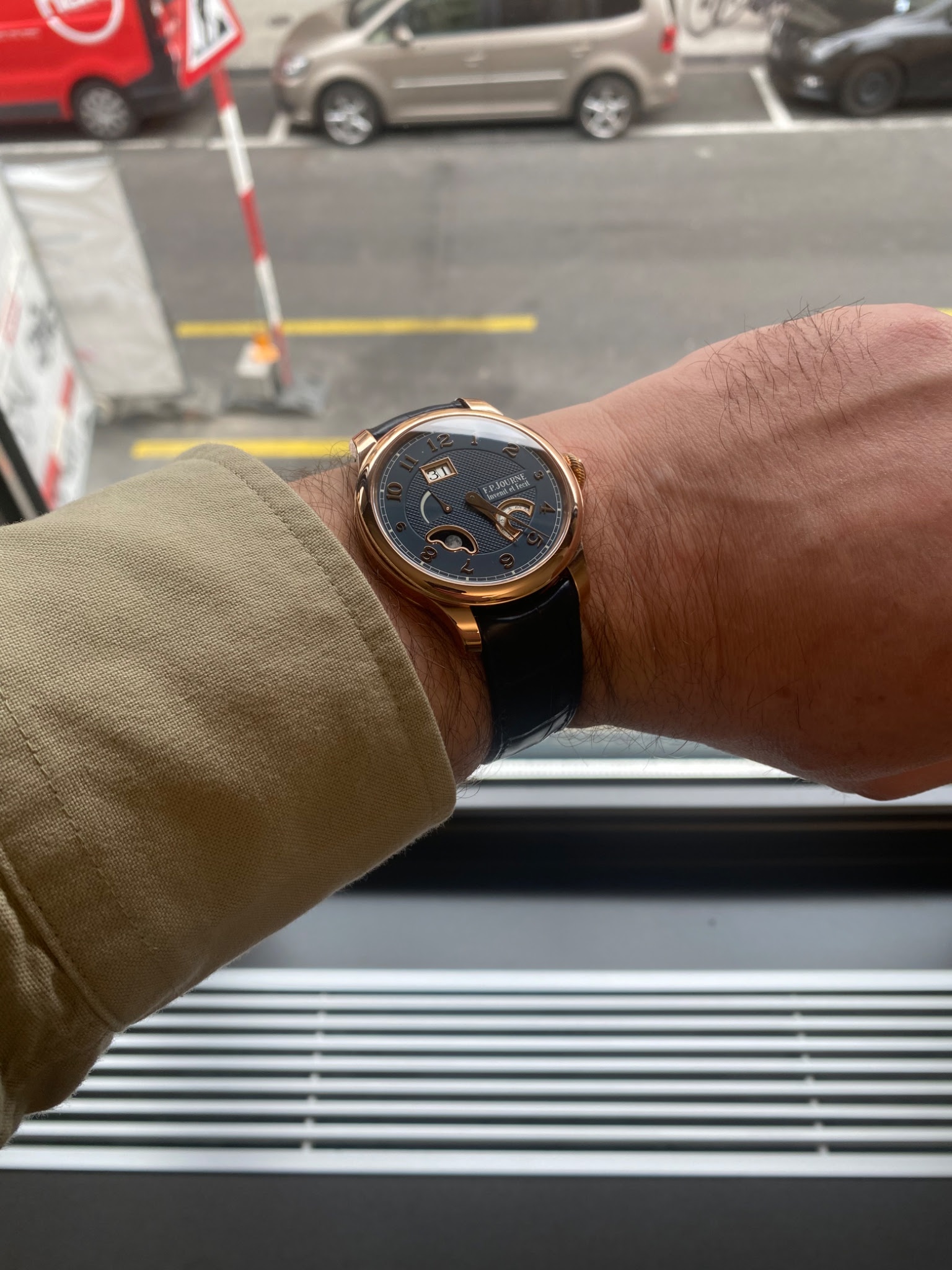
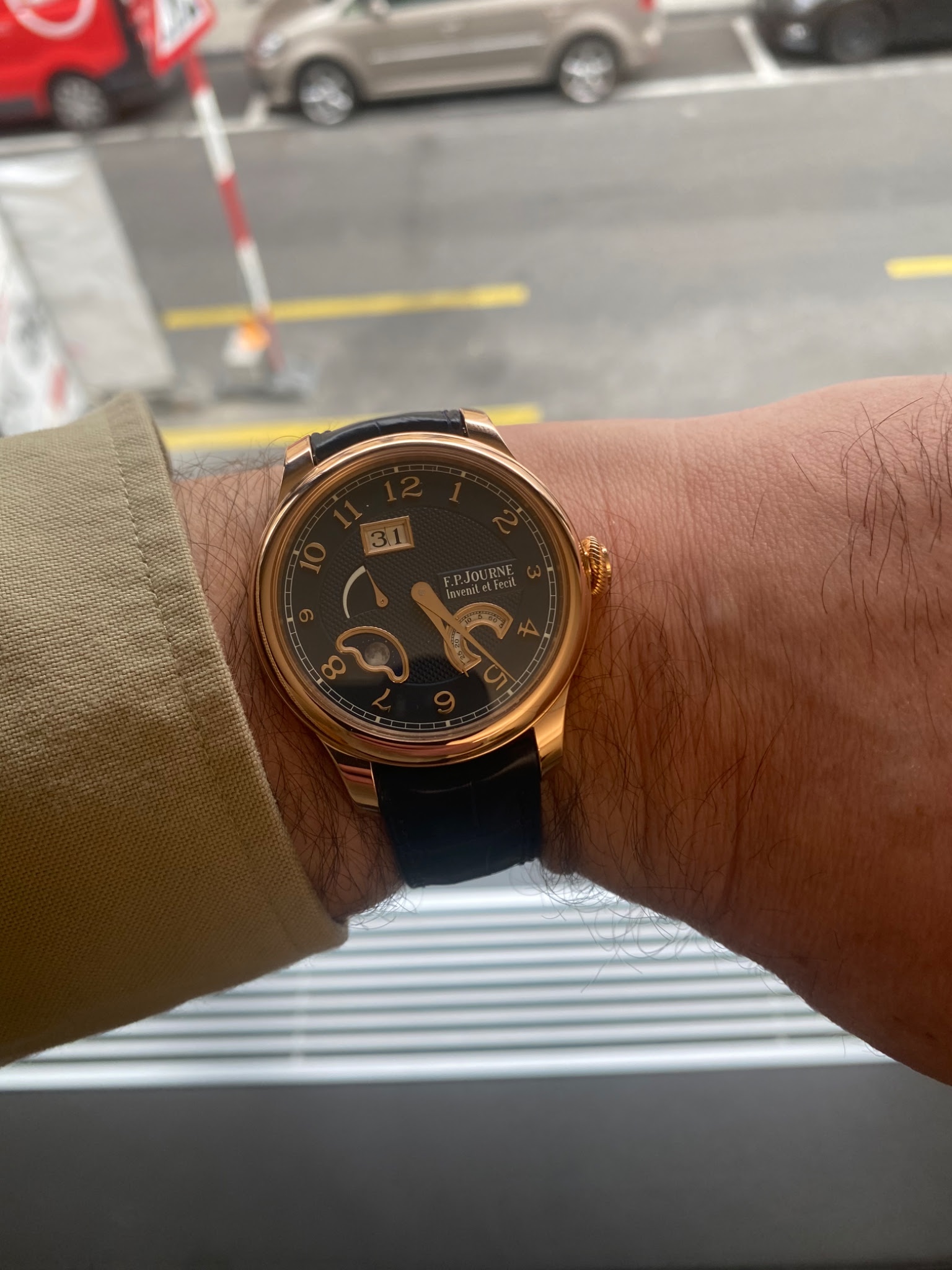
The FPJ Octa Divine 2023 dial - live pictures

The Divine has recieved a make over of the dial design. Just as the Perpetuelle did in 2021. The design is now similar in style and the watch is offered with the option of a white or a blue dial. Both options are available in platinum or rose gold case and with the choice of 40 or 42 mm diameter.
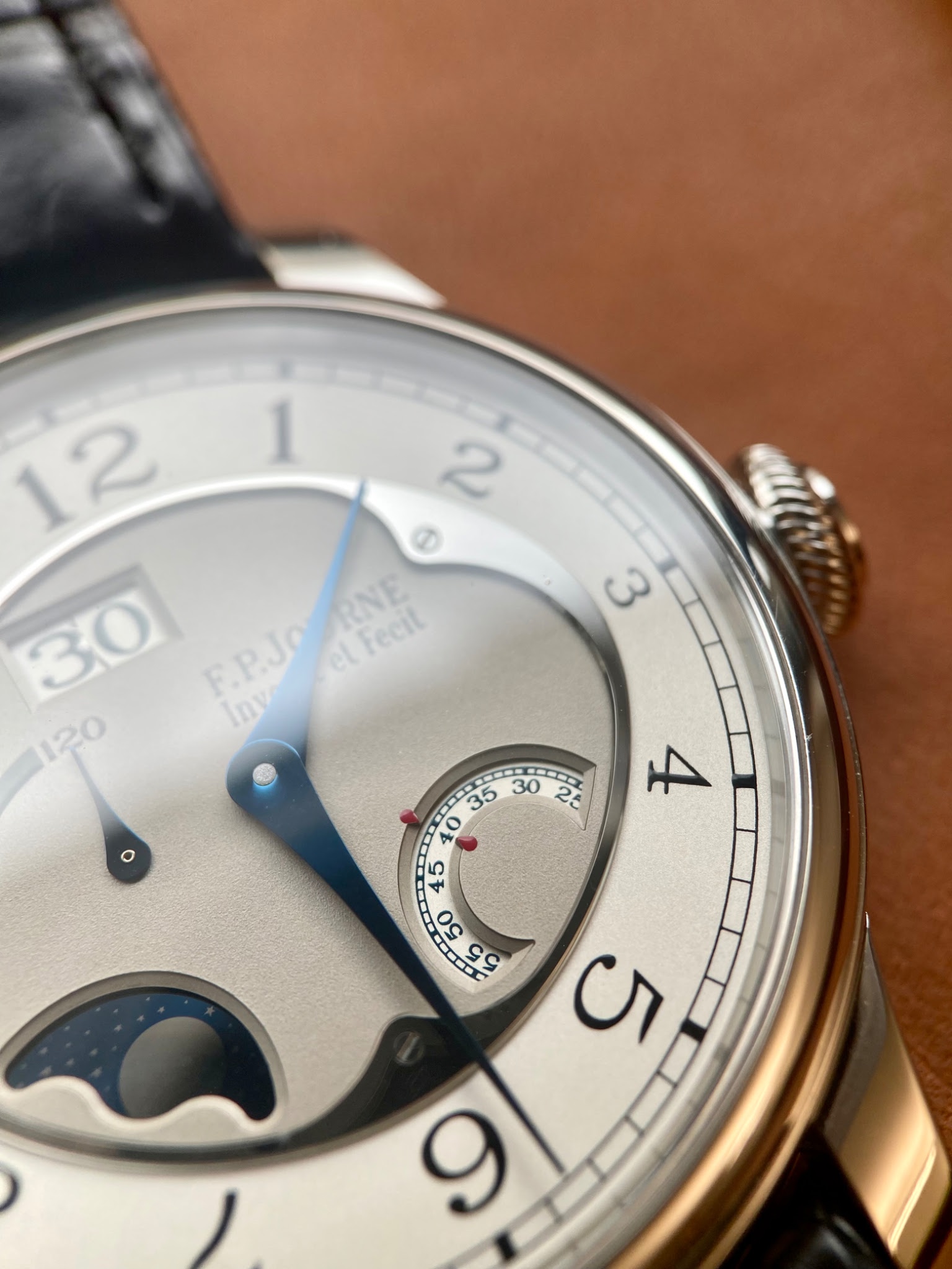
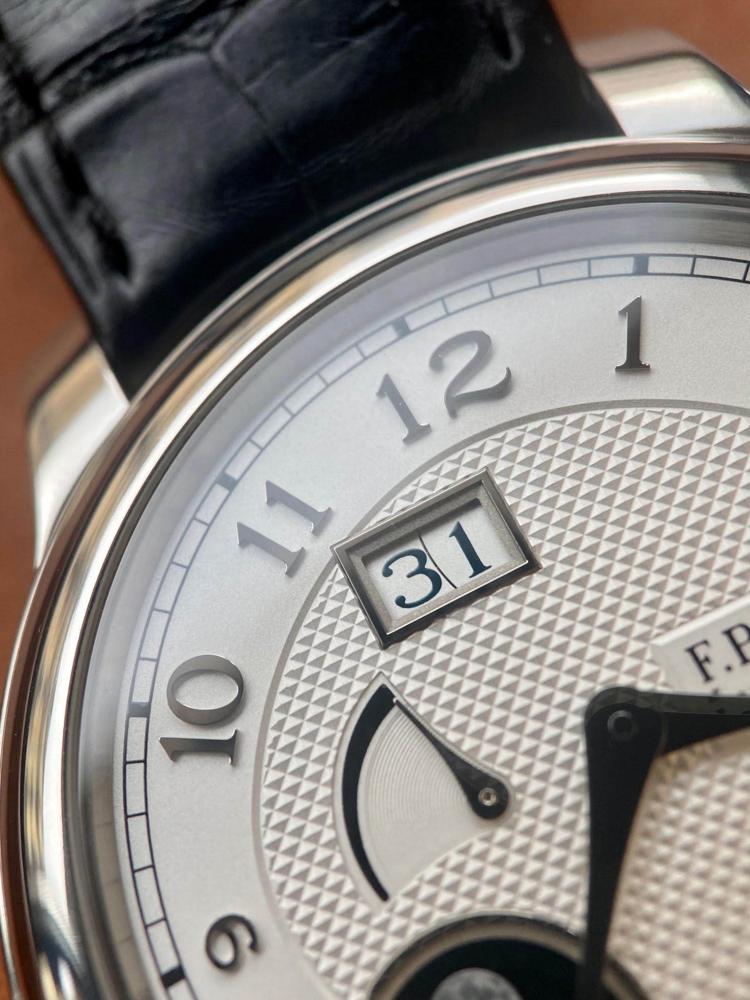
Significant are the new stepped frames around the apertures in platinum or red gold, arching the case. Similarly are the applied numerals. These elements give the dial a strong feeling of depth and and three dimensionality.

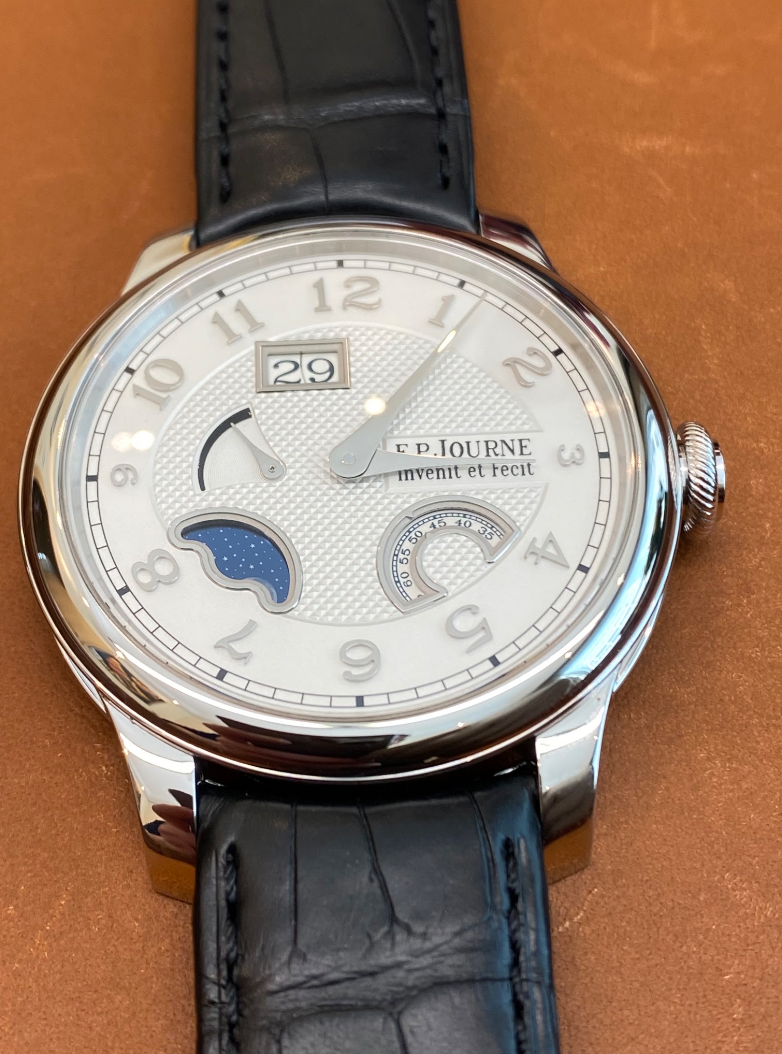
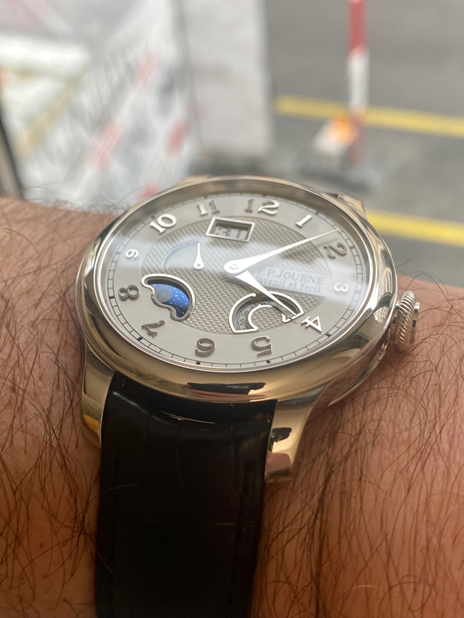
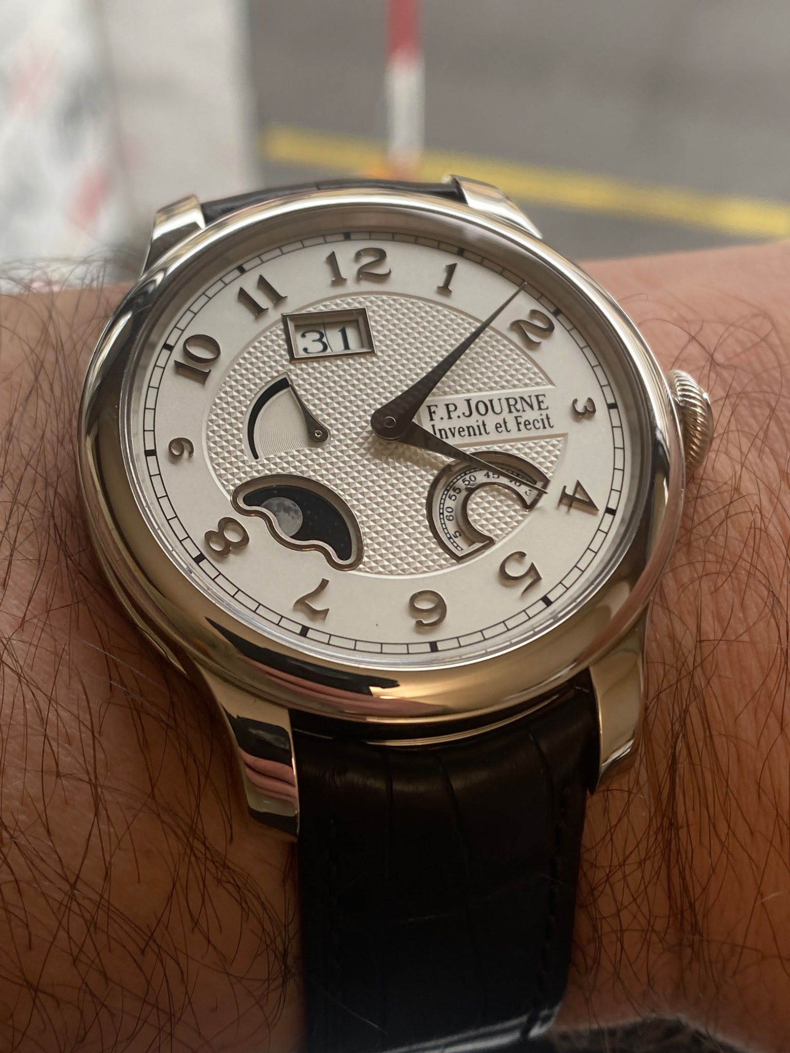
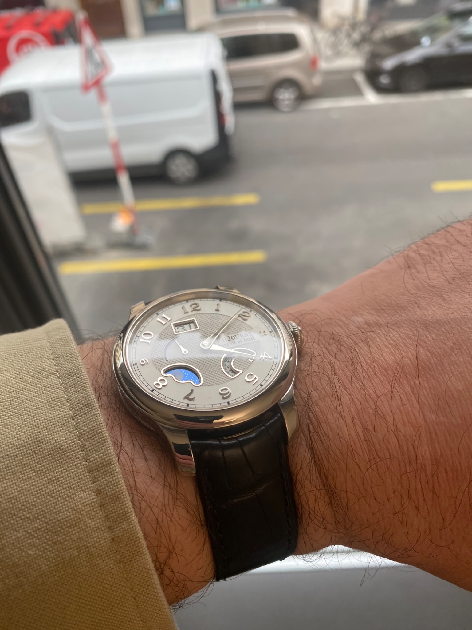
The previous version of the octa divine.
The updated design is an improvement compared to the previous version. The previous dial never seemed to have found a sense of harmony but was rather a product of the old style that worked very well in some dials but applied to this model it didn’t. When comparing it with the Perpetuelle I preferred the previous “clover dial” with its quirky frame that created both harmony but also brought life to the dial with its arch shaped frame.
Here we clearly see an improvement by simplifying the design.
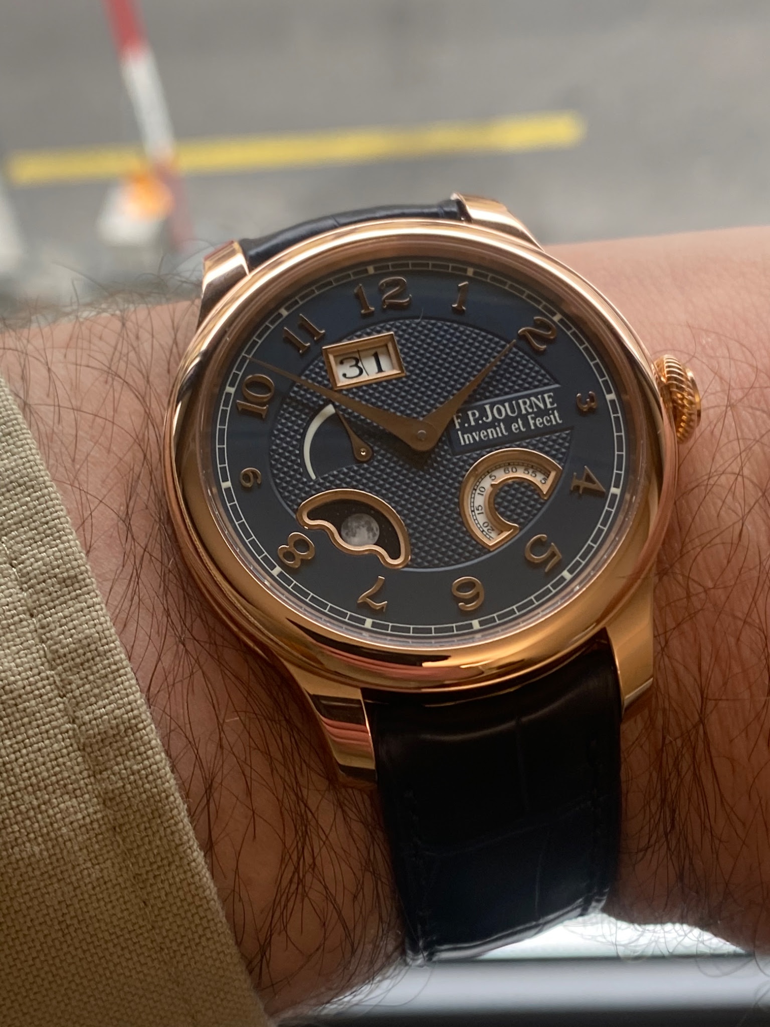
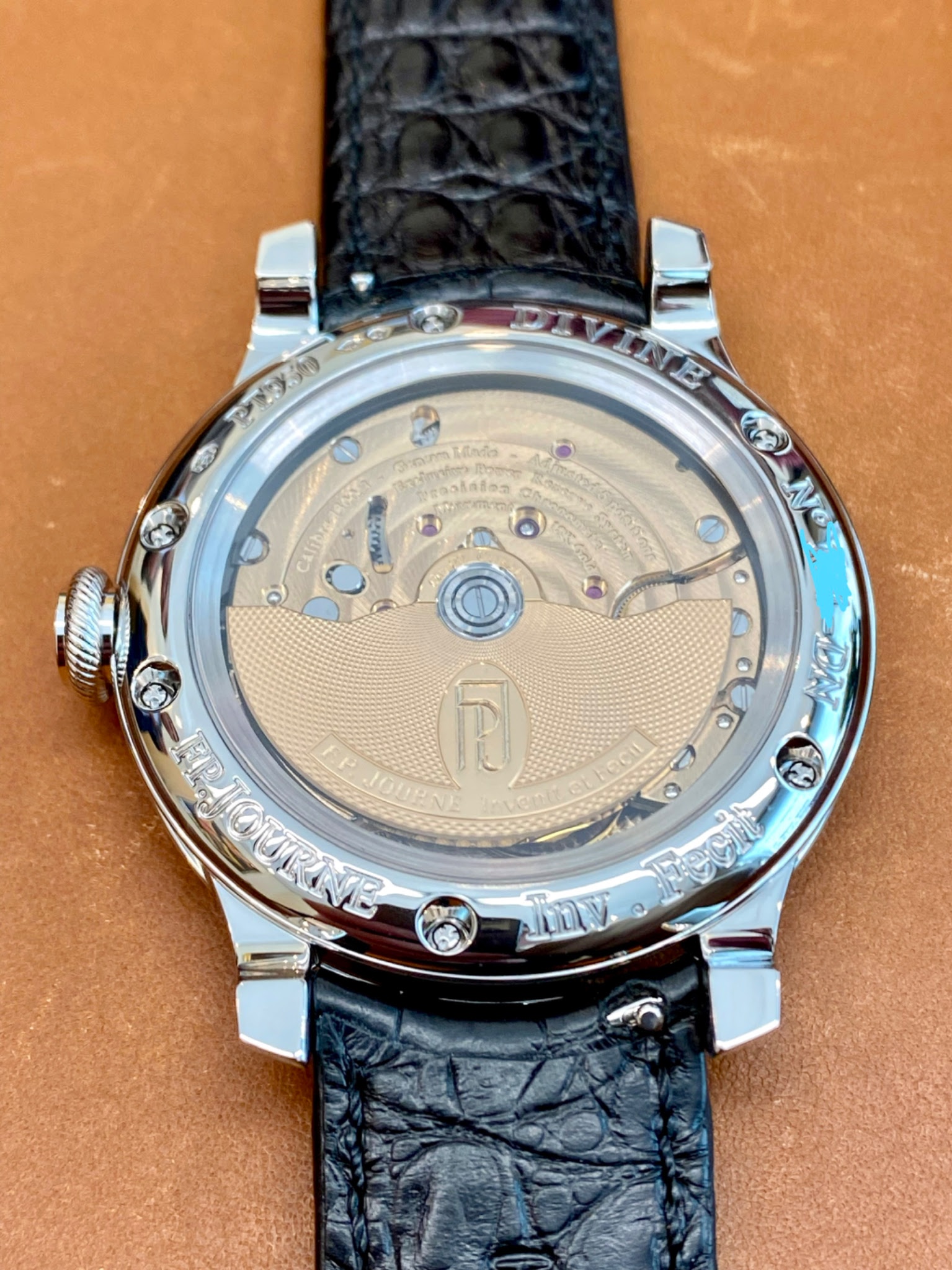
The watch is still powered by the Octa 1300.3 movement. Executed entirely in solid rose gold.

New Release
Explore F.P. Journe's 2014 Geneva Week releases: the innovative quartz Elegante for ladies and the refined Chronometre Souverain.
10 replies4741 views

Reference Guide
Explore the F.P. Journe Octa Divine Lune 36mm's rare transitional features, including case and movement variations. A must-read for collectors.
38 replies8492 views
The FPJ Octa Divine 2023 dial - live pictures
The Divine has recieved a make over of the dial design. Just as the Perpetuelle did in 2021. The design is now similar in style and the watch is offered with the option of a white or a blue dial. Both options are available in platinum or rose gold case an...
Thanks for posting this, Christian. May I ask what the small
Semi circle of numbers represents? Thank you.
You’re welcome Ed. That is a seconds display. It’s a small disk spinning constantly.
Just a fun way to animate the dial.

I like this a lot. At least on pictures much better, than the previous version.
Might just be my favourite automatic from fpj

Not to my liking...
All those thick borders around the openings make the dial heavily unbalanced. Maybe I'll warm-up to it but for now the old version for me please... ...
Different horse for different courses!
The earlier one holds no appeal for me. I just can’t get used to the oval middle. Love the applied numerals on this one also. That’s what great about this . . . to each his own!


To me, a huge improvement on the prior dial.
I’m still unsure if I like it though; there’s a lot going on there. And while I do love the blue and gold combination, I think overall the pt and white dial probably takes my choice between the two. Thanks for sharing.


I like both the older and updated version.
The older version speaks to Journe’s original design language and the practicality of a watchmaker. The updated version is more refined and nuanced while retaining all of the innovation of the original. And as with most Journe pieces, both versions are ma...

Older version for me
The boarders on the new one are too thick. Especially noticeable on the RG model. I also don't like the rectangular date indenting the circular style element around it. A fine watch but not my favorite.

Loving these Journe posts...
For me? Unless I am seeing like 4 more zeroes at the end of my bank account, I just can't do it!!! I accept donations though!!

Thanks for sharing C!
My vote is for the old version - especially in black label. I’d be into the new design more if it didn’t have the frames around the date, digital seconds and moon phase. ...

This is one Journe I’m not crazy about.
Neither version. The oval mid-section of the original design was a turn-off, as Ed said; and the window frames on this new design grab too much attention for me. As Alex said. Geez, I wish I could say something original!