
Jay (Eire)
12586

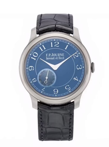
The Bleu
Been a long time since I’ve worn this watch. But without question this watch is still the one that really captures my attention.
The dial is so dynamic, that alone is enough to keep one coming back.
But it’s also some of the unnoticed things. The font choice, the decision to retain all the numerals and not have any cut-offs to accommodate the sub dial. The sub dial too, the placement never felt odd to me (unlike a 5712 for example) it always just seemed natural. And the coloring of the numerals, soft and subtle whereas it could easily have been an harsh white under different direction.
I’ve said it before, and I know this runs against what some collectors believe, but a watch needs to be coherent and appealing on the dial side BEFORE anything on the inside or reverse becomes relevant. And Journe pretty much always get this right.

And the normal state, an unbeatable watch in my opinion.

Available on the marketplace
63 F.P. Journe listings are live on the eBay market and 270 collector listings on the WatchProSite marketplace.


Manufacture
ChristianDK interviews F.P. Journe on discontinued models, the new Resonance, and future innovations at the Manufacture. Gain insights into his vision.
52 replies18219 views

Collection
Explore the F.P. Journe Chronomètre Bleu through collector ChristianDK's lens and community insights. Discover why this iconic watch holds a special place in collections.
58 replies11616 views

Market
Uncover the tipping point for the F.P. Journe Chronomètre Bleu's surge in demand. Explore insights on its unique design, market trends, and collector appeal.
43 replies10857 views

Collection
Explore the F.P. Journe Chronomètre Bleu through collector ChristianDK's macro photography and community insights on case finishes, Elegante sizing, and strap availability.
75 replies9058 views

Collection
Explore the F.P. Journe Chronomètre Bleu and the world of bespoke watch straps. Holdemchamp1225 shares insights on ABP vs. Jean Rousseau for custom straps.
67 replies8112 views

Wristshot
See what luxury watches WatchProSite members are wearing to start their week, featuring F.P. Journe Chronomètre Bleu, Rolex DateJust, and more.
55 replies7968 views
The Bleu
Been a long time since I’ve worn this watch. But without question this watch is still the one that really captures my attention. The dial is so dynamic, that alone is enough to keep one coming back. But it’s also some of the unnoticed things. The font cho...
The first picture is a bit of a novelty shot, but it’s an example of the ever changing dial.
My favourite “face” of the CB is actually when the dial seems to be a darker navy.


It’s all about the straps.
Although my favourite strap for this watch is actually a rather mundane grey.

Agreed! And the tantalum case color is a perfect balance to the vivid blue, not too shiny.
Thanks for sharing those great pics! It reminds me of what a pleasure it is to wear the CB. I need to order some different color straps.
Yes, for sure that too. Dial-case combination is what makes the watch work so well in a casual setting.
Re straps, almost any colour works on the CB. I have grey, this turquoise, orange, tan, green (khaki) and we have seen others here with yellow, red, other shades of green and grey, blues, pink (which looks really good) and on and on. Maybe the most versat...


Great shots!! Love the first one captures the uniqueness
Of the bleu that other photos don’t!!
Thanks. There are so many “faces” of the CB which the camera cant accurately capture.
Even that picture above, in reality there was a lot more clarity. One has to seen them in person.

Thank you.
Been my favourite watch for several years. Just hasn’t gotten so much wrist time this year.

Beautiful
Yes I agree, watches need to be beautiful dial-side (and wearable!) before anything else
Yes, that too. Needs to be wearable.
There are several pieces out there I really like and tick all the boxes except wearability. At 39mm, no question the CB is wearable.
So true...
The fact that there is nothing in the FPJ lineup currently below 40mm has definitely saved my wallet. Well, sort of.
Yes, good for the wallet.
I have tried a few of the 40mm with the newer slimmer bezel and it’s close (but not perfect). Visually it looks better for sure. But at these price points things really need to be right and so for me it continues to be a pass. Perhaps more exposure, more ...
100%
Out of the current "obtainable" collection, I'm eyeing the nacre edition. But at 40 its stretching it and I find the guilloche a bit awkward next to the beautiful MOP so probably a pass
The Nacre.
Like several other of Journe’s watches, I didn’t like the Nacre so much initially. But over the years this dial has really grown on me. I think the rose gold CS is now my favourite of the bunch. It’s hard to make a call when the size is borderline, the 40...

agree on your points, Jay!
Despite all our interests and demasnds - In the end it comes down to aestetics. I love that first shot. It looks like a swimming pool on th wrist ;.-) I hope you are well dear friend.
Yes, first things first. Just like Nico’s DSA, it just looks good...it’s eye catching.
That first shot is one of those crazy faces of the CB, you could swim in there. In fact I may have done that several times over the years while sitting at my desk!


Love the strap combo!
The shot with the floating/reflected numerals is just gorgeous. I've managed to capture my CB in such a state a few times, but I have yet to figure out how to reliably reproduce the effect for one of my portrait-style photos. The CB is truly one of those ...