
seabas132
1348

Boutique Edition Divine RG
Had the pleasure to try on this one. 40mm. I feel that the dial layout is more balanced instead of the clover layout from before. The shade of blue provides enough contrast and subtle color that plays more beautifully in person with the rose gold. The updated moonphase really pops. Hard to capture in this photo, but the golden stars do shimmer in the light. I like this blue better than the stark black from previous boutique editions. I also really like the distinct seconds disc as well as how the numerals change size rather than are cut like in so many other designs. Hopefully, can add this piece one day.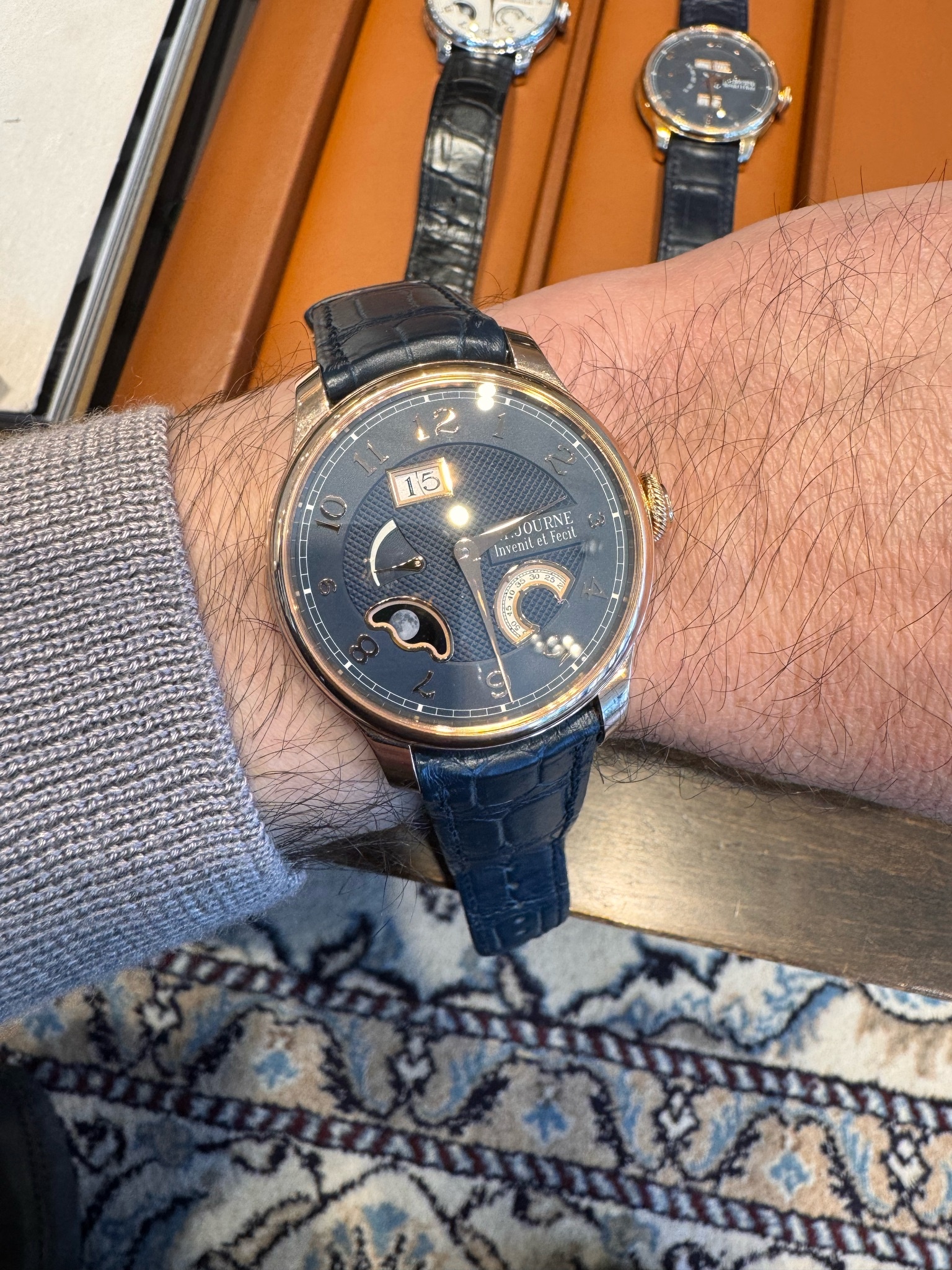

New Release
Explore F.P. Journe's 2014 Geneva Week releases: the innovative quartz Elegante for ladies and the refined Chronometre Souverain.
10 replies4741 views
Boutique Edition Divine RG
Had the pleasure to try on this one. 40mm. I feel that the dial layout is more balanced instead of the clover layout from before. The shade of blue provides enough contrast and subtle color that plays more beautifully in person with the rose gold. The upd...


It looks really beautiful to me.
I like the combination of rose gold and blue very much. I wish you the best for acquiring such a great piece! Best, Emmanuel


Funny you say that.
I’ve generally been of the same opinion for this watch, and any Lune for that matter over the years. The exceptions I have found to this is the Devine Black Label in the prior dial layout. Seeing one in person last year I was smitten. I can’t explain why ...
Interesting. I do agree. I like this style better and this blue works for me.
I’m not a great photographer and it is hard to capture some of these colors in a brief photo, but this blue does work. I do not like the standard white/silver dial color - but this blue dial with the rose gold case was stunning in person. Apparently they ...
For a CS like this, I think it would be better. More coherent.
The only attraction to me of the Devine is really the automatic calibre. So aside from that one version I saw last year which was surprisingly beautiful it’s not otherwise on my radar. I have been thinking about adding an automatic Journe to the collectio...
I do really like the CS. They are supposed to let me know
when they get a rose gold case/blue dial CS in so I can see it in person as I may want that combination instead of the classic CS. The Octa AN is a great piece as well. I am a fan of FPJ as he does ouch the technical side just because he can and not just ...
Stay the course, keep showing up.
That does seems to be a route to an allocation for those not already well known by the brand. You have me curious on the new CS now too. That will be interesting to see.
Thank you for the encouragement. 🙏
I will be sure to share when I am able to see the CS in this version.

RG or Platinum?
What are your thoughts regarding the platinum boutique edition? You think it’ll look nicer vs the RG?