
Ornatus-Mundi
[Zenith]
7136

Delving deeply into the Chopard L.U.C Full Strike Minute Repeater part 3 of 3 - Design
The Chopard L.U.C Full Strike Minute Repeater is not only a superbly engineered timepiece, but also a consistently designed wrist companion.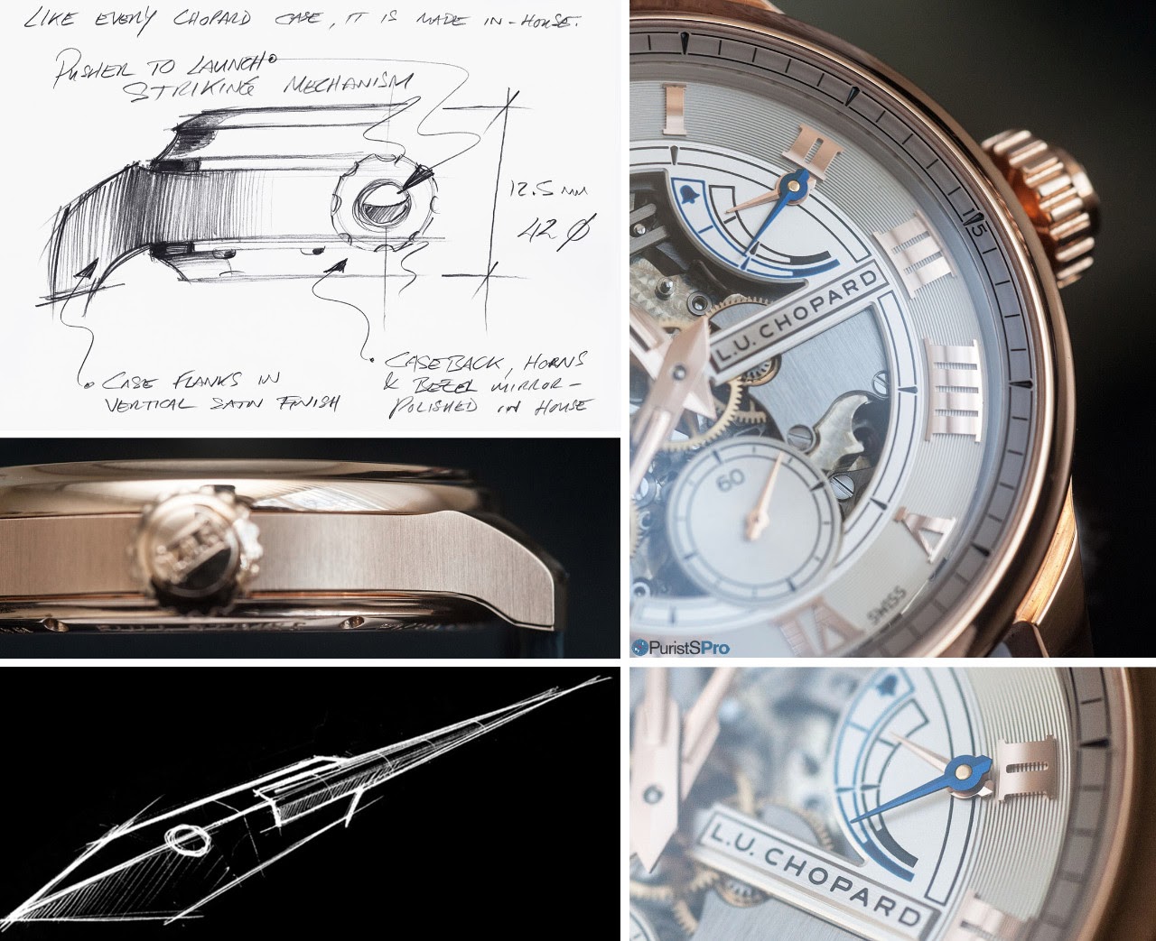
For this last part of my series on this timepiece, I sat down with Chopard's head of design, Guy Bove, for an in-depth session discussing the principle guidelines which drove the design of this watch (for the first part of this series, covering the Chopard manufacturing capabilities, click here ; for the second, delving into the technology behind this watch, here!).
Under Mr Bove's guidance, Chopard has developed a very consistent, well defined design language that is applied throughout the collection. In constrast to many other manufactures, the brand speaks about it openly. For me personally, this was an immensely entertaining and informative time spent, and with great joy I would like to share the essentials with you.
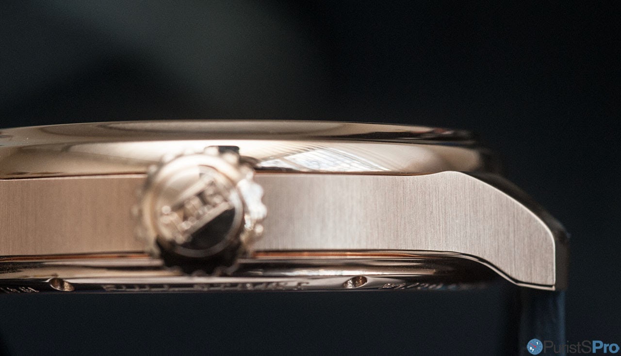
(i) The Case: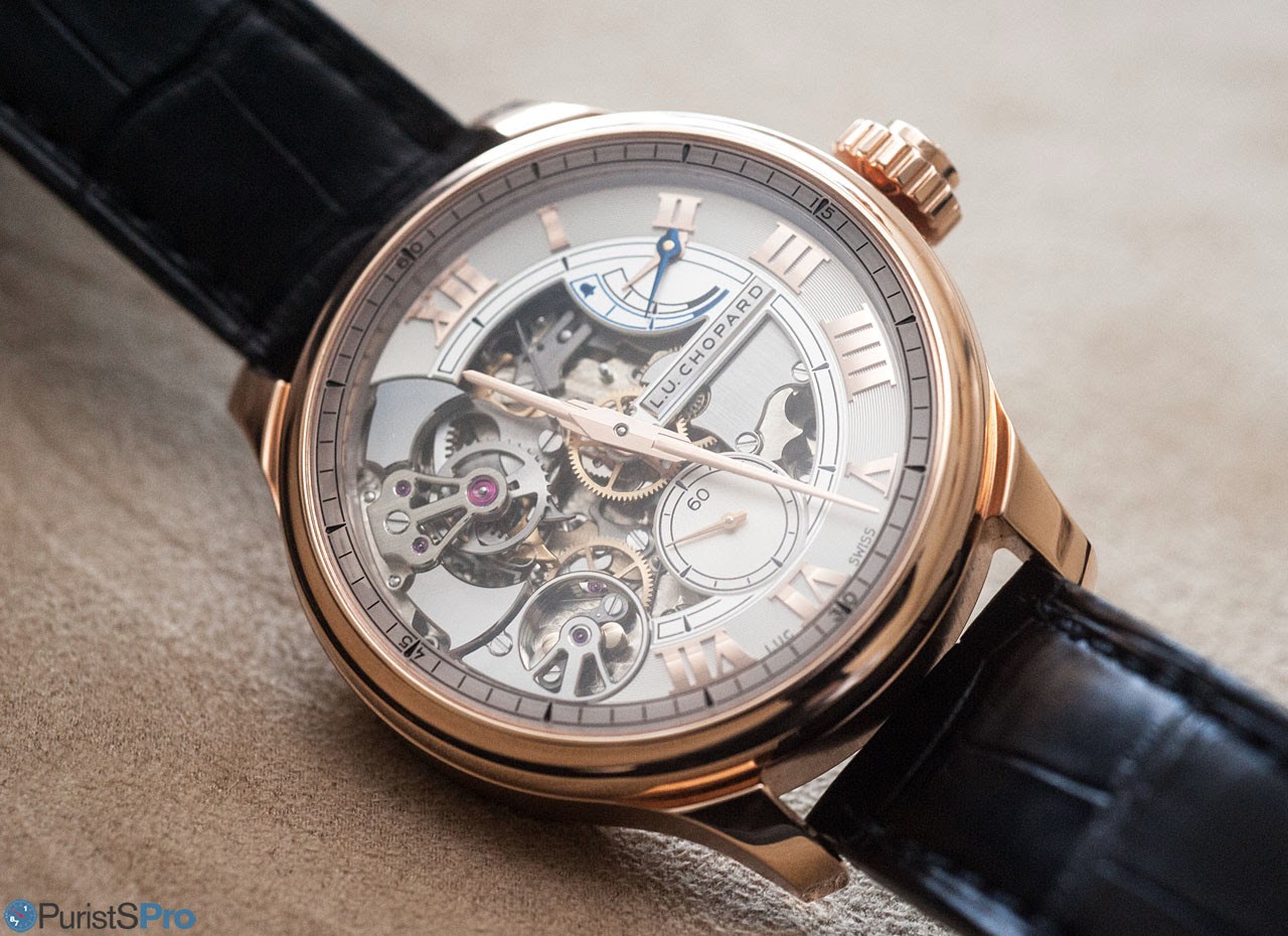
The case design has a couple of decisive elements:
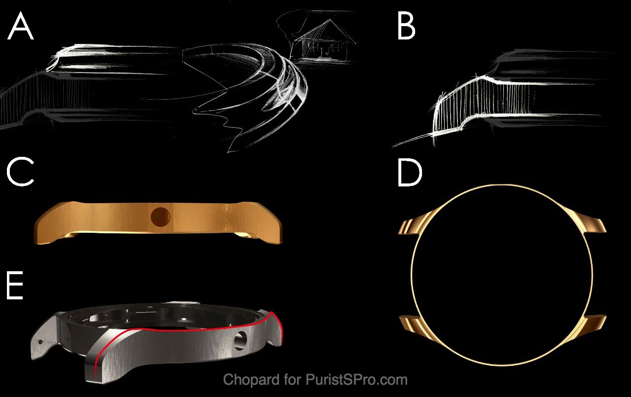
- (A) a concave bezel to create a frame of light around the dial, and optically lift up the bezel
- (B) short lug shape
- (C) brushed case flanks
- (D) notch at case attachment of lugs separate them from the case
- (E) polished lug top and bottom sides create an optical guide for the eyes to follow the case lines
Chopard produces all its cases in-house, which is an ultimatively rare capability in the Swiss watch industry. But thus it is no surprise that the craftsmanship on the Chopard cases is top-notch:
The brushing is perfectly perpendicular to the case band. Note also the wonderfully executed even anglage at the bottom.
Another apsect worth noting is the shape of the lugs. They have a very elaborate design which serves both functional as well as aesthetic objectives: The lugs are short, in order to ensure a tight fit of the 42.5mm case on the wrist. For the same goal, the underside of the lugs extends before its bends down to follow the arm's curvature. On the top, the lugs feature a polished surface with a long, smoothly extending line. The lugs thus appear longer than they are in reality.
The above mentioned notch is clearly visible.
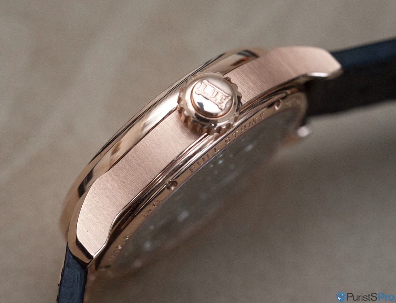
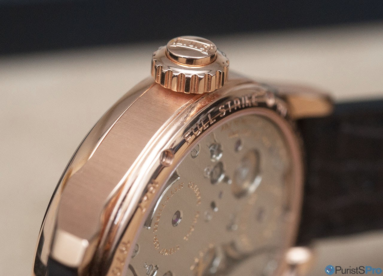
A specific element is the crown. Not only is it large in diameter and equipped with some 19 rims of immensly pleasant tactile feel.
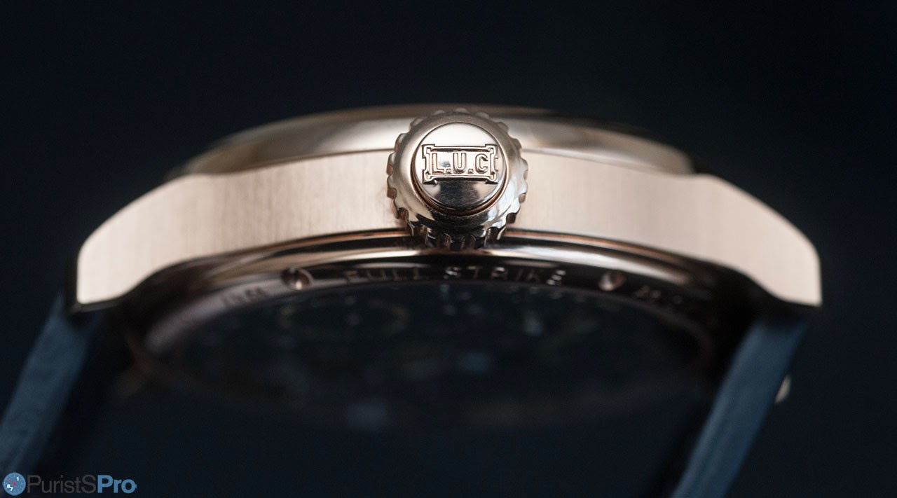
But the key here is: just like a rattrapante or a vintage monopusher chronograph, it bears the activation knob for the minute repeater. This technological feat is one of the main prerequisites for this repeater to offer a usable (3 ATM) water tightness.
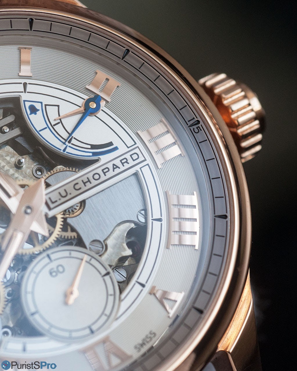
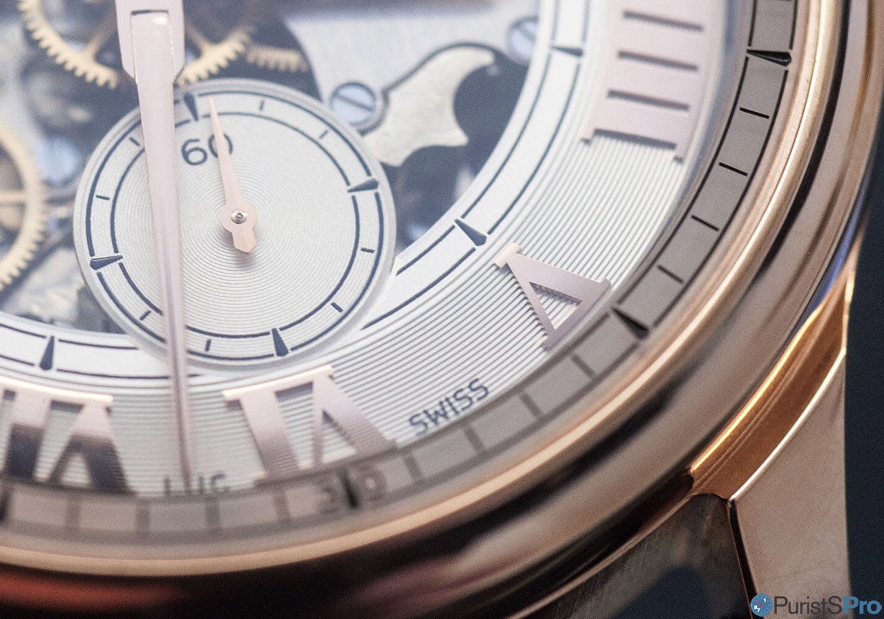
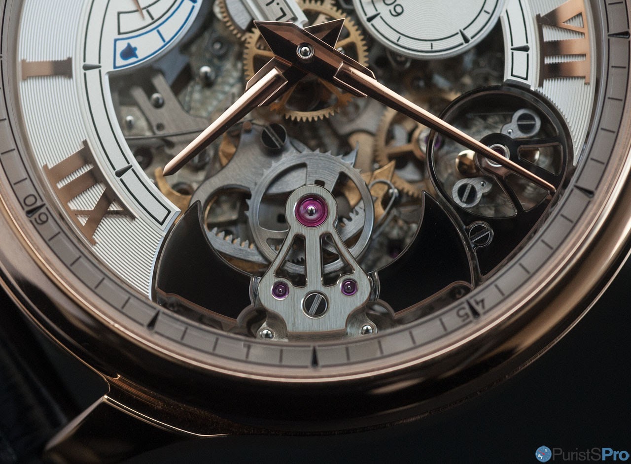
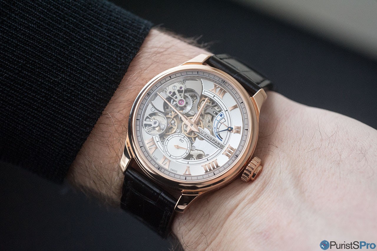
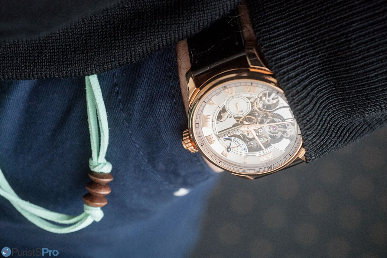
(ii) The Dial:
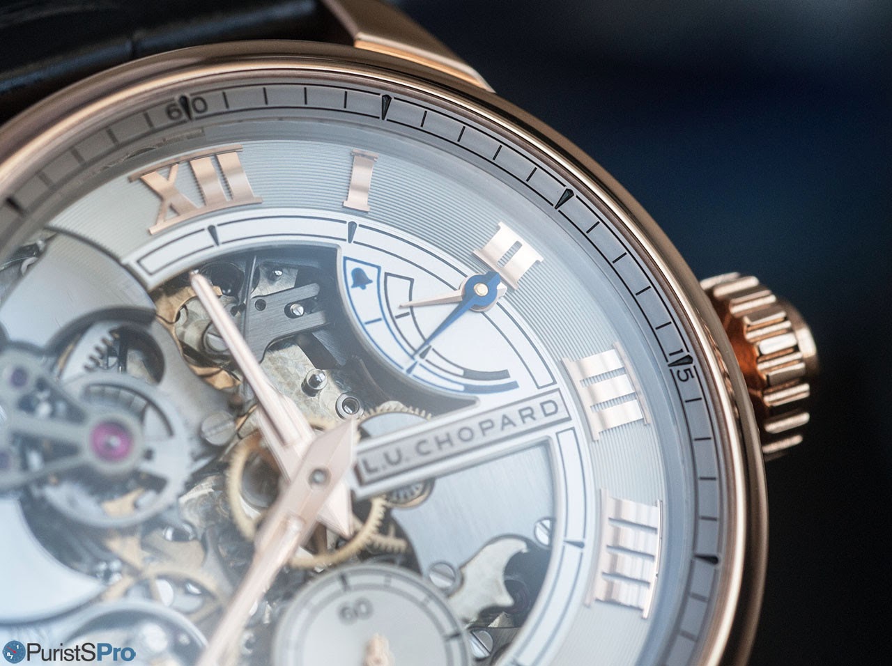
When we talk about the dial, we'll need to consider first the dial plate (or what is left of it), and the numerals.
Mr Bove told me that the the decision to open up the dial was an obvious one given the technical level Chopard has reached with its first repeater watch. Thus, the most of the chiming mechanism can be admired in action.
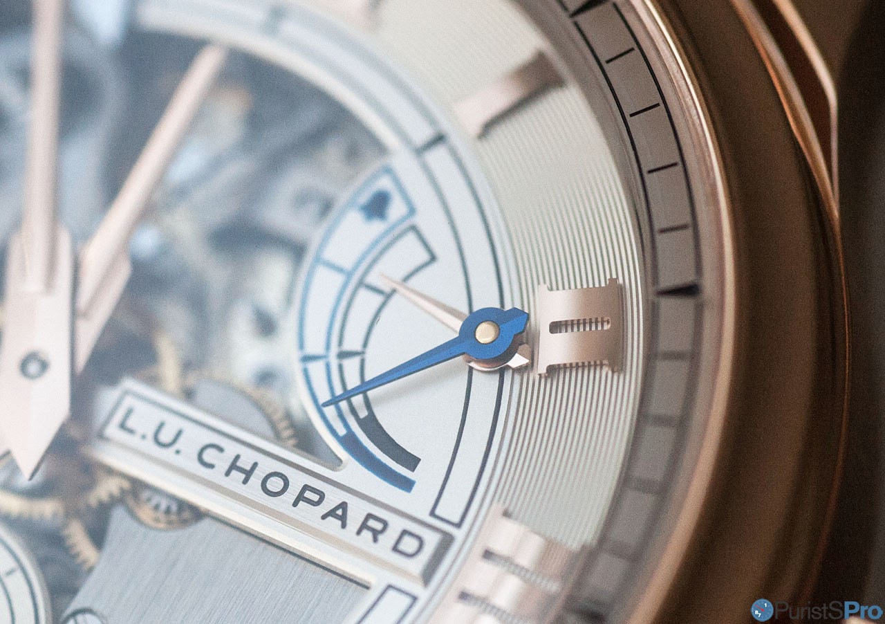
For the remainder, it covers the numeral of 12 to 7, as well as the power reserve indications and the small seconds at 6 o'clock.
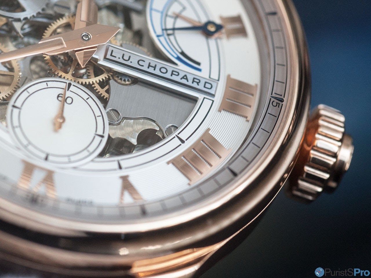
One less obvious but, in the context of the entire Chopard L.U.C collection important, detail are the rhombi. These small elements remind on vintage indices and are placed at each hour on the outer dial, at five of the hours of the inner dial, and at each 15 seconds interval on the subseconds dial. Each rhombus is separated by small gaps in the tracks around their dials, for enhanced precision
The watchful observer might have picked up on two peculiarities: (i) the grooves on minute as well as second track have different depth and spacing, and (ii) only the grooves at the seconds dial are directly printed on. Between the two observations is a direct link:
While the more prominent grooves at the outer ring add great shine to the dial and thus play very well with the bold applied numerals and the openworked dial alike, the grooves are too deep for precise printing. Thus, printing for hours and minutes appear only at the matte elements of the dial.
For the subseconds, however, the grooves are subtle enough for allow a direct print.
At Chopard, each collection has its own typeface, with many of them inspired by vintage Chopard watches. In this specific case, from a wristwatch Mr Scheufele recently bought, and which was originally made in 1963. The Roman numeral choses are found in many Chopard L.U.C watches.
As mentioned just above, the deep grooves don't allow any printing, thus Chopard opted for appliqués. They are bolder than their printed counterparts on other L.U.C watches and have less pronounced serifs (partly due to the fact that paint retracts after it is applied, this is compensated for by more distinct serifs) and they are domed on the top, offering a particularly magical shine:
(iii) The Hands:
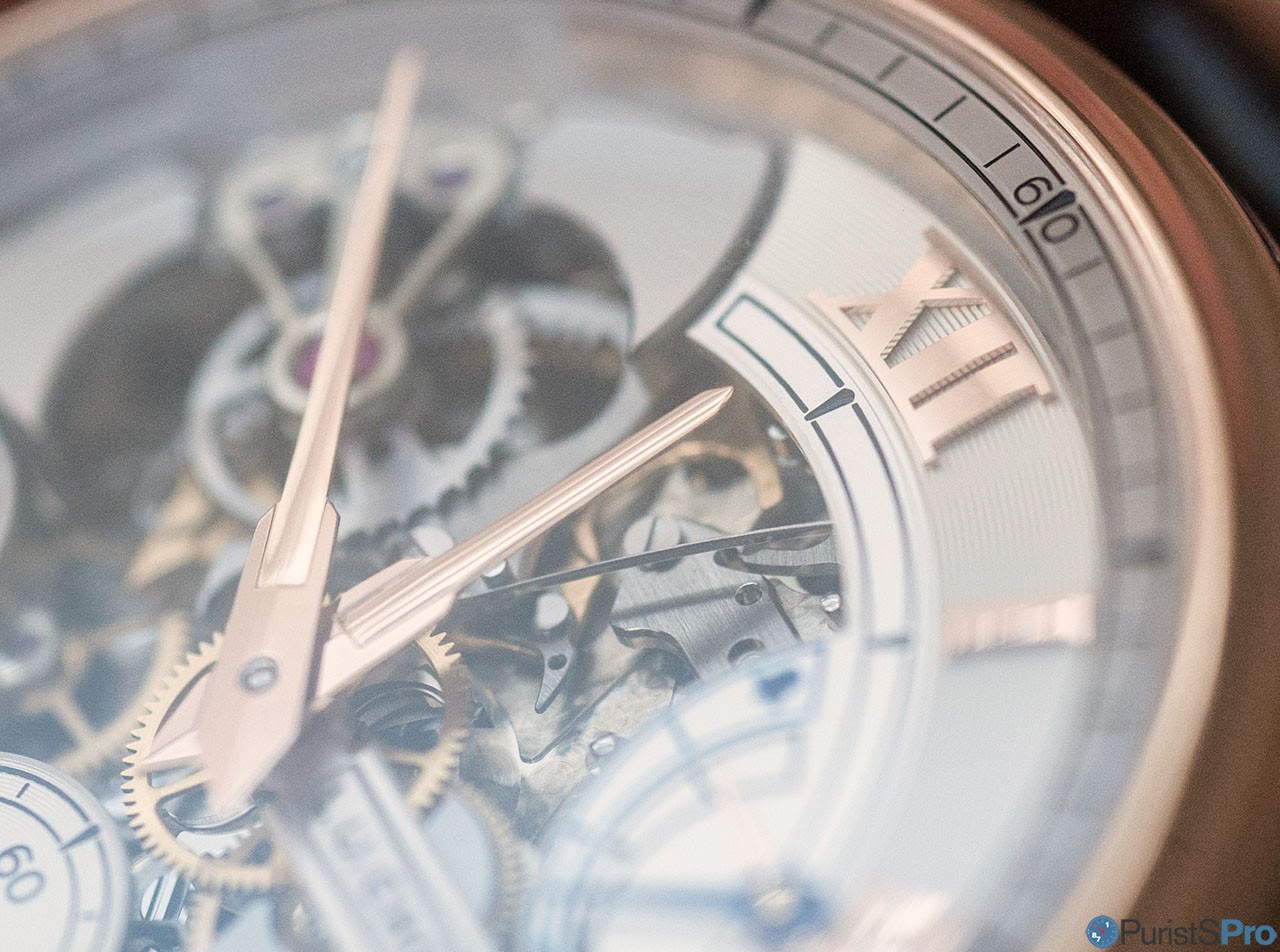
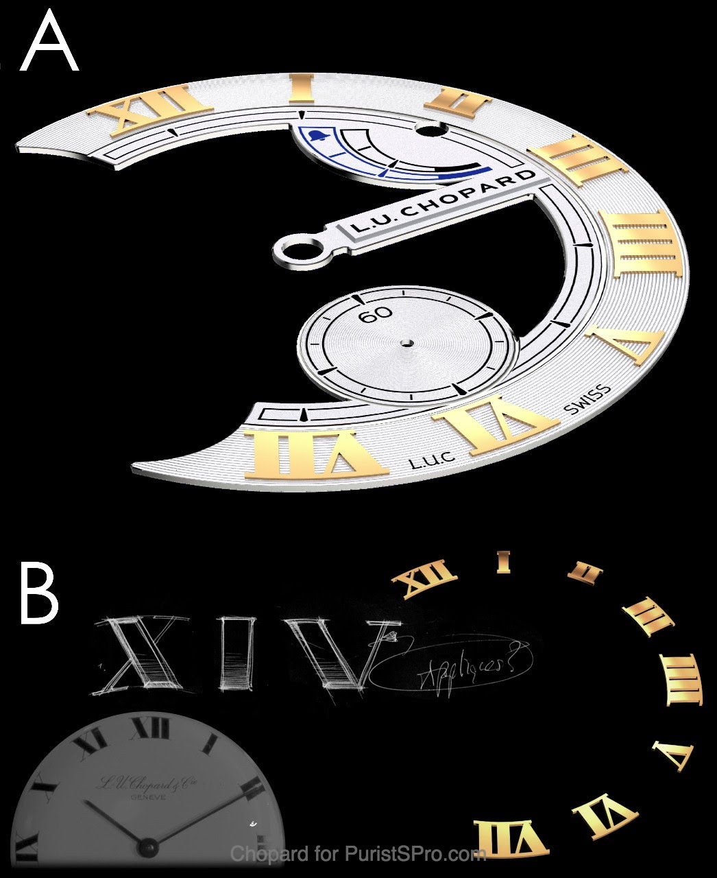
Chopard, throught the L.U.C series, designed an unmistakable and quite versatile flavour of the classical 'dauphine' hand:
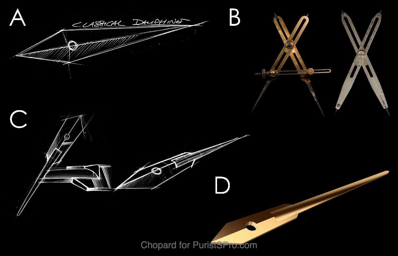
Dauphine hands are a mainstay for classical watches, with their angled top side and the sharp tip they offer great visibility and precise indication of time. There is, however, one major drawback to them: Due to their relatively wide body, they cover a considerable part of the watch face. Something, which particularly with open-worked dials, is not desired. In addition, dauphine hands offer little room for an individual design.
Thus, Chopard came up with an ingenious solution:
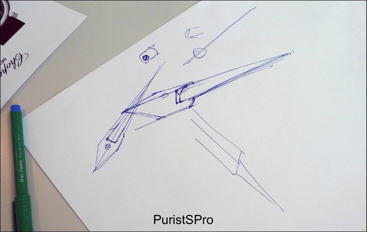
(photo credit: MTF)
They took inspiration from a precision drawing instrument, a pair of compasses, which feature strong arches with thin, precise tips (see 'B' above). Chopard transferred this concept to their hands for the Full Strike and combined the base part of a dauphine hand with a top-rounded, thin and tapered baton tip. The result is an immediately recognisable hand shpe, which on top is also immensely flexible to be adapted and modifed to fit a variety of watch styles.
All I can say is that I love, love, love these hands, their proportions, their legibility, and how entertainingly they reflect light, how authoritatively they indicate time.
Overall, I have to admit that I was suprised to see how much attention Chopard awarded to the design of its flagship watch. Why am I surprised? Because as a complication situated at the very apex of the horological foodchain, minute repeaters, particularly those who follow a more or less classical aesthetic concept, tend to rely primarily on their complication, with a design just being 'pleasant'. But who would criticise the manufacturer's for this? A collector will acquire such a watch for its chiming mechanism, not (at least not at the first place) for its design.
The precise definition deep into smalles details speak volumes about the holistic view Chopard has in terms of its watch. And overall, I think Chopard succeeded to lend a distinct personality to this watch.
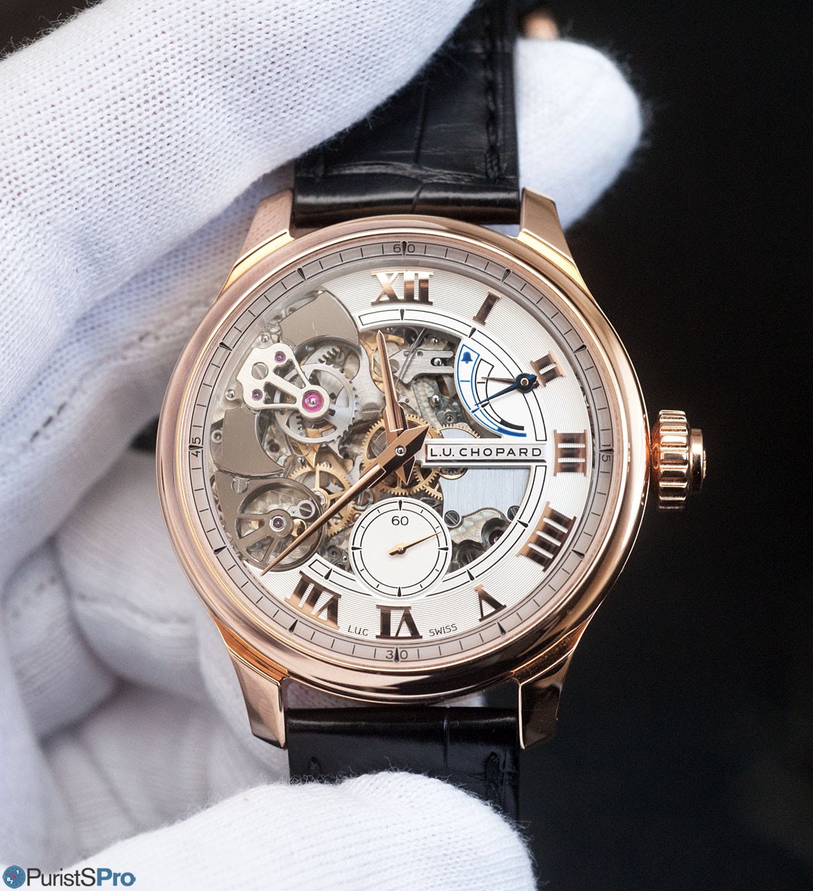
Moreover so, if we take a look at the remainder of the L.U.C collection. The following representative selection demonstrates how perfectly the Full Strike fits into the overall Chopard design language. At very different degrees and with considerable interpretational freedom, the defining elements of case, dial and hands are all in the quite diverse references in existence:
- complicated (quite close to the Full Strike, thus less of a surprise):
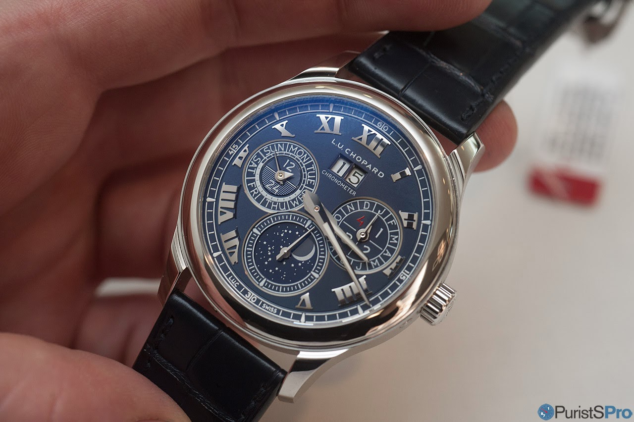
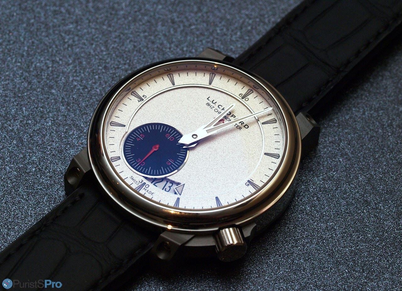
(Chopard L.U.C Perpetual Chronometer Platinum)
- modern/performance-oriented:
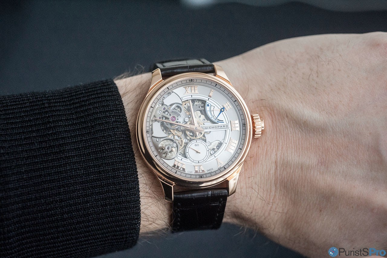
(Chopard L.U.C 8HF Power Control)
- elegant/dressy:
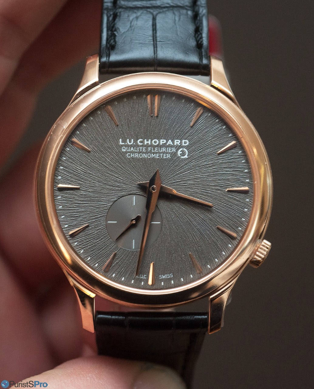
(Chopard L.U.C XPS Twist QF Fairmined)
- and lest we forget: puristic:
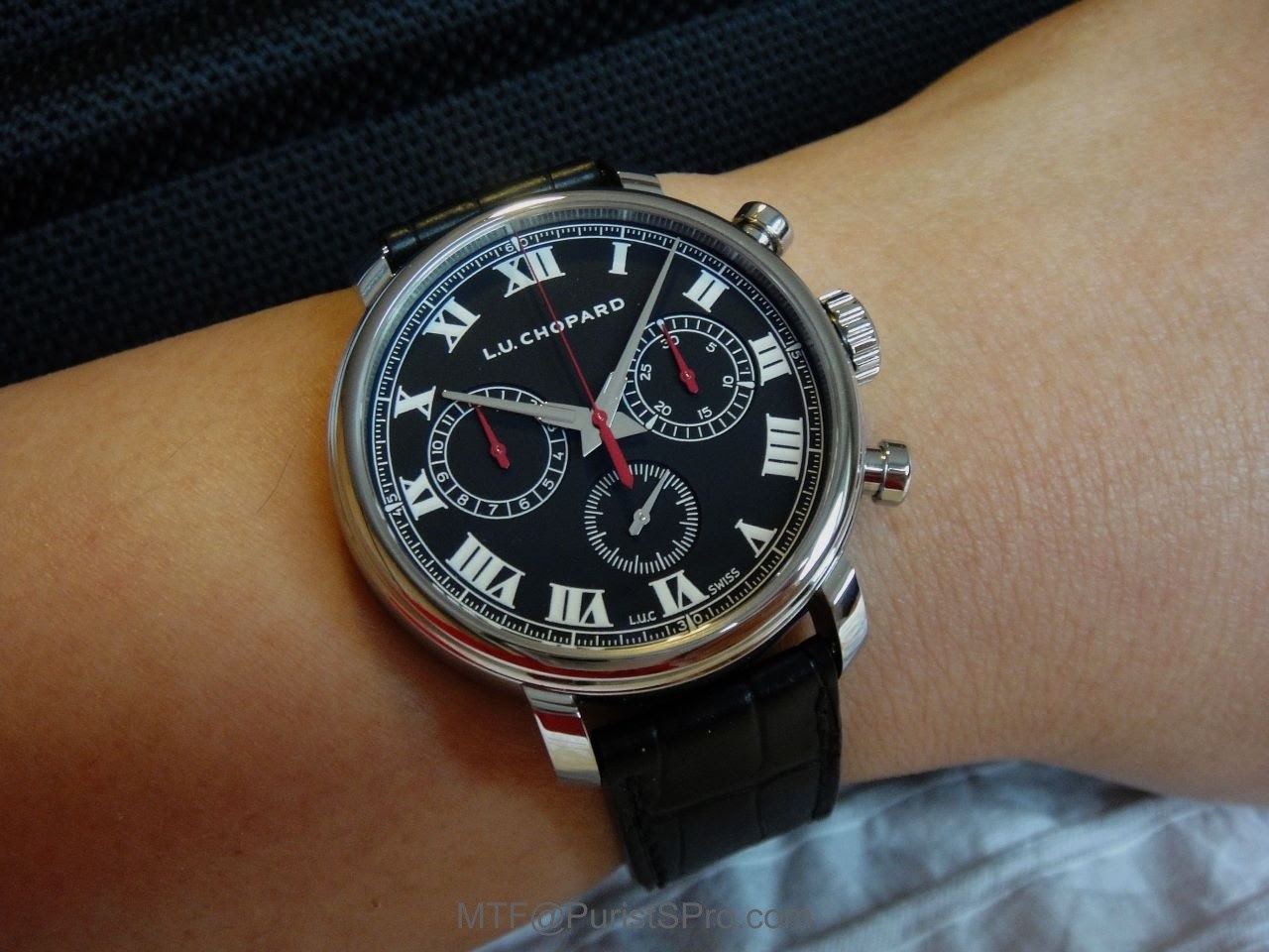
(Chopard L.U.C 1963 Chronometer; photo credit: MTF)
So, at the end of this series or articles, I think it was worth the effort to investigate the technical and aesthetical intricacies of this exceptional watch. Despite Chopard's first attempt to a minute repeating timepiece, this is not a beginner's work. Chopard did not content themselves with a conventional minute repeater. The brand revisited the acoustic conditions that come with a chiming watch, and devised entirely original solutions to the inherent constraints de novo, with a fresh view largely unobstructed from in-house traditions and long time practices.
For the L.U.C Full Strike, the resulting sound quality lift it up to the very best minute repeaters out there, with a full tone, crisp and clear, excellent pitch and loud enough to hear in a crowded room, and al this without the metallic clang which often comes with more conventional ones. Its technical raffinesse and constuctional originality put it on par, and probably even on top, with the other modern repeaters, e.g. the Jaeger-LeCoultre Master Ultra-Thin Minute Repeater Flying Tourbillon or the Breguet Tradition Minute Repeater (which I think is not yet ready for prime time).
It is the design which probably the most polarising feature of this watch. With Chopard's aesthetic language its either love or its hate. Mr Bove has conceived a conception which certainly does not please everybody at first sight (and this includes myself for sure). However, once introduced into the gestation of the aesthetic elements, their objectives and their implementaton throughout the L.U.C line of manufacture timepieces, I changed my view entirely. Chapeau to the design team for putting together a cooncept that serves as a red line for such diverse watch like the 8HF Chronometer at the one down to the XPS Twist at the other end. Between, in the middle, the complicated pieces such as the Perpetual Calendar or the Full Strike are found - all clearly one family.
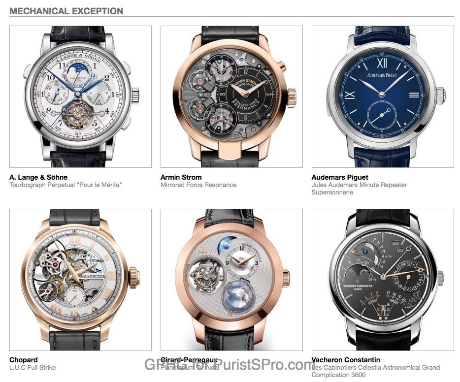
It comes to me as no surprise at all that the jury of the 2017 edition of the Grand Prix d’Horlogerie de Genève pre-selected the Chopard L.U.C Full Strike in its prestigious 'Mechanical Exception' category:
I personally, however, would have preferred a more calm dial design. I fully understand that Chopard intended to highlight the mechanics of this excpetional watch, but for me personally, being not that much enchanted by open-worked dials, less would be more:. just take the L.U.C Perpetual Chronometer above as an example!
But who knows, I cannot imagine that Chopard went though all these efforts, costs and time spent for just 20 pieces?
Thanks for reading,
Magnus
P.S.: A special thanks goes to Guy Bove and Cedric Laforge from Chopard for enabling me to delve fundamentally deep into this outstanding timepiece! Furthermore, also a great, great 'dankeschön' to Mr Karl-Friedrich Scheufele for welcoming me in Geneva!

This message has been edited by MTF on 2017-09-28 11:47:18
Delving deeply into the Chopard L.U.C Full Strike Minute Repeater part 3 of 3 - Design

Chopard L.U.C has a tradition of openwork dials for Launch models
The devil is in the details

Excellent series of posts, Magnus!

Answers to „why?“ need reports by Insiders and contribute so much to the quality of a forum
I was a convert

I think they have moved a step up with appeal of the hands on the Full Strike compared to earlier iterations