
foversta
[PuristSPro Moderator]
20814

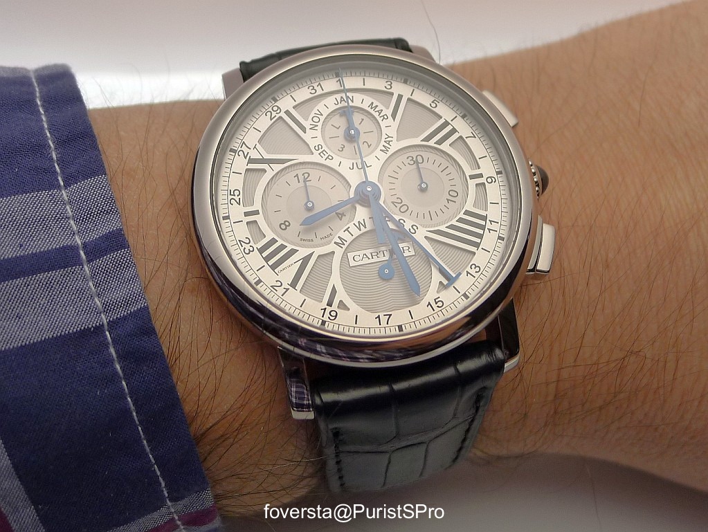
Cartier Rotonde PC Chronograph: what do you think about its dial lay-out?
When I handled this Rotonde PC Chronograph, I was positively surprised by the legibility of the dial despite the numerous displays on it. It even features the day of the week through a retrograde hand in the 6 o'clock subdial.
My only concern is maybe the similarity between the second hand of the chronograph and the date hand.
What is your point of view? Do you think that the similar color for all hands is a good option or Cartier should have taken the decision to use a color per display type (PC or chronograph)?
Fx

Complications
Discover the Rotonde de Cartier Earth and Moon, a high-horology watch with an innovative on-demand moon phase complication and tourbillon integration. See live photos.
2 replies1614 views
Complications
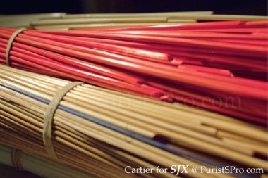
SJX explores Cartier d'Art's straw marquetry on the Rotonde de Cartier koala dial, detailing the intricate 40-hour handcraft and material artistry.
8 replies4883 views
Cartier Rotonde PC Chronograph: what do you think about its dial lay-out?
When I handled this Rotonde PC Chronograph, I was positively surprised by the legibility of the dial despite the numerous displays on it. It even features the day of the week through a retrograde hand in the 6 o'clock subdial. My only concern is maybe the...
cadran blah
a fan of busy dials, I think this one is singularly unattractive. I do like the way the IIII balances the VIII.

A hint of colour
I saw this watch just last week and mentioned to the boutique staff that it needs a hint of colour. I suggested that the Leap Year "L" should be in red, or a red number "4". The hands in all the same colour do not really bother since typically, owners of ...

Cartier Rotonde Perpetual Calendar Chronograph colour hands
FrX, I can understand the use of the same colour for all hands except the date hand. As someone pointed out, nobody expects to use this as a daily precision instrument. But the date hand is used every day and could be confused with the time minutes-hand. ...

I think the watch could look better if the date hand were different
Maybe a silver polished "T" at the end of the blued date hand? Or maybe black? It's such an elegant dress watch that I would minimize the different colors on the watch. Any changes should be done with existing colors on the watch already IMO. Cheers, Anth...